Coloring Contour Elements
A color glyph can be built from the same contours you use for a monochrome design. Give its parts separate colors, arrange them as elements, and inspect how they overlap. The element structure determines which parts you can color independently.
Fill, Stroke, and Opacity
A contour element carries a fill, a stroke, and an opacity setting. The fill colors its interior. The stroke colors the outline generated by its stroke settings. Opacity determines how strongly the element appears over the content beneath it. Color is a separable treatment of the element, secondary to its contour shape: changing that treatment need not redraw the geometry. This supplies the fill and stroke color choices deferred from Working with Strokes.
All ordinary contours within one element share that element's fill and stroke. Selecting one contour inside it does not give that contour a separate color. To color two shapes differently, put them in separate elements with Element > Contours > Separate to Elements, then select the intended element before setting its appearance.
Conversely, Element > Contours > Combine to Element can bring same-colored contour content into one element. Check the resulting appearance when combining parts: one ordinary element cannot retain a different independent fill and stroke for each of its contours. A group can keep its constituent elements and their separate properties.
These appearance settings belong to an element occurrence. A shared contour drawing can therefore be reused with different colors in different occurrences without redrawing its geometry. Editing the shared contour still changes the drawing used by its references.
Color opacity and whole-element opacity have different scopes. The Color panel's opacity control changes the current solid color or selected gradient stop. The Elements panel's opacity setting changes the element as a whole. A partly transparent fill and an opaque stroke are therefore different from reducing the opacity of the entire element, which affects both.
At 100% opacity, a color is fully opaque; at 0%, it is invisible. Transparency lets the background or lower elements show through. White, by contrast, is a visible color: a white shape covers the content beneath it rather than making a transparent hole.
The Elements panel marks elements carrying color or stroke treatment with a color indicator. Use the panel to identify the part you intend to change, especially when several differently colored elements overlap on the canvas.
Applying Color
Open Window > Panels > Color. The panel edits either the fill or the stroke of the selected contour element. Choose that target with the filled or outlined rectangle near the top of the panel. The swap control exchanges their colors.
Stroke color needs visible stroke geometry to have a visible effect. If changing it appears to do nothing, check the stroke's thickness and whether a stroke is enabled. Changing the fill target instead would affect a different part of the element.
Give a part a solid color
- In the Glyph window, use the Element tool to select the part you want to color. Clear other element selections if only this part should change.
- In the Color panel, choose the fill or stroke target.
- Choose Solid color and select a color, or enter a value such as
#336699. - Inspect the element as you adjust the color. Changes in the Glyph window update the active or selected contour elements. With several elements selected, the panel can apply the active element’s current fill and stroke settings across that selection, so inspect both targets afterward.
- Set the color's opacity if it should be partly transparent.
No color removes the selected fill or stroke treatment. Use it when a part should have only a fill or only a stroke. It is different from setting that target to black or white.
Choose and reuse colors
The panel offers several ways to choose the same color value. Use the wheel or box for visual exploration, sliders for channel adjustments, and the text field for an exact value. A #rrggbb value gives an explicit RGB color; supported named colors can also be entered in the field.

The Color panel’s wheel provides a visual way to choose a color, with opacity below it.
The image selector lets you load or paste a reference image and sample its pixels. The eyedropper samples visible color, and the system color dialog provides the operating system's color controls. Check the selected fill or stroke target before using any of these entry methods.

The Picture selector samples a reference image, instead of choosing solely from a generated color diagram.
Use the swatches selector for a small working palette. Select a swatch to load its color, and use the palette controls to add a useful color or manage saved palettes. In the Glyph window, selecting a swatch can update the selected element, so do not use an active artwork selection merely to browse colors you do not intend to apply.

The Swatches list identifies colors by name, making repeated color choices easier to recognize.
A palette keeps choices convenient and consistent. Choosing the same swatch for several elements does not make their contour geometry shared, and changing a saved swatch is not a substitute for deliberately recoloring the elements that use that color.
Make a gradient
A gradient transitions between colors at positions called stops. Choose a gradient type for the fill or stroke:
| Type | Color transition |
|---|---|
| Linear | Along a straight direction. |
| Radial | Outward from a center. |
| Conical | Around a center. |
In the gradient bar, select a stop and choose its color in the controls below. Move stops to change where the transition occurs. Double-click an empty position in the stop row to add a stop; double-click an interior stop to remove it. The end stops remain the boundaries of the gradient. Adjust a stop's opacity when the transition should also become more or less transparent.
For linear and radial gradients, the spread setting determines what happens outside the gradient's defined range. Pad Spread extends the end colors, Reflect Spread mirrors the transition, and Repeat Spread repeats it. Reverse Gradient exchanges its direction by reversing the stop order.
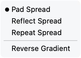
The gradient menu exposes the three spread modes and Reverse Gradient.
With a gradient applied to the selected element, choose Element > Edit Gradient to position it on the drawing. If the command is unavailable, check the selected element and its gradient fill first. The canvas controls let you adjust the gradient's geometry instead of changing the contour. Select a stop on the canvas to edit its color in the Color panel. You can add a stop along the gradient control and remove a selected stop with Backspace.
For example, a linear gradient on a disc can run from a light upper edge to a dark lower edge. Move the gradient endpoints to change that direction or the distance over which the colors transition. Moving the disc's contour is a separate edit and changes the shape receiving the gradient.
Apply a color to several glyphs
For a batch change in the Font window:
- Select the glyph cells to recolor and check which working layer is active.
- Open the Color panel and choose the fill or stroke target.
- Set the color or gradient.
- Click Apply.
- Open representative glyphs and inspect the changed elements.
Ordinary Apply uses the selected glyphs and their active layers. It can recolor the eligible elements within those layers, so it is suitable for giving a selection a common treatment, not for preserving several different part colors while replacing only one named part. For that narrower change, select the intended elements in the Glyph window.
Do not use Alt+Apply as an all-layer coloring procedure. Change the working layer deliberately and repeat the operation when another layer needs the same treatment.
Use Colored in the Font window sidebar's Properties section to find glyphs carrying color. This is a useful audit after batch work or imported artwork: inspect unexpected entries, then determine whether the color belongs to an intended element. Glyph color flags used for organization are separate from the colors drawn inside a glyph.
Color Glyphs as Element Stacks
A layered color glyph can be built from several colored elements in one glyph layer. Their stacking order determines how they are composited: an opaque upper element covers lower content, while a transparent one allows it to remain visible.
For a simple two-color badge:
- Put the background disc and the foreground symbol in separate contour elements.
- Select the disc and give its fill one color.
- Select the symbol and give its fill another color.
- Use the Elements panel or Element > Arrange to place the symbol above the disc.
- Inspect the filled result and its spacing at the intended size.
Keep parts separate when they need independent colors, gradients, opacity, or later edits. Reordering the elements changes the composition without changing the shapes themselves. A counter in a foreground shape reveals what is underneath; a white foreground shape paints white over it.
Overlay existing fonts
Font > Overlay Fonts can combine matching glyphs from open fonts in a new font. In Overlay to elements mode, the contributions become stacked elements, with source colors and other overlay settings controlling their appearance.
This is particularly useful for comparing related outlines: assign contrasting colors and inspect where the shapes coincide or differ. It can also assemble artwork prepared in separate fonts, but for a new color glyph it is usually more direct to build and color the required elements in that glyph.
Overlay to layers creates separate glyph layers instead of one element stack. Each source font can supply a separate master layer, as described in Layers and Masters; it does not by itself mean that all those layers are painted together as one color glyph.