The Preview Panel
The Preview panel keeps a proof visible while you edit. It can mirror the current passage, hold an independent sample, or compare sizes and source designs without repeatedly replacing the Glyph window text.
Content Modes
Open Window > Panels > Preview. Expand its sidebar when you need content and formatting controls; use the compact panel when the current proof should remain visible with minimal controls.

The Preview panel combines rendered text with formatting and feature controls. In this example, smcp is enabled in the feature list.
Choose content according to the question:
| Mode | Proofing use |
|---|---|
| Echo | Follow the active window's text. |
| Custom text | Retain an independent passage or glyphtext sample. |
| Context | Place the current glyph among neutral neighbors. |
| Text or glyph waterfall | Compare a passage or glyph across sizes. |
| Masters | Compare source designs. |
| Composites | Inspect related constructed glyphs. |
| Mark attachment | Inspect base/mark relationships. |
In custom glyphtext, the current-glyph placeholder @ helps build a reusable context without rewriting it whenever the current glyph changes. Predefined texts provide another starting point.
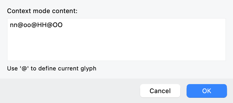
Context mode uses @ as the current-glyph placeholder, so the surrounding text can remain fixed as you change glyphs.
Echo text is synchronized display: the proof follows the active Glyph window rather than retaining its own independent string. The same Echo control appears in the Glyph window’s context toolbar (see Text in the Glyph Window) and beside the TrueType Hinting panel’s text input (see The TrueType Hinting Model and Workspace). Older descriptions call Echo “Current” and Composites “Clones.” Turn Echo off when a proof must remain fixed while another window changes.
Use Copy content to window to move a useful sample into a Glyph window. Cmd-double-click on macOS or Ctrl-double-click on Windows opens a preview glyph in the Glyph window, except in waterfall views. Check which font and master become current before making the edit.
Formatting and Comparison Modes
Preview formatting includes preview transforms and preview effects, analogous to typesetter formatting in a layout application. It changes the proof view alone. Unlike element transforms in Element Transformations, it does not change the source’s parameterized content or create another font style.
Choose Custom in the size selector to enter a preview size from 4 to 2048 pt. This changes the viewing size, not the font’s UPM or the outline coordinates.
Compare forms and family members
Left, centered, or right alignment lets you proof the setting you intend to use. Choose Masters content to compare the masters marked visible in Layers & Masters; if none is marked visible, the panel shows all masters. A single-glyph sample is shown on one line, while a longer passage can give each master its own line.

The master-preview layout options explain when the display uses a single line or multiple lines, with a separate preference for Glyph-window text.
Use Preview master for the current source layer or Preview variation instance for the dynamic location chosen in the Variations panel. These choices distinguish a drawn source from its calculated intermediate result. Keep the text and size unchanged while comparing them.
Horizontal or vertical flipping can interrupt the reading habit and make uneven weight or curvature easier to notice. It is a viewing technique, not a design criterion by itself.
Slant and stretch simulate synthetic obliquing or condensing. Preview weight simulates artificial emboldening. Use those views to inspect what a consumer's synthetic treatment might do; they do not replace correctly designed italic, width, or bold styles.
Preview an interpolation range
- Choose Echo or Custom text as the Preview panel’s content.
- Open the Variations panel and choose Map view. For a font with more than two axes, select the two axes you want to examine.
- Drag the two
+endpoints of the map’s gray interpolation vector to define the start and end locations. - Enable Preview interpolation in the Preview panel to show seven steps between those locations.
- Compare the progression, especially where counters, joins, or stroke weight change abruptly.
Choosing Preview master or Preview variation instance leaves this comparison. Return to Preview interpolation to reuse the vector. This gives you a repeatable range to inspect after a drawing correction.
Compare viewing conditions
Text and background colors, including light/dark combinations, help assess contrast and color-font appearance. Verify the actual colored output separately: a preview's chosen background is not part of a monochrome font's glyph data.
Blur can expose counters that close or neighboring strokes that fuse under degraded viewing. It is a controlled visual stress test, not a simulation of every visual condition or a substitute for accessibility research.
Outline and node views reveal construction while retaining text context. Return to filled text to decide whether the construction actually improves the reading result.
Check layout details
Underline and strikethrough previews make their Font Info position and thickness settings visible. Check marks, descenders, and small sizes for collisions rather than judging only a line through capitals.
Glyph-name preview places glyph names beside the text to identify substitution results. In Custom text, /glyphname can also address a glyph explicitly. Compare the displayed names with the expected feature path when two drawings are nearly identical.
Kerning, feature selection, tracking, and leading controls mirror the relevant text-proof settings. Change one at a time and retain the neutral version as a reference. A passage that looks right only with simulated tracking may still need source spacing work.