Briem’s notes on type design: The diagonal
Assembly work
With a few exceptions, we can use the same diagonal everywhere. A few characters, such as the numeral 4 and the letter z, will look awkward with a standard shape. They need, and will get, slants of their own.

The diagonal of the letter n is a straight line, and starts at the stem.
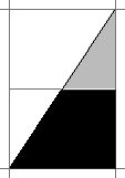
The slant is spans two horizonals in height for each stem width. (That’s easier to remember than 33.49518°, and gives the same result.) For the n-diagonal, use the lower of the two rectangles.

A slight adjustment is still necessary. The sharp corner of the diagonal shouldn’t be a single point. This can cause obscure problems later. Give it two instead, one right above the other, as this enlargement shows.

With a diagonal defined, and the curve already taken care of, the letter n practically assembles itself.
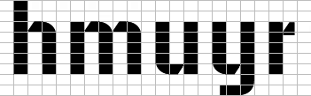
Once the letter n exists, the letters h m u y r are not much of a hurdle. Experiments will decide the length of the horizontals of the letter y and r. And the letter r will also look better with some vertical thickening. You had better test how much is right.
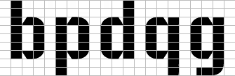
Simple copy and paste will take care of the letters b p d q g. Not many decisions are necessary. The descender of the letter g is the same as on the letter y.

The letter a is ordinary assembly work. You cut the vertical at the same height as in the letters c e s. The result is slightly top-heavy, as you may have noticed. We’ll adjust it later.
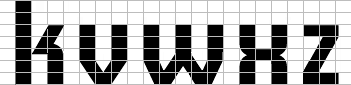
The letters k v w x z are exceptions. We’ll come to them later as well.
Notes on type design. Copyright © 1998, 2001, 2022 Gunnlaugur SE Briem. All rights reserved. Republished with permission in 2022 by Fontlab Ltd.