Briem’s notes on type design: Italic
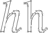
Designing an italic is much the same as designing a roman. A few extra points are worth bearing in mind.
You should be careful when you space your italic. Not only must it look right on its own. It must also fit the roman. Sometimes the two are even used in the same word.

Uneven: The letter u is too far to the right in the character box. This causes a gap when it follows a roman letter.

Even: The letter u is closer to the left of the character box. The gap after the letter H is all right.

When you’re ready for precision work, straighten slanted letters. Measurements are easier that way. Adjust. Recheck coordinates. Then slant the letters again.
Notes on type design. Copyright © 1998, 2001, 2022 Gunnlaugur SE Briem. All rights reserved. Republished with permission in 2022 by Fontlab Ltd.