Briem’s notes on type design: How to imitate spacing
Study good work. You can learn a lot (as I mentioned in the section about decisions.)
There are many approaches to good spacing. They change with the times. Individual tastes play a part, too. Here’s an example.

These are the sidebearings of the Baskerville letter f.
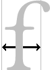
The right sidebearing of the same letter in Zapf International is wider.
To demonstrate the difference, I borrowed sidebearings from two designs and used them to respace Times Roman. Here are the results.
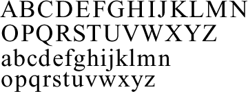
This is Times with sidebearings from Baskerville. The approach is classical, the spacing loose.
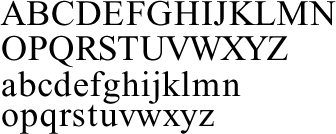
And here’s is Times with the sidebearings of Zapf International. The spacing is tight, the approach modern.
If you’re in doubt about your own spacing, take a look at designs you admire and trust. Trying their sidebearings may help you make up your mind.
Notes on type design. Copyright © 1998, 2001, 2022 Gunnlaugur SE Briem. All rights reserved. Republished with permission in 2022 by Fontlab Ltd.