Style Groups
Benefit Peace of mind that your fonts will work for all OS’s and retailers.
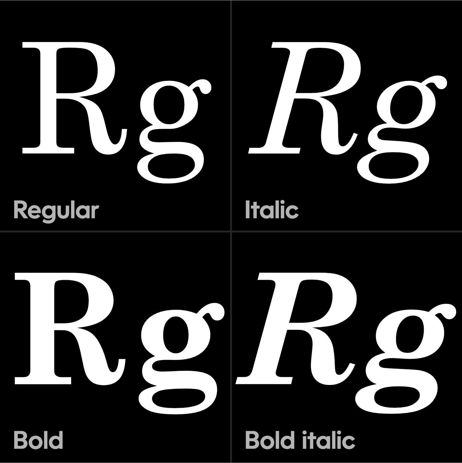
Remember the basic family we talked about in the intro to font families?

This quiet, four person family is still used on legacy systems, and so still needs to be defined.
Even if your full font family has 100 members!
Download VFJ
These small families are called “Style Groups”. (Not to be confused with the OpenType feature “Styles Sets”.)
Here’s a file for this tutorial.
Setting Style Groups
⓿ Fire up FontLab. Open the file. Go to menu: File > Font Info… > Instances.
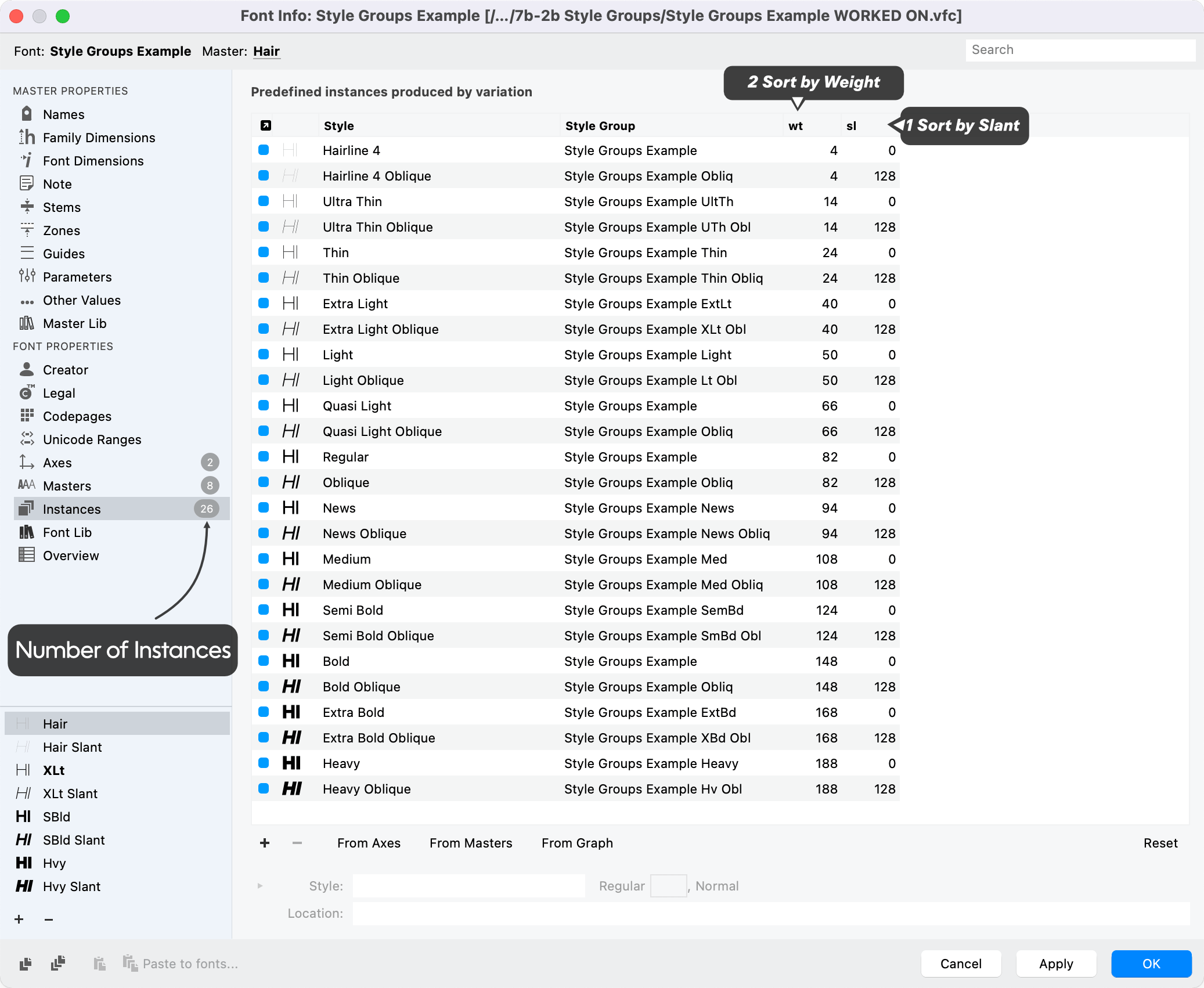
❶ I’ve already assigned values to the axes. Push From Axes on the page to populate the list.
If your instances ever get out of order, push the top row in this order.

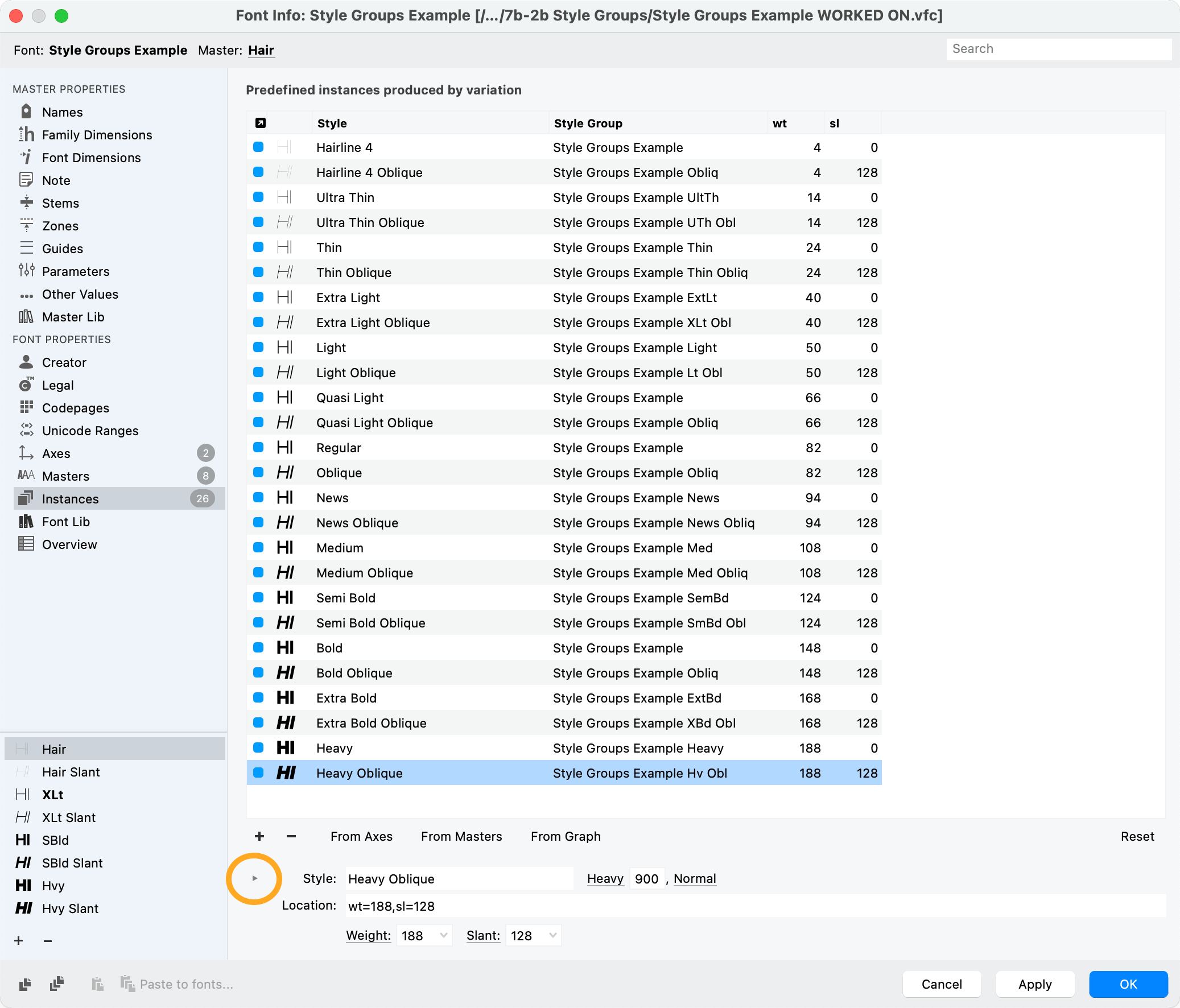
❸ Open Style Groups by pushing the triangle.

❹ Changing names. Use a mixture of refresh and highlighting names in order to get the groups you want.
It basically works like this:
a) Select weights to be in same group. (Use Shift and Cmd.) b) Push style group refresh. c) Modify the name while still highlighted to change entire group.
Video of how you’d do this. 1 minute. In only a minute, you can get the exact style group names you want!!
In this case, here’s an example of how groups can be linked.
Style group linking is shown by the solid lines. Some of the other family relationships are shown by the dotted lines on the right. The faded Orange and Cyan grouping is optional.
However, in programs like inDesign, when you have a Quasi Light selected, then push to bold, the letters turn into Semibold instead of bold. Love that.
Quasi Light and News are similar to “Book” weight from times of yore. “Book” weights are slight adjustments—either bolder or lighter—that correct the original regular.
You can check out this section of the manual that gives other options: https://help.fontlab.com/fontlab/7/manual/Organizing-Font-Families/
OCD ALERT!!☣
Variable Fonts Style groups in variable fonts doesn’t work well. In fact, in programs like InDesign once you turn on bold then turn it off, it goes back to the default master…and then gets stuck there.
Choosing Good Instances
It is very difficult to choose good instances.
Good instances need to fit a couple criteria:
- Is the instance sufficiently different from the surrounding ones?
- Does it work with a style two or three away?
- Does it have a matching Oblique or Italic?
With clean and simple styles, what’s interesting is not each letter or individual style. What’s interesting is how those styles relate and interact with one another.
BEEP BEEP. This has been an OCD alert.
Style group names are not going to be seen as often by your users. But these smaller families are necessary for computers. MyFonts and other retailers will not accept fonts that don’t contain style groups.
That’s a basic rundown.
When building style groups, use the recommended short names listed in the “Making Instances” tutorial.