FontLab in 8 days — Day 1: Start making fonts
Do-it-yourself fonts with FontLab 8
Whether you need a client’s new brand identity package, a unique movie title, an ad headline that pops, or you just want your distinctive handwriting style available in your word processor, the time may come when you want to create a brand-new font. You sketch some ideas, try a few test drawings, open your design program and get to work. But then what happens next?
It turns out that making a font is more complex than just drawing some letters. What looks good on paper may not be legible on a screen. How can you make the font work in all those applications and operating systems? Is there a way to get character spacing just right, so your text doesn’t look like a ransom note? Because of considerations like these, designing a new typeface used to be more like programming than art.
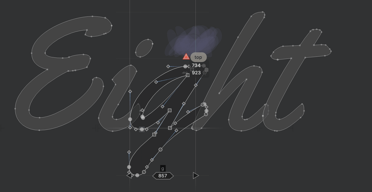
Fortunately, modern typeface design tools have evolved to help. FontLab 8 can automate much of the tedious repetition and precision work that goes into producing a robust font.
FontLab 8 is a professional font editor that provides drawing tools optimized for making fonts. You can draw using your favorite vector graphics application and import the glyphs (individual characters in a font) into FontLab 8 for refinement. You can scan your physical drawings or take photos of some lettering, bring those images into FontLab 8, and turn them into vector glyphs. But you may find it most efficient to simply draw the characters directly in FontLab 8.
When you hand-write letters, the natural pen or brush strokes in each letter have consistent thickness, the curves in the “p”, “o” and “d” have similar shape, because the same tool and hand is creating the letterforms. If you practice careful writing, even a bit, you’ll see that the letters you make acquire pleasant rhythm and consistency.
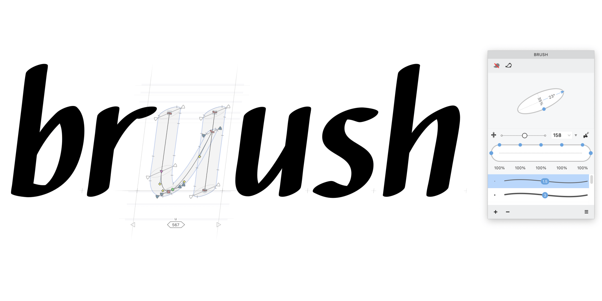
FontLab 8 helps you achieve this rhythm and consistency in digital drawing. With the Power Brush tool in FontLab 8, you can draw a vector skeleton and apply an editable calligraphic stroke, and experiment by instantly making all the letters thicker or thinner. Even if you make more rigid letters from ovals and rectangles, FontLab 8 assists with consistency. FontLab 8 suggests common widths (called “stems”) as you draw new paths, and reports uncommon widths in existing drawings. FontLab 8 lets you draw a piece of a letter once as an element, then transform and re-use that element across many letters via references.
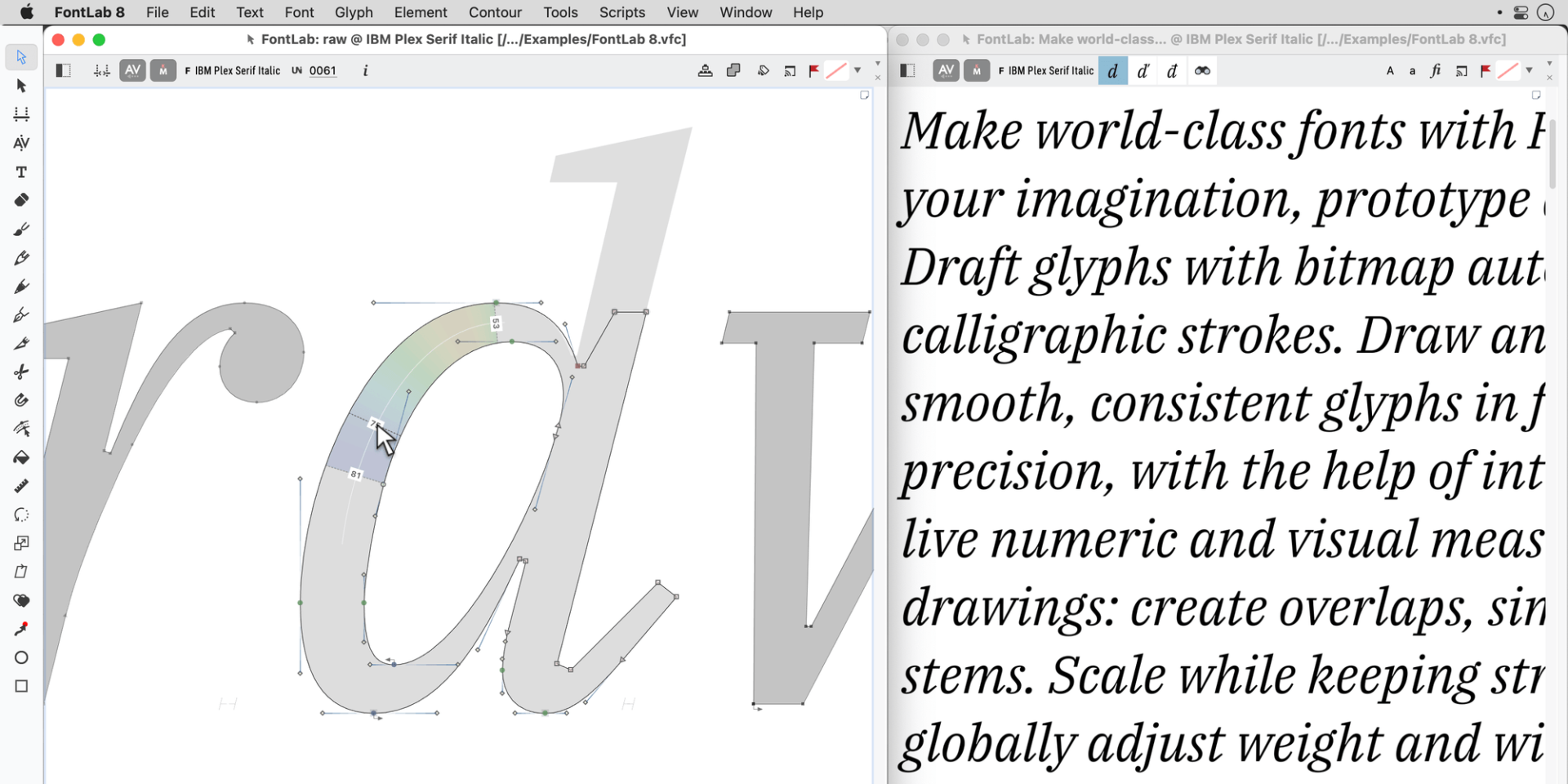
To achieve the right rhythm between glyphs, you can start with auto-spacing and auto-kerning in FontLab 8, then link metrics (“advance widths” and “sidebearings”, which control the space around each glyph) of one glyph to another, and correct spacing between groups of glyphs using “class kerning”.
Fonts must be drawn with extreme precision to work correctly in all applications and operating systems. FontLab 8 helps you double-check your work. Turn on the FontAudit feature in FontLab 8 and it will scrutinize every node, line and curve, find oddities and help you fix them.
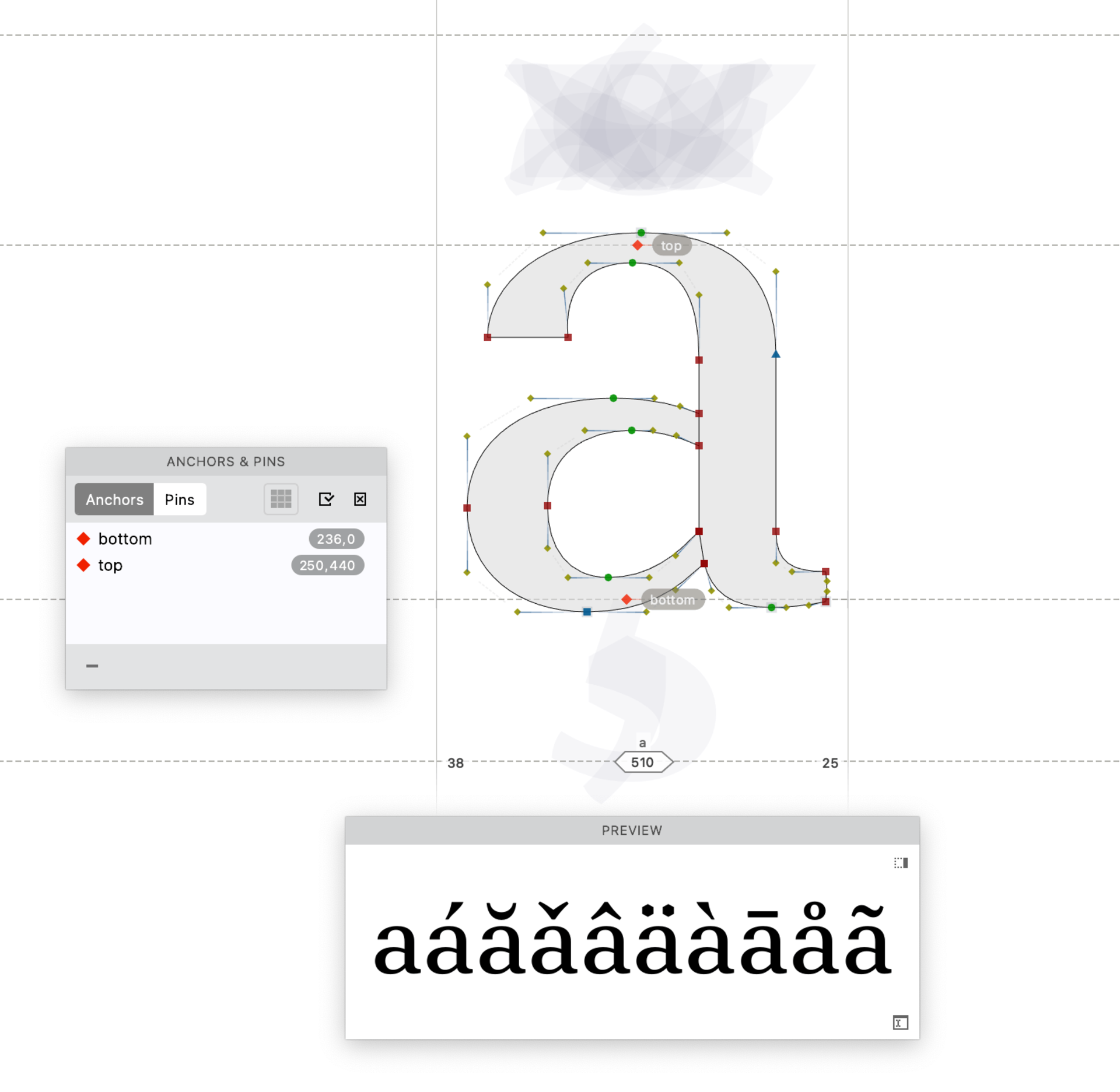
The English language mostly uses the letters A to Z, digits and some punctuation. To make your font fit for Europe, you need about a hundred more letters with diacritic marks (like accents). Double that number for uppercase and lowercase letters, add small capital letters, currency symbols, ligatures (combined letters like “fi”), oldstyle figures, fractions, swashes (decorative flourishes), or perhaps Cyrillic or Greek alphabets.
Ordinarily you would have to painstakingly draw each of these glyphs — but not with FontLab 8! With auto layers and composites in FontLab 8, it takes just a few clicks to go from 50 glyphs to 500. Whenever you change the base letterforms, FontLab 8 keeps those extra glyphs up-to-date. And with auto features in FontLab 8, the software adds the magic code that makes ligatures, fractions or small caps appear when you flip a switch in applications like Microsoft Word, Adobe InDesign, Adobe Photoshop or Affinity Designer. This is a massive timesaver!
With great power comes an extensive user interface. What does a particular button do? Hover over the button, hold the F1 key, read the Quick Help popup, and you’ll gradually discover all the power behind FontLab 8.
Congratulations! With just a bit more polishing your new typeface will be ready for the world to use.
Read more
Video tutorials
From sketch to font in an instant with FontLab 8
Sometimes you don’t need to climb the mountain — there may be a tunnel straight through to your destination. In FontLab 8, that tunnel is called Autotrace.

Most fonts start with design ideas and sketches. That’s the fun part. But turning those sketches into precise vector letterforms (mathematically defined shapes built from points, lines and curves) can be a long, tough slog. You can scan or photograph your sketches, import them into FontLab 8, and Autotrace can turn the sketches into ready-made glyphs in an instant.
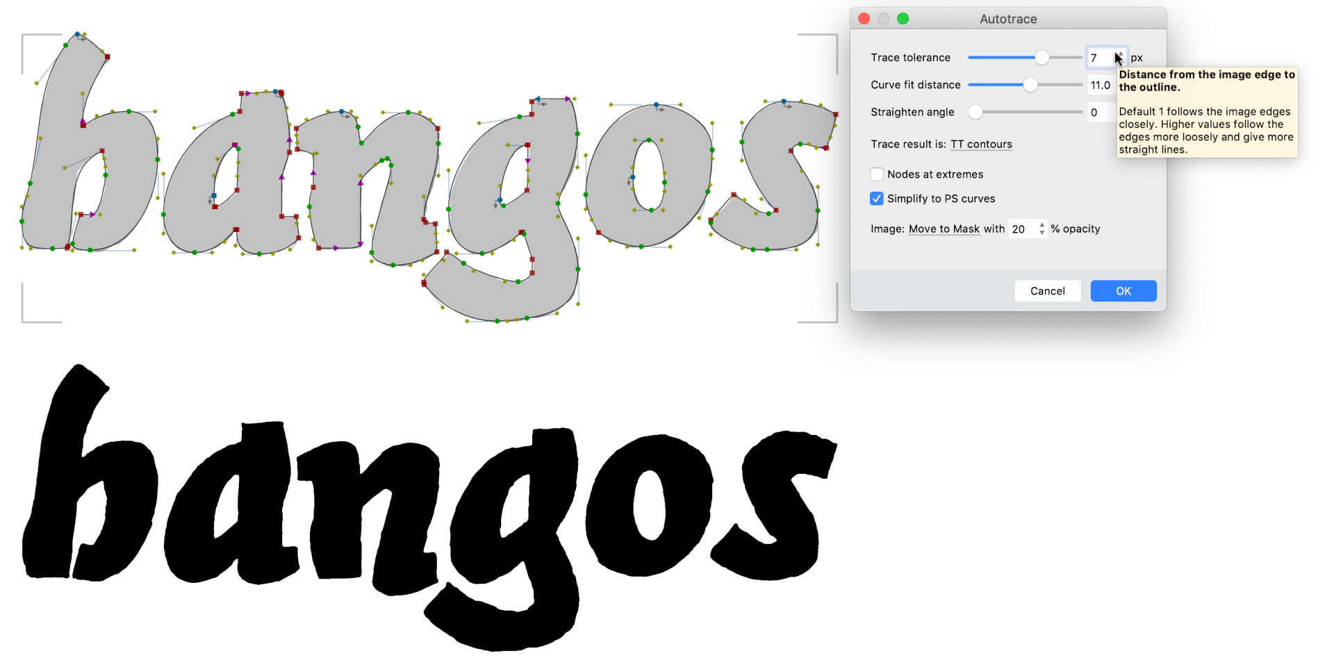
Drag and drop or import an image of a word or alphabet onto FontLab 8’s Sketchboard window, or drop multiple images of single glyphs onto a Font window. FontLab 8’s autotracer is fine-tuned for creating font glyphs, with sliders and live preview to get optimal contours. Use the Simplify, Clean Up, Eraser and FontAudit tools in FontLab 8 to further optimize the autotracing results.
Use the Optically Separate function on the Sketchboard in FontLab 8 to get each glyph as a single element, select the glyphs with the Element tool, then use the Place As Glyphs function to put the glyphs into a new font. FontLab 8 puts every element into its own glyph slot.
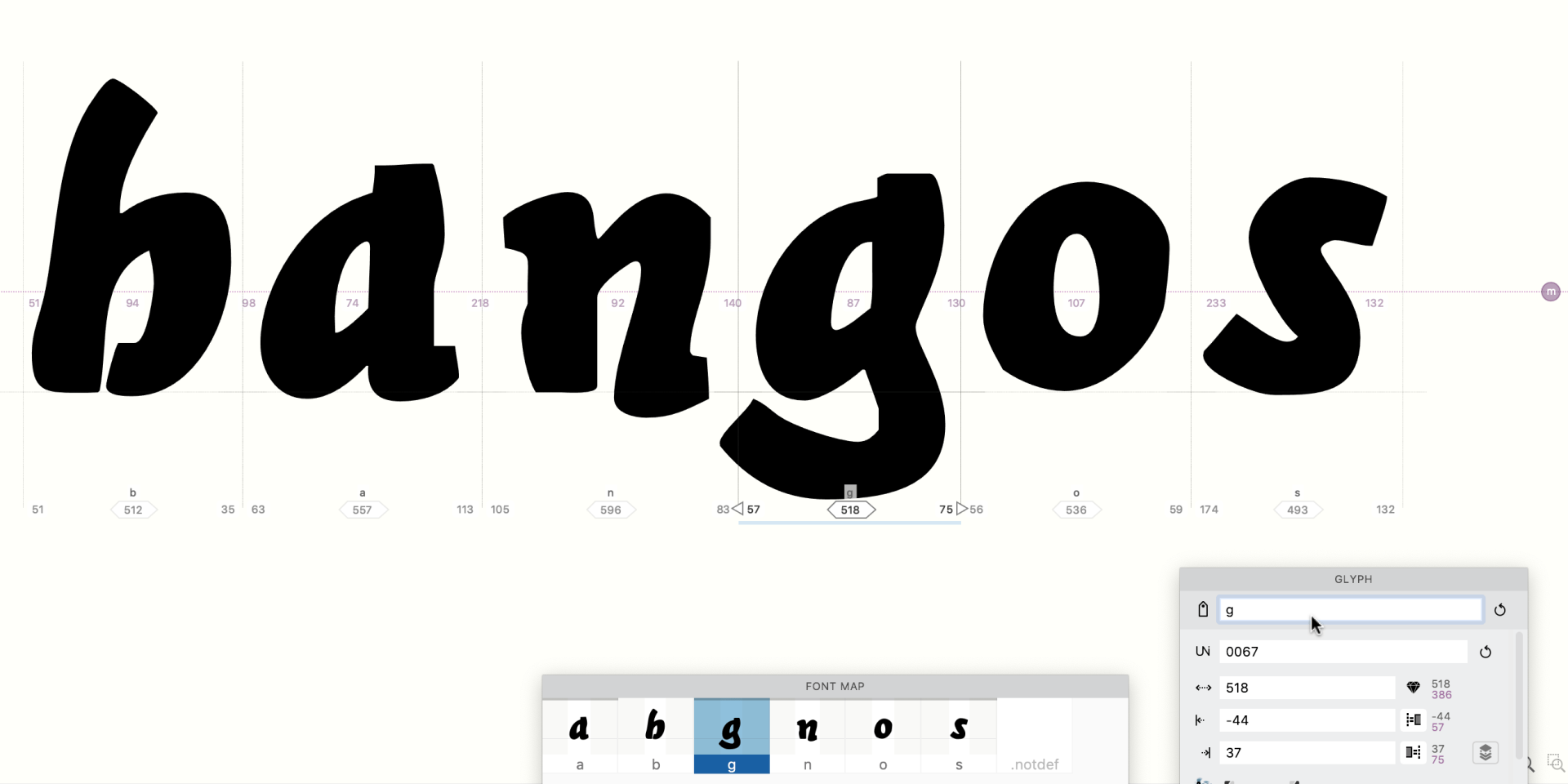
Use the Glyph panel in FontLab 8 to assign the correct names to the glyphs if FontLab 8’s built-in optical character recognition didn’t get the names right. Tweak the sidebearings (the space on either side of a glyph) for each glyph using the Metrics tool in FontLab 8.
You can go from a hand-drawn alphabet into a working font in less than a minute using FontLab 8’s Autotrace. This process is ever so much easier than the alternative of manually tracing the sketches, which is like climbing over a mountain.