FontLab in 8 days — Day 2: A-B-C
A-B-C: The building blocks of typeface design
You don’t always need a font with a “full” character set. Maybe you just need an attention-grabbing headline, a distinctive title, a company logo, or a special symbol. For a small job like this, it might seem easier to simply draw the characters in a graphics program rather than use a font editor.
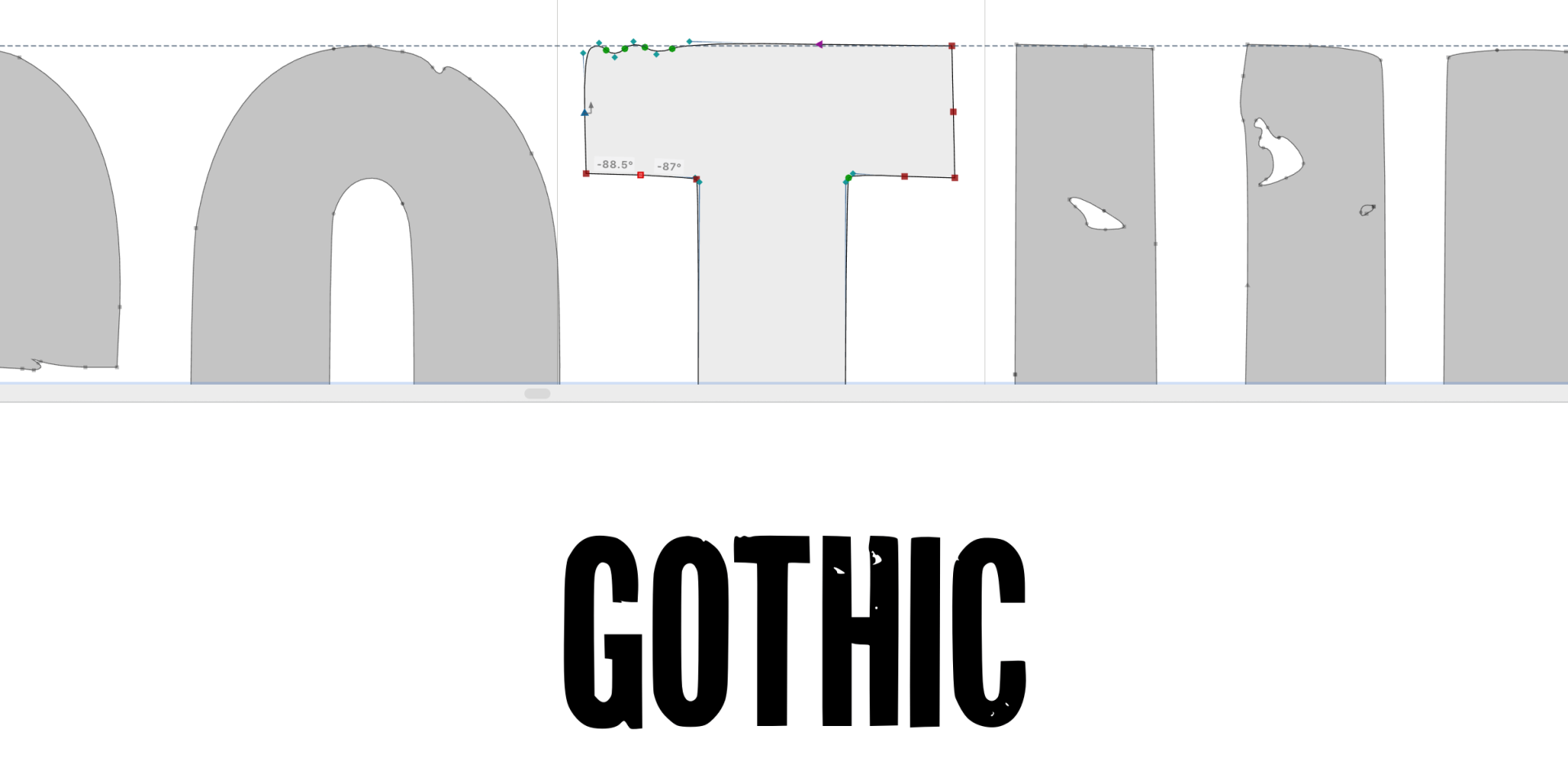
But there are advantages to taking the font route, even for a handful of glyphs (individual characters in a font). Font editors like FontLab can do almost anything vector drawing programs can do. And a standard OpenType font (a modern font format) really works everywhere! An OpenType font is a file that renders smooth scalable vectors (mathematically defined shapes built from points, lines and curves) in professional design applications, in office applications, in web browsers, on Mac, Windows or Linux operating systems. Forget PDF, EPS, SVG, WMF, PNG — OTF (OpenType Font) is the one universal container for simple drawings.
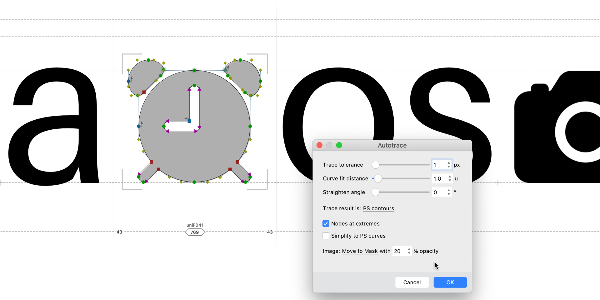
Your font can include as few or as many glyphs as you want. If your signage requires only a dozen letters then you can make a 12-character font and leave it at that. And a logo can be just one character. If you decide you want to expand the font later, all the font basics are still there for you to build on.
Fewer characters also means less work. You don’t have to draw unnecessary glyphs, kern them (adjust the spacing between specific pairs of characters) or hint them (add instructions to improve rendering at small sizes). You can create a standard single-color font and colorize the characters in the application of your choice. Need the logo in black, red, white? No problem, just change the text color! You don’t need separate “dark” and “light” versions.
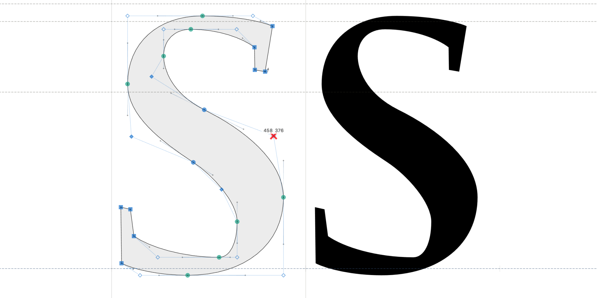
FontLab also provides specialized glyph-drawing tools that are more efficient than those in general graphics programs. With FontLab’s Rapid tool, you can rapidly draw consistent glyphs. With the Brush tool, you can draw live calligraphic strokes.
With FontLab’s Power Nudge, Servant nodes and Power Guides, you can easily modify glyph widths and heights while preserving stroke thickness, without the tedious zooming in and out that graphics programs require.
With FontLab, you don’t lose the ability to use color or special effects, either. For a two-color symbol, draw vectors for one color as one “letter” (like “A”), vectors for the other color as another zero-width “letter” (like “B”), and they’ll perfectly overlay when you type them together. If you put the symbols in a font, and assign them to characters — the result is text. When you use the font, most applications will let you style that text with different colors, shadows, gradients etc. You’re completely free to creatively stylize your final design!
So next time you need a special label, funky headline, fancy title, or impactful logo, consider making a font for it. You could save yourself a lot of time and hassle!
Read more
- Basics of drawing in FontLab
- Bézier Curves and Type Design: A Tutorial
- The Art of Eyeballing: Overshooting
- Two Methods For Smooth Curves
Video tutorials
Brush up your font with FontLab 8
Common typefaces like Helvetica have many straight lines and symmetrical curves. They may look simple to draw, but ensuring consistent stroke thickness is not easy with standard vector tools. But fluid scripts, handwriting, calligraphy, or Japanese Kanji? Making those organic curves with plain vectors is truly tedious.
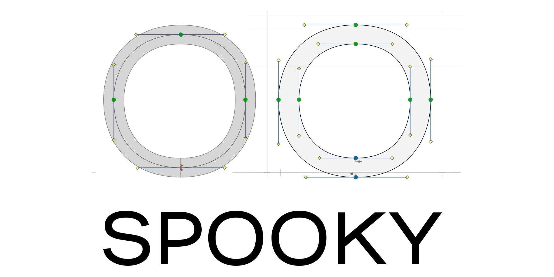
The most popular font formats require that all glyphs be formed by closed contours — lines drawn around enclosed spaces. This method works but is labor-intensive for geometric fonts, and extremely painstaking for pen- and brush-style designs. Wouldn’t it be great to draw the glyphs with an actual pen or brush?
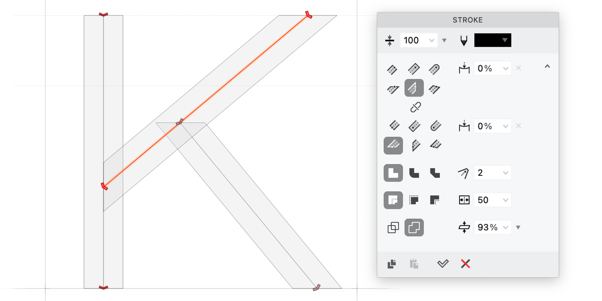
Enter stroke-based design: instead of wrestling with outline contours, you draw a skeleton line and let FontLab expand the line to the appropriate thickness and shape. Tweak the end caps (the shapes at the start and end of a stroke) and voilà — a perfect sans serif letter!
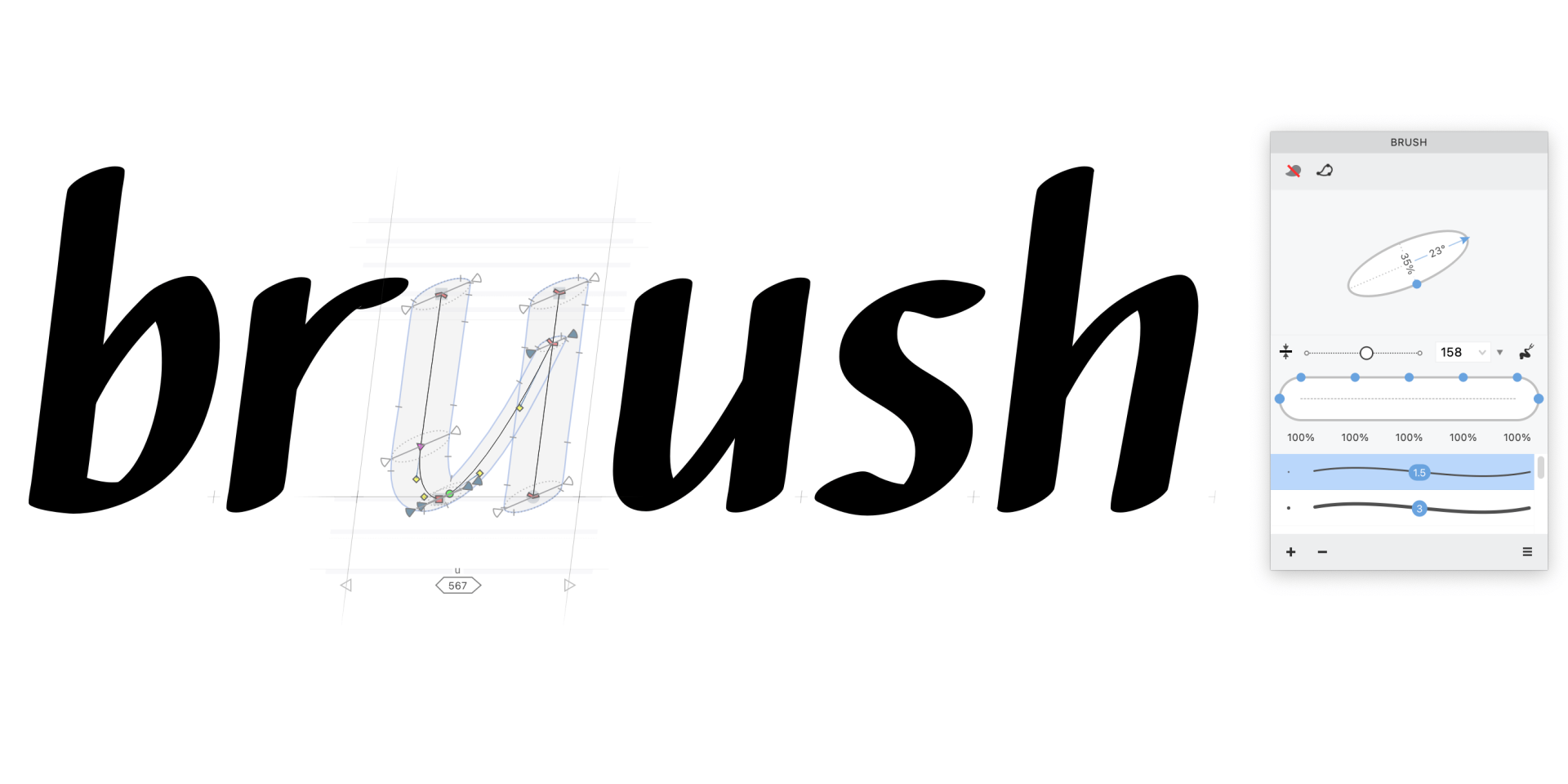
Rather than pushing and pulling around on the contour, you edit strokes by adjusting the central skeleton. But you can easily convert strokes to contours if you want to fine-tune the edges of your design.
You won’t need to convert strokes to contours early though: in FontLab, you can customize your pen/brush tip to mimic anything from a marker to a ballpoint pen. You can customize stroke shapes.
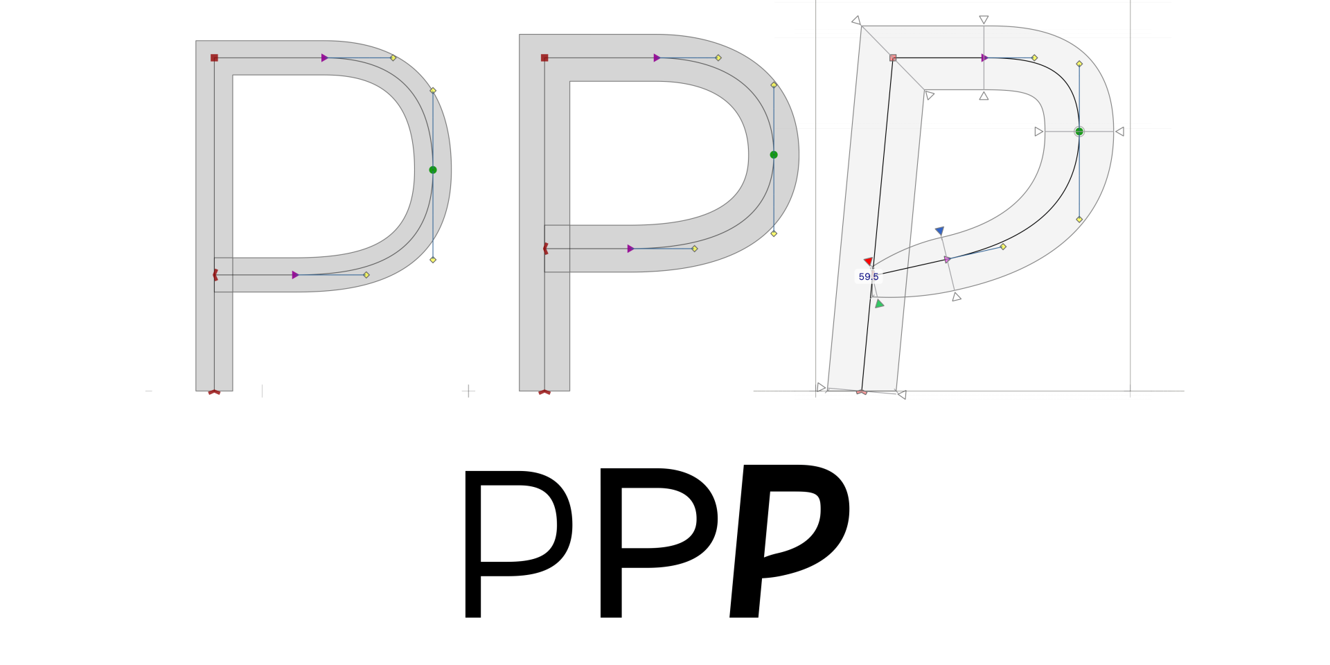
And the strokes don’t need to have uniform width — you can make a stroke that starts thin, tapers up to full width, then narrows again. If you happen to have a pressure-sensitive tablet, you can fluidly draw strokes of variable thickness just by increasing or decreasing the pressure. Drawing with a pressure-sensitive tablet is just like using a real brush, and so much more natural than using a mouse.
Don’t be daunted by the apparent difficulty of curvy fonts. With FontLab 8’s customizable strokes, fluid scripts and lush calligraphy are more accessible than ever. Your designs are limited only by your imagination, not your vector wrangling endurance.