Basics of Drawing in FontLab
Benefit Feel confident, knowing how to start a font, activate glyphs, and draw into the correct containers.
You might already be experienced in a vector illustration program. Or maybe you’ve drawn fonts in another font editor like Glyphs or Robofont. Even if you have drawn in FontLab 6 or 7, this might be a helpful refresher.
This tutorial is to help you understand how drawing works in FontLab 8, especially FontLab’s two arrow system, which when used correctly allows you to non-destructively edit letter shapes.
Also, after this tutorial you should understand: What’s the difference between an element and a contour?
Creating a Font
Let’s start at the very beginning.
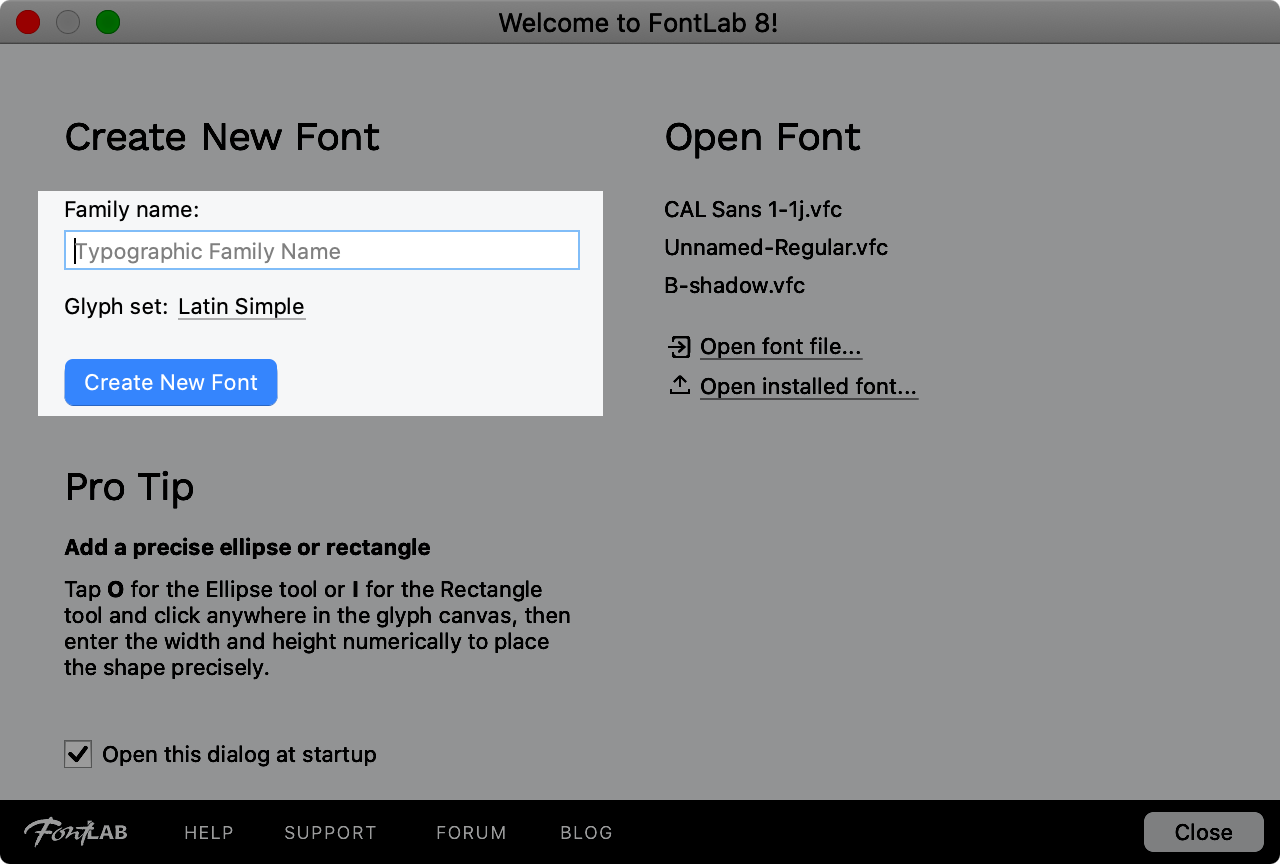
Fire up Fontlab.
In the Quickstart screen, type in any name such as “My Font”. The glyph set can remain “Latin Simple”, or you can click and choose something else, such as “Drawing”.
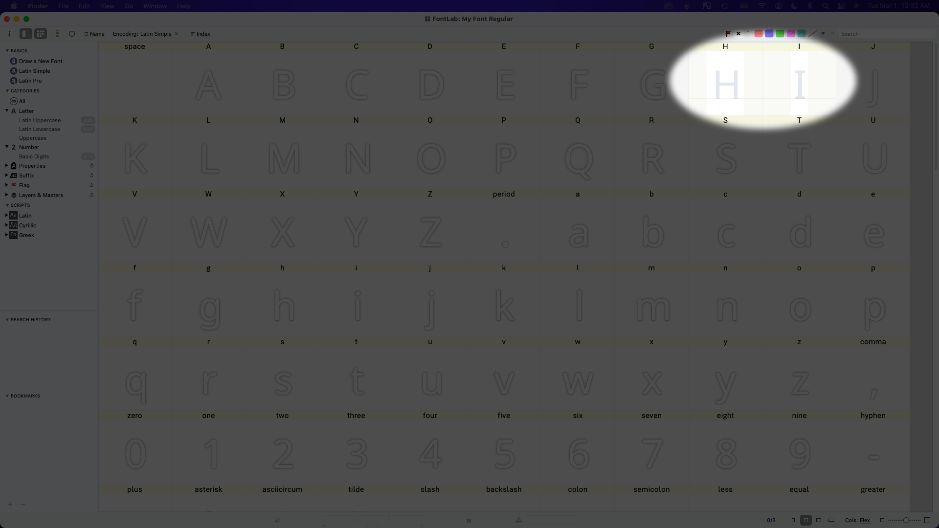
Now you should see a bunch of glyphs or “symbols”. When they are greyed out like that, the glyphs are inactive. In this case, the A is blue (selected) but is still inactive.
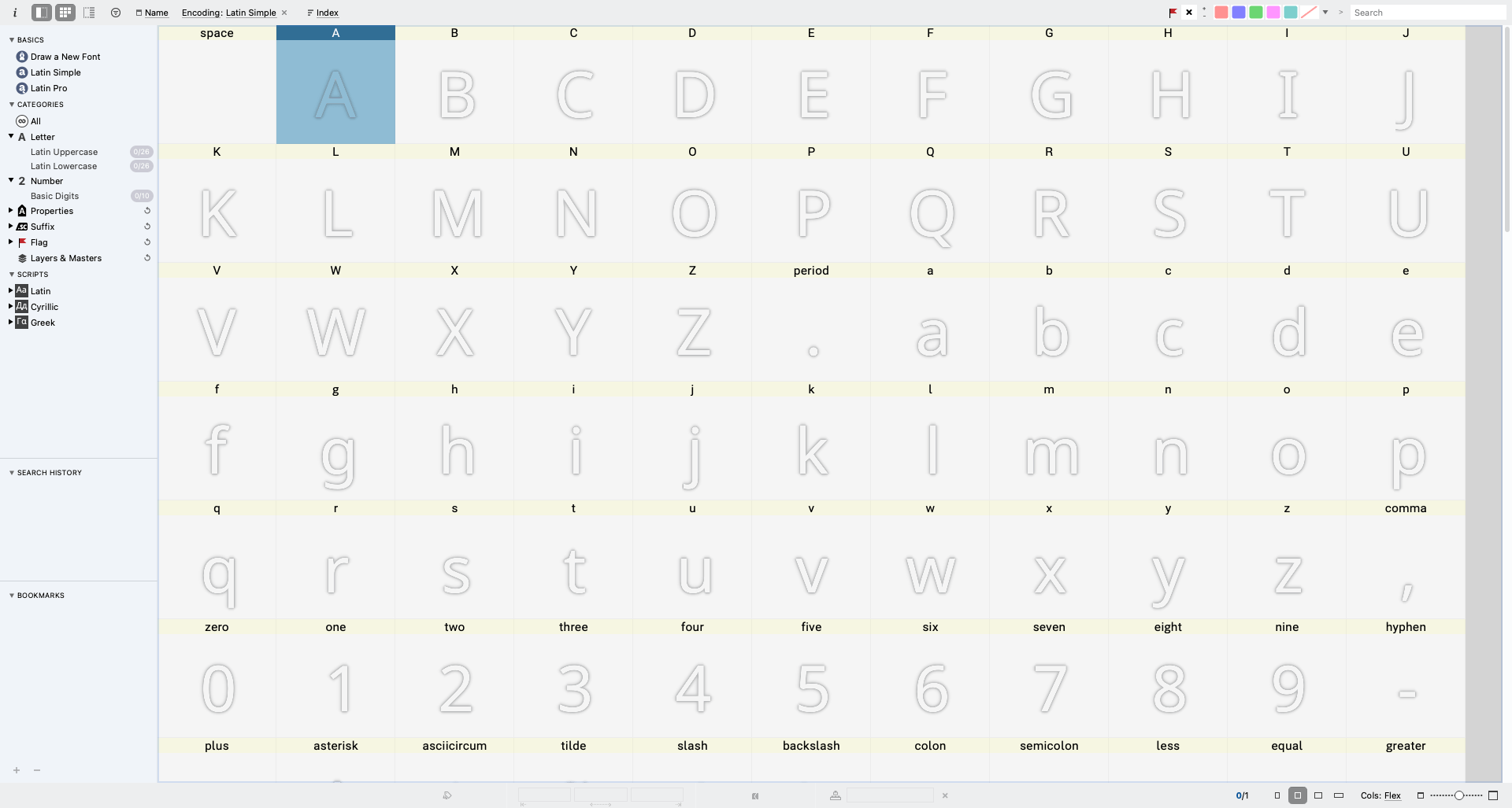
You can think of this font like a package—like a Christmas gift that contains an entire set of drawings and symbols.
Because this window shows all the contents of your font, this window is called the “Font Window”.
Creating Symbols
To activate a symbol, double click one. Or select a symbol, and hit enter ⏎ on your keyboard.
Here I activated the H and I, easy letters to start. Notice how the active “H” and “I” look more filled compared to the inactive symbols.
If you come from vector programs, you can think of these squares—or cells—as similar to artboards.
Note
In fact, if you draw your letters in a vector program, it’s a good idea to draw each letter on a separate artboard (see the tutorial Importing Artwork).
The difference between these symbols and regular artboards is that their height is more-or-less fixed, at more-or-less 1,000 units. (However, the width of symbols varies.)
To enter a symbol, do the same thing you did to activate it: double click. Another way is to select a symbol, and hit Enter ⏎ on your keyboard.
I will go into the H here.
Now you should see the drawing window (technically, the “Glyph Window”).
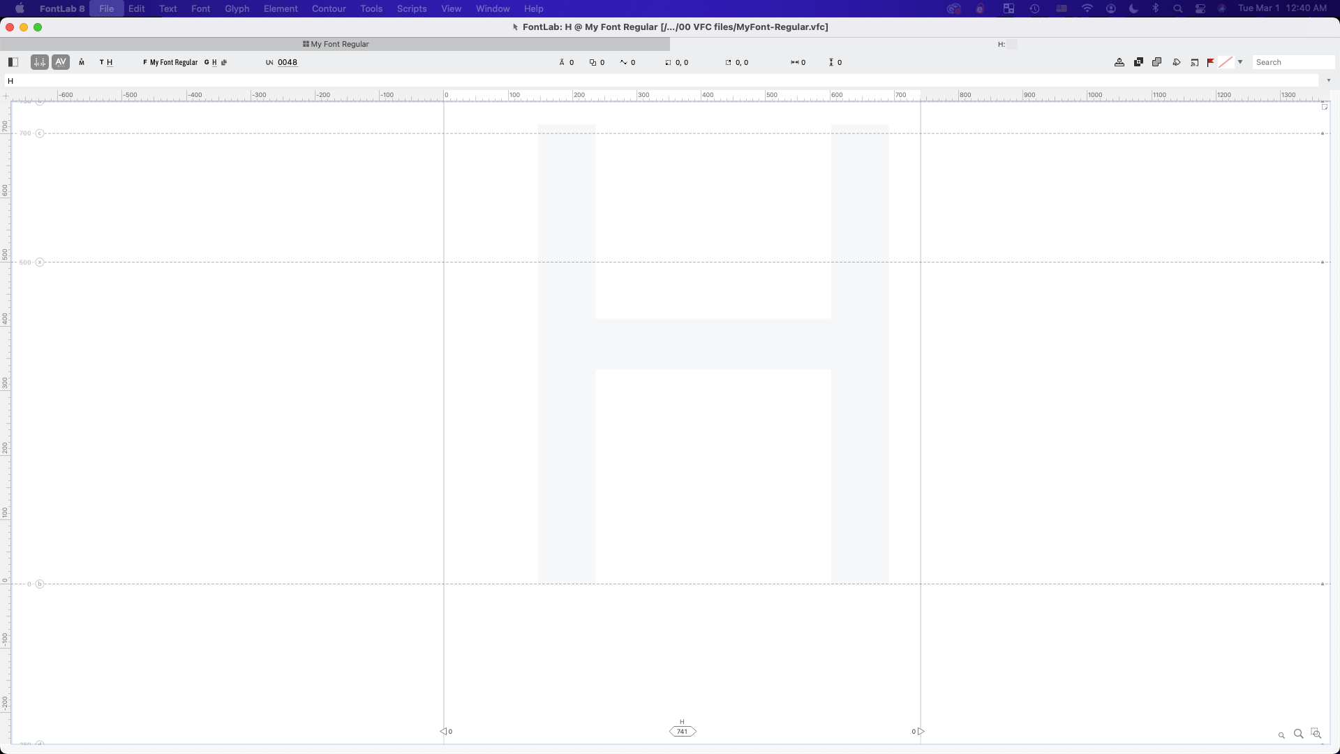
Even though this symbol is active, it’s empty. Sort of like a ghost town.
That’s why there’s a ghostly H haunting this glyph!!
Opening Panels And Tools
If you are familiar with pro apps, you are probably familiar with toolbars and panels. If not…
Opening the Toolbar
This is what FontLab’s toolbar looks like. (There’s a lot of tools here, and you don’t really have to know what all of them do. I’ll show you later.)

If you can’t find this toolbar on your screen, go to menu: Window > Toolbar.
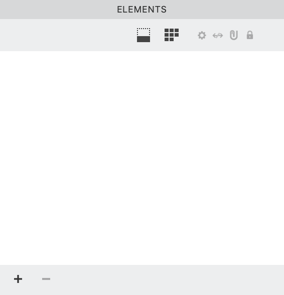
Open the Elements Panel
If you are not familiar with panels from other pro apps, here’s what a panel looks like:
OK, here’s where it gets a bit tricky.
If you’ve looked at the panels in FontLab, you might have seen the “Layers & Masters Panel”. This is not a “layers panel” in the traditional sense.
These are special layers used for making “Masks” for tracing, or “Masters” for making variable fonts or font families.
At this point in time, it is not necessary to worry about those. So, hover over the “Layers & Masters Panel” words and push (∨) to minimize.
However, the “Elements Panel” is just about identical to Adobe Illustrator’s “Layers Panel”, but with some important differences that we’ll look at later. (In fact, when you import artwork from Illustrator, the Adobe layers show up in FontLab’s Elements Panel.)
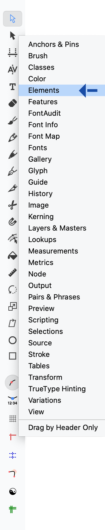
So we want to open that, if it is not open already. The new way for opening panels is by right clicking (or Ctrl-clicking) an empty part of the toolbar. You will see a list like this. click Elements.
Your workspace should now look something like this ▼
Drawing Inside Elements
There are many tools you can draw with!
Choose the Pencil tool for now. That’s the easiest to use, but least precise.
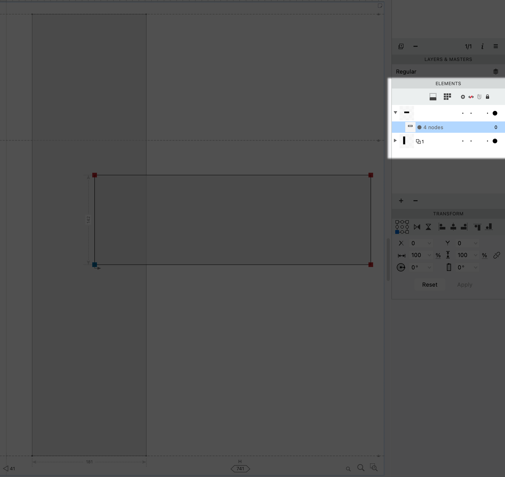
Before you start drawing, look at the Elements Panel. It should be empty.
Then draw and connect the beginning and end of the path like this. (It should show a blue circle.)
Here is what I drew. (Not pretty yet, but I will show you how we can make it good in the refining stage, in this tutorial.)
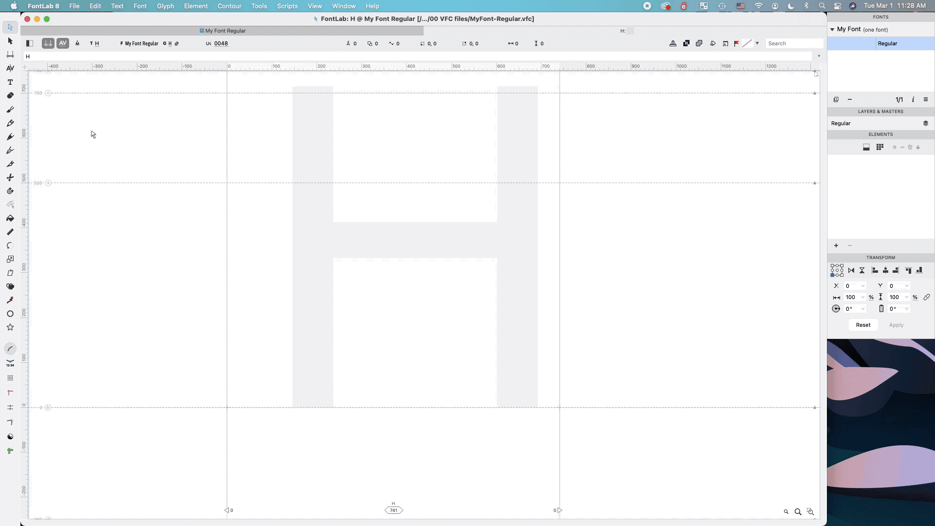
Look at your Elements Panel. What happened?
In my case, it looks like this:
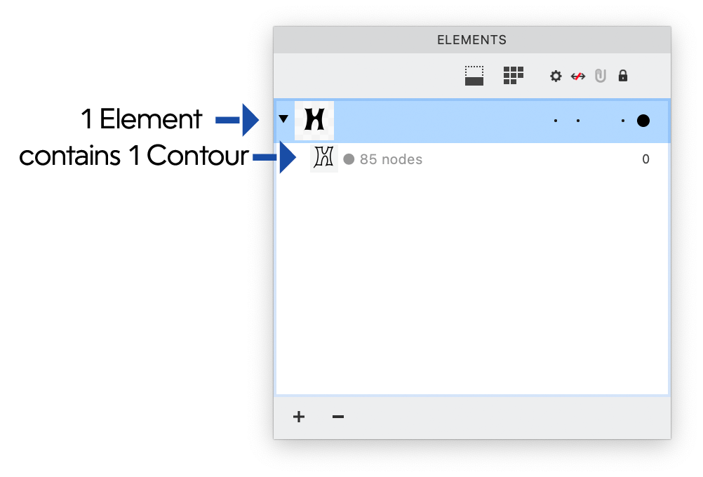
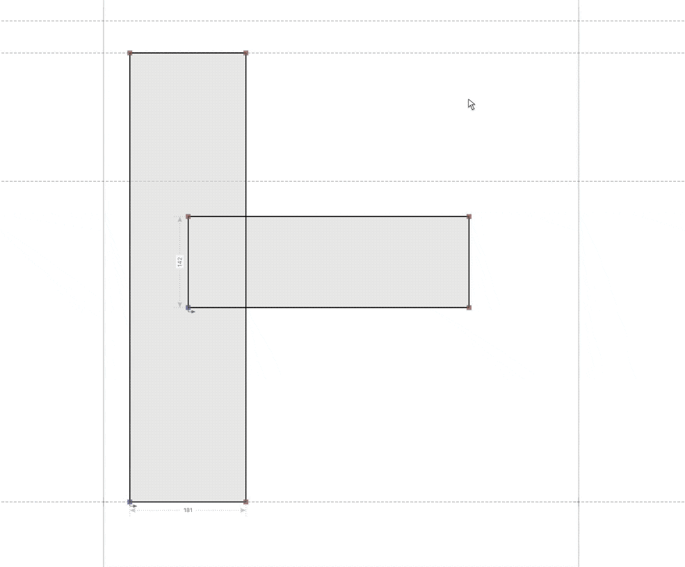
We have 1 Element containing 1 Contour.
But this is not the only configuration you can use to draw the H.
First, save your drawing of the H. We’ll save it for a later tutorial, where you’ll learn how to hone this rough letter till it’s sparkling.
Other Drawing Configurations
Make a new file (File > New Font…).
Activate the letter H, and go into the drawing window.
This time we’re going to make a standard sans H.
First though, let’s make sure that font dimensions are showing and snapping. Go to the View menu ▼
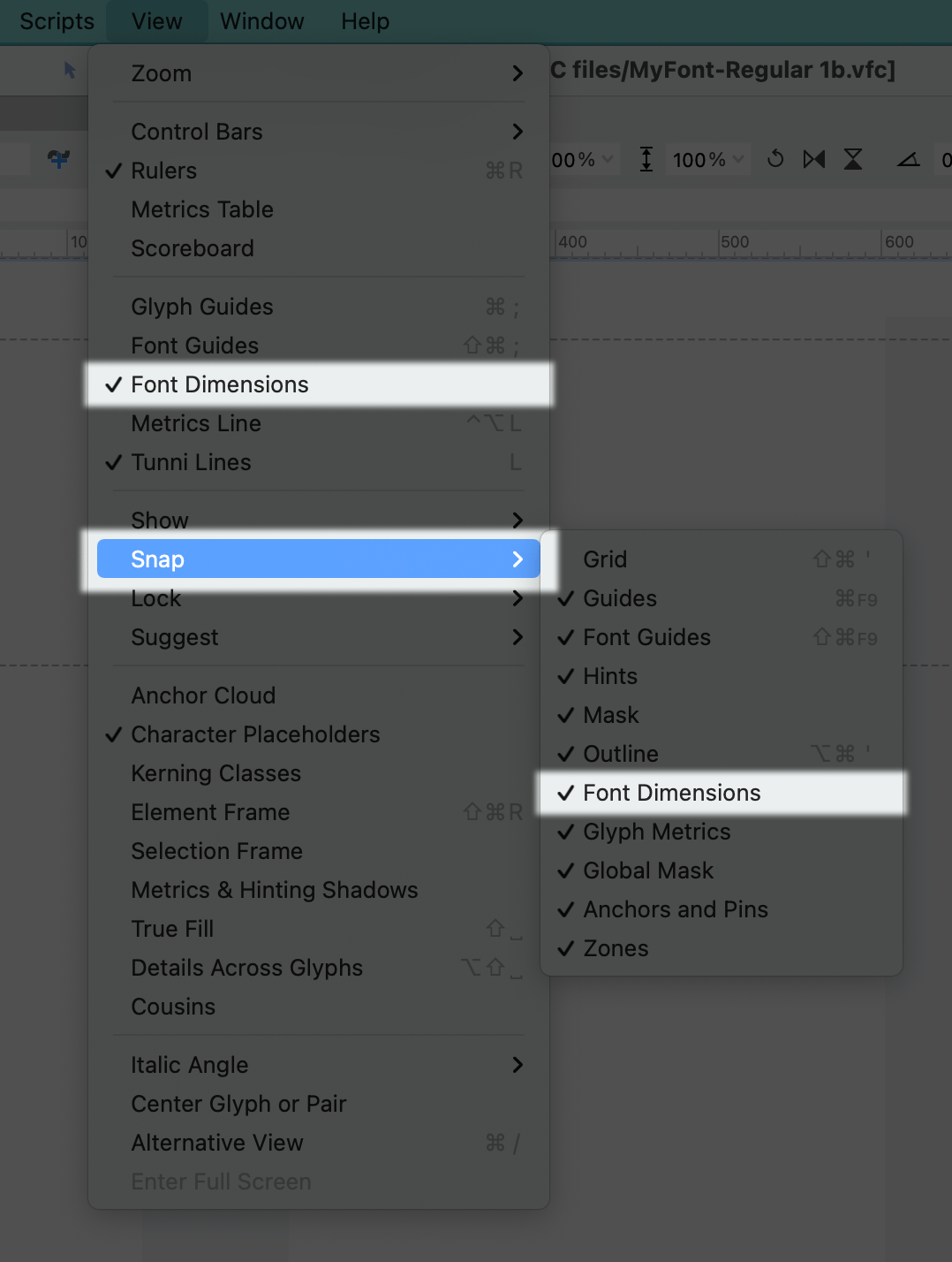
What are these font dimensions, that we just activated?
Generally, they are the same as the lines in your elementary/primary school handwriting book, when you first learned handwriting.
Also, these are similar to “vertical metrics” in Glyphs. In FontLab, font dimensions are gray dotted lines. On the left they are labeled with a value and a circled letter.
OK.
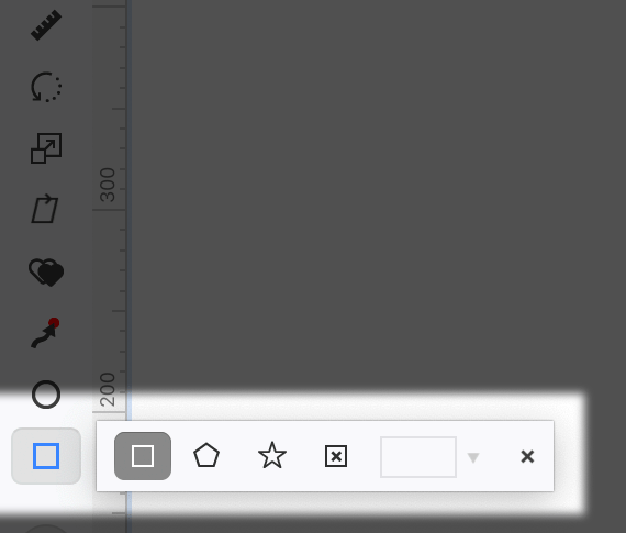
Now we are going to select the tool to draw. Select the polygon ⬠ from the toolbar. Double click to open the toolbox and select the Rectangle □ tool.
First let’s draw the left rectangle of the H. Then let’s draw the horizontal bar. It will look something like this:
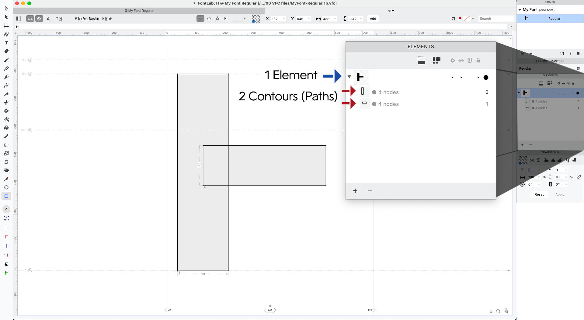
Notice how FontLab will automatically put your 2 rectangular contours (paths) into the same element.
Next thing we want to do is select the Contour (shortcut: A).
Now double click the left rectangle. It will glow orange.
Sometimes it is tricky to double click so you can hold down Shift and do this to select everything:
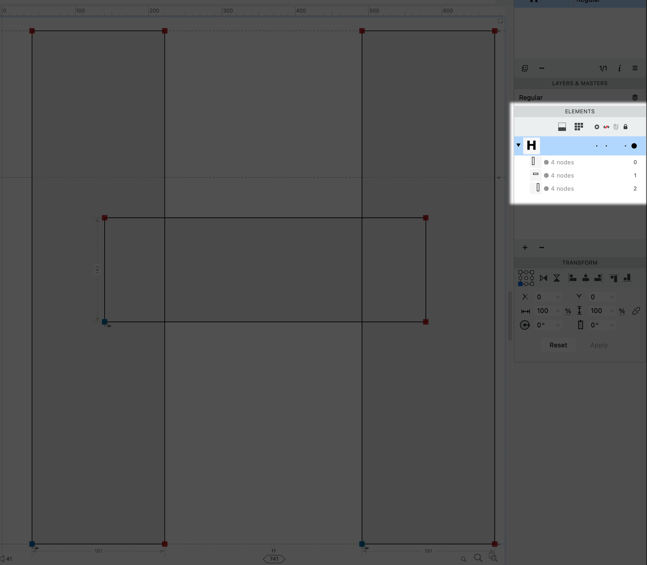
Copy, paste, and move the rectangle to complete your H. You have one Element with three Contours (paths).
Duplicating Elements
The problem with our last configuration is that we are using two of the same shapes, but they aren’t linked!
That means any time we want to change that vertical rectangle, we have to change both individually!
While that’s not a big deal now, when you have an entire font with hundreds of the same rectangles, it can get a bit tiring on the wrist.
In this section, you’ll learn how to link Elements, the containers that hold your paths. That way, whenever you change the left rectangle, it changes the right rectangle, and vice versa.
So let’s delete everything, except your first vertical rectangle. Here’s how: using the Contour (Contour) tool (A), highlight and push delete or backspace on your keyboard.
Next, we are going to draw the horizontal rectangle.
But wait!
This time we are going to need to create a separate Element for the horizontal. Go to menu: Element > New > Element, or push CtrlS.
Your Elements Panel will show that you have an “empty element”. Draw the horizontal rectangle inside that.
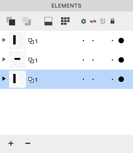
We now have two Elements. They each contain one contour. Like so ▼
Next thing is really important. To copy elements we need to use the Element (black arrow) tool (shortcut: V).
This is similar to the black arrow tool in vector programs. The Element tool doesn’t move individual points paths. It moves entire shapes.
Once you have selected the Element tool, click the vertical rectangle and copy.
Ok, so now if we just do a regular paste (CmdV), there will be a new element with the vertical rectangle. But they won’t be linked.
So go to menu: Edit > Paste Element Reference (ShiftCmdV).
Look at your Elements Panel.
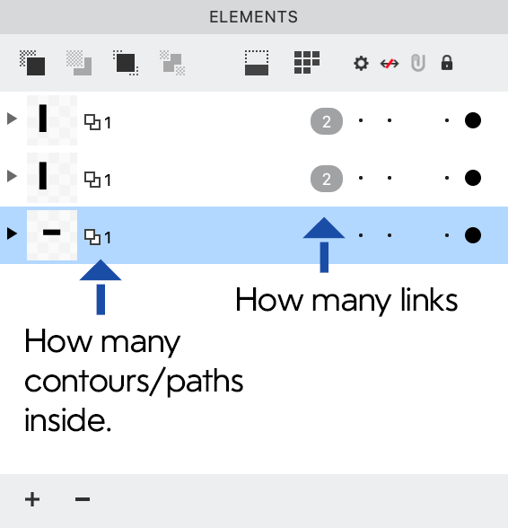
This is correct. Since these elements can be reused throughout your entire font, the oval two shows how many links in your entire font.
This is incorrect ▼
OK, but the rectangle is not in place yet.
Using the Element tool, hold Shift and move the rectangle to the right, until you like its placement.
Now select the Contour tool. Click into a rectangle.
click one side, both it and the similar side in the other rectangle should highlight orange. Now when you move this rectangle it moves both!
Exporting Fonts With Overlapped Elements
You might be wondering: How do exports work? When an H comes out, does it have all these rectangle shapes?
No. When exporting a font, FontLab automatically assembles this letter (flattens, removes overlaps), so that way it becomes a solid contour.
Final Words
Good work! That was a lot to get through.
No matter what drawing tool you use, it pretty much works the same way.
Drawing adds a path to the same element. If you want to draw into a new element, you need to create it.
Also, you’ve seen that if you want to reuse shapes, they have to be in separate elements.
Check out the next tutorial on how to manipulate you contours and elements by merging, separating, overlapping—all that good stuff.
Also…
Make sure you saved your H file! We are going to use that in the next tutorial.
Happy drawing!
PS: Glance at Drawing Tools
FontLab’s drawing tools are pretty standard.
The drawing tools are these:

The other tools help you manipulate nodes and shapes, do special tasks, pathfind, measure, transform, view.
Rapid Tool
This tool is unique to FontLab. It’s easier than a Bezier pen. I never learned how to use the traditional Bezier very well, so mostly I use Rapid.
In the Toolbar, this is the one that looks like a black ballpoint pen. Push 5 to activate it.
Things you can do with Rapid Tool
-
Square Nodes To make straight lines, just click around (similar to pen).
-
Circle Nodes To make curves, hold Ctrl and click around. Or double click. This uses the curve tension of your font.*
-
Handles To make different curves, click using Alt, and it will put down a handle.
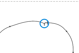
- Triangle Nodes This one is a bit trickier! Here’s a GIF to show what to do.

TIP
Use Shift to make your lines horizontal or vertical.
To change the Rapid Tool’s curves, go to menu: File > Font Info > Font Dimension sidebar > Curve Tension. Common values are 57 – 63. These values are font-specific.
Resources
For more information about the different drawing tools, check out these:
Brush Tool: https://help.fontlab.com/fontlab/7/manual/Brush-tool/
Brush Video: https://www.youtube.com/watch?v=gFY-dAxs7_U
Rapid Tool: https://help.fontlab.com/fontlab/7/manual/Rapid-tool/
Rapid Video: Rapid. The next-generation pen for the rest of us in FontLab VI. https://www.youtube.com/watch?v=z6PEgcBelo0
Pencil Tool: https://help.fontlab.com/fontlab/7/manual/Pencil-tool/
Pencil Video: Pencil. Fast and smooth contour sketching in FontLab VI. https://www.youtube.com/watch?v=3AqFg8AKFeE
Ellipse Tool: https://help.fontlab.com/fontlab/7/manual/Ellipse-tool/
Rectangle Tool: https://help.fontlab.com/fontlab/7/manual/Rectangle-tool/