Customizing the fonts’ appearance
You can use one of TransType’s many filters to change the font’s appearance. Some are purely functional, others are much more experimental. The filters are not a replacement for a professional type designer’s work, but they’re fun to use.
The filters are available through the Effect menu. Most of them work on all selected fonts (one at a time), while Blend only works when exactly two fonts are selected.
After you process a font through a filter, TransType will add a new target item for the font, so you’ll have both the unmodified target font and the new target font (processed through the filter) visible in the Main area. This way, you can “multiply” the number of the fonts in your conversion. Of course after processing a font through a filter, you can select the result and process that through another filter.
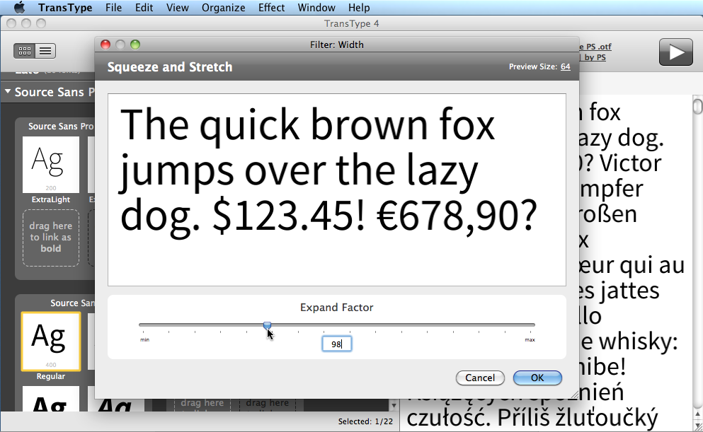
Width
Geometrically scales the width of all glyphs in the font. This is just “stretching and squeezing”, so it’s not equivalent to creating a typographically-correct condensed or expanded typeface. However, if you only scale the font by a very tiny amount, the results may be acceptable.


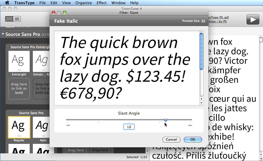
Slant
Geometrically slants the font. This is “poor man’s oblique” — certainly not equivalent to creating a true italic font, or even a properly optically corrected oblique font. But may be useful for some quick experiments.


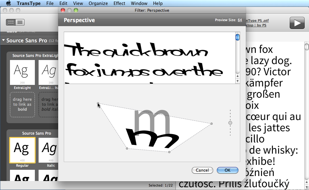
Perspective
Perspective is a geometric slant of the vertical glyph plane back or forth. There is a slider at the right of the ‘m’ glyph image. Move it up to make glyph’s top edge closer to you or move it down to make glyph’s top edge farther. Drag the glyph’s bounding box corners to change perspective arbitrarily.
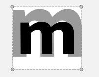
It is also possible to change glyphs’ image height and/or width without changing perspective. Note that this “scaling” effect is applied to glyph images only but doesn’t change their metrics.
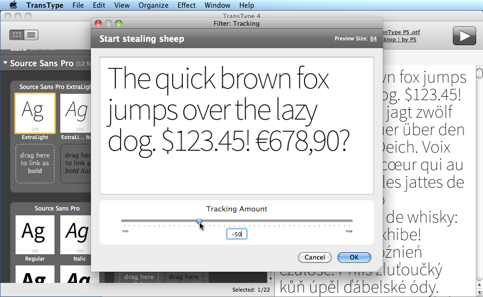
Tracking
Increases or reduces the spacing in the font by a uniform amount. Useful if you want to use the font in an application which doesn’t let you control the tracking — or if you just want to “hardwire” the new tracking in the font without having to remember to change the tracking in the application every time.
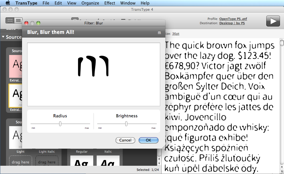
Blur
Applies a Gaussian blur to the font’s outlines.
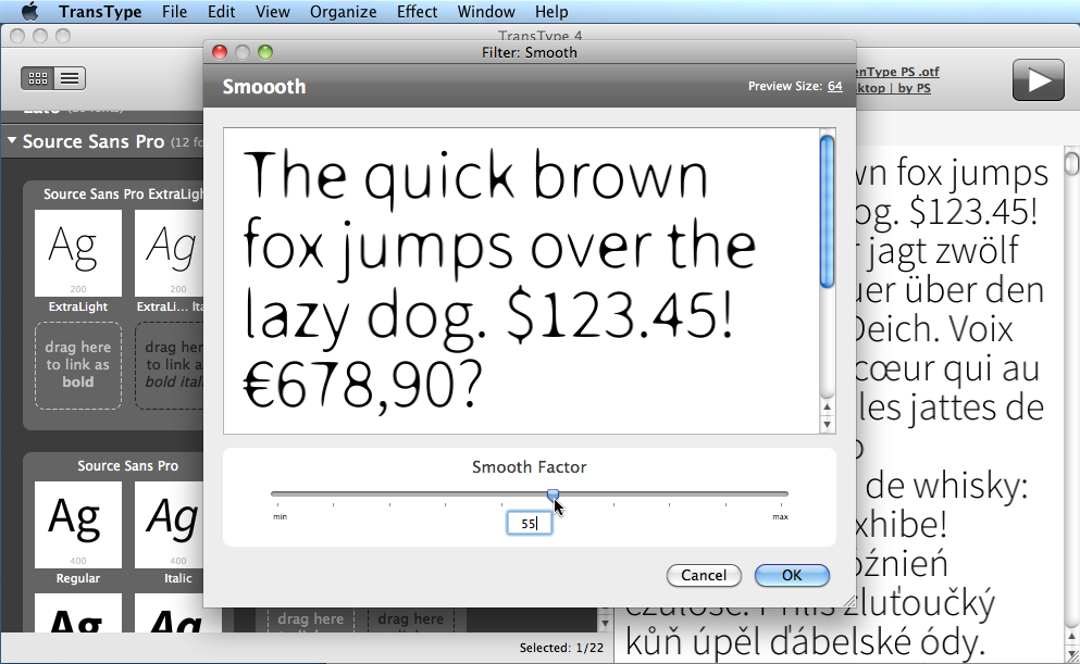
Smooth
Turns a font’s straight lines into curvy ones.
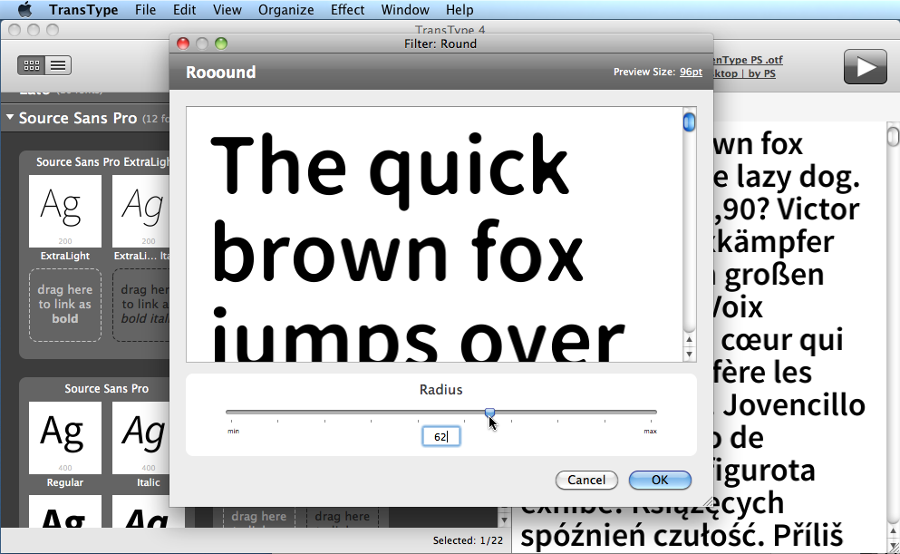
Round
Creates a “rounded corners” effect across a font. The results are imperfect and probably would require manual outline editing in a font editor to get really credible results.
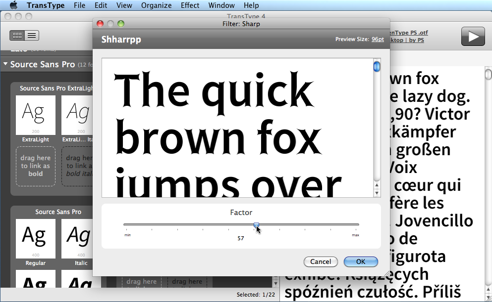
Sharpen
Adds pointy edges (reverse ink traps) to the font’s outlines.
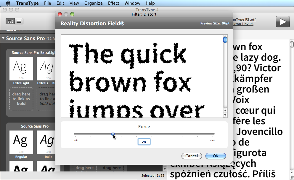
Distort
Applies a random distortion to the font’s outline. It will be random each time, even with the same Force value, so you can run the process multiple times to get different results.
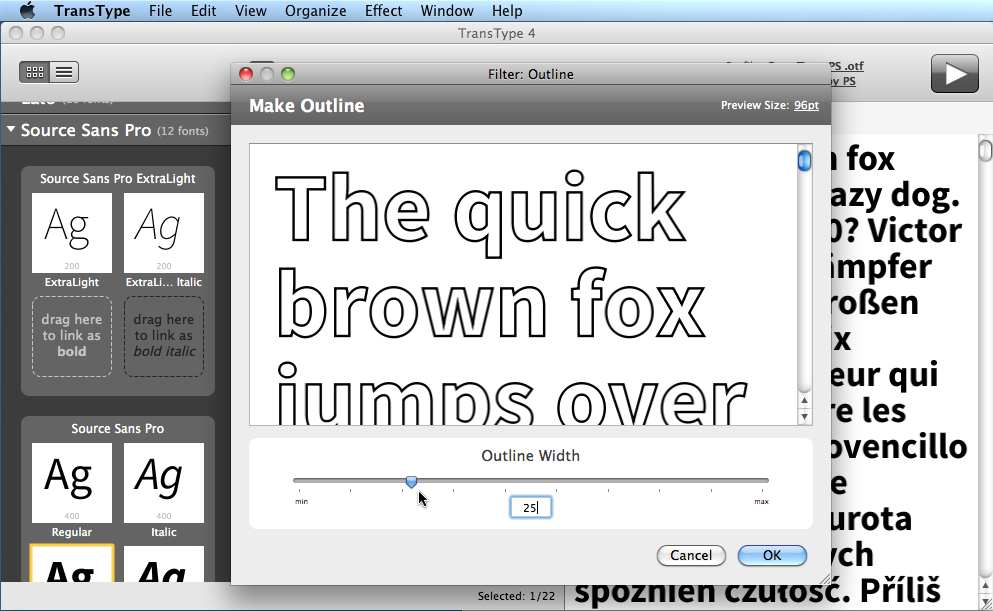
Outline
Creates an outlined version of a font.
Blend Fonts
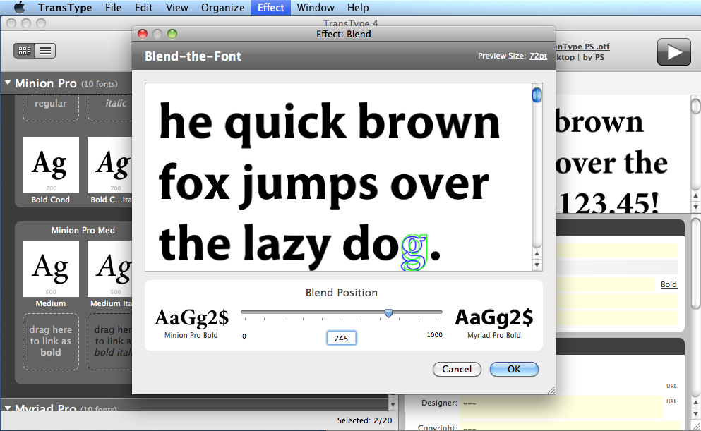
Blends (interpolates) between two fonts — works only if exactly two fonts are selected. Useful for creating intermediate weights or widths. Best used if you choose two fonts from one family which don’t differ much in weight (e.g. Light and Regular or Semibold and Bold). But you can even try blending fonts from completely different families — yet the results may be rather unpredictable in such a case. But may be fun.
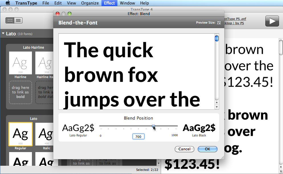
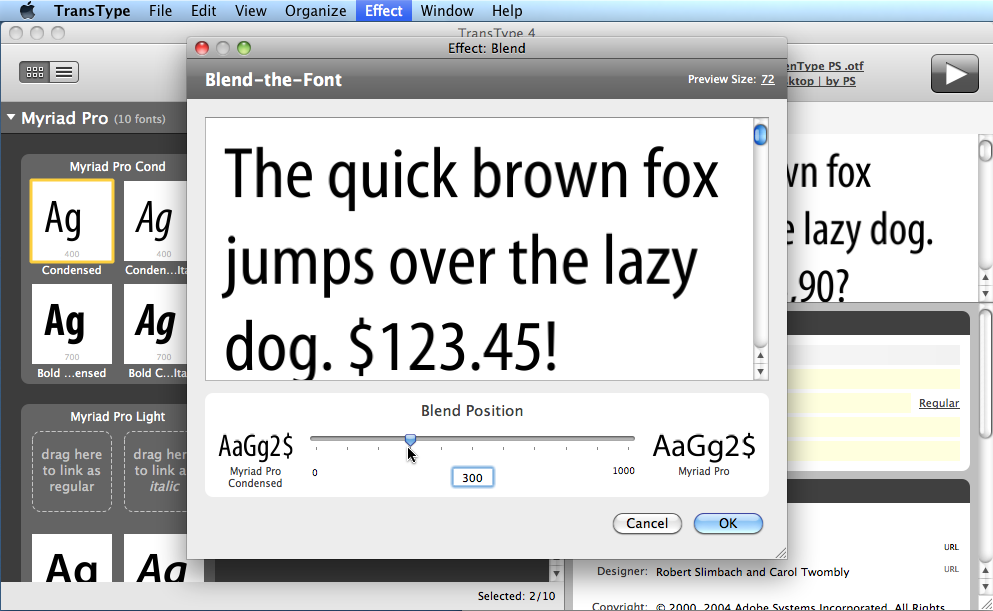
If two glyphs are too different and cannot be automatically blended, TransType will show them as outlines, and will save the first font’s glyph outline into the resulting new target font.
Overlay Fonts
Overlay is the most powerful feature in the Effects menu. It is used to create layered fonts with applying different colors to the layers. This effect can be used with one, two or more selected fonts. The number of fonts determines the number of layers new font will include.
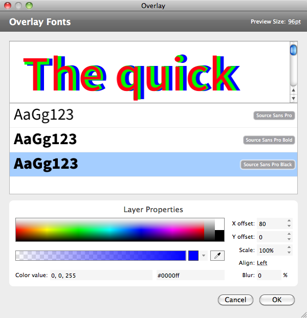
The Overlay dialog box consists of 3 main parts: the overlay preview, the list of fonts used, and the Layer properties.
All changes you do are reflected in the overlay preview. This is how your destination font will look after conversion.
Click on the font in the list to switch between layers. Changing the order of fonts in the list by drag-and-drop changes the layers order in the font. For example, to put the layer on top of others, drag the font to the first position in the list. 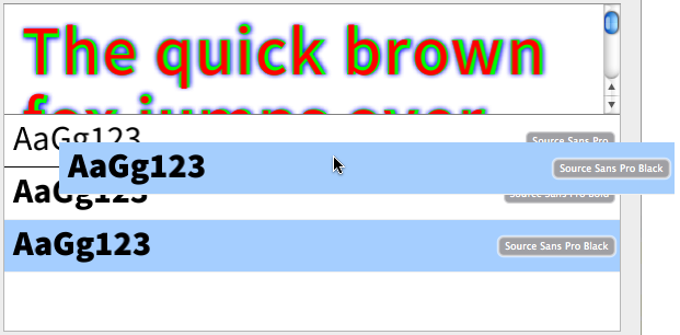
Editing layer properties
Use controls in the Layer properties section to change the current layer properties:
- color: standard color palette includes the grayscale bar, black and white colors. Use it to apply color to the glyphs of the current layer;

- opacity: the current layer opacity selection bar
 with additional popup palette with common colors
- vertical and horizontal offset to move the layer. Use negative values to move left and down;
- scale factor to reduce or enlarge glyph images;
- alignment to position layers left, centered or right;
- blur: the effect to soften edges of glyph images on the current layer. This effect can be used to imitate glyphs’ shadows. Use values below 10% for better results. Blur by 50% and more may take several minutes.
Finishing
When you are satisfied with the overlay preview click on OK to create new color destination font. TransType will add new destination to the list in the Main area where you can rename the font if needed.
The destination font will inherit all glyph metrics, kerning and OpenType features (if there were any) from the most bottom font, i.e. the last font in the list.