FontLab in 8 days — Day 5: Social letters

Personal space for each letter in FontLab 8

The relationships between glyphs in a font are of paramount importance. English typographer Harry Carter once said: “The success or failure of a type is very much a question of getting a good balance of white inside and outside the letters.” American type designer Sumner Stone seconded: “Each alphabet has its own rhythmical pattern. Each individual character is a variation on a basic dance step. These different patterns strung together into a complex choreography of words, sentences, paragraphs, and pages.” Swiss type designer Adrian Frutiger famously illustrated this principle when presenting his Meridien design.
Letters are social creatures. They cluster together to form words and sentences. Each letter needs just the right amount of personal space — not too little, not too much. In a well-spaced font, that space is visually equal between all letter combinations. Since every letter has a unique shape, “visually” equal isn’t the same as “mathematically” equal.

In FontLab 8 terms, the space to the left and right of each glyph is its “sidebearings”. You can adjust these by dragging the lines in the Metrics window. But you don’t have to set each one individually. FontLab 8 lets you set up “metrics keys” to ensure the that similar glyphs have the same sidebearings.
In a Latin font, start by spacing the “control characters”: ‘n’ and ‘o’ for lowercase, ‘H’ and ‘O’ for uppercase. Get these to feel just right in pseudo-words like ‘nnonoo’ and ‘HHOHOO’. Then link other glyphs to these — for each side separately. The left side of the ‘b’ glyph is flat like ‘n’ but its right side is round like ‘o’. So you can put ‘n’ as the left sidebearing of ‘b’, ‘h’, ‘i’, ‘j’, ‘k’, ‘l’, ‘m’, ‘p’, ‘r’, and put ‘o’ as the left sidebearing of ‘c’, ‘d’, ‘e’, ‘q’. Then put ‘o’ as the right sidebearing of ‘b’, ‘p’, and so on.

Test words and sentences in the Metrics window: are some letter pairs colliding while others gape? Tweak the control characters spacing, and independently space the glyphs that don’t look like any others (‘a’, ‘g’, ‘s’, ‘t’, ‘z’). Give reader-friendly “personal space” around the letters for as many letter combinations as you can.
Read more
- How to space a typeface
- Spacing a Font
- Briem’s Notes: Spacing
- FontLab 8 tutorials by Dave Lawrence
- 60 Second Quick Start Metrics
Video tutorials
Typographic kerning harmony in FontLab 8
Some combos will still stand out, but every two letters instantly make great neighbours. Think of the classic ‘VA’ pair — that big wedge-shaped space looks odd, as if they’re holding each other at arms’ length after an argument. This is where kerning comes in: custom-tweaking the space for specific pairs to even out these awkward gaps.
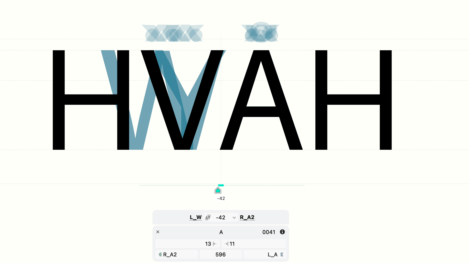
In FontLab 8, kerning adjustments are independent of the spacing sidebearings. Fixing one pair won’t mess up the spacing of the full glyph set, but doing this for every potential pair is overwhelming. Similar glyphs — similar gripes: if two letters look alike, cause similar spacing problems with neighbors. To solve these, group similar glyphs into kerning classes. Select all members of the ‘V’ family (V, Ý, Ŵ, etc.), then group them in left kerning class and a right kerning class with the buttons in the Glyph panel. Do the same for the ‘A’ shapes. Now any kerning you apply to ‘VA’ will automatically apply to all other combos of those classes.
Don’t start kerning until you’ve finalized the spacing. Use class kerning as long as you can, then add kerning exceptions. As you kern, try flipping the glyph order for a fresh perspective.
When is kerning done? Aim not for perfection, but for an overall pleasing texture. Trust your eye. Step back and take in whole paragraphs, not just pairs. Kerning is supplemental to spacing, and it should give the text a friendly, comfortable flow. After all, what are best-buddy letters but an invitation to a really great conversation?