Briem’s notes on type design: Kerning fun
What should you kern?
Normal spacing is fine for normal use. Some combinations, 7W for instance, don’t occur often. They can be kerned manually if and when they come along.
The letter T is usually kerned with the letters A a c e o r s u w y, and sometimes with the letter i as well. It is also kerned with the colon, comma, hyphen, period and semicolon. The letters V W Y often need much the same adjustments.
Customary kerning pairs are within easy reach. Take a look at font metric files. Then decide. Adobe Garamond has over 600. That’s a lot. Stempel Garamond manages with 115. Here they are.
Ay  Aw  Av  A'  AY  AW  AV  AT
F.  F,  FA  Ly  L'  LY  LW  LV  LT
P.  P,  PA  Ry  RY  RW  RV  RT
Ty  Tw  Tu  T;  Ts  Tr  T.  To  Ti  T-  Te  T,  T:  Tc  Ta  TA
Vy  Vu  V;  Vr  V.  Vo  Vi  V-  Ve  V,  V:  Va  VA
Wy  Wu  W;  Wr  W.  Wo  Wi  W-  We  W,  W:  Wa  WA
Yv  Yu  Y;  Yq  Y.  Yp  Yo  Yi  Y-  Ye  Y,  Y:  Ya  YA
f'  ff  ``  't  's  ''
rz  ry  rx  rw  rv  ru  rt  rr  r'  rq
r.  ro  rn  rm  r-  rh  rg  rf  re  rd  r,  rc
v.  v,  w.  w,  y.  y,
How many you use may matter. Last time I knew, oversize kerning tables could slow a large system to a crawl. You should ask yourself who is likely to use your design.
How far do you want to go?
There’s a dividing line between commonsense kerning and damn-fool waste of time and eyesight. Where to draw yours is up to you.
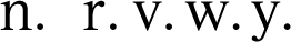
A period that follows the letter n stand s right next to it. A period after the letters r v w y is farther away. Would you like to move it closer? The same applies to the comma. Should it be kerned? I think so.

A hyphen between two letters o is close to them. When it stands between two letters n, they are farther away. Should it be kerned? You decide.
When the letters A T V W Y follow a wordspace, it may seem bigger than usual. Would you like to kern them ?
These are some of your decisions. You can do what you like. What is your pleasure?
Notes on type design. Copyright © 1998, 2001, 2022 Gunnlaugur SE Briem. All rights reserved. Republished with permission in 2022 by Fontlab Ltd.