Setting Your Letter Heights
Get the Correct Heights for Your Letters
Benefit Save weeks of heartache by getting the height right!
This tutorial is about setting up the heights of your letters.
As technology has developed, vertical metrics has become a bit of a mess. For the technical side of vertical metrics, please see this tutorial.
The Risks of Incorrect Letter Heights
Finding the right height for your letters is one of the most difficult and risky tasks of font design.
If you get it wrong, then you risk losing hours…or even days of time.
A Sad Story, or, Cautionary Tale
Once upon a time, when finishing up my third and final draft of a font, after I cross checked with another source, I discovered that one of my sources had the incorrect cap height!
I had in the realm of 2,000 glyphs by this point in eight masters: 16,000 total. So I had to change the cap-height to make it right.
What’s worse…
In this font the Cap Height equaled the ascender height (not normal), that meant I had to change the lowercase as well. Also all the uppercase punctuation, quotation marks, also descenders—everything!
I can’t remember how long it took me to fix it, but I’m sure it was no less than a week of solid 12 hour days.
In this article, I will show you what I learned by trial and error, hopefully saving you many hours of pain!
Basic Heights
Baseline, Descender, x-height, figures height, small Cap Height, superiors, inferiors, etc.
You’ve probably seen charts like these before:
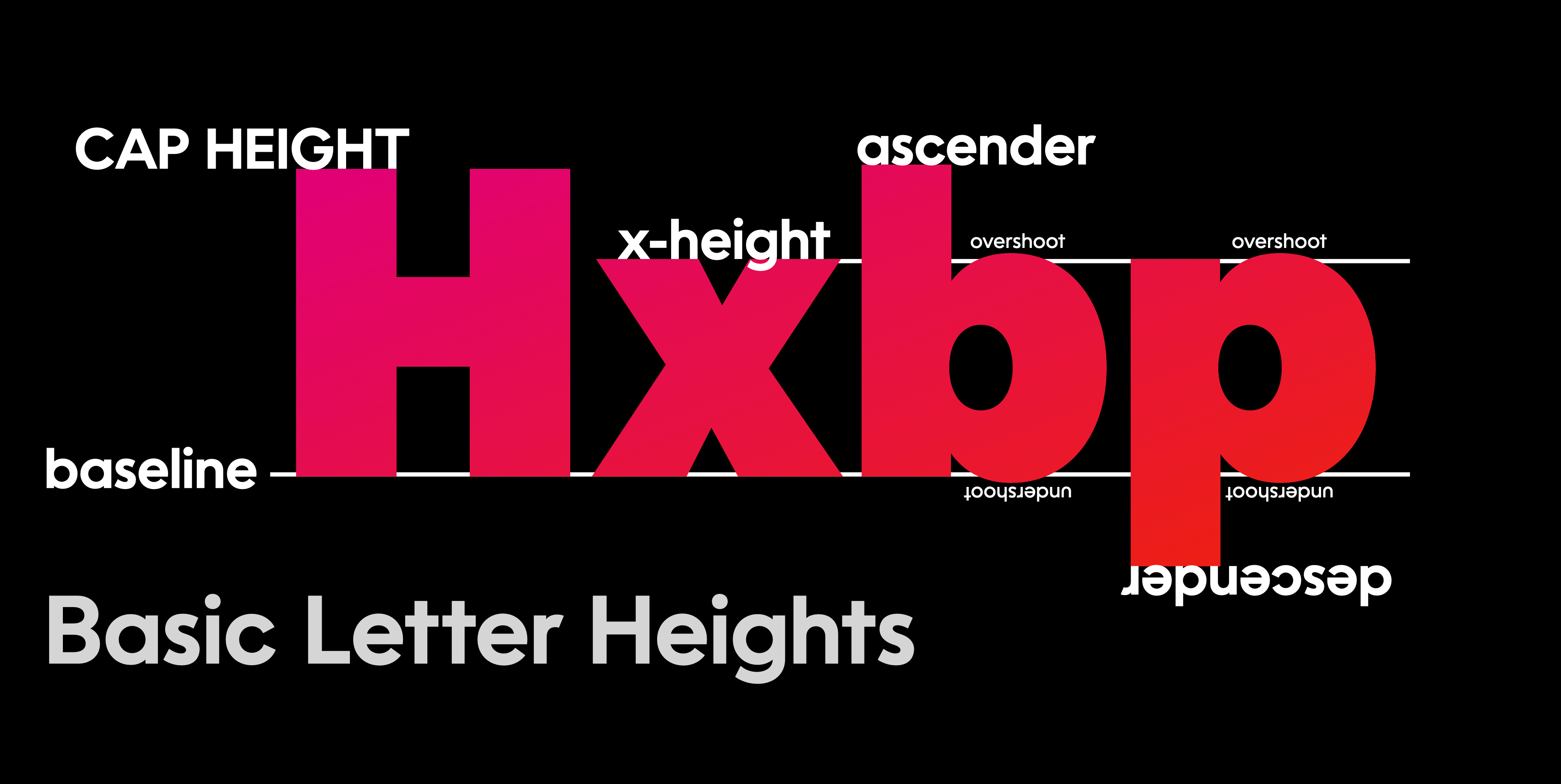
When you are in FontLab’s drawing window, these show up as dotted gray lines.
These lines are labeled on the left with a number (the height) and a circled letter.
The primary line
ⓑ = baseline
The drawing area
ⓐ = Typo Ascender (a bit different from an actual ascender) ⓓ = Typo Descender (a bit different from an actual descender)
The relationship between your lowercase and uppercase
ⓧ = x-height ⓒ = cap height
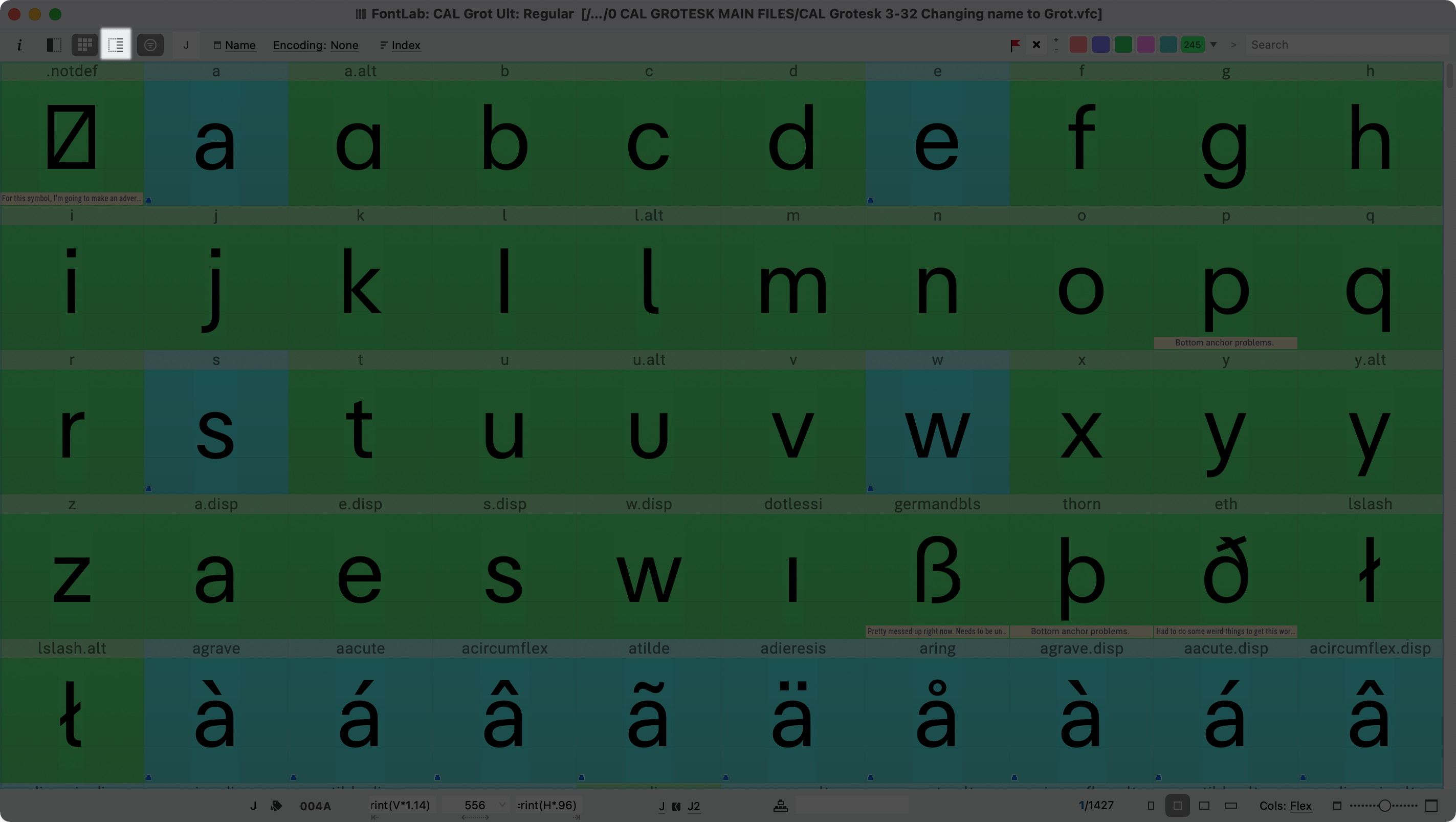
These are the main heights that you need to set. Here’s how to set them.
Download VFJ
Grab this font and open it.
⓿ Baseline
The baseline is zero and stays zero. Yay! This is the only thing we don’t have to set!
But while we’re here, let’s turn these on:
- View > Font Guides ON
- View > Font Dimensions ON
- View > Show Zones ON
❶ Ascender and Descender: Your Drawing Area
History
This is a tricky one. To better understand all of the terms and how we got to our current system, a bit of history is needed. Feel free to skim or skip to “Designing Fonts Inside the Correct Verticale Space.”
Absolute Units
Back in the old days Grandfather Baskerville and Papa Bodoni had to carve each individual shape.
If they or their punchcutters cut a Pica (pai-kuh) font (about 12 points), the em, or body, would be at 12 points.
If they wanted to carve something at another size, they had to do it again.
Today, typographers use these absolute sizes: 72 points = 1 inch 6 picas = 1 inch 12 points = 1 pica
Relative Units
Relative units solve an important problem: they allow something to be scaled by a computer.
For fonts, the relative unit is the em—approximately the width of an “m”.
Suppose you draw an “m” into FontLab, and it happens to be exactly one “em” wide (normally 1,000 units).
When someone takes your font and sizes it, to say 72 points, the letter “m” is now exactly 72 points wide, or one inch wide. If they resize that to 24 points, the letter “m” will be 24 points wide, or 2 pica wide.
Designing Fonts Inside the Correct Vertical Space
Now let’s talk about the height of the letters.
⚖️ RULE The normal characters 0 – 9, A-Z, a-z without accents, should fit within the em, that is from the Typo Descender to Typo Ascender.
For practical purposes, this means your tallest letter, f should be under the Typo Ascender. Your lowest letter, probably a g, should be above the Typo Descender.
Info
In the tutorial on vertical metrics, you will see that the standards have been relaxed, and that the absolute values of the Typo Ascender and Type Descender no longer need to equal the em.*
How to Apply This Rule
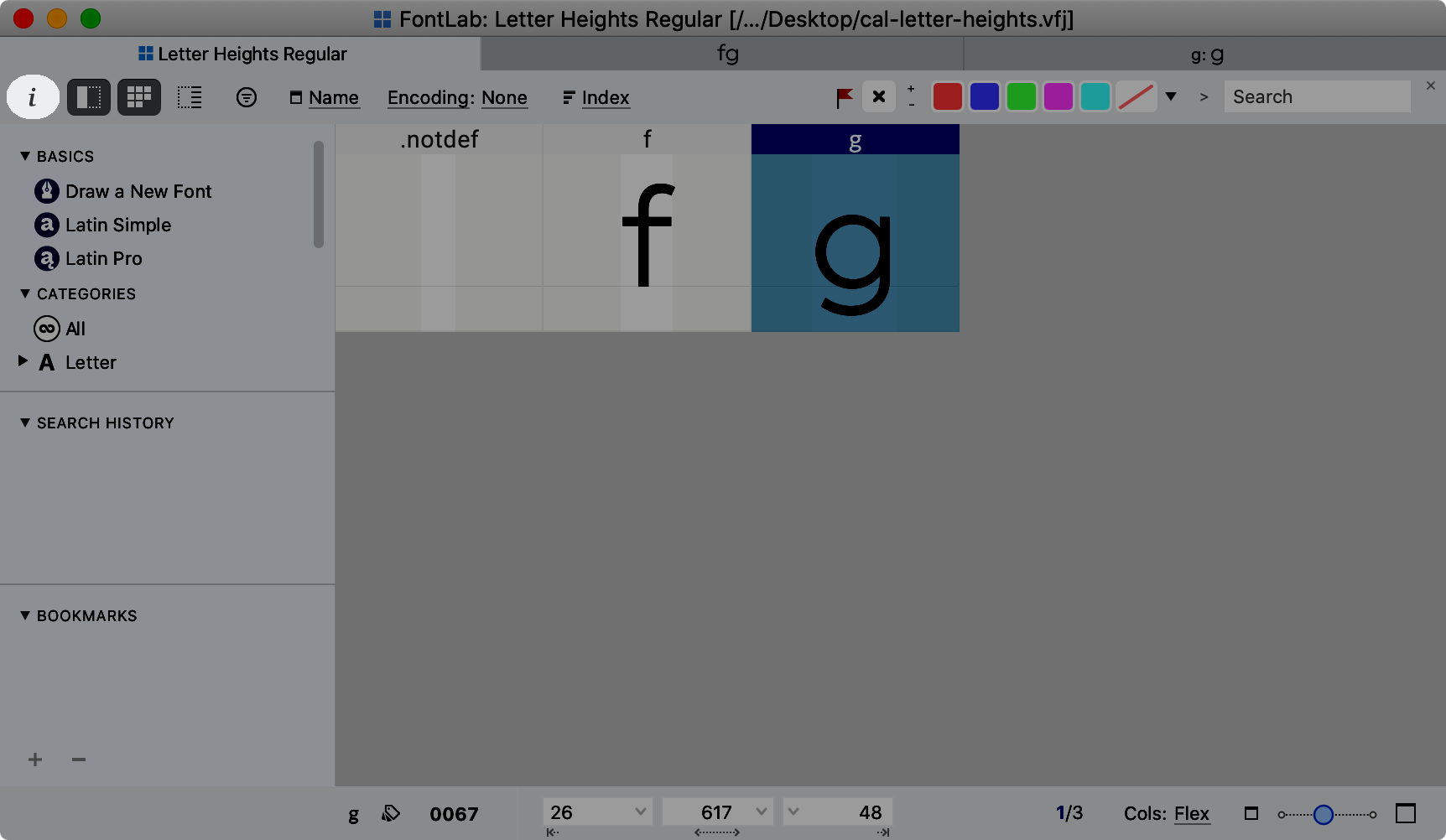
Let’s go back into the file you downloaded above: “cal-letter-heights.vfj”.
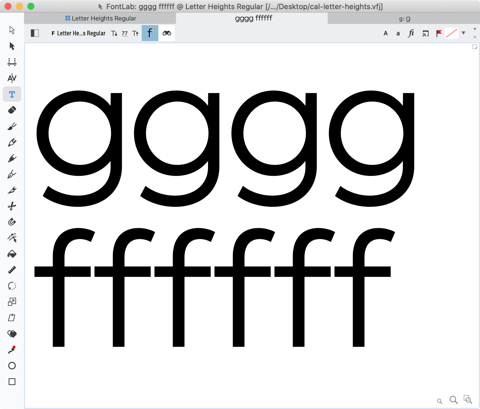
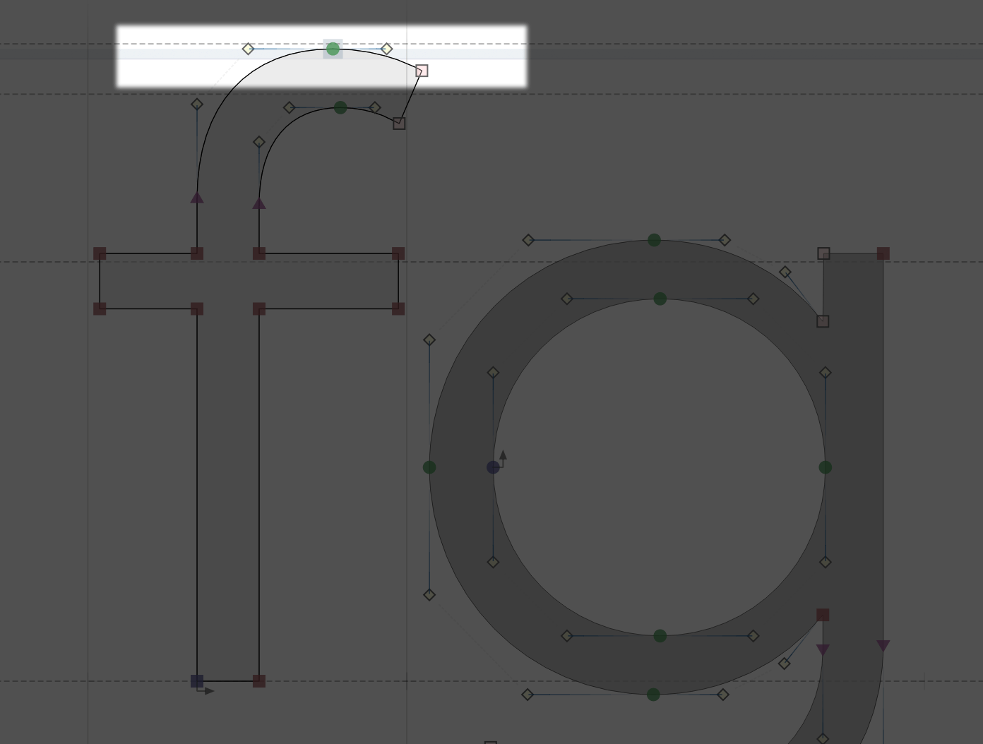
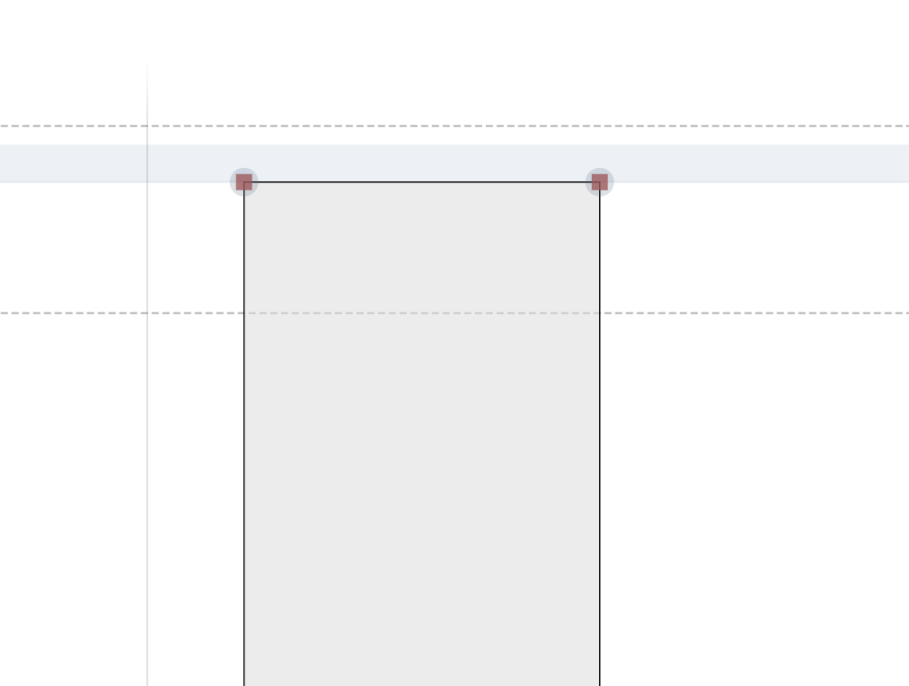
Open the f and g in the drawing window. You will see this. ▼
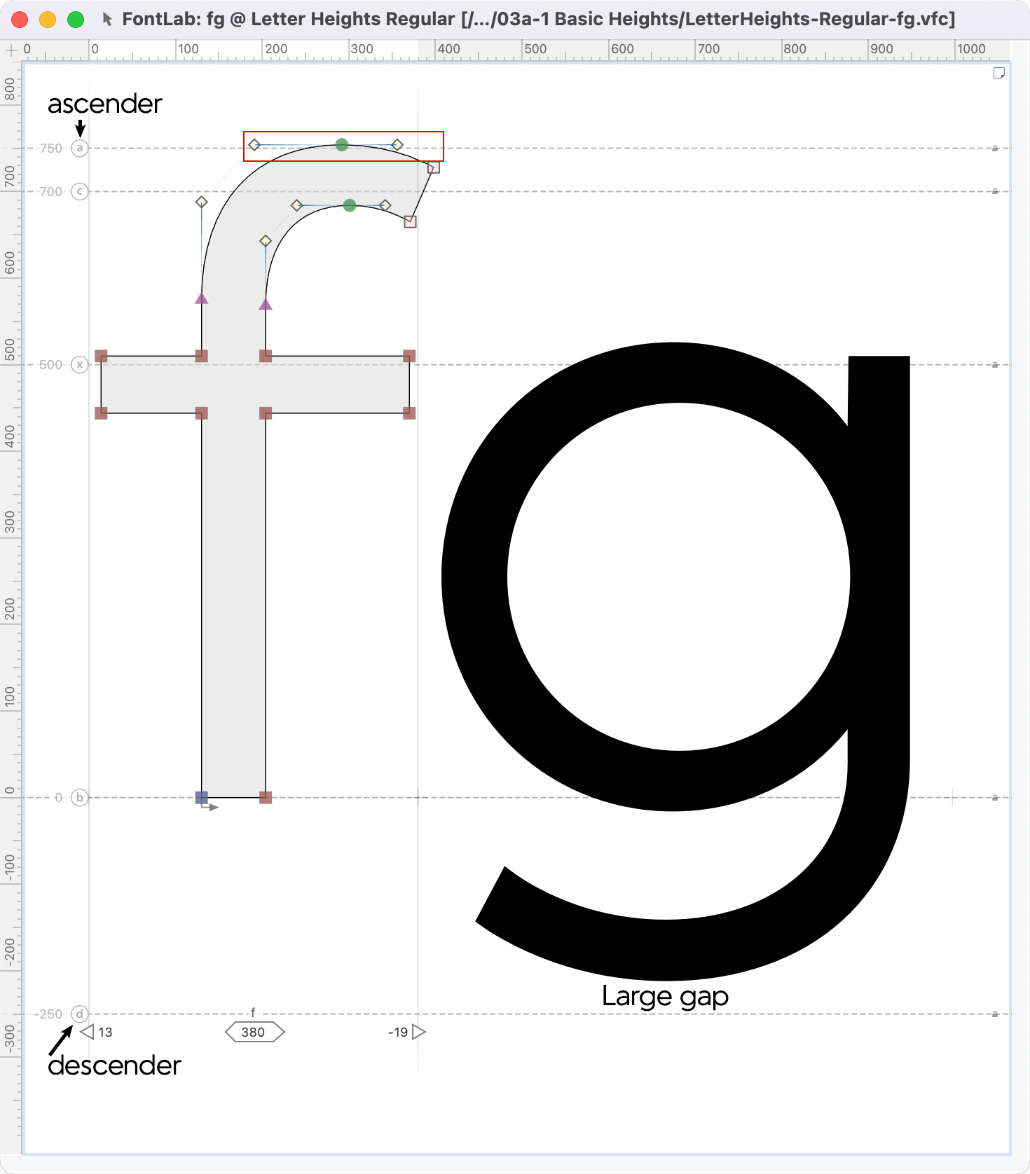
See how the f is out of the boundary? The g is a bit too far away from its boundary.
We need to change our Typo Ascender and Typo Descender values.
Since 750+|-250| = 750+250 = 1,000
if we move 750 to 760, the value of g needs to become 240.
Because 760+240=1000.
Here’s how you change those values.
Changing Typo Ascender and Typo Descender Values
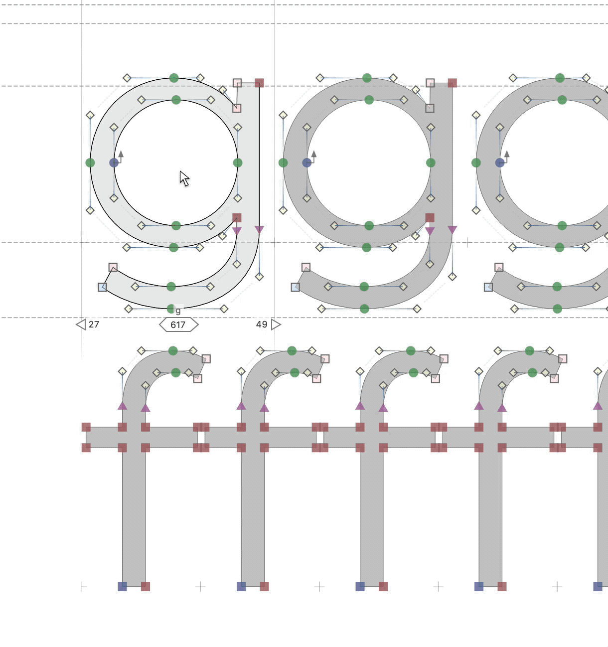
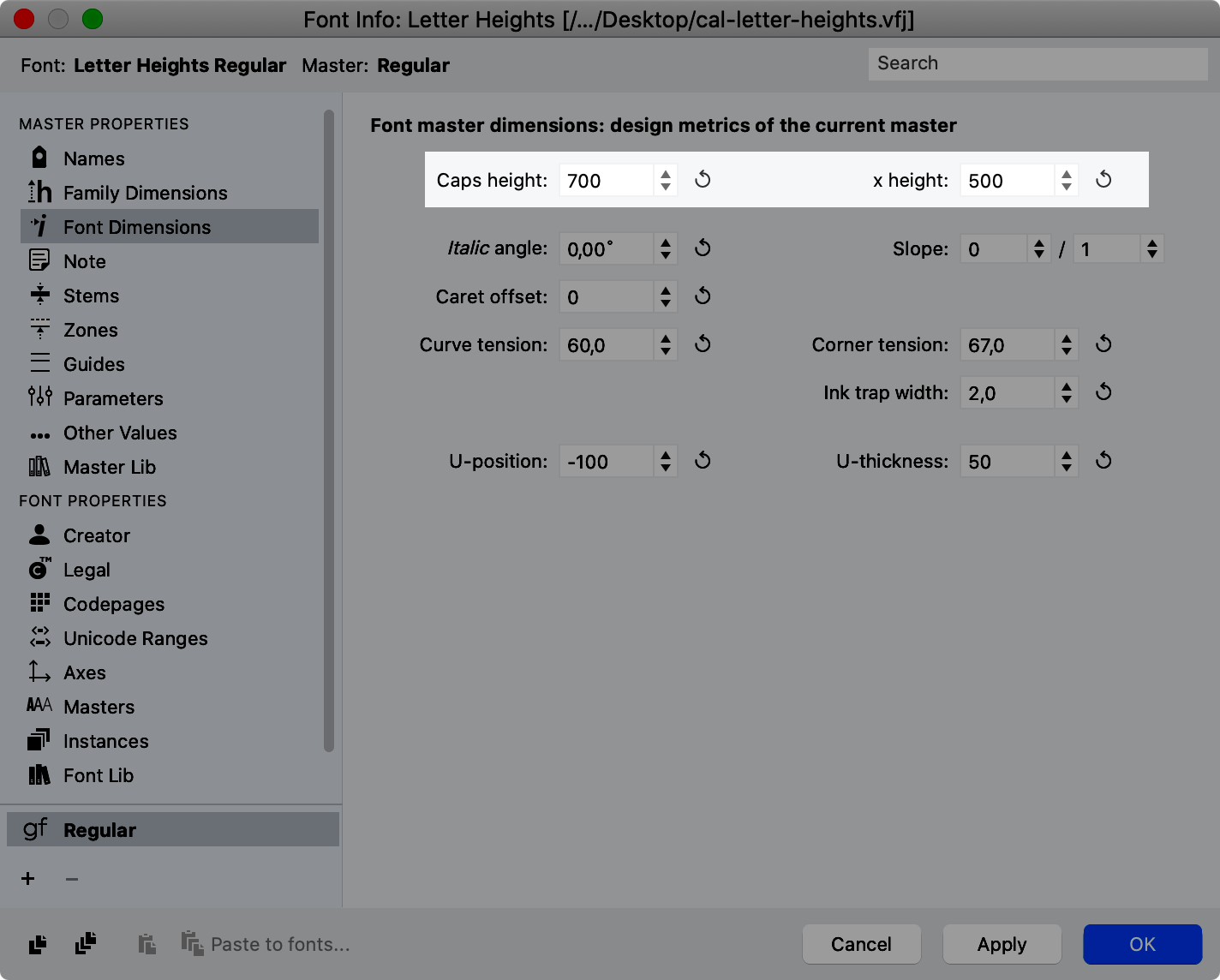
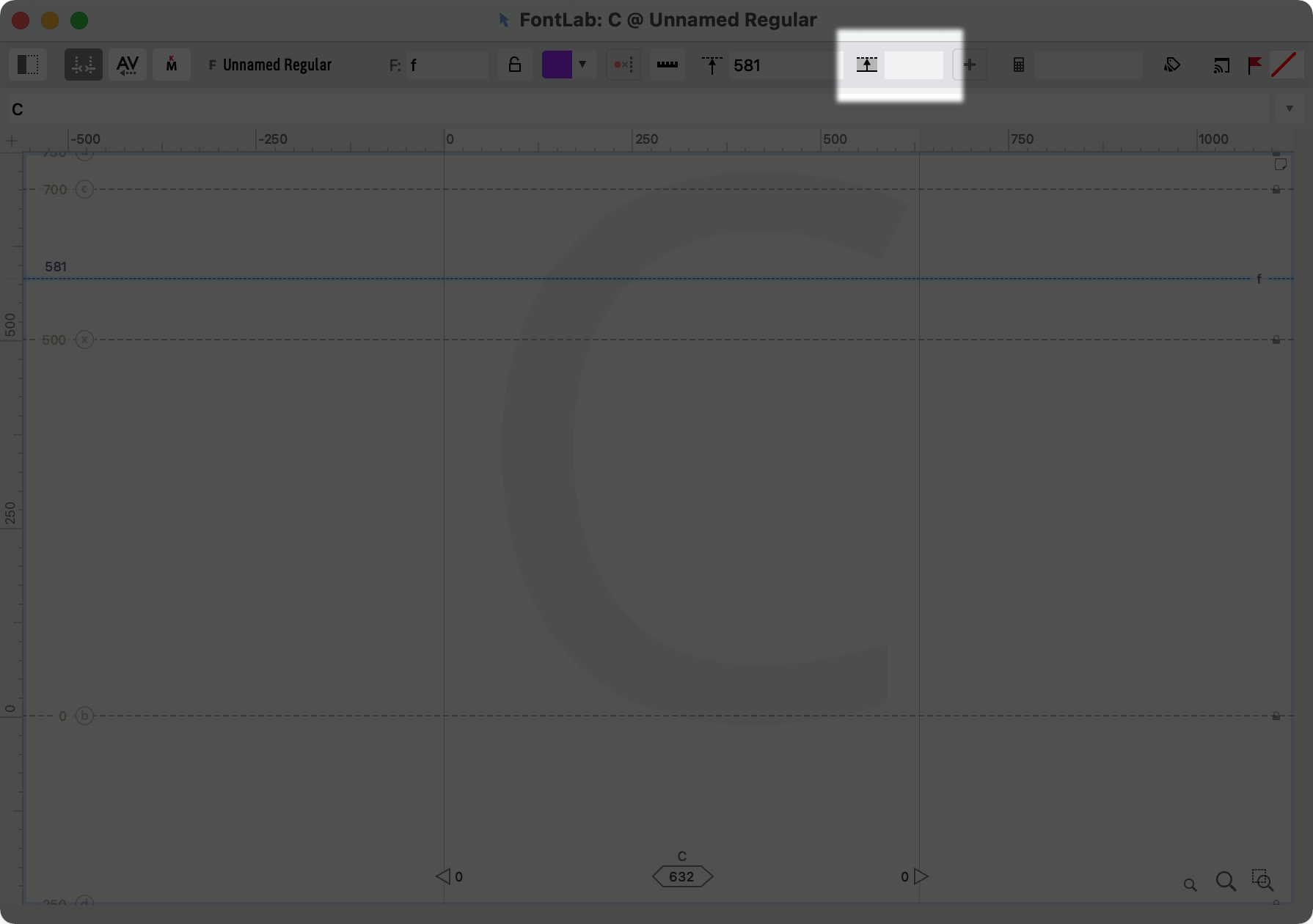
❶ Go to the font window, and push the info button:
❷ In the window that comes up, go to the sidebar: “Family Dimensions”. Change the Ascender and Descender to 760 and -240.
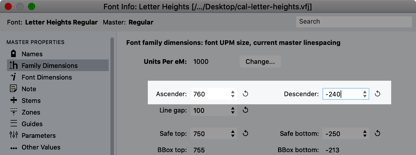
Note
The refresh buttons don’t fit the letters into the em (1000 units).
Don’t worry about those other values for now.
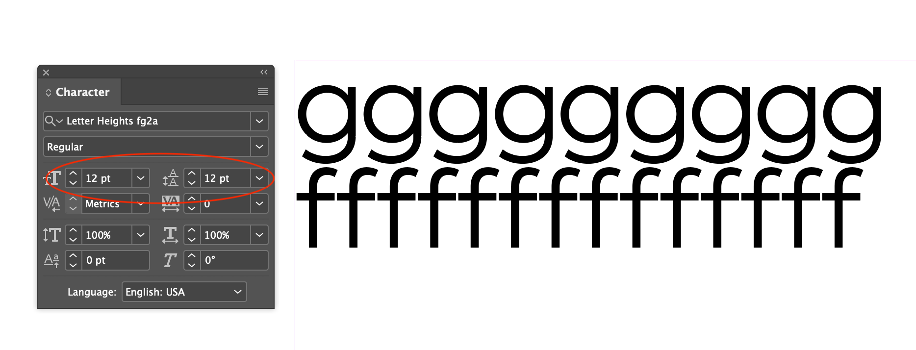
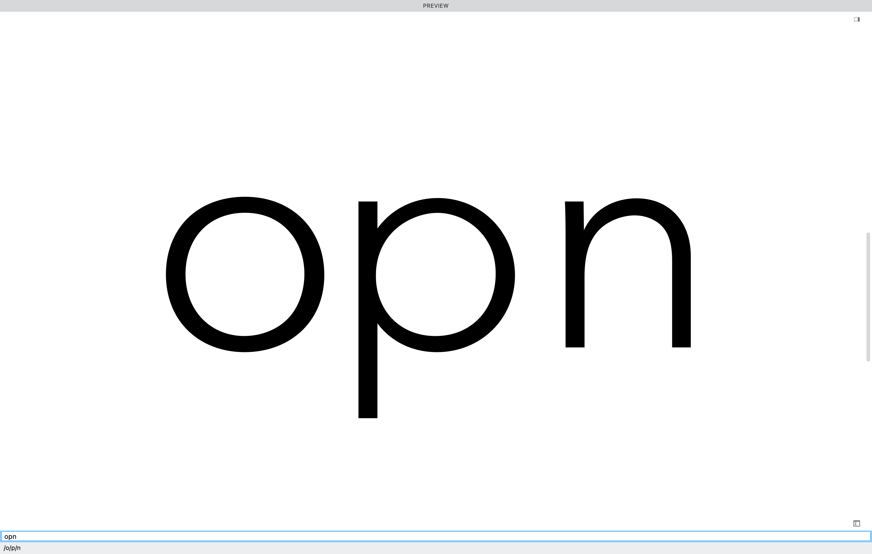
❸ Go back to the drawing window, push go to toolbar, Text Tool (T), and type something like this:
But if you push Esc then click between the two lines, you can see that there’s a gap.
Mind the Gap
In typography, the space between fonts is called leading (pronounced led-ing, not leed-ing), named after the pieces of lead between lines of type.
If we export this font and bring it into digital publishing software and set it like so…
…this setting is called solid. There is no space between the lines.
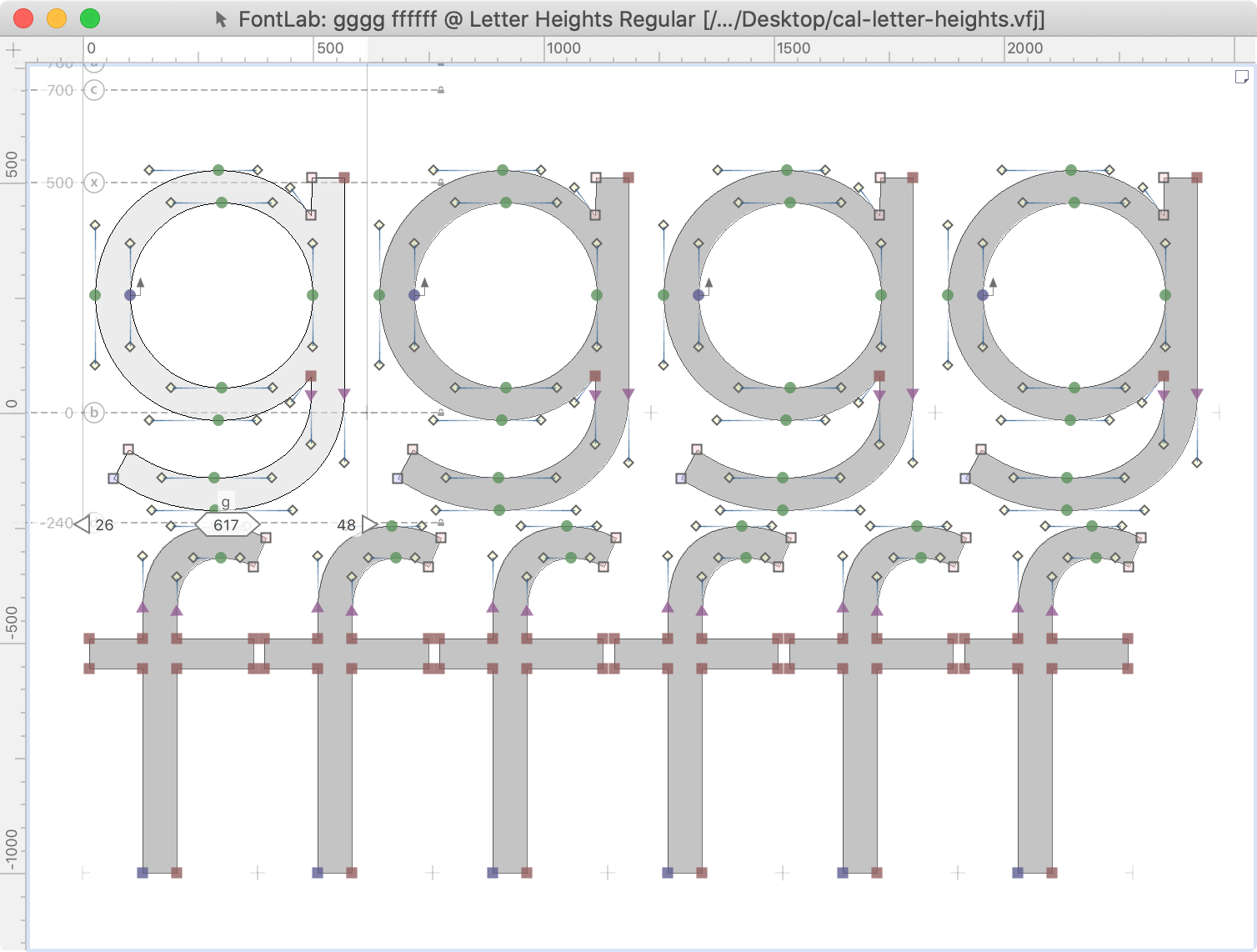
❹ Set text solid in FontLab.
Tip
Instead of designing with a line gap, it is safer to draw the main letters when the font is set solid.
This way you can spot crashing between lines.
So we go back to Font Info (CmdAltF) > Family dimensions > Line gap. Change the line gap to 0.
Now our drawing window should be more accurate.
Warning
Sorry, I hope this is not the case for you. If there is 1) overlap between the f and g, 2) touching between the f and g, 3) not enough space between the f and g, you need to redraw or resize these letters and all others! Or else remedy the mistake in your next font.
Pro Tip
When you make diacritics (accents), you can turn the line gap back up.
❺ Let’s add zones to help us line up our letters.
Zones are similar to guidelines, but have thickness by default.
One use for zones is to tell us how tall our overshoots should be.
So let’s talk about overshoots.
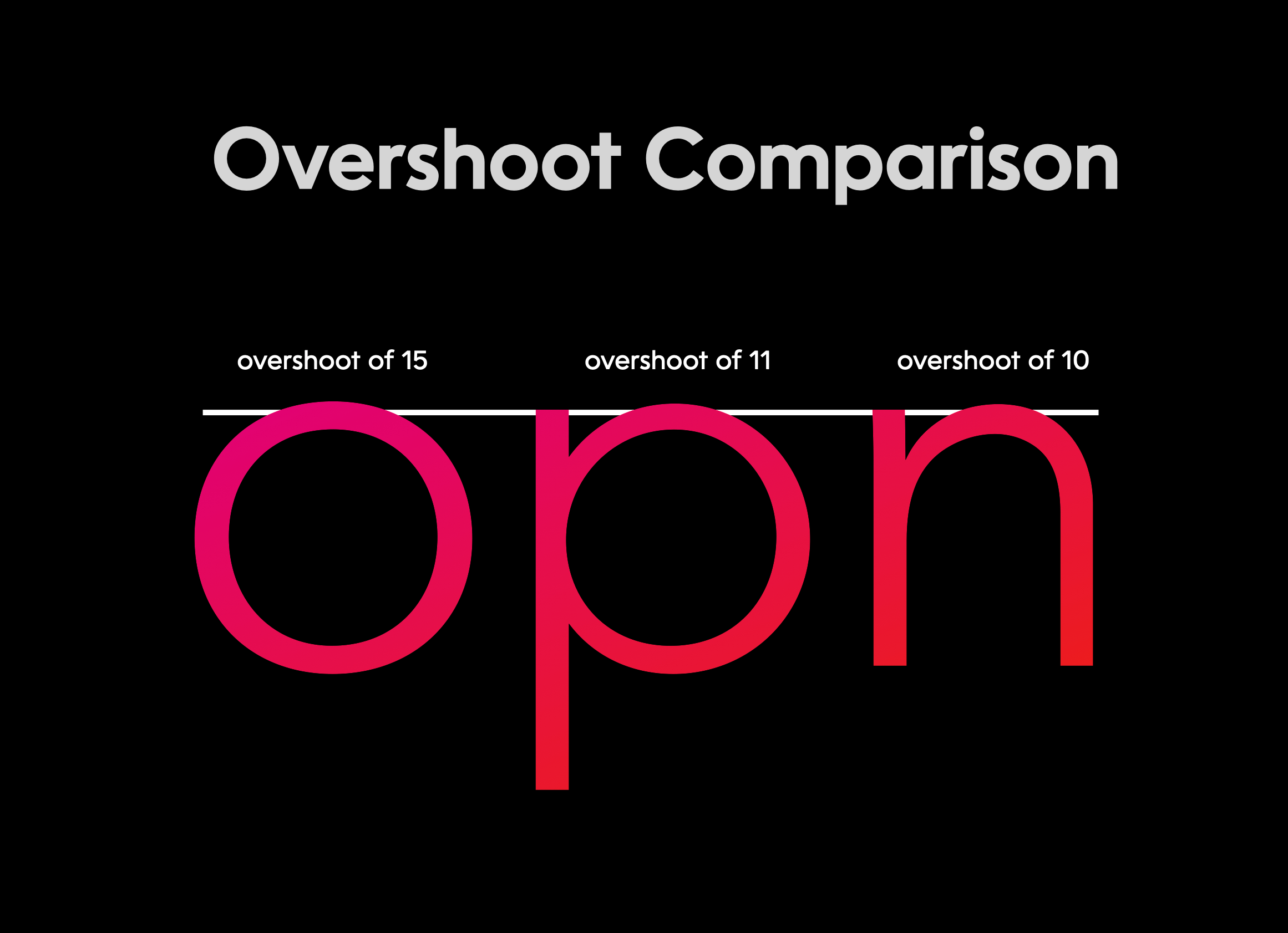
What Are Overshoots?
Overshoots are important to make round letters feel like they are the same height as straight letters.
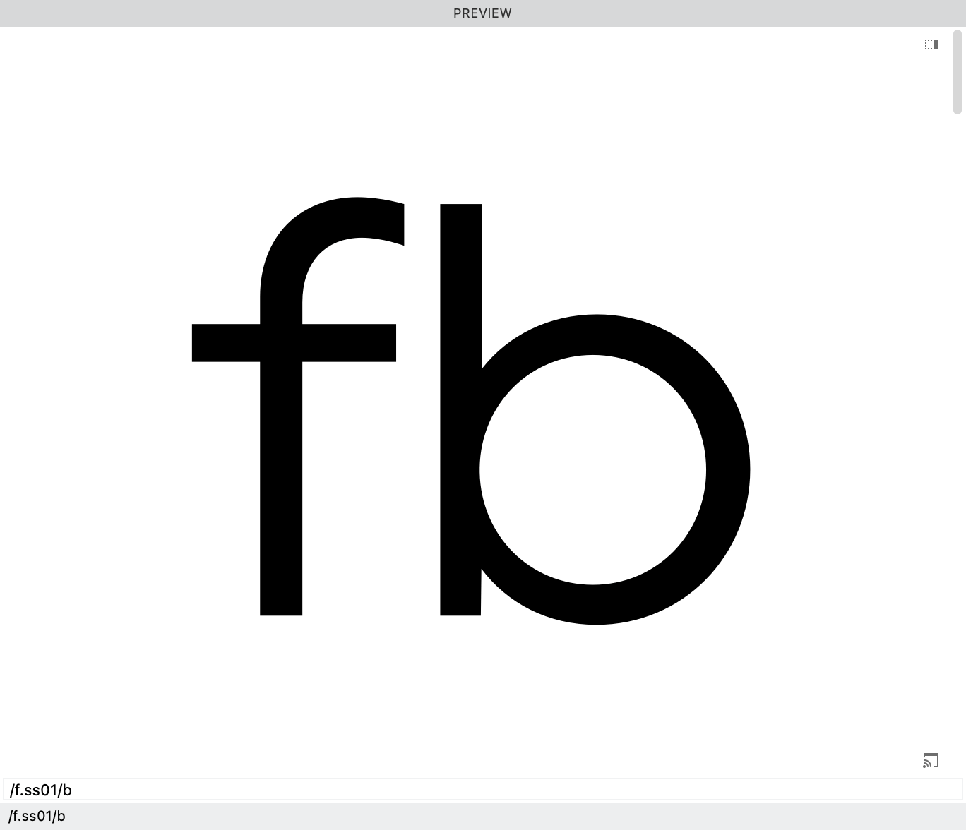
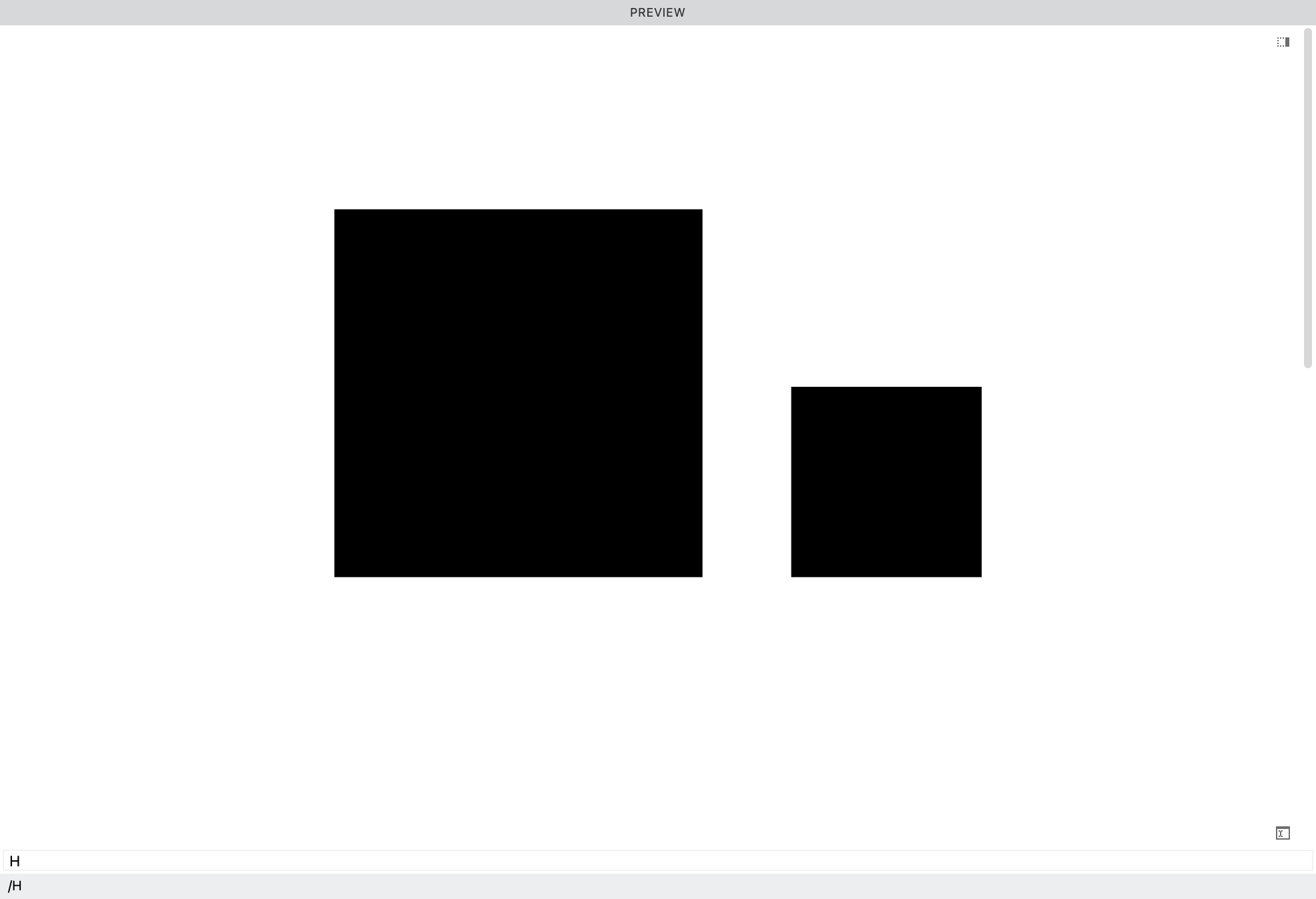
Here’s an f with the same mathematical height as the b.
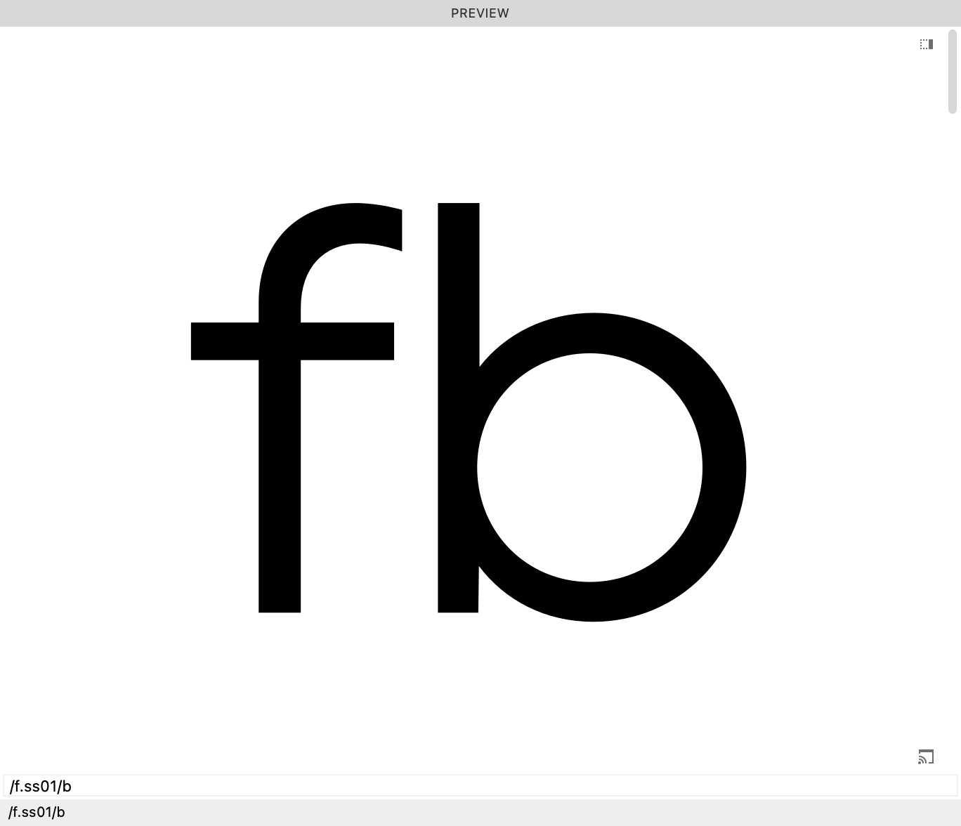
So how he is hunching over and doesn’t look tall enough?
After adjusting the f up by 15, to give him an overshoot, he feels more equal.
A typical overshoot is anywhere between 6 and 20. For wide fonts, the overshoot can be more (though there’s a certain upward limit). For ultra condensed the overshoot can be less.
❻ Finally we are to our next step!
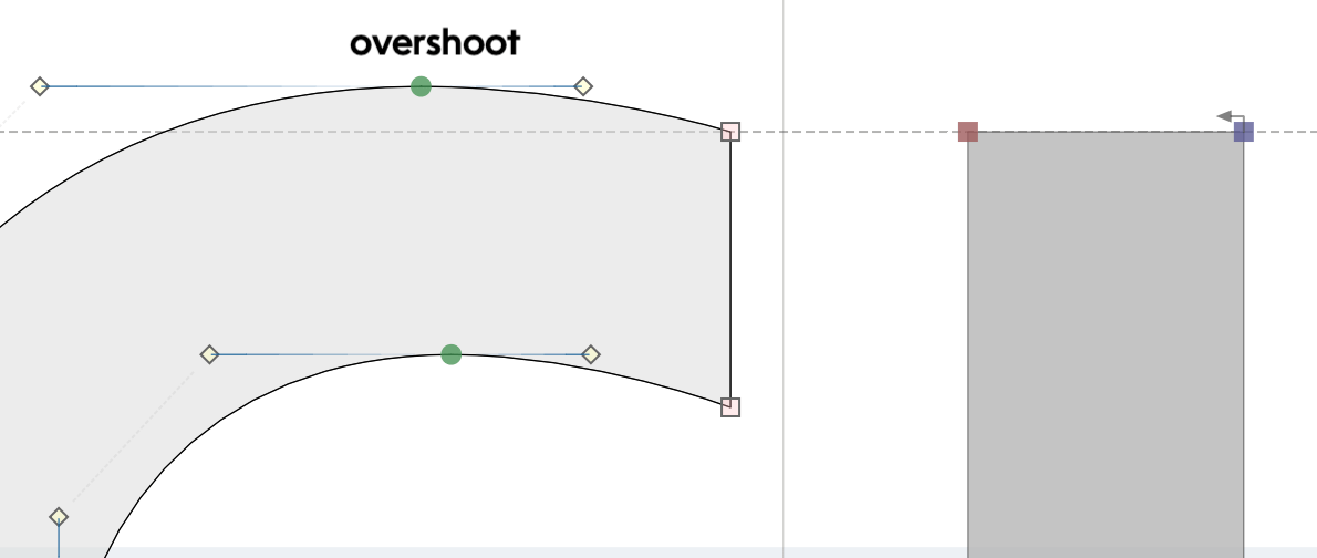
Let’s find the top of our f. It is 754.
Now, let’s go add our zone.
Go to menu: File > Font Info… > Zones.
We will have to make a guesstimate.
By our best guess, let’s say we want an overshoot of 12.
Now subtract 12 from 754. This would put the bottom of the zone at 742. So enter this into zones:
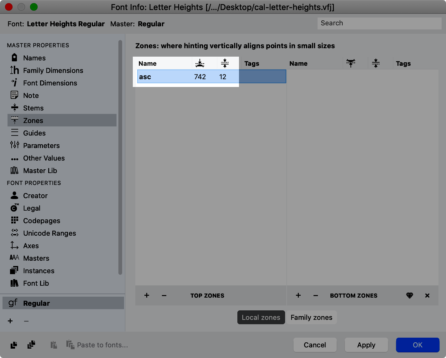
Unless you have variations, naming the zone is not strictly necessary, but helpful.
Hit apply and you can see that the zone looks like this:
The node has a tiny grey square on it. This tells you that the node is in the zone.
When a node is in the middle or at the top of a zone, it has a faint gray square.
When a node is exact at the bottom of the zone, it has a gray circle.
Info
Gray zone markings are reversed for undershoots.
❼ Adding Zones for the g
Our g goes down to −212. Supposing an overshoot of −12, we need a zone of 200.
−212−(−12)=−212+12=200
Go into Font Info, and set the descender zone like so:
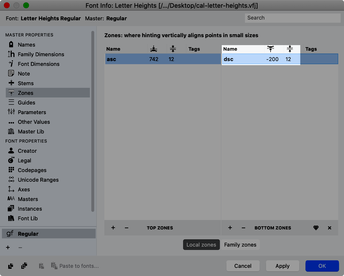
Warning
Even for bottom zones, enter the positive value for the zone thickness, not negative.
The Relationship Between Ascenders and Descenders
Descenders should almost always be smaller than the ascenders. This is a pain, but FontLab has a new non-destructive filter that can quickly help. For the tutorial, click here.
That’s it! We got our tallest and lowest normal letters within the “em”!
❷ Cap-height and x-height: The Relationship Between Uppercase and Lowercase
More History: Cap-height and x-height Relationship Through the Ages
Another brief history lesson, skim or skip to “Takeaways” if you’re already familiar with this backstory.
A Story like Romeo and Juliet
There’s an undeniable relationship between uppercase and lowercase that has developed over a thousand years.
Digitization of the beautiful The ‘De Tournes’ Ten-line Pica Roman by Granjon, from the 1500s:
According to my measurements, the x-height is about 51.6% of the uppercase.
The Caps are almost twice the height of the lowercase!
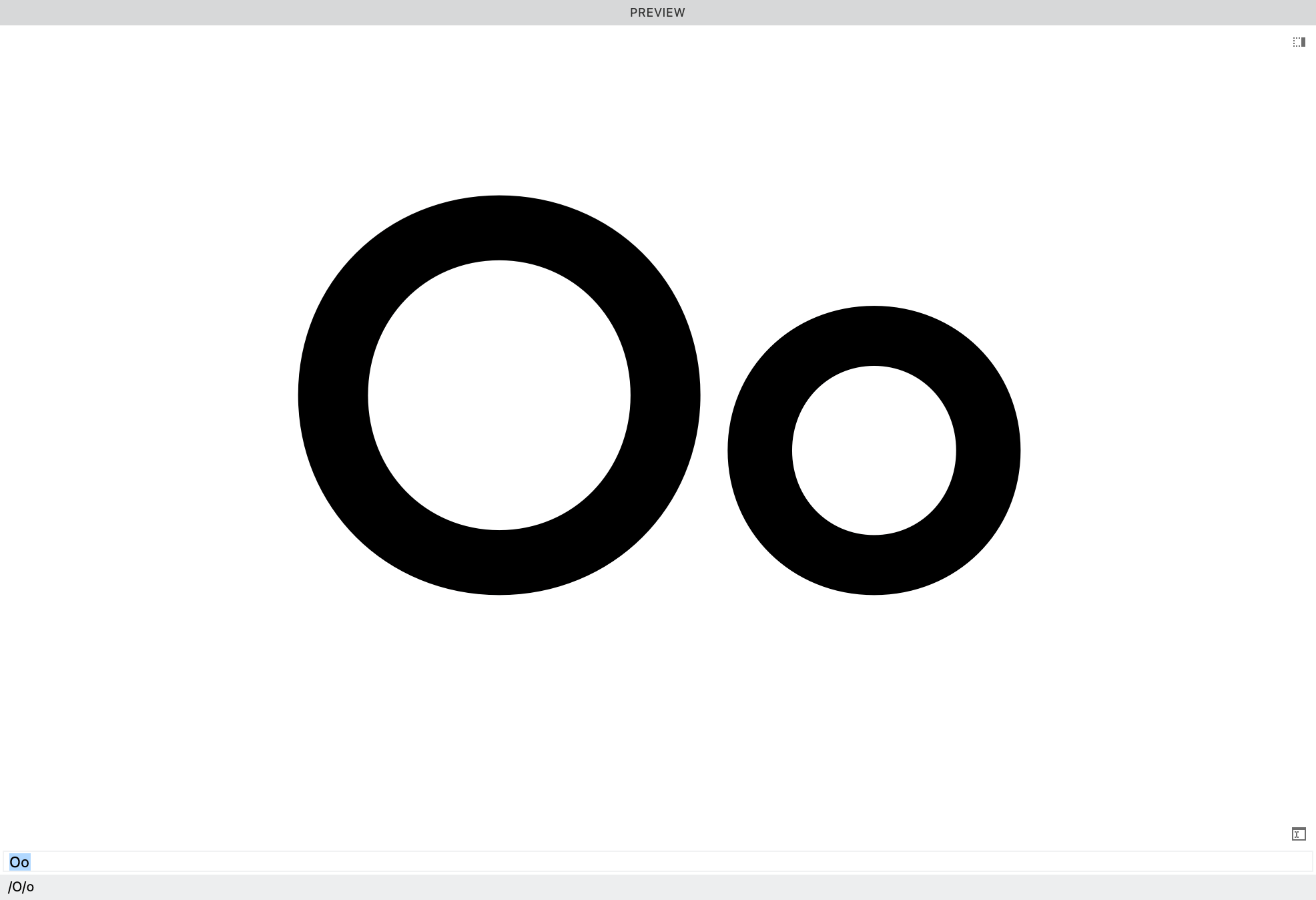
If you construct a square on the cap height and x-height, it looks like this. ▼
The small square is only 26.7% of the uppercase! About ¼.
In the Renaissance, the relationship between uppercase and lowercase was one of height.
This is still the case with many elegant scripts. For example, in Bickham script the lowercase is about 40% of the uppercase.
The More Modern Take
In the 19th and 20th centuries the relationship changed.
Here are the O’s from the first geometric of Frutiger, 1969.
The cap-height is 720 and the x-height is 510.
The x-height is 70.833% of the uppercase.
This relationship doesn’t seem impressive, until you look at the areas of the squares. ▼
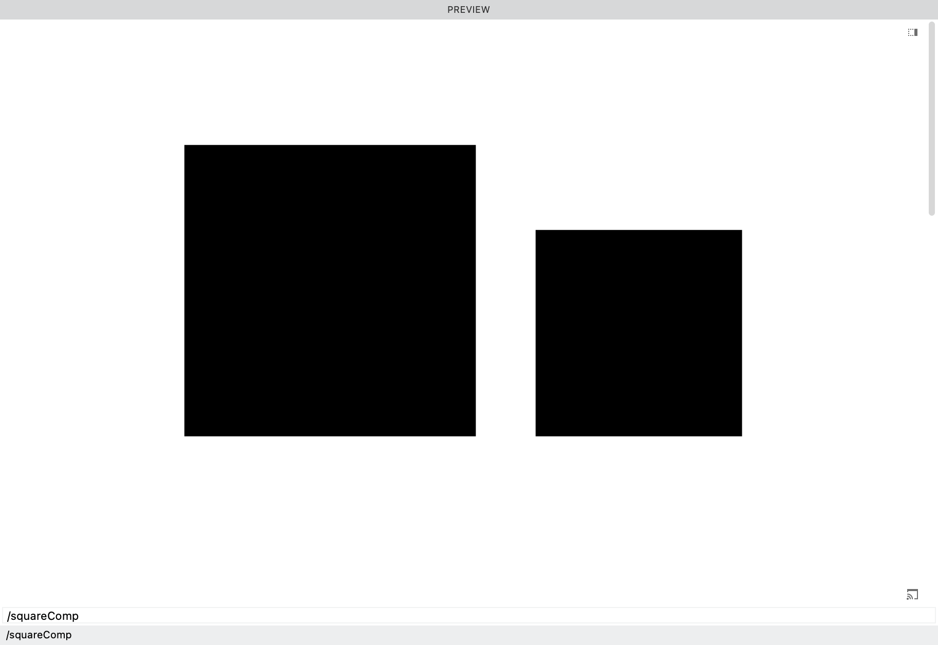
The area is 50.17%. Almost exactly ½!
Today the relationship has changed to one of area.
Info
If you start with the uppercase, and you want to calculate for the x-height on which the square is half the size as the Cap height square, use this formula: Cap height ÷ √2
If you start with the lowercase and want to caluclate the cap height on which the square is twice the size, use the inverse formula: x-height × √2
Takeaways
In fonts like Antique Olive , and many 21st century fonts, the lowercase has gotten even taller!
Even up to 600 units.
Sometimes the x-height is so huge, that the CAPS look like glorified small caps.
Once the lowercase becomes as tall as the caps, you now have a unicase font. (Though unicase fonts more like go the other way around with the small caps becoming the same sizes as the lowercase—petite caps.)
What is the limit of these huge x-heights?
Another thing to consider: Cap height is usually lower than the ascenders.
In some cases the cap-height is the same as ascenders. This greatly simplifies the design process, but the caps can overpower the lowercase.
How x-height Impact Various Languages
Tall x-height is more universal, working well for languages like German that have many uppercase letters.
Tall x-height may not look as elegant for languages like Italian and Spanish.
X-heights of scripts are anything goes, in some cases the x-height going all the way down into the 100s!
Average Heights
In a world where x-heights can go from 100 to 700, averages don’t mean that much.
But for a sans, a common x-height is around 500, and cap heights are around 700.
But it really depends upon the style that you are making.
Changing the Cap Height and x-height in FontLab
Go to Font Info and the side bar “Font Dimensions”. Change the Cap Height and x height lines at the top.
OK, we are all done with changing the Cap Height and x-height.
And we’ve seen that it’s more art than science.
In the next section, you discover a little known tool for checking all your heights.
Checking Your Heights
Here is one of the unsung heroes in FontLab.
Go to the Font window and click button to open the right sidebar “list of glyphs”(actually located on the left)
Once it opens click the gear in the top right. Check Bounding Box Top and Bounding Box Bottom.
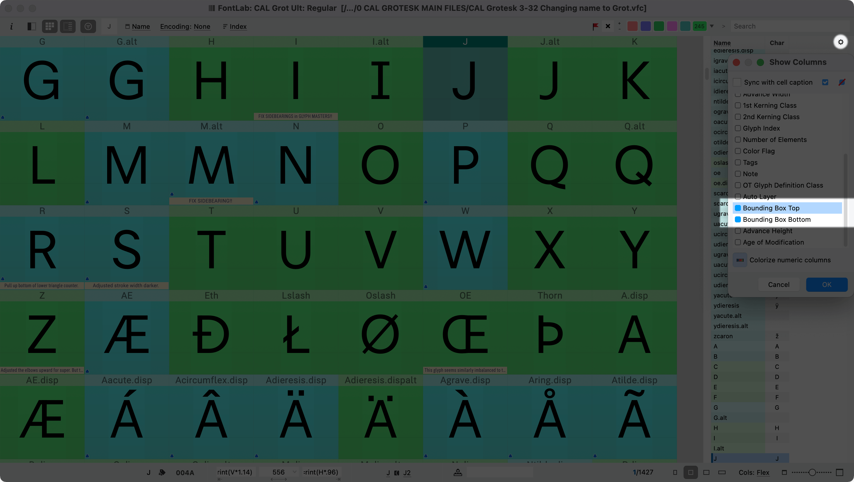
Hit OK.
Now click the top of the menu: to order by bottom as I did here.
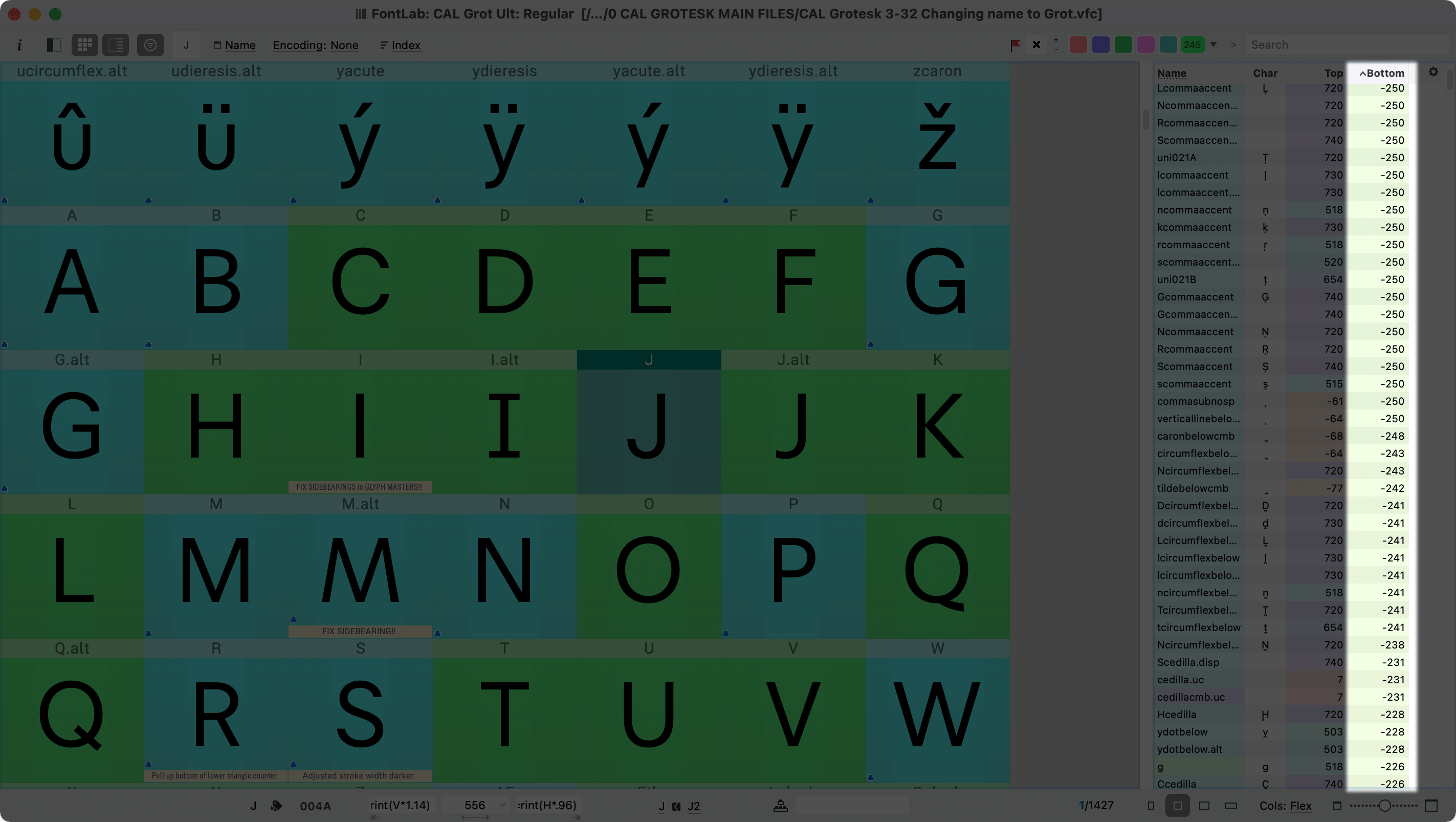
Isn’t that amazing!
You can also use this list to organize in other ways.
Also, click a name to go to that glyph.
Warning
Do not rename letters in this panel! It is uncontrolled and may impact links, features, and kerning classes. Instead, go to menu: Glyph > Rename Glyph…
Caution
On rare occasion, the top and bottom in this list failed to update after an actions move. If in doubt, check the drawing window.
Exact Overshoot Size?
Here’s some detail stuff if you are curious about what the exact overshoot should be.
What should the exact overshoot size be?
You judge this with your eyes.
For example, compare the H and O for the uppercase, and the n o and x for the lowercase.
Here’s some rules to help you figure it out.
Rule #1 In general, the bigger the round shape, the larger the overshoot (in absolute units).
For example, if the O has an overshoot of 14, and the lowercase o has an overshoot of 12.
Info
You might notice that I said absolute units, because relatively, the cap O has a smaller overshoot than the lowercase o.
What I mean is this. At the same time, resize an “ox” to make the x match the H in height. Compare the lowercase o to the uppercase O. The “o” is now larger and has larger overshoots.
Rule #2 Wider shapes need more overshoots, narrower shapes need less overshoots.
This is because for wider letters, you can’t compare as directly the round with the straight. In condensed, the rounds and the straights are right next to each other. Large overshoots would be too obvious.
Rule #3 This is similar to rule #2: Letters with stems need to have smaller overshoots.
Example of Rule #3
Frutiger’s drawings for Avenir were extremely nuanced, but when his drawings were digitized, they lost much of their character. (The reason is in Rule #5.)
As an experiment, I digitized his original drawings as accurately and precisely as I could, and this is what I found.
So you can see how they look, here are just the plain letters:
Rule #4 Open shapes need less overshoots than closed shapes. For example the C needs less overshoots than the O.
Rule #5 Digital However, for digital, text fonts (and possibly smaller displays), ignore all the above rules. It’s a good practice to make all overshoots exactly the same to avoid rounding errors by the rasterizer (the software that changes font information into screen pixels).
I mean exactly the same. Working with fractional coordinates, even an error of 0.03 units can cause a rounding error for hinting, making the letter render differently from his counterparts.
For more information about optically correcting shapes in FontLab, see this tutorial. And this tutorial on hinting.
Info
Use this equation to figure out how many units it takes to move one pixel or dot. (This equation does not take rounding into account.)
Where u=units to move one pixel or dot.
u=UPM/(DPI*(user point size/72))
Example
1200 dpi (dots per inch) laserjet, printing a font at 30 points. Units to move pixel or dot=UPM/(DPI×(user point size/72)) In this case it is
u=1,000/(1200×(30/72))
u=1000/(1200×0.4167)
u=1000/(1200×0.4167)
u=1000/500
u=2
It will take 2 units inside FontLab to move a path by 1 printer dot.
Heights of Other Characters
There is an entire host of other characters.
Here are some general guidelines for their heights.
Small Cap Height
Small Cap Height is larger than lowercase. Small Cap Height has to be determined by eye and is difficult.
A starting point might be to multiply the lowercase height by 110 – 115% (1.1 – 1.15).
In many fonts the undershoots are inconsistent with the lowercase, probably the result of poorly made auto small caps.
Small caps undershoots should be equal to the lowercase. Or else they should be lower.
Small caps overshoots should match undershoots. (Corrected optically of course.)
Small caps figures have the same height as the other small caps.
Petite Cap Height (pcap)
This feature isn’t widely supported. Fortunately, it is supported by Apple OS and Affinity Apps (Mac, not sure about PC), and of course, web.
These caps are the same height as the lowercase. Overshoots should be equal to the lowercase.
Figure (Number) Height
Lining figures (lnum, or default)
Lining figures (normal figures, sometimes considered uppercase figures) are strange in that they look too big when they are the exact height of the uppercase. But if you put them lower, they look too small.
I’ve seen examples from the days of metal and photo-type, where the lining figures were a tiny bit lower than the caps, but overlapped somewhat.
For example, the 5 would be below the H, but the 9 would be above the H.
Unfortunately, because zones can’t overlap, you can’t make lining figures the perfect size in digital fonts!
So you have to choose too high (same height as caps) or too low (so that zones don’t overlap). But there are ways other than height to make the numbers feel bigger or smaller, such as width or design, or smaller or larger overshoots.
Old Style Figures (onum)
I prefer to think of these as lowercase numbers, since they work with the lowercase.
The height of old style figures (onum) can be the same as the lowercase, sometimes a bit taller, and sometimes even taller than the small caps. Sometimes the descenders go down the same as lowercase descenders, such as the p. But I’ve found that for classic fonts, they usually don’t go this low.
Old style figures are somewhat complicated. Find an example that you like. Try measuring it, using a UI measuring app.
Other Types of Numbers
Rarely, fonts offer a set of figures that are between small caps and Cap Height, then offer another set of lining numbers that are the same height as the caps. Bernina Sans is one such example, which has a special “case” feature.
Small Caps Numbers (smcp or c2sc)
The small caps numbers match the height of the small caps.
Denominators (dnom and frac)
Out of the small numbers (denominators, numerators, superiors, inferiors), usually start with denominators.
Denominators are the bottom number of a fraction, such as ½. As such, denominators sit on the baseline.
In some text and caption fonts, denominators go below the baseline. This makes fractions more readable at small sizes.
Denominator height is usually a little more than half of the figure height. For sans around 55%-70%.
If you want stacked (nut) fractions, then obviously the denominator height has to be less than half the figure height. Here the denominator is about 40%.
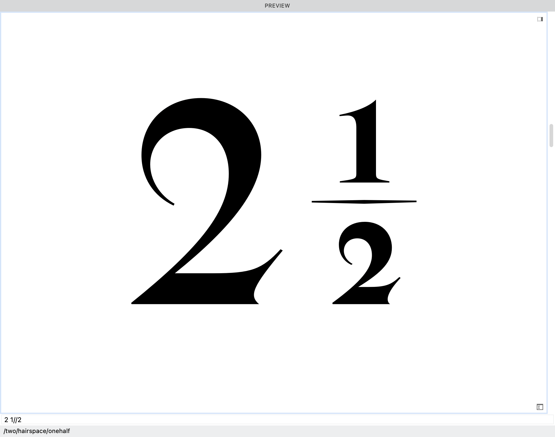
Nut fractions are technically OpenType feature afrc, but can be used as default fractions in the frac feature.
Note
Afrc is not supported in any apps that I know of. If you want regular fractions and nut fractions (rare), a better solution would be to make a nut fraction style set (such as ss02).
Numerators (numr and frac)
Numerators (top number in a fraction) are the same size as denominators, but are raised.
Usually the tops align with 1) lining figure height, 2) cap height, 3) ascender height, for text sizes and smaller.
In some fonts, these are at the same height as superiors.
Superiors (sups)
In many fonts these are the same size as denominator numbers and numerator numbers. This saves the font designer time.
However, often it looks better if superiors are a bit smaller than numerators.(See the tutorial on how to slightly resize using auto-layers.)
In some major fonts, the height of the superiors are identical to the numerators.
In other fonts, superiors are more raised. They even go out of the Typo Ascender.
Subscript/Scientific Inferiors (subs and sinf)
These are usually the same size as superiors.
The base of subscripts almost always go below the baseline.
- In some cases they go to the actual descender line (the bottom of the p).
- In text or caption fonts, sometimes subscripts even go out of bounds, below the Typo Descender!
- Most often inferiors go somewhere between the baseline and the p.
Overall the height of these is least standardized. They are also less frequently used than other numbers.
Ordinals
Ordinals are related to numbers.
Raised ordinals change a cardinal number (1, 2, 3) to an ordinal number (1st, 2nd, 3rd).
Ordinal forms are raised like this 1ˢᵗ 2ⁿᵈ 3ʳᵈ.
Examples are 1ª 1º (prima, primo) in Portuguese and Spanish, and the raised “e”, “er”, “re” in French, such as 2ᵉ (deuxième). In English these are numbers such as 1st. Raised ordinals (2ⁿᵈ) are less often used in English.
The height of these depends upon your number strategy.
Here are some ways people do it.
- Many times the tops of the ºª line up with the top of the lining numbers, such as 7ª. The ascending ordinals, such as ᵇ, will go above the Cap Height and even out of the Typo Ascender.
- Others put the baseline of the ordinals with the baseline of the numerators. This usually makes the tops of the ordinals less than the tops of the makes them lower than normal. This strategy is used by some fonts of FontFont. Since the ordinals are lower in this strategy, they would work better with old style figures.
- Sometimes the bottom of the ordinals line up with the bottom of the superiors. In many cases this will make the ordinals look too high, like they are flying above the numbers.
Grouping Symbols
These are remarkably difficult to design because their heights have to:
- Fit within the Typo Ascender and Typo Descender.
- Have to look like they are centered on the x-height.
- Have to look like they are centered on the caps.
- Look like they are centered on ascending letters.
- Look like they are centered on descending letter.
- Parentheses, braces, and brackets have the same height.
Meeting all these requirements is impossible!
Compromises are necessary, and there’s many ways to do it.
Usually the parentheses will go up to the ascender or thereabouts, then go down to somewhere between the descender and baseline.
Pretty much nothing looks centered. At least nothing looks overly uncentered??
Because of the complexity, it is good to make parentheses as you start your first letters.
Bar
Some designers put the bar at the same height as the parentheses. The danger of this is make the the bar look like an l in sans typefaces.
Some designers make the bar higher and lower, even going out of the Typo Ascender and Typo Descender.
Case Grouping Symbols
Capital grouping symbols (case feature) are centered on the caps. They usually go a bit over the cap height and a bit under the baseline.
Math Symbols
In previous times, math symbols +=÷, used to be solely centered on the x-height. Probably for math expressions with lowercase variables, such as 2x+y=0
Today, math symbols are usually moved a bit upward. Not entirely centered on the lining figures. Not entirely centered on the lowercase.
Like parentheses, they don’t look entirely centered on anything.
Diacritics
Descending Diacritics
Descending diacritics should fit within the Typo Descender.
However, comma accents underneath (Ș in Romanian) has an elongated shape. Also it needs a gap between it and the letter.
Sometimes it is impossible to keep in bounds.
Comma accents frequently go out of the Typo Descender bounds, especially at bold and black weights.
Lowercase Ascending Diacritics
Upper lowercase diacritics are easy. They usually line up with the cap height or ascenders.
In cases where the x height is extremely large (in the 580s and above), sometimes the lowercase diacritics might go out of the Typo Ascender.
Obviously, fonts like this will not be able to be set solid for languages requiring lowercase accents.
Ascending Uppercase Diacritics
In many cases, ascending uppercase diacritics (grave, acute, dieresis, etc.) are entirely above the Typo Ascender. (Unless you use this strategy.)
You are out of bounds.
So the main question becomes, “how high up do you go?”
Choosing the number using the line gap.
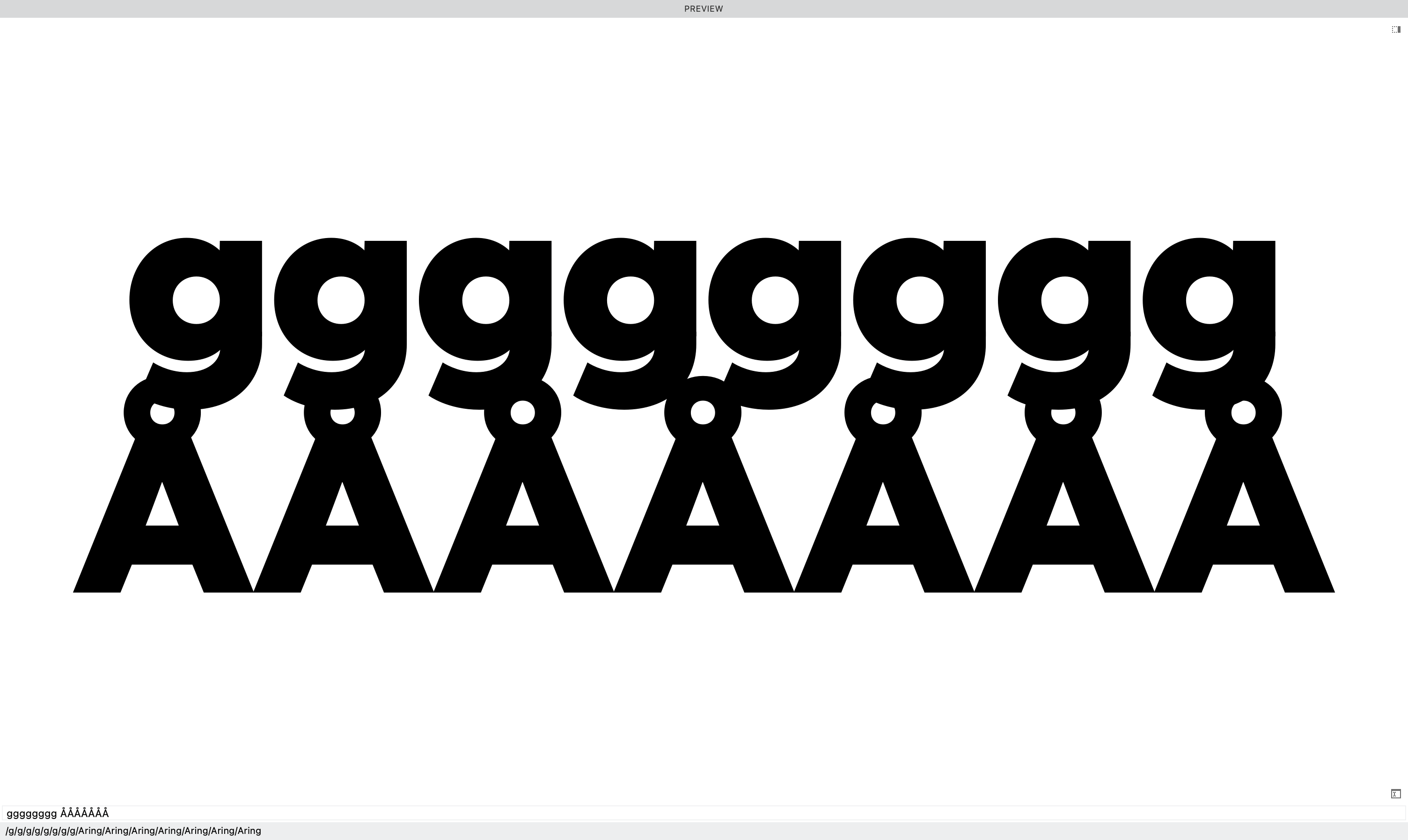
For uppercase diacritics the Å is usually the highest of the single stackers. (Except for Vietnamese.)
At zero Line Gap my diacritics crash with the g like this:
Open this file.
Go into the drawing window and look at the guides.
Basically, just add 50 to the Typo Ascender. Then add a guid.
These guides will tell you exactly where the line gaps are!
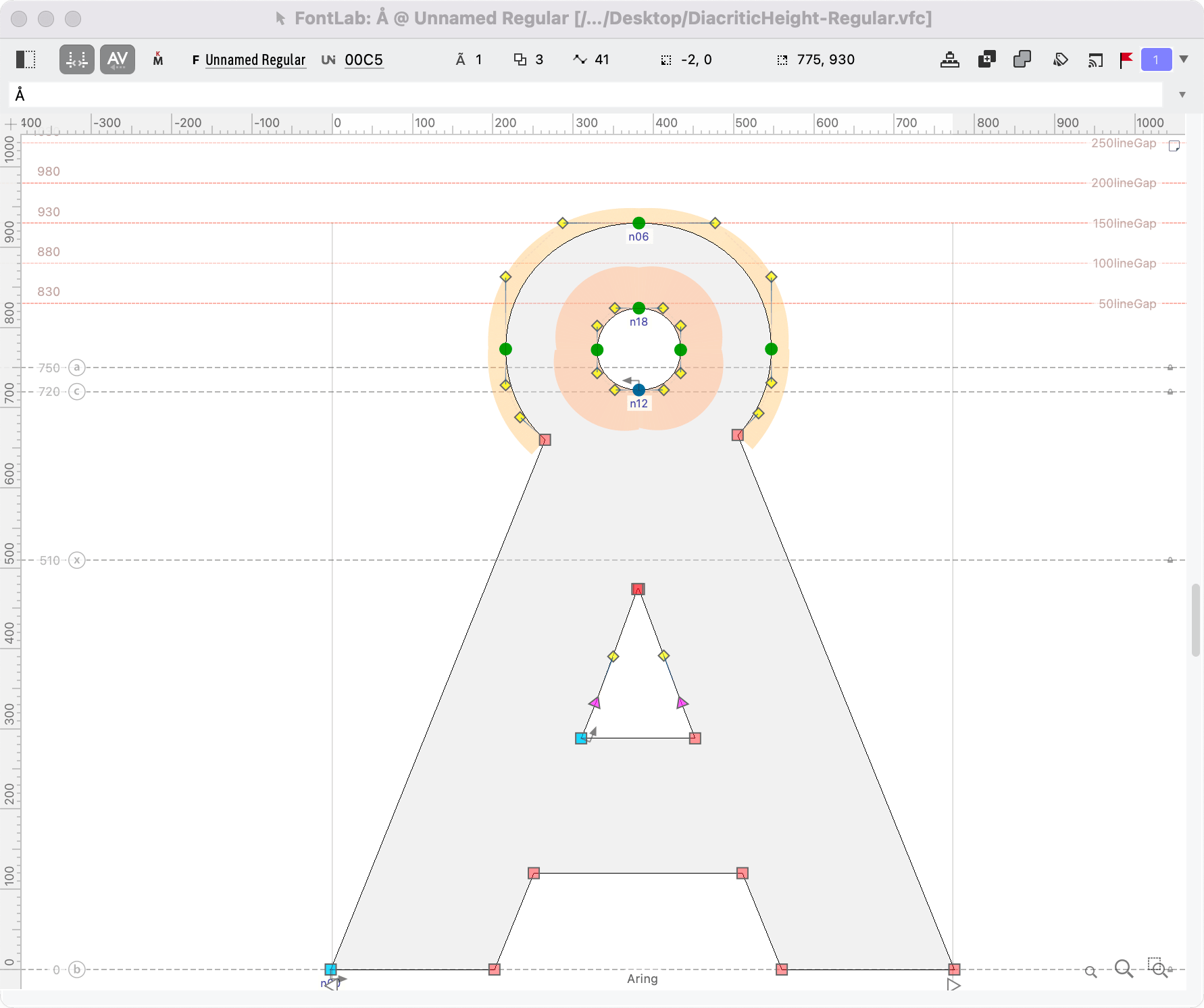
You can see here that my particular Aring goes up to 930, which means it would be about touching the g, with a line gap of 150.
Soo….
A gap of 200 would make more sense.
Tip
Since you want the fonts in your family to match, make sure that you do this test in your heaviest and tallest master.
Note: We are not actually choosing our line gap now. We’re just trying to get an idea of where our diacritics should be.
Here’s the math: Suppose someone using a desktop publisher wanted to set the above font in Swedish (which uses the Å g), and they wanted the font at 24 points. They would need a line height of
(UPM+lineGap)×point size=(100%+20%)×24We’ll think of UPM as 100% and the line gap as 20% in this case.
=(1+.2)×24=1.2×24=28.8So they would need about 29 points of line height to prevent all crashing, but they could probably get away with 28. (Though it would get tight if a g was exactly above an Å.)
Punctuation
Quotation “”
Quotation marks are aligned (listed from most frequent):
- With cap height
- With actual ascender
- Between cap height and actual ascender.
Usually they will have an overshoot, but if they have a flat top, usually there will be no overshoot.
The bottom of quotations are somewhat aligned with the x-height, but since the x-height varies so much, there’s no hard and fast rule.
Guillemet «»
Guillemets are usually centered on the lowercase «xox», but can be a bit above center.
Often font designers include a case feature that moves these up for all caps.
Keeping Track of Heights
It is difficult to track all these heights!!
You can use a mixture of guides and zones to help.
We’ve already seen how to create zones. Let’s create guides.
Creating a Guide
Open one of your files or create a new one.
Now push CmdR to turn on the side rulers. Or go to menu: View > Rulers (toward the top).
From the ruler, hold shift and drag out a guide. You should have a dotted guide.
Dotted guides are font guides and show up for all your letters, unless you tag them.
To make the guide have width like a zone, click the guide.
Go to the property bar at the top of the drawing window.
Put a positive or negative number here.
Consistent Design Features
Also, use guides to get consistent design features, such as the notches of you letters.
Info
Of course for certain styles, such as geometric sans light, it is not possible to make all notches equal.
Messy Guides
Guides can get pretty messy if you don’t clean them up.
See this tutorial on measurement and guides to know more.
Final Word
I was fortunate enough to meet the late great Mexican actor Ricardo Montalbán. He had more presence than anyone else I had ever seen, before or since. He kept you at the edge of your seat. He seemed larger than life.
I was so enthralled that I forgot, until the end, that he was in a wheel chair.
Height is only one aspect of what I call in symbols “presence”.
It’s not just how tall something is. It’s how it holds itself. How confidently it relates to those around it.