Briem’s notes on type design: Spacing
The old
Jan Tschichold, one of the great typographers of the twentieth century, published in 1952 some examples of good spacing and bad ( Meisterbuch der Schrift, Otto Maier Verlag, Ravensburg). He made these comments.

“Legible, and attractive.”

“Unsatisfactory. A thicket of letters. Frequent mistake.”
Tschichold examples were meant to “serve not just the moment,” as he put it, but provide a lasting standard for lettering and typography. But time passed. Technology moved on. Tastes changed. _
The new
In 1950, two years before Tschichold’s treatise, the Stempel typefoundry released Hermann Zapf’s Palatino. (It, too, has changed.)
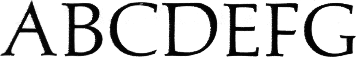
This example of Palatino was scanned from a sample of the first version. The letter A slants slightly to the right and has a high bar. The second arms of the letters E and F have no serifs. The curve of the letter D is unusually high.
The design stood out. The lettershapes were striking. The spacing was tight. (I thank my friends at Linotype for copies of the original work drawings.)

Forty years later, Palatino has changed. In proportions and lettershapes, it is closer to conventional text faces. It has more serifs.
The spacing is even tighter and more demanding. What Tschichold condemned, Hermann Zapf practised. It carried the day.
Notes on type design. Copyright © 1998, 2001, 2022 Gunnlaugur SE Briem. All rights reserved. Republished with permission in 2022 by Fontlab Ltd.