Variations»
When you work on a type design in FontLab, you design the shape (look) of each glyph, but you can also design the variation of each glyph.
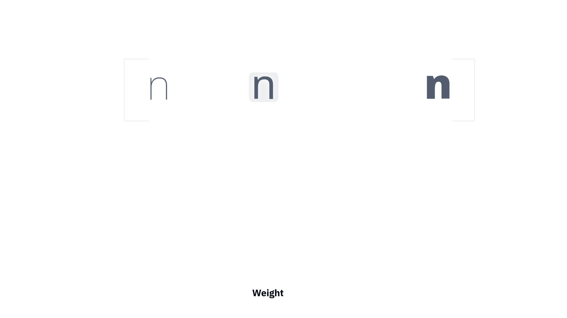
In metal type and in traditional digital fonts (“static” fonts), a font with “regular” weight was completely separate from a font with “bold” weight. The users could switch between those two, or perhaps a few more, weights, like you would switch the channel on your TV. But as a type designer, you can fluently change the weight or some other aspect of the design, which is more like using sliders to change the brightness, contrast or volume of the TV.
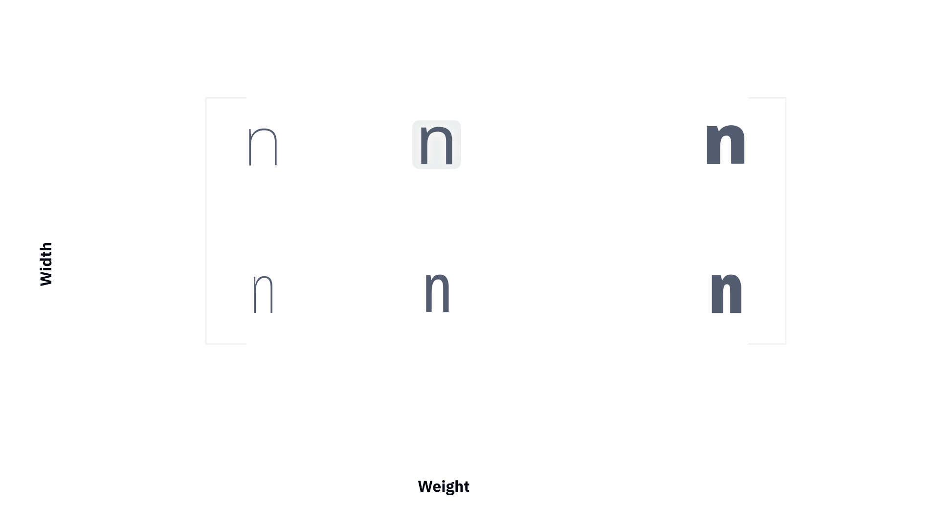
An aspect of the font that changes fluently (such as weight, width, slant, contrast, optical size or ascender length) is called a design axis. All axes together form the design space.
In FontLab, you can add multiple masters to your font. In these “master styles”, you design how each glyph looks when it’s “regular”, “bold”, “condensed”, “wide” etc. Each master has a numerical location on each axis. along these axes.
Masters are like “key frames” of the variation. If the masters match (are geometrically compatible), you can use interpolation to combine your masters at a requested axis location and to to produce instances: intermediate, blended snapshots of the variation. You can preview instances dynamically at any axis location, and you can predefine some instances by giving them names.
Type designers used variation in font editors like Fontographer and FontLab Studio 5 for more than two decades. They would design the masters, then pick a set of instances, and export them as a family (or part of a family) of traditional static fonts in the OpenType format or older formats such as Type 1. But with FontLab, in addition to static fonts, you can also export your multiple-master design as one variable OpenType font, so that the end-user of the font can dynamically choose any instance within the font’s design space.
Note
The extension of the OpenType font format that allows this is called OpenType Variations and was introduced in 2016. It is based on Apple’s TrueType GX Variations format and Adobe’s Multiple Master format, which both originated in the 1990s but never became popular at the time. You can read the details in this introduction from John Hudson, and in the OpenType specification.
Axes»
When a type design changes some typographic property via interpolation, that property is called a design axis. You can create up to 65,536 (64K) axes, each representing the change of a different typographic property: weight, width, optical size, slant, serif size, contrast, ascender length and so on. The user can choose a location (a numerical coordinate) on an axis, and sees the font change shape accordingly.
In FontLab, an axis has a name, a two-letter code that FontLab uses internally, and a four-letter axis tag that is used in the Variable OpenType font format.
The OpenType specification has a list of registered axes that correspond to common types of variation: weight (wght tag), width (wdth), italic (ital), slant (slnt) and optical size (opsz). More axes may be registered in future. If your font changes along an axis that is not yet registered (for example serif length), you must use an axis tag that begins with an uppercase letter and contains only uppercase letters or digits. FontLab defines a few unregistered but common axes: for example, our built-in Serif axis definition uses the tag SERF.
Axis coordinate systems»
Each axis has numerical coordinates where you “place” your masters and instances. Note: axis coordinates are not in any way related to the Cartesian x and y coordinates on which you place nodes, handles, guides etc.
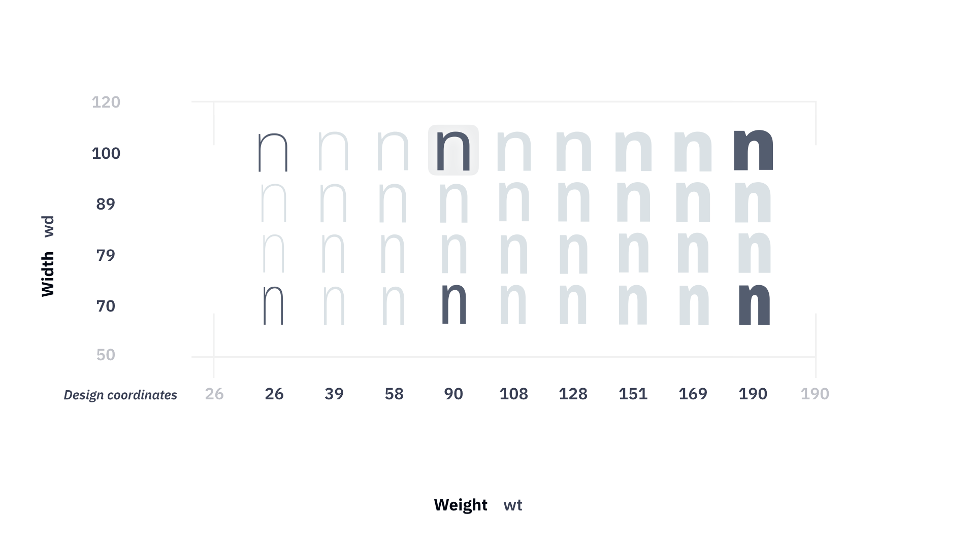
Each axis has two coordinate systems (or “scales”) that are linked together: user and design coordinates. Each master and instance has a location that uses these coordinates. A location is a bit like a “house address”, but expressed in two types of units. The design coordinates are picked by the designer, so they’re a bit like U.S. miles, nautical miles, leagues, furlongs and other kinds of length units. The user coordinates are more standardized across fonts, so they’re a bit like the “metric system”.
Your variable OpenType fonts should use the standardized user coordinates (“meters”), but when you design, you can work in whatever design coordinates you choose, which includes “meters”, so you make your design coordinates the same as the final user coordinates. When FontLab exports variable OpenType fonts, it needs to convert between these two systems. The “conversion rate” between design and user coordinates of each axis does not have to be linear — you can influence it by editing the axis graph.
Design coordinates»
Design coordinates are the coordinates that type designers use internally when they create a font with multiple masters. You can use user coordinates as your design coordinates, but you can also use more meaningful numbers.
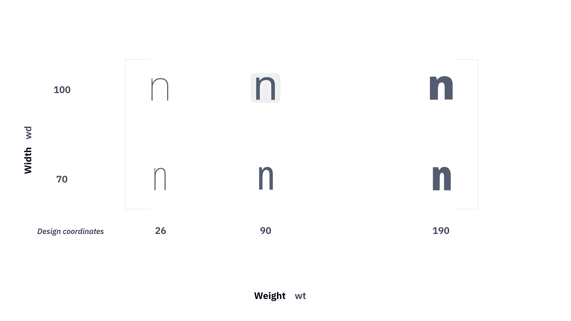
For example, many designers use the thickness of the vertical stem in the n glyph in font units as their design coordinates for the Weight axis. This is helpful because you can measure some contours in some glyphs visually, and use those same numbers for axis coordinates. The design coordinates are only used in development font formats — they’re never exported into any end-user fonts.
User coordinates»
User coordinates are the coordinates that end-users of a variable OpenType font see when they interact with sliders in apps such as Adobe Illustrator, or with the CSS font-variation-settings property. The user coordinates are only used in Variable OpenType fonts, and in development font formats. They are not used in static (non-variable) fonts.
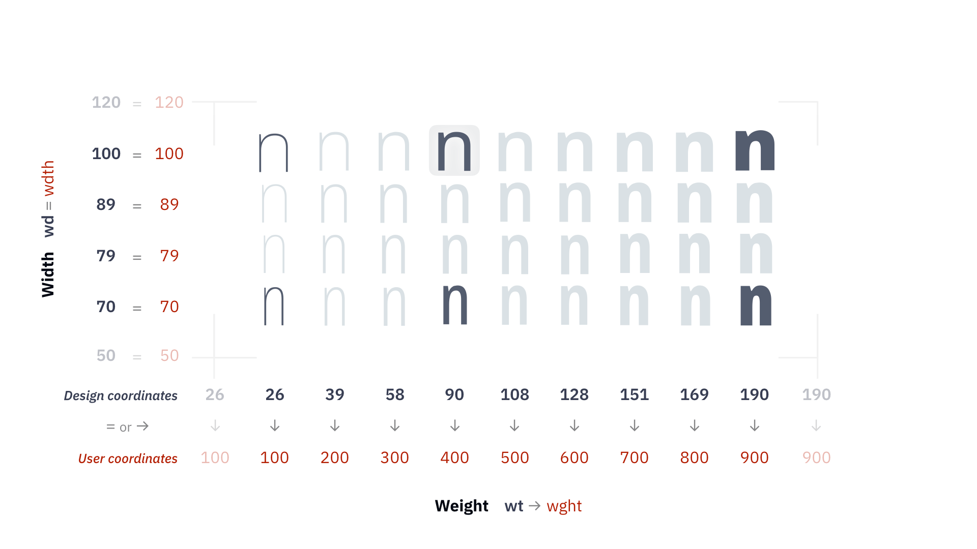
The OpenType specification mandates that for registered axes, user coordinates are standardized across fonts. For example, a regular weight in an OpenType variable font must have the location 400 on the wght axis, and a bold weight must have the location 700.
Normalized coordinates in variable OpenType»
Variable OpenType fonts don’t use design coordinates, but they have their own secondary coordinate system (scale) called normalized coordinates. The normalized coordinates are used internally by the OpenType font.
The range of the normalized coordinates goes from -1 to 1. When FontLab exports a variable OpenType font, it makes a linear translation of design coordinates between the lowest master and the main master to -1…0 normalized coordinates, and makes a second linear translation of design coordinates between the main master and the highest master to 0…1 normalized coordinates. If the axis graph mapping between the design and the user coordinates is more complex, FontLab converts it to the OpenType avar table that maps between normalized and user coordinates.
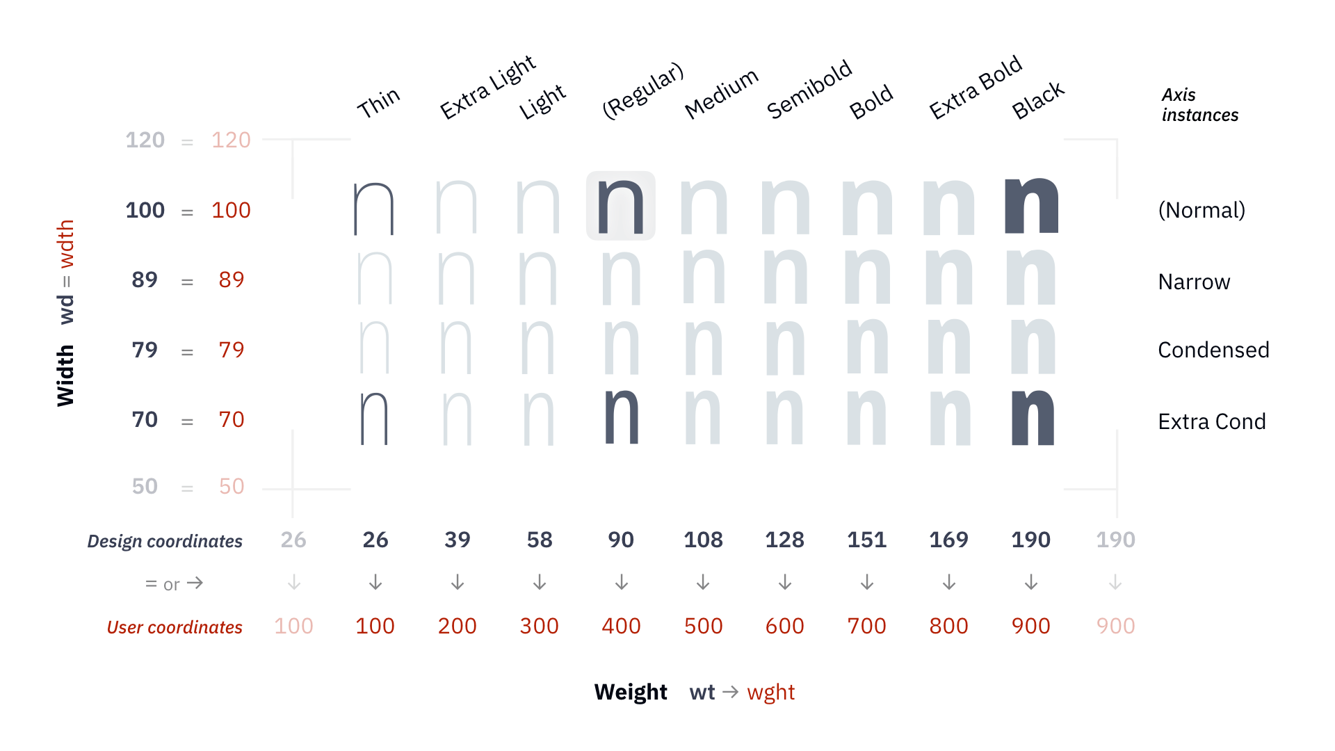
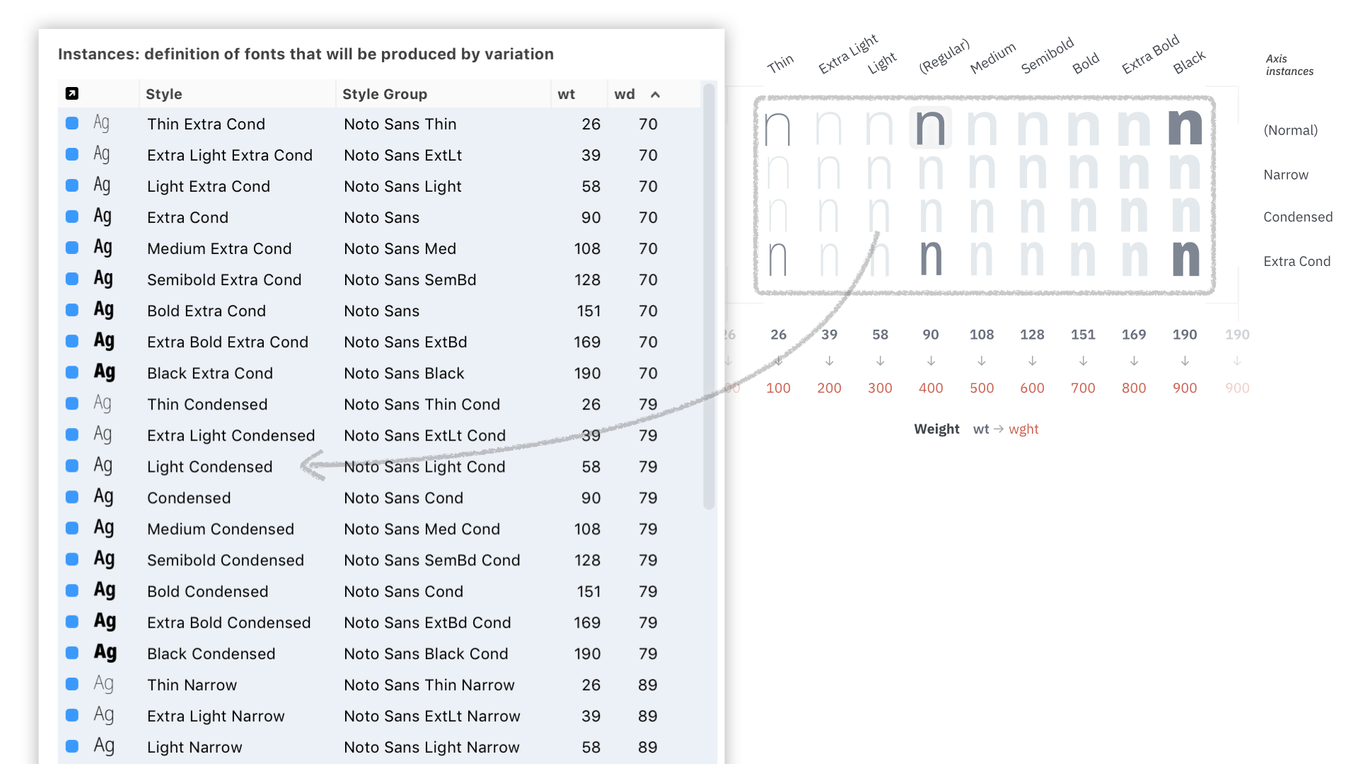
Axis instances»
Each axis can contain several named locations (axis instances). In a font with multiple axes, you can produce a list of predefined instances as a combination of all axis instances. FontLab can also export the axis instances into a variable font as a STAT (style attributes) table. The STAT table is a mandatory table in variable OpenType fonts, and future apps may use to let end users select instances from a series of per-axis lists of axis instances, instead of presenting end users with a huge list of predefined instances.
Axis ranges»
In FontLab, the design coordinates of an axis have a range that goes from a minimum to a maximum value. The user coordinates of an axis also have their range. Those ranges are only used inside FontLab.
The design coordinates range controls the range of the sliders and map in the Variations panel, so you can change the range to allow extrapolations.
You can also change the user coordinates range to define the Axis Graph that performs the mapping (“conversion rate”) between design and user coordinates — even if you haven’t created masters that are located at the edges of that range.
Those ranges are not used in the variable OpenType fonts. When you export a variable OpenType font, FontLab uses the existing masters with the smallest and largest location on an axis to determine the user range that goes into the font. When you open a variable font, FontLab uses the range stored in the font to determine the user and design ranges.
An example axis would be Weight with the code wt, tag wght, the user range minimum 1 and maximum 1000, and the design range minimum 11 and maximum 370. You can place masters anywhere within the design range, and you can decide how the design range converts to the user range.
Masters»
Font masters»
A font master in FontLab is a complete “font” that is has a defined location on each axis. You can define some font properties for a font master in Font Info: dimensions, some names, stems, zones, font guides and some other parameters and values. A font master also contains its own set of kerning classes and kerning pairs.
In addition, a font master is associated with font master layers in all or some glyphs — or, in other words, any glyph layer that has a name identical to a font master’s name is associated with that font master.
By default, when you add a font master, FontLab will also add associated glyph layers for all glyphs in your font. However, you can add a font master without adding any font master glyph layers. You can remove a font master and choose to also remove the associated glyph layers.
You can rename a font master and the associated glyph layers. But you can also add, remove or rename a glyph layer in all or some glyphs without renaming the font master — then those glyph layers become disassociated from the font master. If you give a glyph layer a name that matches a font master’s name, the glyph layer becomes associated with that font master.
A variable font master also defines the location in all font axes, which allows it to participate in interpolation. A variable font master also needs the associated glyph layers to be variable. A glyph layer is variable only if its contents matches the contents of other variable master glyph layers, that is if the number and order of elements are the same and those elements have the same number of contours and the same number of segments.
At a minimum you need a total of one font master, plus one font master per axis. Each axis must have font two masters that have different coordinates on that axis.
Font-less masters»
A font-less master is a variable glyph layer that contains the design at an axis location where a font master does not exist. Font-less masters can be used to correct interpolation results for particular glyphs, but they do not contain font-wide information such as kerning.
Instances»
An instance is a “snapshot” of the interpolation process at a chosen location within the design space. FontLab can generate a “static” (single-master) font from an instance.
You can predefine some instances in File > Font Info > Instances. The predefined instances are “named snapshots”.
The particular instances that you choose to name are primary instances. Primary instances can be used in an output variable font, or output as separate, standalone fonts. Each kind of variation in a variable font is an “axis.”
For example, you can design a master with “regular” weight and a master with “black” weight, and derive an instance which has a weight somewhere between the “regular” and the “bold”.
For example, if you design a Variable font with a weight axis, you could have an Extra Light master and an Extra Bold master. Each master has its own set of glyph outlines. There would be hundreds of possible in-between instances. Some of these you could label some specifically as the Light, Regular, Medium, Semibold and Bold weights.
Interpolation»
Simply speaking, interpolation between two masters on one axis works a bit like mixing a drink from two ingredients. If you put gin and rum into a glass in equal proportions, then your drink will taste like a 50%–50% combination of gin and rum. If you put much more gin and only very little rum, then your drink will taste very much like gin and only a bit like rum.
If you have two masters, one “Light” (at the “weight” axis location 300) and one “Bold” (at the “weight” axis location 700), and you derive an instance at the axis location 500, then the resulting instance will look like a 50%–50% combination of Light and Bold, because the Light master contributed its design in 50%, and the Bold master contributed its design in 50% (500 = 0.5 * 300 + 0.5 * 700). Since both masters contributed equal interpolation factors, the instance will be a style that is in-between both masters in equal proportions.
But if you derive an instance at the axis location 340, the Light master will contribute its design at the interpolation factor of 90%, and the Bold master will contribute its design at the interpolation factor of 10% (340 = 0.9 * 300 + 0.1 * 700), so the result will be much closer to the Light master.
During interpolation, FontLab finds corresponding (matching) points (nodes and handles) in all masters of a glyph, and for each point, it calculates the final position in the instance by taking the interpolation factor the point’s x and y coordinates in all masters. Similarly, it calculates the position of elements, the advance width and the kerning pair values.
Design space»
The axes combine to form the design space, a multi-dimensional space where each axis is a dimension. An example of a design space would be two axes: weight (code wt) and width (wd), with four masters:
Thin Narrow, at the locationwt=200,wd=75Thin Wide, at the locationwt=200,wd=120Bold Narrow, at the locationwt=700,wd=75Bold Wide, at the locationwt=700,wd=120
With such a design space, you could choose an instance at the location wt=500,wd=100 which would be then interpolated, and would represent a design with Medium weight and Normal width.
See Working with Font Variations for how to work with axes, masters and instances in FontLab.