Creating an Italic Font»
How to create an italic font to go with an existing upright font.
Process overview»
- Start a new (renamed) font file based on upright
- Change internal name information
- Prototype
- Define italic angle and offset
- Revise glyphs
- Generate font
- Test with upright font
Start a new (renamed) font file based on upright»
If you created the original upright font in a font editor, then the source file you used is the ideal starting point. If not, or if it’s a format FontLab does not handle, you can start with a final-output format such as .otf or .ttf.
Take the upright file, and make a copy of it. On macOS you could Ctrl-click (right-click) the file and choose “duplicate” from the pop-up menu. On Windows, Ctrl-click (right-click) the file and choose “copy” from the pop-up menu, then Ctrl-click (right-click) the destination and choose “paste” from the pop-up menu.
After the file is duplicated, rename the file. For example, if the original was Glurbish-Regular.vfc, name the new file Glurbish-Italic.vfc.
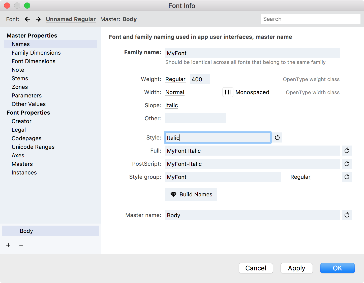
Change internal name information»
Open the Font Info dialog: File > Font Info (CmdOptionF)
- Click on the “Plain” next to “Slope” and change it to “Italic”
- Click on the circling arrow button next to the Style to regenerate that entry. (For example if it says Regular or Roman it should change to Italic. If it says Bold it should become Bold Italic.)
- Click on the diamond button that says “Build Names” to regenerate other name entries such as the Full and PostScript names.
Prototype»
Design some italic glyphs! Figure out how much of a slant the italics will have, and find the basic design principles of your italic. A typical slope for an italic is about 9° to 12°, but anything in the 7°–14° range is not too unusual. (When the operating system does a “fake” italic it is more like 20°, but that is partly in lieu of having any design change, and perhaps to make the fake italic more obvious.
Depending on the design, you may plan to:
- redraw nearly all glyphs from scratch
- start the capitals and numbers by slanting, but redraw the lowercase
- start all glyphs by slanting, or a mix of slanting and rotating (for round shapes such as “O”).
Generally speaking, serif typefaces and humanist shapes tend to get more re-drawing, and sans serif typefaces, particularly more “constructed” and less calligraphic ones, tend to be more closely based on the upright letterforms. However, even the most constructed sans serif will benefit from some optical corrections after slanting, as it distorts letterforms, particularly round parts.
Set Italic Angle»
In the Font Info panel, or in the Font Info dialog in the Font Dimensions section, set the Italic Angle, and then reset the auto-calculated Caret Offset by clicking the button next to the Caret Offset. (That tells the app/OS how much to shift the cursor after slanting it, usually a negative number for an italic font. Auto-calc is usually a good start.)
Revise Glyphs»
Generate Font»
Export your italic font in the same format as the upright font using the same procedure.