Font Sizes and the Coordinate System»
The Em and the UPM Size»
Each glyph is designed in a space called an Em. The Em in metal type was originally a square of metal the same height and width as the point size. This may have gotten its name from an average letter “M” that required a block of about that width.
In digital type, the Em is simply an imaginary space, subdivided into a grid for design purposes. The division is usually 1000 or 2048 units, referred to as Units Per eM (UPM) size. Think of these units and the grid as relative coordinates rather than as specific physical distances.
In FontLab, you can set the UPM in File > Font Info > Family Dimensions.
When type is imaged on screen or in print, the Em is scaled to the desired size. For example, when type is scaled to 12 points, it is the Em that is 12 points high, not any particular/specific part of the type or its letters. Defining a font in this fashion allows a single outline to be scaled to any size requested. It is also independent of any single writing system, allowing a common scale for things as diverse as symbol fonts, Arabic, Chinese and English (this diversity is why we can’t just specify all font size by, say, cap height).
The font’s effective height is determined by the distance between the highest and lowest points on the outline, which might be the ascender and descender in western (Latin) fonts. This can be more or less than the height of the Em.
The position of the baseline in the Em is always at zero in the X direction; but how much of the Em is above the baseline and how much is below can vary. Generally in western fonts it is 75–80% above and 20–25% below.
If a font has 1000 UPM, to get a text string with a height of 100 pixels (assuming that we use a raster output device), the rendering system would scale this font by 10%. If a font has 2048 UPM size of 2048, to get a text string of 100 pixels it would need to be scaled by 4.9%.
The maximum UPM size allowed by font format specs is 16,384 for TrueType and OpenType TT.
OpenType PS fonts usually have a UPM size of 1000 font units. Although they can theoretically have any UPM within the spec limit, there are various old systems and workflows with lower limits. If you intend to output as OpenType PS (.otf), whatever UPM you use, keeping all glyph coordinates within ± 4095 units in X and Y on the grid is “safer.”
Microsoft promotes having UPM for TrueType fonts always be a power of 2 for performance reasons. However, on modern hardware this is rarely an issue. TrueType and OpenType TT fonts typically have a UPM size of 2048 units, although other values are more common than is the case with OpenType PS fonts.
Glyphs are not restricted directly by the Em, but font consumers (operating systems and applications) may have unexpected problems with glyphs that exceed the Em by dramatic amounts. We recommend restricting all vertical (y direction) coordinates to not exceed ± 1.3 x the Em.
Font Units»
The coordinates of any object in the font are presented in a standard, somewhat abstract, measurement system. One unit of this system is called a font unit. All positions of points, anchors, guides and elements, all sizes of contours and elements, all dimensions, advance width, sidebearings and kerning values are measured in these font units. The scale of font units used in a particular font is the Units Per eM (UPM) size. The program that scales the font knows the UPM size of the font, and can use this UPM to properly scale it. To get a text string to render in the same visible size when set in different fonts, the font that has a larger UPM size must be scaled with a smaller scale factor.
FontLab supports fractional coordinates for all nodes, metrics, etc. Turning off Contour > Coordinates > Round when Editing allows FontLab to perform all operations in fractional space. Turning off Contour > Coordinates > Preview Rounding allows FontLab to show decimals in the positions. The advantage of fractional precision rather than rounded coordinates is that you can scale and transform freely, and operations can be reversed without loss of accuracy.
The final output fonts must use integer coordinates if they use TrueType outlines, and using higher-precision coordinates with PostScript outlines is non-standard and results in larger font file sizes. So FontLab still has to round the coordinates on export for TrueType-based font formats. You may control rounding coordinates for PS-based font formats in Export Profiles.
Contour > Coordinates > Apply Rounding instantly rounds the coordinates of all items in the current glyph to the integers.
Font and Family Dimensions basics»
All font dimensions are also measured in font units and depend on the font UPM size.
Family dimensions (also known as font family metrics) are the dimensions common for the entire family, used to determine the linespacing. This includes baseline, the ascender and descender lines, safe top and safe bottom, and the line gap.
Font dimensions are the dimensions common for the entire font. This includes Caps-height, x-height, italic angle etc.
You can view and change all font and family dimensions in the File > Font Info dialog box.
A more “graphical” font parameter is the font bounding box (BBOX) height. It is important not to confuse UPM size and font BBOX height. UPM size is just a scaling base. Font height, on the other hand, depends on the font design and differs between fonts — even within the same family:
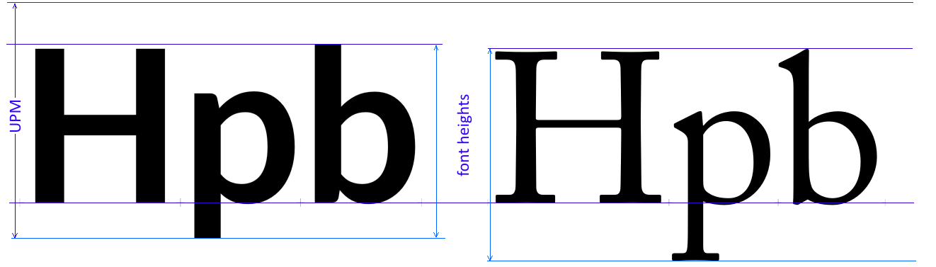
The font BBOX can be defined as the distance from the bottom of the glyph that goes furthest below the baseline, perhaps the ‘p’, and the topmost point of the tallest glyph, perhaps the cap A with ring accent, or a tall lowercase character such as ‘b’, or some symbol (such as partialdiff). Sometimes a font contains even taller glyphs, but the BBOX may be calculated on some particular subset of glyphs, such as Win-ANSI (codepage 1252) and ignore taller/lower values from other glyphs.
PPM Size»
PPM means pixels per Em. It simply means the scaling factor applied to the font, expressed in terms of how many pixels or dots are used to image something the size of the Em square, with that scale factor.
For example, if you print 12 point text (which means the Em is scaled to 12/72 or ⅙ of an inch) on a 600 dpi printer, you have scaled the font to fit at 600 x 12/72 = 100 ppm. If your cap height in that font is 70% of the Em square, you will see your caps coming out 70 printer dots high.
If you have text at a nominal 15 “pt” on screen, in an environment where a point is 4/3 of a pixel (the standard for the web), then your font is being scaled to 60/3 or 20 ppm. Here, a 70% cap height would mean your caps end up 14 pixels high.
Note that the UPM has no impact on the PPM size. Also, as few things (if any) in a typical font are the same height as the Em square, output at a given PPM size does not mean that anything major will be that size—most things will be smaller.