Panels»
A Panel is a small window with valuable information and/or controls relating to a single category of functionality, such as Font Info, Glyph Info, Transformation, Guidelines, Elements, etc.
You can open panels by choosing their names in the Window > Panels menu. Or you can open the Panels List Window > Panels List, the special panel containing a button for every other panels — and open or close panels by clicking on the corresponding buttons. Buttons corresponding to opened panels are highlighted in blue.
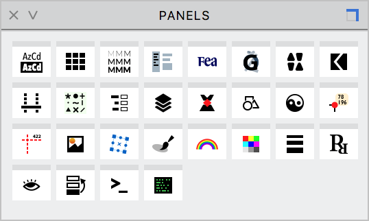
The panel names in the Window > Panels menu are sorted alphabetically so that it is easier to find them. Buttons in the Panels List have the different order.
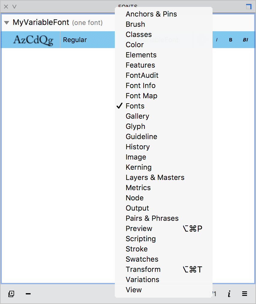
But the quickest way to open panels is to Ctrl-click on any panel’s title bar and select the panel in the dropdown menu:
Note
Some panels, associated with a particular production mode, cannot be accessed either from the Window > Panels menu or via the Panels List. Currently the only one is the TrueType Hinting panel, which appears when you select the TrueType Hinting tool (CmdShiftF7). There may be other production modes in the future, which will get the same treatment.
To close a panel, click on the “X” icon in the top-left corner.
To resize a panel, drag its edge (a blue line appears). If it’s undocked you can also drag its corner.
To move a panel, drag it by any grey space within the panel.
Panel Groups»
Panels can not only float freely, but most of them can also be connected together to form Panel Groups. If a collection of panels is displayed together connected edge-to-edge (generally in the vertical direction) they form a Docked Panel Group. On the other hand, if panels are stacked on top of another (in the Z-axis), they are displayed as tabs and form a Tabbed Panel Group. In addition, they can be anchored to the edge of the screen or a window.
To add a panel to a docked panel group, move it close to an edge of the panel or panel group where you would like to attach it. If docking is possible, a blue line will appear on the edge. Drop the panel here to dock it. To undock a panel, drag its panel header out of the group. Note that the leftmost or topmost panel can only become undocked or free, if all the panels docked to it are undocked one by one. To move a docked panel group, drag the topmost or leftmost panel header, depending on whether the panels are docked vertically or horizontally.
To add a panel to a tabbed panel group, move it on top of the panel or panel group where you would like to stack it. If the panel can be added, a translucent blue layer will appear on the base panel(s). Drop the panel here to stack it. Once you do this, a tabbed footer will appear if you have connected two panels; or a new tab will appear in the footer if you have added a panel to an existing group. To bring a tab forward, click on its panel tab. To remove a panel from a tabbed group, drag its panel footer out of the group. To move a tabbed panel group, drag the panel header.
Note that you can connect existing panel groups with individual panels or panels groups to make new docked or tabbed groups by following the same steps that are described above.
To anchor a panel to the edge of the app window, move it close to location where you want to attach it. If anchoring is possible, a blue line will appear. Drop the panel here to anchor it.
Panels in the tabbed panel groups may pop forward when you select some object in the Glyph window. For example, selecting a node can bring the Node panel forward, selecting an anchor will bring the Anchors and Pins panel forward. You can switch this feature off in Preferences > General.
When a panel is not docked, stacked or anchored (i.e. it is free-floating) it has a square toggle on the right corner of in its title bar:
| Toggle | Description |
|---|---|
 |
The panel cannot be anchored to windows, screen edges or other panels |
 |
The panel cannot be anchored to windows, but it can be grouped with other panels to form docked or tabbed groups |
 |
The panel can be anchored to windows, screen edges and to other panels to form docked or tabbed groups |
You can click on this toggle button to control the behavior of individual panels.
Note that windows accept panels only when the All fonts and glyphs open in tabs option is selected in Preferences > General.
List of Panels»
FontLab VI has the following panels:
| Icon | Panel Link & Description |
|---|---|
 |
Anchors and Pins panel shows the list of anchors and pins associated with the current glyph |
 |
Brush panel allows you to change the size and shape of the Brush Tool |
 |
Classes panel shows OpenType and kerning classes, and allows their addition and modification |
 |
Color panel is a color picker for selecting and applying colors to contours and their fills |
 |
Elements panel helps you manage all the Elements in the current layer |
 |
Features panel to manage OpenType features |
 |
Font Info panel shows only the most principal font properties |
 |
Font Map panel is the functional replacement for the Font Window in FontLab VI |
 |
FontAudit panel lists all errors detected in the current glyph |
 |
Fonts panel shows you the opened fonts grouped by families, it also contains buttons for all main file operations: open, save and export |
 |
Gallery panel is the container of all named Elements in your font |
 |
Glyph panel shows all the properties of the current glyph |
 |
Guideline panel shows the properties of the currently selected guideline, and allows modification of these properties |
 |
History panel records all operations you perform with glyph contours, glyph metrics, kerning or glyph info |
 |
Image panel lists bitmap filters which can be applied to image Elements |
 |
Kerning panel includes the list of kerning pairs defined in the current font |
 |
Layers and Masters panel shows all lists and masters of the current glyph and allows their addition and modification |
 |
Metrics panel shows the name and metrics of all the glyphs in the current font, with an option to preview glyphs one at a time |
 |
Node panel shows all the properties of the selected node and allows one to edit them |
 |
Output panel is used to show the results macro program interpretation in the Scripting Panel and errors and warnings produced by the Features Panel |
 |
Pairs and Phrases panel lists pairs and phrases that can be used when working on glyph metrics and kerning |
 |
Preview panel is a text editor within FontLab VI where you can preview text |
 |
Scripting panel is where you can create or modify Python scripts |
 |
Stroke panel shows stroke attributes for selected Elements |
 |
Swatches panel contains several standard sets of colors that can be applied to contours and their fills |
 |
Transform panel allows you to apply simple transformations to the selected area or to the whole glyph layer |
 |
Variations panel is where you deal with Variable Fonts |
 |
View panel can be used to easily toggle the visibility, snapping behavior and lock status of various details of the Glyph Window |