Elements panel»
The Elements panel Window > Panels > Elements helps you manage all the Elements in the current layer.
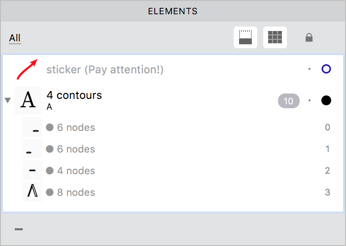
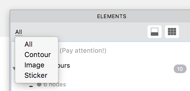
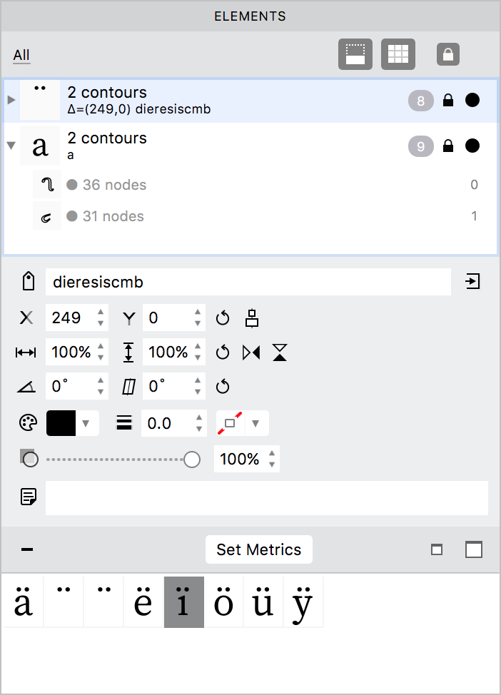
The Elements panel lists not only contour elements, but elements of all types. You can use the dropdown menu above the list to choose which type of elements are currently visible in the panel. The selection in the dropdown menu doesn’t change what elements you see in the Glyph Window; it only filters the list of elements in the panel.
The order of elements in this list is important. The higher elements in the list are placed over the lower elements. You can change this order by dragging-dropping elements in the desired location on the list. Note that the order of contours within an element is also pertinent for interpolation. This order can also be changed by dragging-dropping.
Element properties»
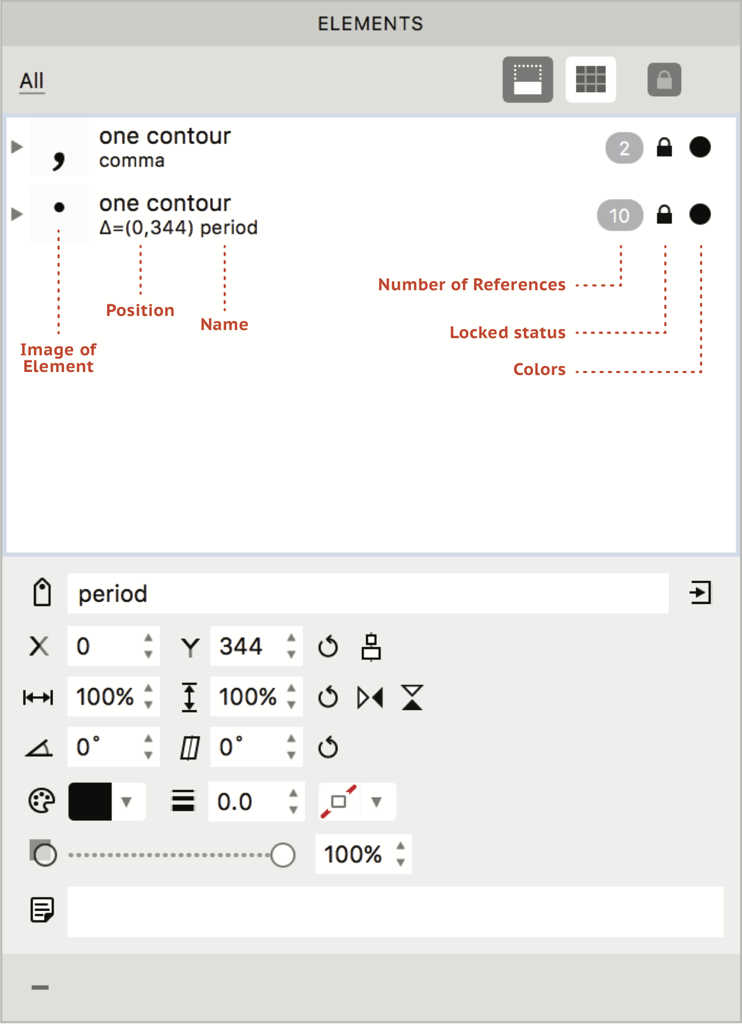
The list in the panel also shows the properties of each element: name, position in the glyph, whether they are locked or unlocked, number of references the element has and its colours.
To edit element properties, open the Properties section using the  button on the top-right of the panel. Element properties can be edited even if an element is locked. Changes to the element’s properties, except its name and text note, are applied only to that particular copy of the element. If an element is locked (which is usually the case with references), you cannot edit its contours or drag-drop to reorder the contours within the element. Once an element is unlocked, you can edit its contours, but this will change all element references in all glyphs referencing to this element.
Element name»
Type in the Name field and press Enter to name or rename the currently selected element. A named element can be accessed in the Gallery panel. Renaming an element doesn’t break element references, instead all elements that reference the renamed element get renamed accordingly.
You can create a new glyph from a selected element by using the  button. Select an element, type a name in the Name field and click on the button to create a new glyph, with the typed input as its glyph name, in which the selected element is placed as reference. Or, choose Element > New Element in the menu, draw a new element, type a name, say “test” in the Name field and click on the button at the right. A new glyph named
 test containing the reference to your newly-drawn element will appear in the font. Both references to the element will be unlocked.
Element transformations»
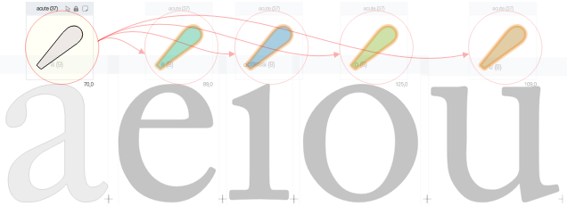
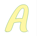
Position/shift, scale, flip, rotate, slant, body color, stroke width and color and opacity are attributes of the particular selected element. This means different transformations can be applied to references sharing the same contours. For instance, references to the “acute” element may get different colors (size, position, opacity etc.) in every glyph:
Position/Shift»
The X and Y co-ordinates show the current position of the selected element. You can modify these values to shift the element or use the reset button to set the values to 0,0. Further, the  button can be used to centre-align selected elements vertically.
Scale»
You can change the value of Width and Height to scale the selected element: values below 100% will make the element smaller; values above 100% will make it larger. Note that if you want to scale the element proportionally, you will have to enter the same value in both fields. The reset button changes the values back to 100% and the element goes back to its original size.
Flip»
Use the buttons to flip the selected element horizontally and vertically respectively.
Rotate and Slant»
Enter values in degrees to the Rotate or Slant fields to transform the selected element by that angle. Note that the point of origin is bottom left. You can use the reset button to bring the element back to its original form.
Body Color»
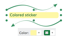
Use this option to change the fill color of the selected contour element. The result is visible in the preview mode and in the Font Window cells. All color information is preserved in the VFC format and in formats which allow colors. Changing the body color of a sticker element changes its background color.
Stroke Width and Color»
Use these options to add a stroke of your chosen width and color to the selected contour element. The result is visible in the preview mode and in the Font window cells. The stroke width is in sync with the one in the Stroke panel. All color information is preserved in the VFC format and in formats which allow colors. If the selected element is a sticker, changing its stroke color changes the color of the text and arrows.
Strokes can be reset to “no stroke” with the Element > Remove Stroke command.
Opacity»
You can modify the opacity of the selected element by entering a value between 0 (completely transparent) and 100 (completely opaque) in the input field or by moving the slider. Note that this changes the opacity of the body color and the stroke.
Element notes»
You can also add text notes to elements. Like element name, notes are applied to all element references sharing the same contours.
Element References»
Click on the  button to see the list of glyphs that contain the currently selected element as a reference:
Double-click on any glyphs in the list to add them to the Glyph window for editing. Use the Set Metrics button to copy metrics from the base glyph to the selected glyphs containing it as reference.