Font Info Dialog Box»
The Font Info Dialog Box is the space where you can define the properties of your font. It is accessible from the File > Font Info menu. The Font Info Dialog Box should not be confused with the Font Info panel. The panel acts as supplement to the Font Info Dialog Box: it shows only a limited set of properties, and can also be used to compare the properties of two or more fonts.
The properties displayed in this dialog are divided into two sections: Master Properties and Font Properties. Since variable fonts can have several master fonts and instances, the per-master information goes into Master Properties; and the general information about the font goes into Font Properties. Information from this dialog is necessary for a font to function with operating systems, applications and web browsers.
If you start a new font by giving it a family name in the Welcome dialog, FontLab will fill in enough basic information in the Font Info Dialog Box. Once you have designed some glyphs, it will be possible for you to generate a font that will install. However, in most cases you will want to further customize the Font Info to get better results.
Use the Apply button in the dialog to apply ongoing changes to the currently opened font.
Master Properties»
Names»
The names section comprises the most important font-registration information. All programs use the information on this page to refer to a font. Be sure to enter all the values very carefully and use the automatic features where available.
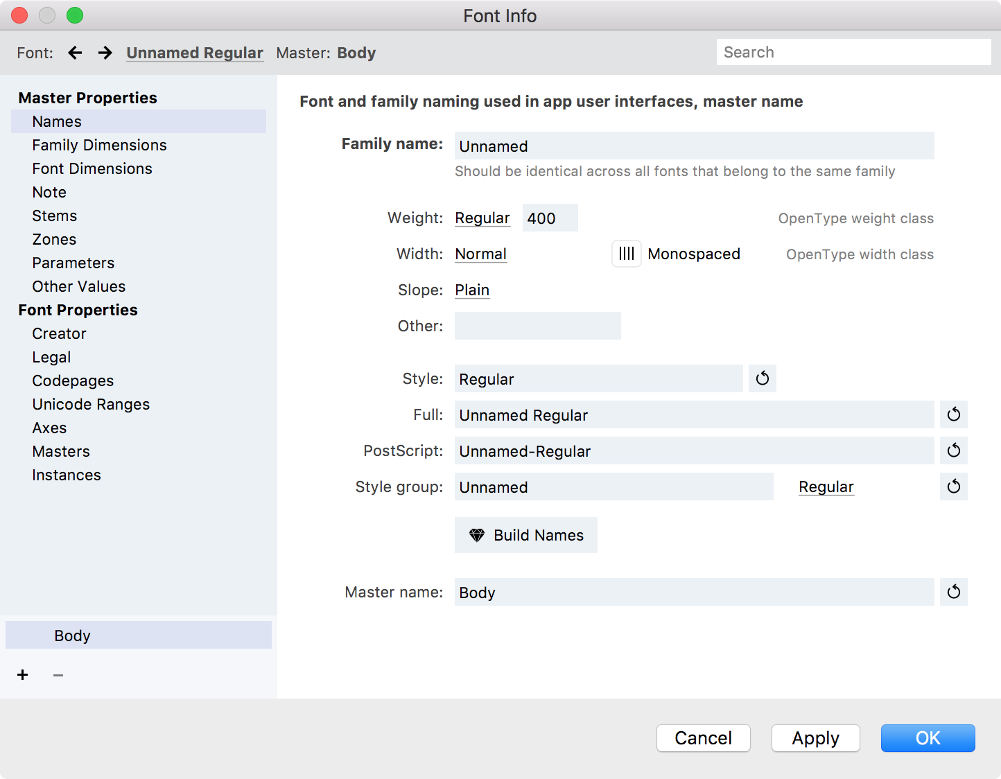
Family name»
The Typographic family name (TFN or just “Family name”) is the name under which all fonts from one family are grouped in the font menu of a modern application. It is sometimes called “Preferred family name”. Sometimes a family has only one font. Other times, there are several fonts in a family, which differ from one another in some important design attributes.
The Typographic family name may contain spaces but some vendors choose not to use any spaces here. The Typographic family name must be identical in all fonts that need to appear as one family in the font menu of modern applications. The length of the Typographic family name should be no more than 31 characters. It is recommended to use only uppercase and lowercase English letters, spaces and numerals. Usage of non-English letters and special characters such as underscores, ampersands, etc. is strongly discouraged.
Attributes»
The design attributes of a font or master describe its typographic properties. They are declared by the font vendor. The three important attributes are: Weight, Width and Slope. There is also Other for custom attributes.
Weight describes the typographic weight (stroke thickness) of a typeface, ranging from Thin to Extra Black, and defaulting to Regular. We recommend to set this attribute to a value which truly reflects the typographic weight of each font. Alternatively, if a family consists of a single font, you may set the Weight attribute to Regular, and if a family consists of just two weights, you may set the Weight attribute to Regular for the lighter weight, and to Bold for the bolder weight. This attribute is additionally expressed using a number — from 100 for Thin to 950 for Extra Black.
Width describes the typographic width of a typeface, ranging from Ultra Condensed to Ultra Expanded, and defaulting to Normal for most fonts. You should set this attribute to a value which truly reflects the typographic width of the typeface.
Slope describes whether the font acts as an upright or italic font. Most fonts (including true upright fonts and also script fonts which are cursive) should have a Plain slope. You should set the Slope to Italic only if a font should act as an italic companion to an upright font. Advanced users may set the Slope to Oblique instead of Italic.
Other is your chance to specify some way in which a style of your font differs that is not weight, width or slope. For example, if your family has different optical sizes, you might have use a set of other names such as “Six”-“Nine”-“Twelve”-“Eighteen”-“Twenty-four”-“Seventy-two” or “Tiny”-“Small Text”-“Text”-“Subhead”-“Headline”.
In other words, you may use this field for building a custom style name.
Style»
The Typographic style name (TSN or just “Style”) is the name under which a certain font within a family appears in the font menu of modern applications. It is sometimes called “Preferred style name”.
The Typographic style name typically describes the typographic properties of the font within the typographic family. Usually, it consists of a combination of keywords, which describe its design attributes: weight, width and slope. For normal width and plain slope, no keyword is used. For example, if a font’s Weight is defined as Black, its Width is defined as Condensed and its Slope is defined as Plain, then the Typographic style name would typically be “Black Condensed” or “Black Cond” or “Cond Black”. The TSN must be unique for each font with the same Typographic family name. The TSN may contain spaces. The length of the Typographic style name should be no more than 31 characters.
To automatically build the Typographic style name from design attributes, click on the Auto  button next to the Style field.
Full»
The Full font name (FFN, or just “Full name”) is a more detailed font name. It is sometimes used by applications to refer to a font by its name (for example when storing information about fonts used in a document), and is sometimes displayed to the user (mostly by font viewing or managing applications). Its length cannot exceed 31 characters. Typically, the FFN consists of the Typographic family name and the Typographic style name, separated by a space.
PostScript»
The PostScript name (PSN) is a name used internally by a PostScript printer to identify the font within a printing job. Its length cannot exceed 29 characters, and it must only consist of uppercase or lowercase English letters or digits. In addition, one hyphen is used to separate the family name portion from the style name. The family name and style name segments are derived from the TFN and the TSN, but spaces are eliminated.
Style Group»
All fonts that are associated with each other through styling links form a styling group. The Styling group name (SGN) is the name that appears in older Windows applications as the “Family” or “Font” name. It is sometimes called “Windows family name” or “Microsoft menu name”.
The typographic family must be divided into styling groups, each having no more than four members which all must be connected by styling links with each other. Each styling group within a typographic family must have a unique SGN. The length of the SGN is limited to 31 characters. It is recommended that only uppercase and lowercase English letters, spaces and numerals are used. Usage of non-English letters, special characters such as underscores, ampersands, etc. is strongly discouraged.
Note
Within one typographic family, there must be exactly one default styling group, which must have the Styling group name identical to the Typographic family name.
Style link»
The Styling link value (SLV) is the information that links a font within a styling group to a certain combination of the “B” and “I” buttons. This information is used in all applications on all operating systems. The Styling link name (SLN) is the name which appears as the name of the “Font style” in a font selection menu in applications that do not support Typographic families. Only the following names are permitted for the styling link name: “Regular”, “Italic”, “Bold”, “Bold Italic”. The Styling link name and the Styling link value are two ways to express the same information. Select the Styling link name in the dropdown menu next to the Style group field.
The following table illustrates all possible combinations of SLN and SLV in a font and how they correspond to the “B” and “I” buttons:
| “B” button | “I” button | SLV | SLN |
|---|---|---|---|
| off | off | Regular | Regular |
| off | on | Italic | Italic |
| on | off | Bold | Bold |
| on | on | Bold Italic | Bold Italic |
!!! Important:
If your styling group has only one font, its SLV should always be Regular. If your styling group has two fonts, their SLV should be Regular and Italic or Regular and Bold. A Bold Italic SLV is only permitted if your styling group has three or four fonts.
Build Names button»
Press this button to automatically generate the Full name, PostScript name and Style group name fields. If you are creating a new font we recommend that you fill in the Family Name field, generate or manually fill in the Style name field and then press this button to create the Font and Full names.
Note
The Build Names button doesn’t re-biuld the Style name (TSN) field.
Master name»
If you designed several font masters for your variable font, you can rename them here using the Master name field. Master name is identical to the layer name where master lives. If you rename a master, the change is instantly visible in the top and bottom-left master selectors.
Family Dimensions»
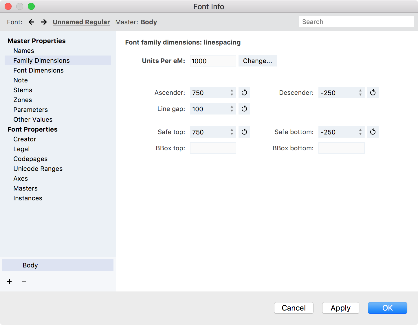
Family Dimensions are those font metrics that must be identical in all fonts of the same font family.
Units Per em»
The Units Per eM (UPM) is the basis of all font dimensions. The UPM is the number of font units that defines the font height and the coordinate grid on which the glyphs are drawn. See Font Sizes and the Coordinate System for details.
For technical reasons in FontLab the UPM is limited to 10000 units, but we strongly recommend you work with one of the standard UPMs. Both in OpenType-PS and in OpenType-TT fonts the UPM may be set to any value, but the recommended values are 1000 and 2048 units.
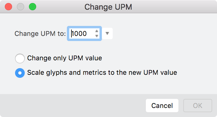
If you need you can change the UPM value in your font. In oder to do this correctly, you have to scale all the characters to fit them in the new UPM setting manually or you can switch on the Scale glyphs and metrics to the new UPM value option and all the font data will be scaled automatically:
Ascender»
Position of the font’s ascender line. This is the typographically correct ascender value. It is the topmost line of lowercase characters, usually, the topmost line of the ‘b’ character.
Descender»
Position of the font’s descender line. Usually this is the position of the bottom line of the ‘p’ character.
Line Gap»
Typographically correct line gap value (distance between bottom line of the upper line of text and top line of the lower line of text).
See also hhea.Ascender, hheaDescender, and hhea.LineGap values on the OtherValues page of the Font Info dialog.
Safe Top and Safe Bottom»
Safe Top value defines the topmost line of all important characters in the font. “Important” characters are all non-exceptional characters. For example, if most of the characters have the topmost position at 900 font units and one, not often used character, has it at 1300 font units, it’s a good idea to set Safe Top at 900 units. Note that in most cases portions of the characters that are above the Safe Top value will not appear on the screen or print on some printers. Please note that Safe Top is NOT a typography ascender, usually measured as the topmost line of lowercase characters. It is mostly a technical parameter used by the rasterizer to allocate vertical space to render characters.
Safe Bottom value is the same as Safe Top, but for the lowest line of all “normal” characters.
BBox top and BBox bottom»
The topmost and the lowest positions of all glyphs in the font family.
Font Dimensions»
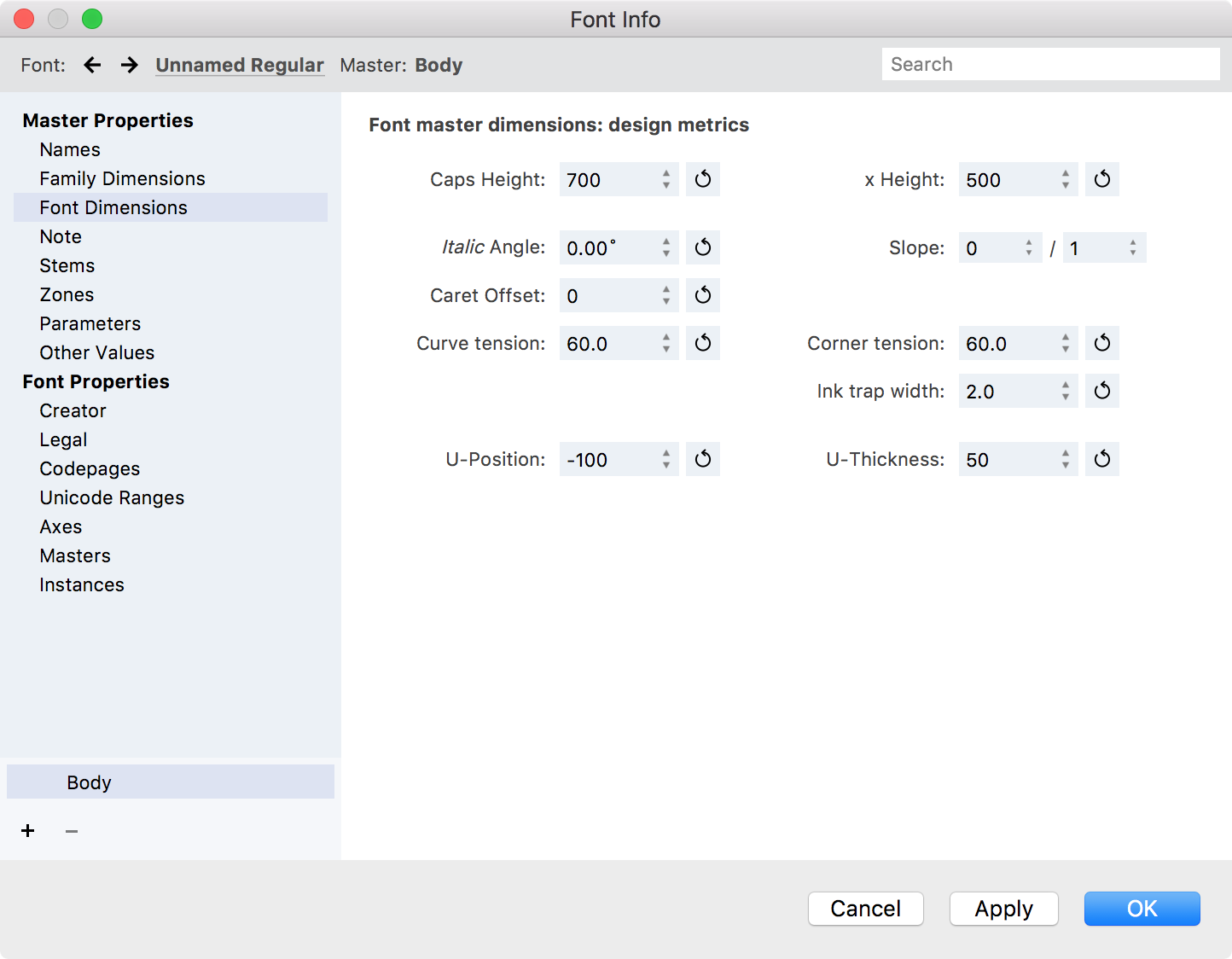
Caps Height»
Height of the font’s uppercase characters. Usually the height of the ‘H’ character.
x-Height»
Height of the lowercase characters. Usually the height of the ‘x’ character.
Italic Angle»
Actual italic or oblique angle for the font. The italic angle is measured in the counterclockwise direction, but FontLab shows it positive here. So the default value is 12º. Use this field if you are creating an italic font.
Slope»
The Slope value is based on the Italic Angle and used to calculate the slope of the cursor.
Caret Offset»
Normally used only for italic or oblique fonts. This is the amount by which a cursor on a glyph, or a slanted selection area of one or more glyphs, needs to be shifted to produce the best appearance. Non-slanted fonts should have a setting of zero.
A negative value is normal for italic or oblique fonts. This means that besides the cursor or selection area needing to be slanted, it needs to be shifted to the left.
Clicking on the “auto” (circle-arrow) button next to the value will estimate a reasonable caret offset based on the italic angle and the heights set in your font.
Curve Tension»
Curve tension is a measure of how much a curve deviates from a straight line between two points, from zero to 100%. This parameter is used when you draw curves for your font.
Corner Tension»
Ink-trap Width»
Ink-trap Width controls the amount that the corners or details are removed from the letterforms. When the type is printed, ink spreads into the removed area.
U-Position and U-Thickness»
The position of the middle and the thickness of the underline line in your font.
Note»
Note is a place for entering any designer notes about the font. It won’t be exported into final fonts.
Stems»
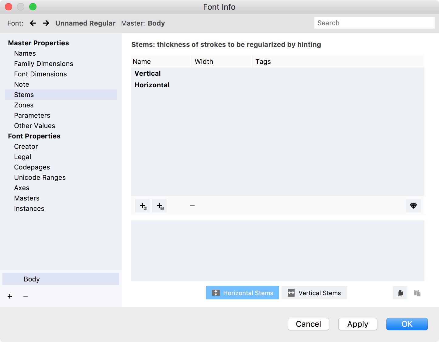
The Stems page is the place to define PS standard stems used in font hinting procedures. See the Stems section of the Hinting a Font article.
Zones»
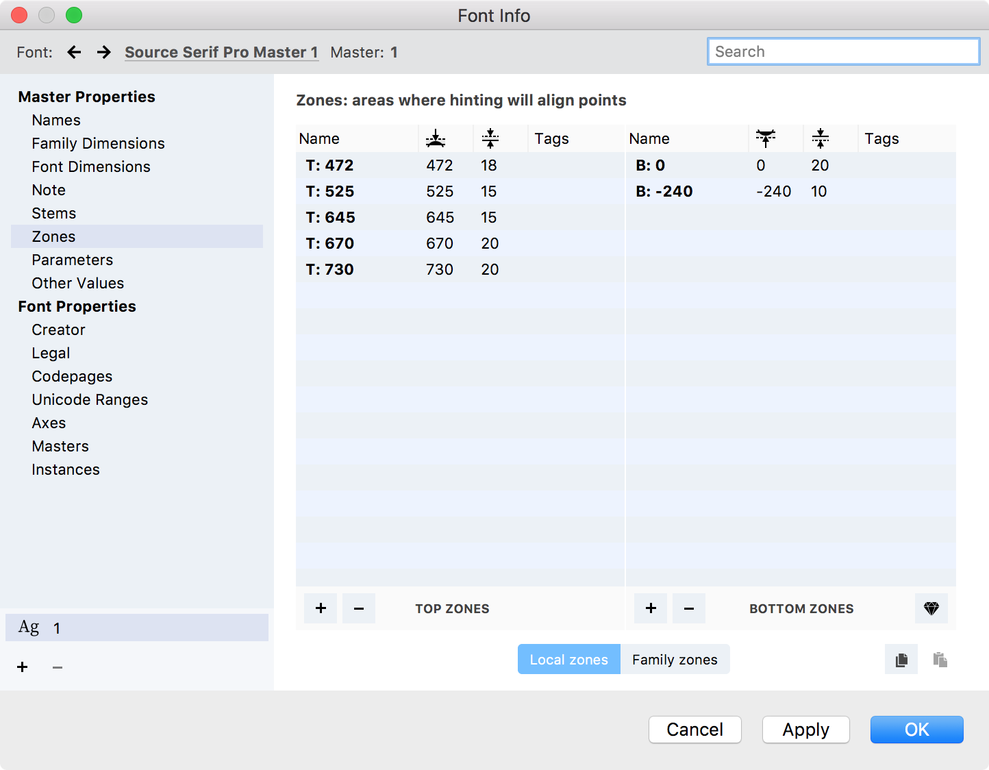
The Zones page displays the areas where hinting will align points. See the Zones section of the Hinting a Font article.
Parameters»
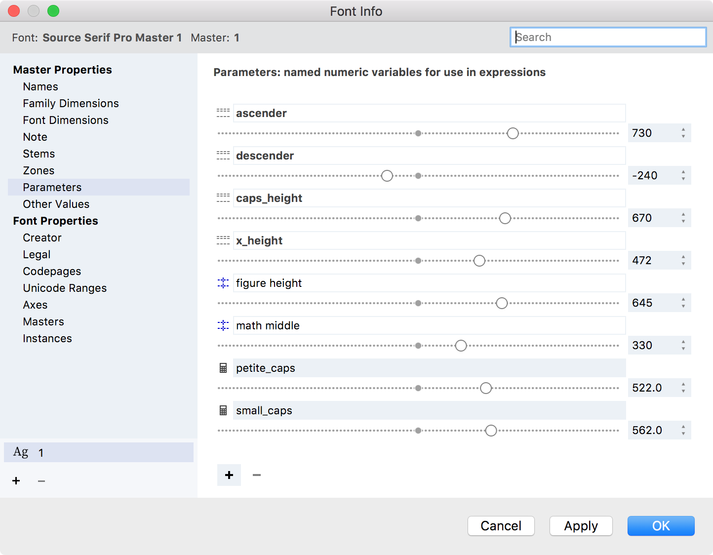
Values you can reference in expressions font-wide — parameters, font guidelines and selected variables — are listed in this section. Variables are preceded by the  icon; parameters by
  ; and font guidelines by
  . In this section, you can also add, remove and modify parameters. Parameters can be especially useful to define heights that are not covered by font dimensions, such as small caps, or heights for other scripts, like Arabic, Hebrew or Armenian.
To define a new parameter, click on the + button, name the variable and drag the slider to define its value.
To remove an existing parameter, select it in the list and click on the - button.
To modify the value of a parameter, enter the new value in the input area, use the number steppers or the slider. Note that changing the value of a pre-defined variable will also change your font’s dimensions listed on other pages.
Other Values»
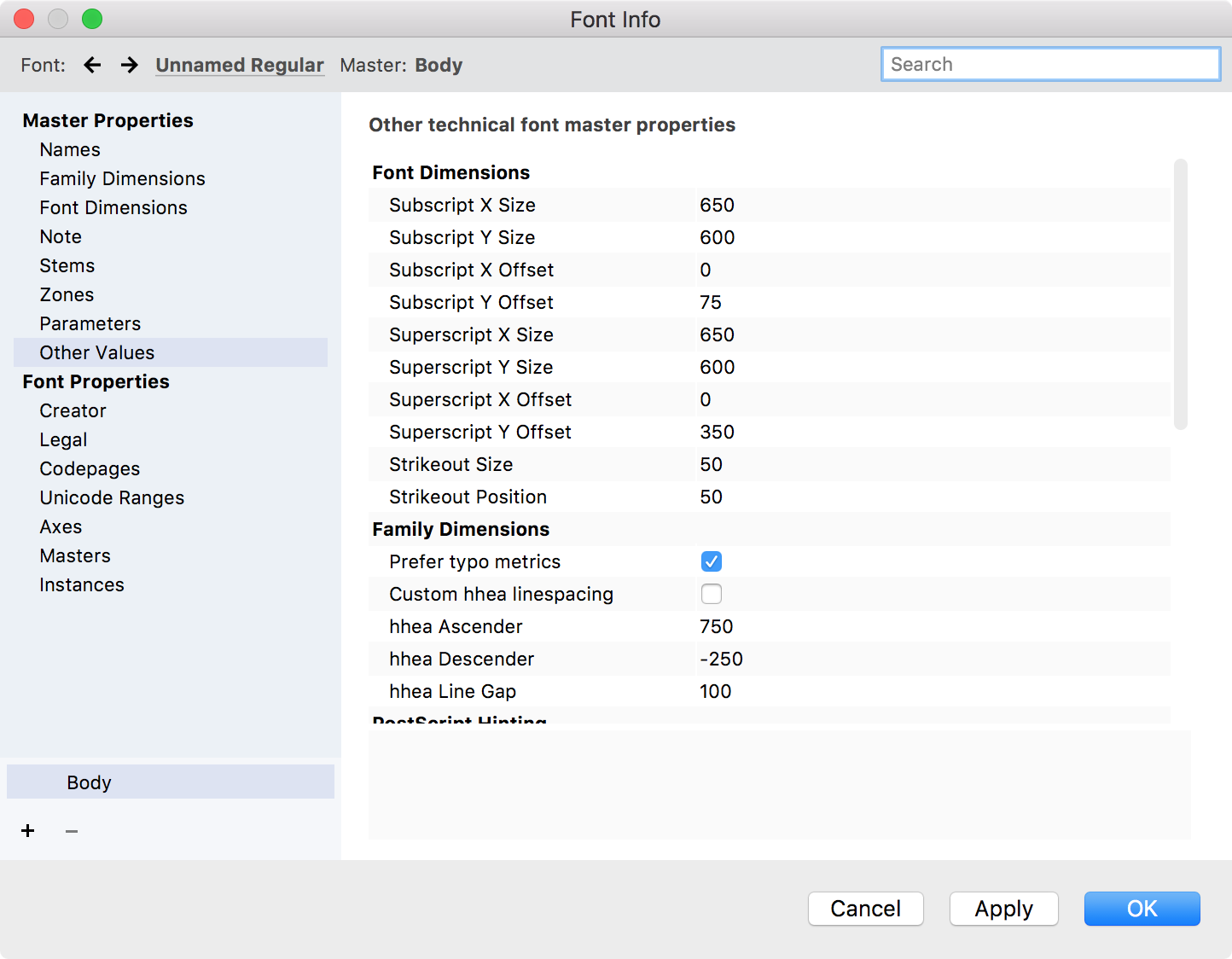
Subscript, Superscript and Strikeout values»
OpenType font format allows you to specify position and size of the superscript and subscript characters, as well as the position and the width of the strikeout line.
You can find the complete description of these values in the OS/2 table specification.
PostScript Hinting»
Some additional data may be set to control the PS hinting process:
| ForceBold | When this option is switched on, PS hinting algorithm makes the font looking “bold” |
| BlueScale | Controls PPM when overshoot depression is switched off |
| BlueShift | Gives more precise control over overshoot description (see below) |
| BlueFuzz | Expands alignment zones in both directions |
BlueScale is the PPM size at which overshoot suppression is switched off. If PPM is less than BlueScale, then overshoot suppression is applied. If it is equal to or exceeds BlueScale, overshoot suppression works only if the distance from the aligned point to the base line of the alignment zone is less than the BlueShift value and the scaled distance is less then half of a pixel.
The BlueFuzz value allows you to expand the action range of the alignment zones in both directions. Thus if you have defined a zone like (700–715), and BlueFuzz is equal to 2, then the actual zone used will be (698–717). This is usually used when you are not sure that you correctly set all the alignment zones or when the characters are not all precisely aligned. The normal value of this parameter is 0 but by default it is set to 1.
TrueType hinting algorithms do not use BlueScale, BlueFuzz and BlueShift values.
TrueType Hinting and Smoothing»
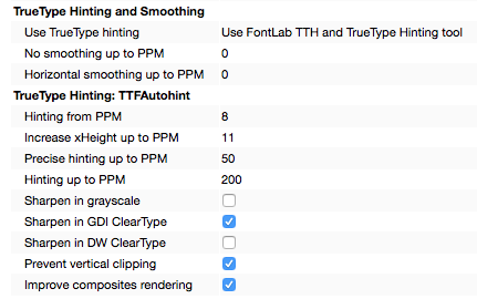
FontLab’s TrueType hinting algorithms use the following values:
| Use TT hinting | Select among FontLab TrueType hinting algorithms, TTFAutohint, and no hinting for this particular font |
| No smoothing up to PPM | Zero - smoothing is on for all PPMs |
| Horizontal smoothing up to PPM | Zero - horizontal smoothing is off for all PPMs |
Other values are used by TTFAutohint hinting algorithms if they were selected in the Use TT hinting selector above.
Creator»
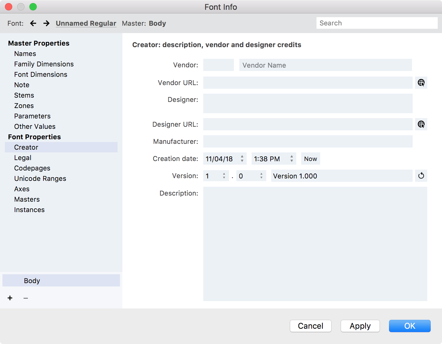
If you are creating a new font enter your name or the name of your company here. Set the font version number. You may also add additional information that you want to include.
Vendor Code and Name»
Vendor Code - an up-to-four letter length code that is assigned to most TrueType producers to identify their fonts. A vendor code must be registered with Microsoft. All registered Vendor Names known at the time of FontLab release are placed in the drop-down list box next to the vendor code field. Start typing the vendor name and you will see the drop-down list box. If you want to identify yourself without registering you may enter a lowercase four-letter vendor code.
Vendor URL»
A web site address for the vendor.
Designer»
Name of the font designer(s).
Designer URL»
This is where you enter a web site address for the designer.
Creation Date»
Year when the font was created. This is used by FontLab to automatically fill in the Copyright field and is exported in OpenType-TT fonts as the Creation year entry.
Version»
Version of the font. Enter major and minor version numbers and click on the Auto button to generate the version string.
Description»
Exported in PostScript Type 1 fonts as the Copyright entry, and in TrueType fonts as the Description entry.
Legal»
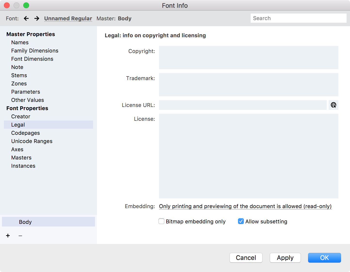
On the copyright page you can enter information about the creators of the font. If you have created a new font you should enter your copyright notice here. If you have edited an existing font that was not your creation you must not remove the information contained on this page, or you may violate copyright laws.
Copyright»
Copyright notice. Must include the © symbol or the word “Copyright”, the name of the company or person that owns the copyright and the copyright year. In Type 1 fonts this information is stored in the Notice entry and in TrueType fonts in the Copyright entry.
Trademark»
Used to save the font’s trademark notice.
License URL»
This is where you enter a web site address for the License if any.
License»
The font License or EULA text.
Embedding»
Embedding is the inclusion of font files in an electronic document, like a PDF or a web page.
Choose among four main embedding options:
Only printing and previewing of the document is allowed (read only means the font may be embedded, and the document may be viewed and printed using the font, but editing of the document using the font is not allowed.
Editing the document is allowed (default) means the font may be embedded and the document that uses the font may be viewed, printed and edited.
Everything is allowed (installable mode) means after the document is opened, the font may be installed in the system for future use with any documents.
Embedding of this font is not allowed – the font cannot be embedded in documents.
Codepages»
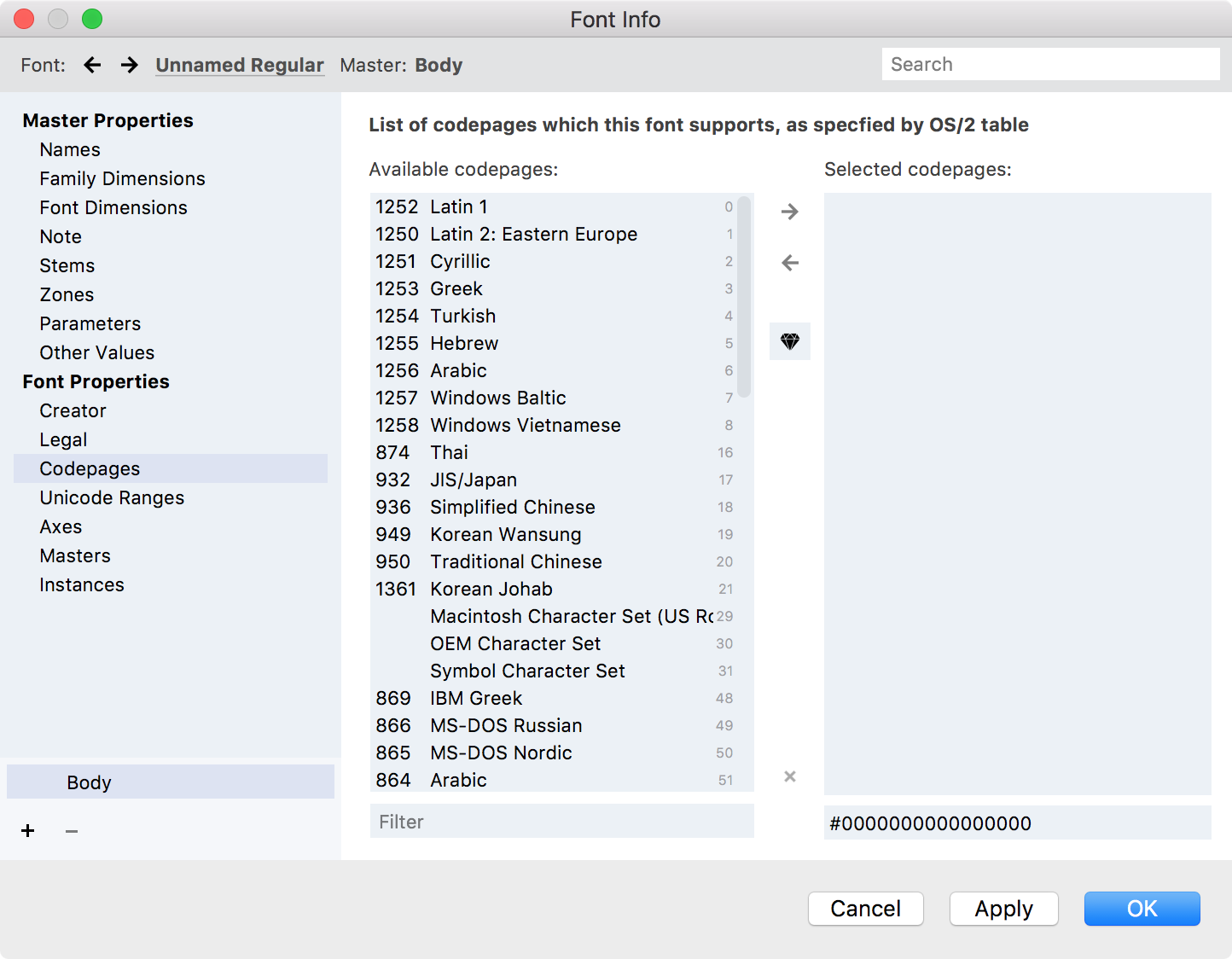
The operating system needs to know which codepages an OpenType font can support. To set this information you select all the codepages that this font can “cover” from the list of standard codepages that are available to the operating system.
This information is stored as the ulCodePageRange1 and ulCodePageRange2 fields in the OS/2 table.
To select the supported codepages automatically, click on the Auto button. FontLab will analyze the Unicode information available in the font and will automatically detect which codepages this font can support.
To add a codepage to the list of supported codepages, select a codepage in the left list and press the Add button.
To remove a codepage from the list of supported codepages, select a codepage in the right list and press the Remove button.
To reset the list of supported codepages, click on the x (Reset) button.
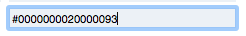
If you want you may edit the CodePageRange1 and CodePageRange2 values of the OS/2 font table directly in the field below the selected codepages:
Unicode Ranges»
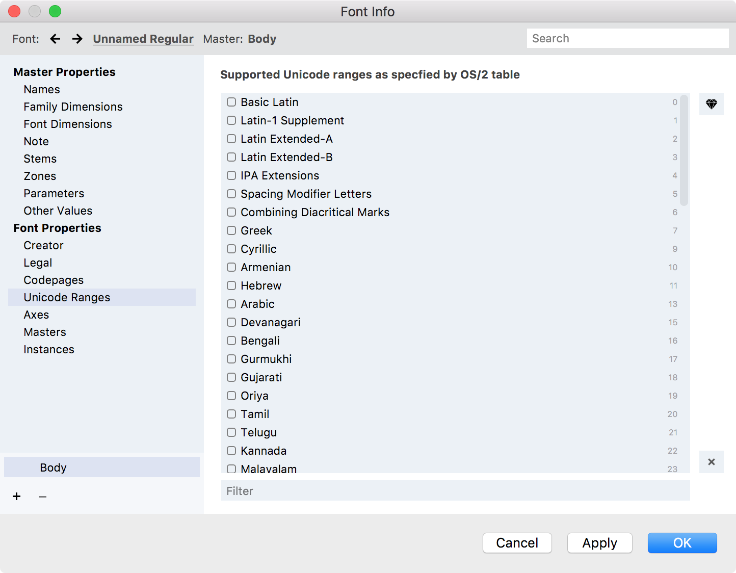
OpenType fonts must declare Unicode ranges that the font can support so that the operating system can decide which characters the font can be used to represent.
This information is stored in four ulUnicodeRange fields in the OS/2 table.
The Unicode Ranges page is relatively simple: you can see a list of all Unicode ranges with a check box to the left of each name. If the check box is checked it means that range is supported.
To select the supported ranges automatically, click on the Auto button. FontLab will analyze the Unicode information available in the font and will automatically detect which ranges should be turned on.
To uncheck all Unicode ranges, press the Reset button.
Axes»
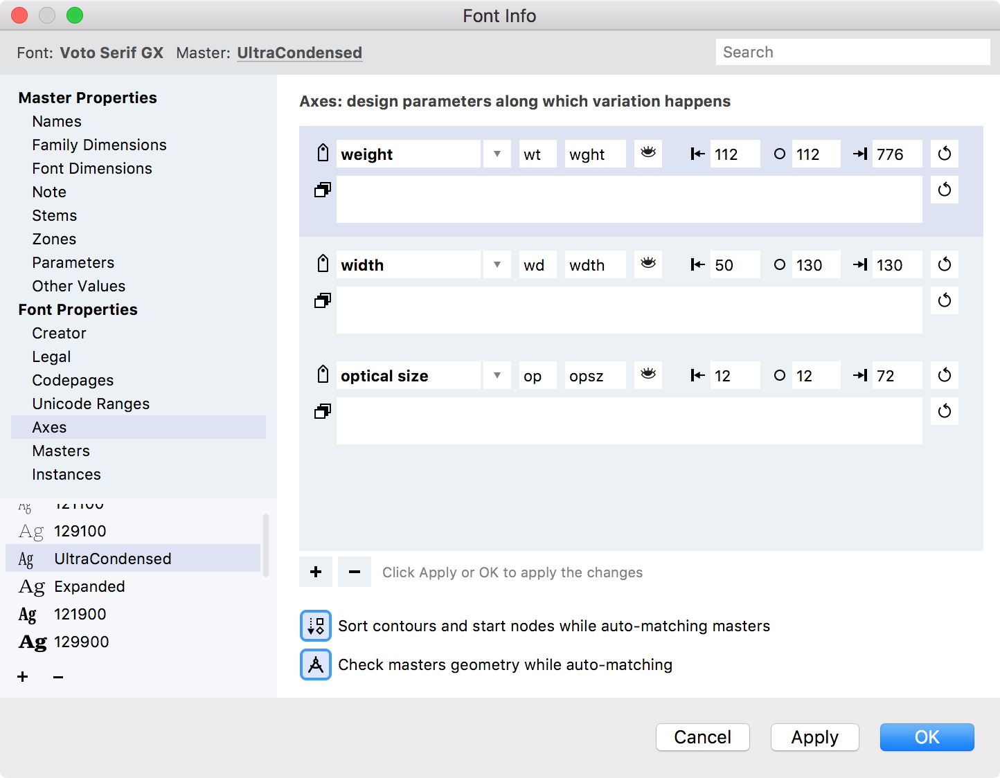
Axes are typographic properties that change during interpolation. Axes form the coordinate system for your font design space. So the starting point for a variable font is to define its axes.
If you have 2 standard default axes in your font – weight and width – you may have this page empty and still be able to design 2-dimensional variations. But if you need to change default axes or add more axes to your design space you must use this page.
To create a new axis, click on the “Plus” button. Select one among several predefined axes or choose the “Custom” one.
The list contains the following categories of axes:
- standard registered axes from the OpenType spec: Weight, Width, Optical size, Slant, Italic
- additional non-standard axes which users commonly want: Contrast, Serif, Grade etc.
- the option for a custom axis.
When a new axis appears you can change its properties here: name, FontLab-internal two-letter axis code, four-letter axis tag, “show/hide in the apps” toggle, min, max and default coordinates for the axis.
When you add a custom axis, make sure you have changed the zz axis code and ZZZZ axis tag to something unique.
The axis also can contain the recipe for instances – named points on the axis coordinate line.
To remove an axis, select it in the list and click on the “Minus” button.
Remember that you need to click on Apply if you add, remove or rearrange axes in Font Info; only then will the changes be visible in the Masters section of Font Info.
Sort contours and start nodes when auto-matching masters
Check masters’ geometry while auto-matching
See Variable Fonts and Variations panel for more details about axes.
Masters»
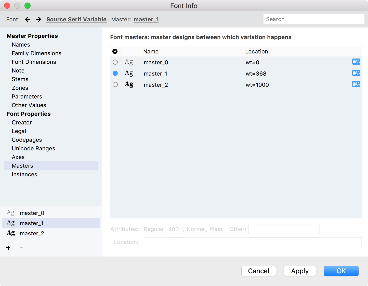
Here you may change your font master’s properties. The list contains all font masters in your font.
Click a dot in the left column to turn it blue, telling FontLab which master is the default master (sometimes referred to as the default instance). In a Variable Font, the default master has several functions.
-
If you export a variable font with TrueType outlines, the default master will be the one that is shown and used in older apps that do not otherwise support OpenType Variations. (Variable fonts with CFF outlines do not work in apps that do not support variations.)
-
In some apps, the default master may be the instance the app picks by default, when a user switches to that font.
-
IMPORTANT: This master is also the starting point for your variable font. Again, this only matters for masters taking part in variations. A master has direct access to another master if you can get from the coordinates of one to the other by changing the value on just one axis. In a 2D space this would be a “straight move” like a rook in chess. At a minimum, you must set up your masters such that each and every master taking part in interpolation has direct access, a straight move, to at least one other master, and that some sequence of such straight moves from one master to the other reaches the default master.
The blue “AAA” icon at the right means that the master can be used for interpolation. Click on it to exclude the particular master from the interpolation process.
To add new font master to your variable font, click on the “Plus” button at the bottom of the left list. The dropdown menu allows you to select the method of creating new master.
To remove the font master from your variable font, click on the “Minus” button in the bottom of the left list.
To edit the font master name, use the Names page of the dialog.
To edit other font master properties, select the font master in the list of masters and refer to the properties section below the list. Here you define what position the master takes in the design space formed by the axes.
Instances»
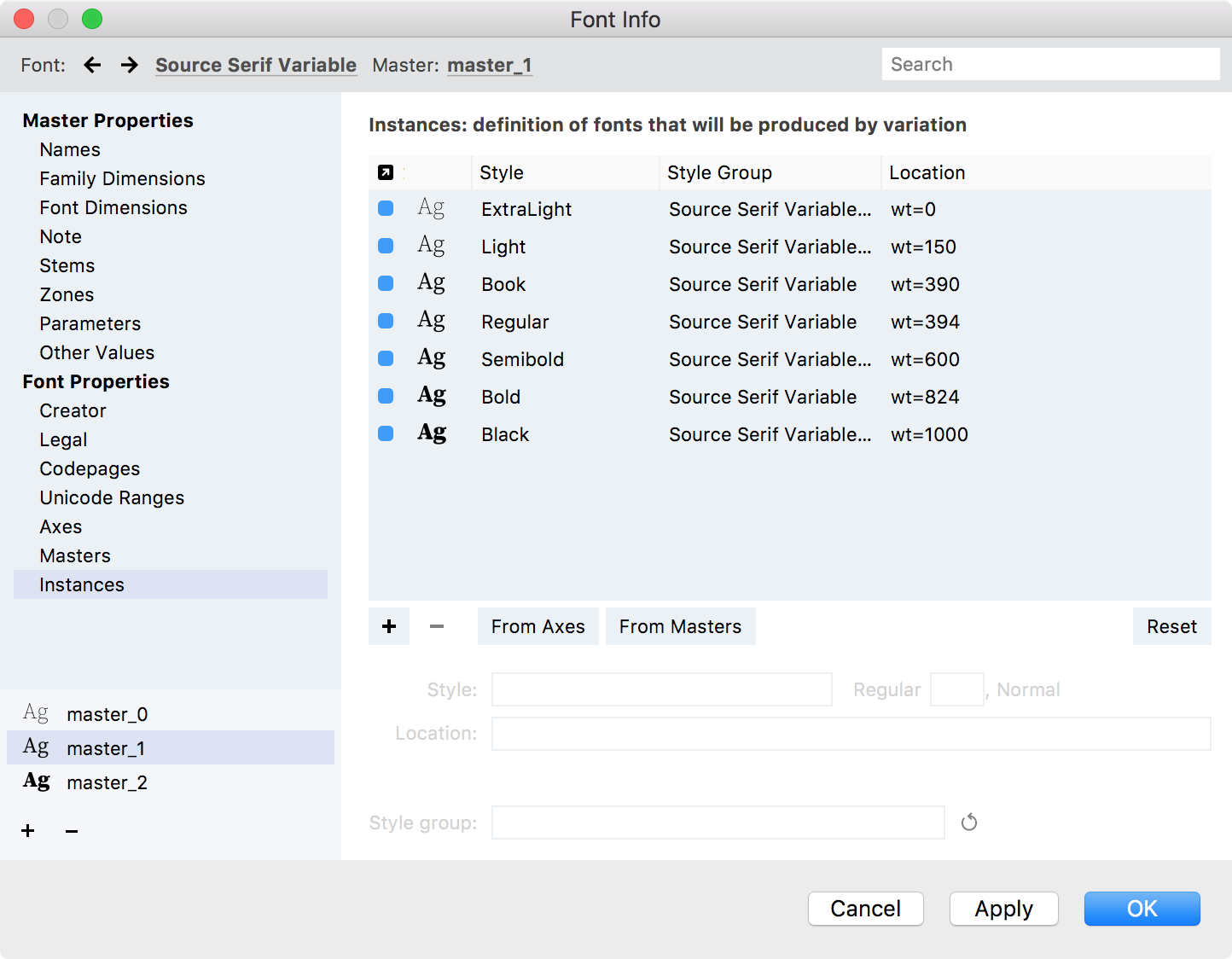
An instance is a “snapshot” of the interpolation process at a chosen location within the design space. You can declare predefined instances in your variable font here. A predefined instance has a location in the design space (one numerical coordinate per axis) and some naming fields. A predefined instance is not a real font — it’s merely a “plan” to create a real font in future.
If you just started to create your variable font, you have an empty list of instances.
To add new predefined instance to your variable font, click on the “Plus” button at the bottom of the list of instances. The new default instance will be added and you can change its properties.
To remove the instance from your variable font, select it in the list and click on the “Minus” button.
To edit instance properties, select the instance in the list and refer to the properties section below the list. Here you define what location the instance takes in the design space formed by axes, the Typographic Style Name (TSN) and what Style Group (SGN) of the typographic family will it belong to. See the Names page and Font Naming for details about styles and style groups.
There are two quick ways to define several instances at once:
-
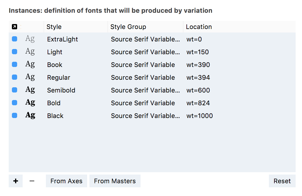
Click on the From Axes button and the list of instances will be populated with instances according to the recipes in your axes. For example, if your weight axis looks like this:
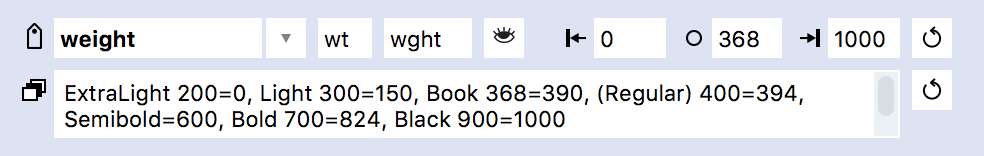
you will get all those predefined instances in the list:
-
Click on the From Masters button and the list of instances will be populated with font masters. You then can edit their properties individually if needed.
To empty the list of instances, click on the Reset button. Since instances are just the “planned” fonts this doesn’t change your font designs in any way.