Hinting»
Hinting is the process of adding information to a font which affects how the outline fits onto a grid for screen display or printing. It has the greatest impact at lower resolutions – mostly on screen, but also at very small sizes in print. Generally, it tries to make the font look better by keeping heights, distances and stroke thicknesses consistent, distorting the outlines to fit the grid better, or increase certain features (such as x-height). See also Hinting actions and TrueType Hinting.
Hints may be at the font level, such as overshoot zones (blue zones) and standard stem thicknesses.
Font-level hints define important vertical positions in the font, the most commonly used stem widths and some other important data that helps control the hinting process.
Note
Having correct font-level hints, especially overshoot zones, is critical to getting good results from either auto-hinting and manual hinting in FontLab.
Hints may also be at the level of an individual glyph, identifying particular distances between points as ones that need to be controlled/optimized.
Glyph-level hints are used to declare the position and width of the most important parts of the glyph. The most common use for hints is to declare the position and width of stems. These hints are scaled with the outline in the rendering stage, but due to their independence from the outline, they help to maintain the same stem widths for all stems of a certain width, independent of how it happens to fall on the discrete raster:
Coordinate Rounding, Gridfitting»
Output devices take the vector outline of a glyph and “rasterize” it. That is, they calculate from the outline data where they need to place each pixel to get an accurate output representation of the glyph. Since the final output is on a discrete raster (i.e. a grid of numbered pixels), the scaled pixel coordinates need to be rounded somehow to integer values.
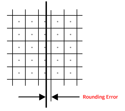
To minimize rounding errors font rasterizers use special algorithms that slightly change the scaled outlines to get better results on devices with low and medium resolution. This process is called gridfitting. Algorithms that gridfit outlines use additional information stored with an outline’s definition. These instructions are referred to as hints. Hints usually define the most important proportions of characters, the positions of critical elements of characters, and a set of rules for outline modification.
For perfect-looking fonts it’s not enough to define the characters’ outlines, you must also provide hints. The process of specifying the hints is quaintly called hinting.
TrueType and PostScript Hints»
The two most commonly used font formats are PostScript (Type 1) and TrueType. However, they use very different hinting instructions and it is not always possible to automatically convert PostScript hints to TrueType hints.
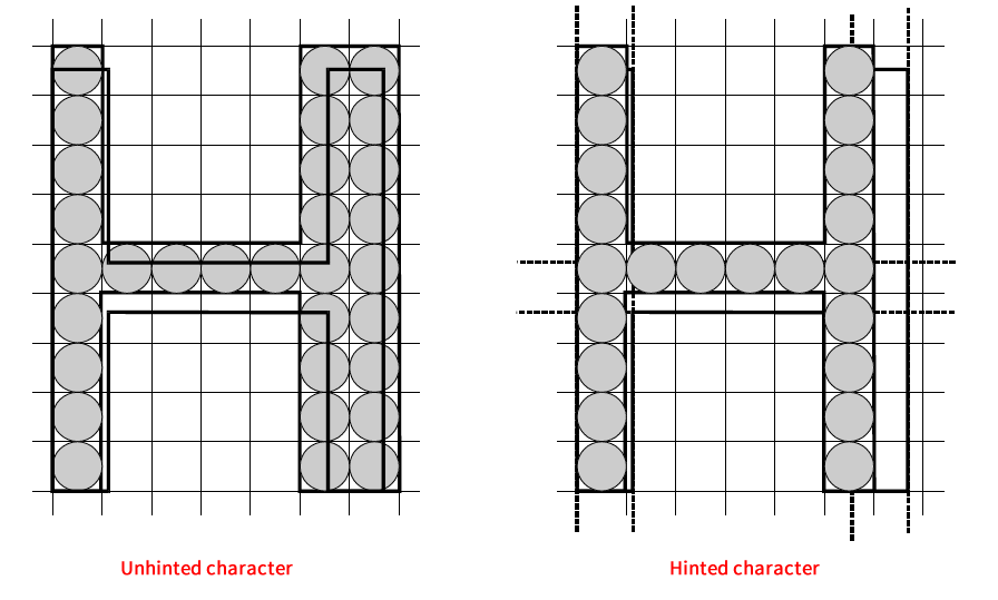
In PostScript (Type 1) fonts, hints define the most important dimensions in the characters, like the position and width of the crossbar of the letter ‘H.’
To learn how to hint glyphs, see the PostScript Hinting section.
Hints in TrueType (usually called instructions) directly control the movement of points and the rounding of point coordinates. A TrueType hinting program is written in a special programming language. This makes TrueType hinting very flexible and powerful but also too complex to program directly. Usually a smaller set of higher-level instructions are used to define hints. These instructions are compiled to native TrueType hinting language during font export.
Please refer to TrueType Hinting tool to learn how to manually add high-level TrueType hinting instructions.
Font-Level Hinting»
Here we discuss font-level hints. Font-level hints are used to keep important glyph elements similar at all PPM sizes.
There are three components of font-level hints:
| Alignment Zones | Positions and width of important heights |
| Standard Stem Widths | Widths of the most commonly used stems |
| Control Data | Controls the hinting process. |
All font-level hinting settings are set on the Other Values page of the Font Info dialog in FontLab.
Alignment Zones»
Alignment zones are typically used to perform a process known as overshoot suppression:
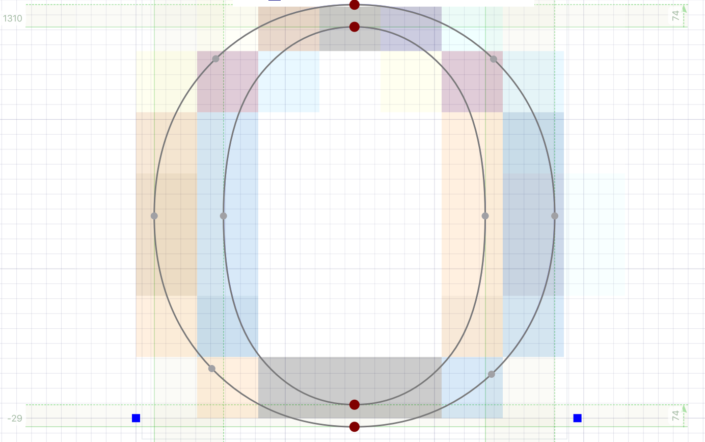
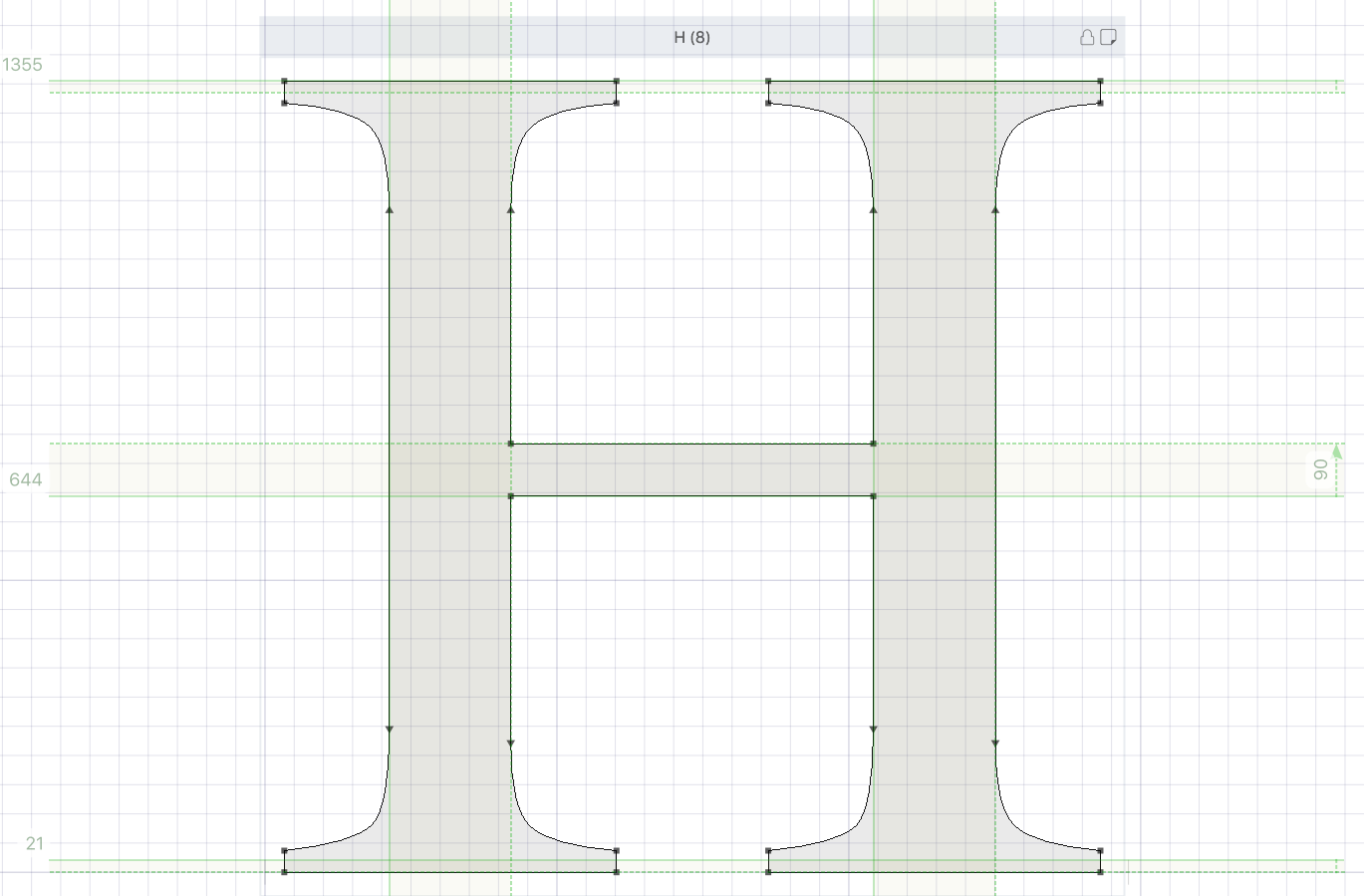
Rounded characters and characters with sharp ends usually are created a little bit larger than “flat characters”:
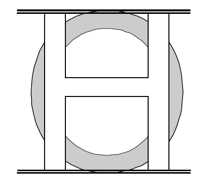
Notice that the top and bottom of the O extend just a little beyond the top and bottom of the H. This is called overshoot. It is necessary to compensate for a visual effect that makes rounded characters look slightly smaller. Usually the overshoot height is set to 3–4% of character height. However, at small PPM size, this value may be rounded to one pixel.
When the PPM is small, one pixel may be 15% of the character height or even more. Here’s how it happens:
Assume that the topmost position of the H character is 700 units and the top position of the O is 715. At 12 PPM (1000 font units scaled to 12 pixels), the rounded height of the H will be 8 pixels. The height of the O will be 9 pixels. One pixel difference at this height means 8%. Much more than the original 2%!
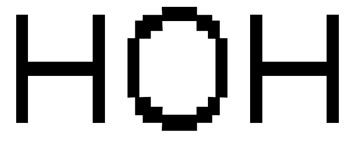
To avoid such an excessive difference between the rasterized heights of the two types of characters, overshoots are suppressed and the size of O is forced equal to the height of H at small PPM.
This is done by declaring alignment zones that define the bottom and top positions of the zone (in our example the height of H and O) and the alignment direction (bottom or top):
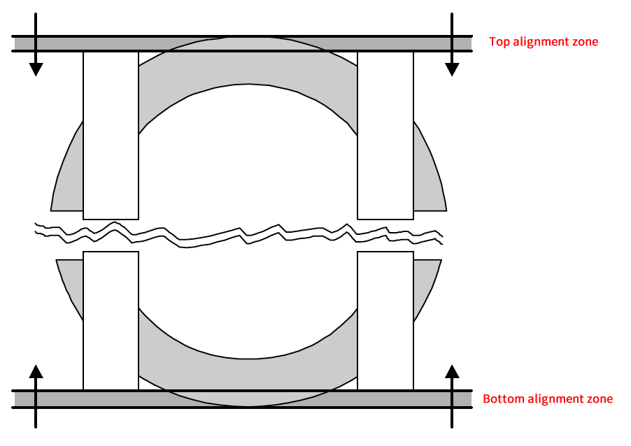
At small PPMs all points that have vertical positions inside the zone will be aligned to the primary line (i.e. moved in the direction of the alignment zone).
Standard Stem Widths»
Typically many glyphs in a font use the same few standard stem widths. As examples, let’s take the H, B, and F glyphs shown below. All of them have the same width for the straight vertical stems and the same width for the horizontal stems:
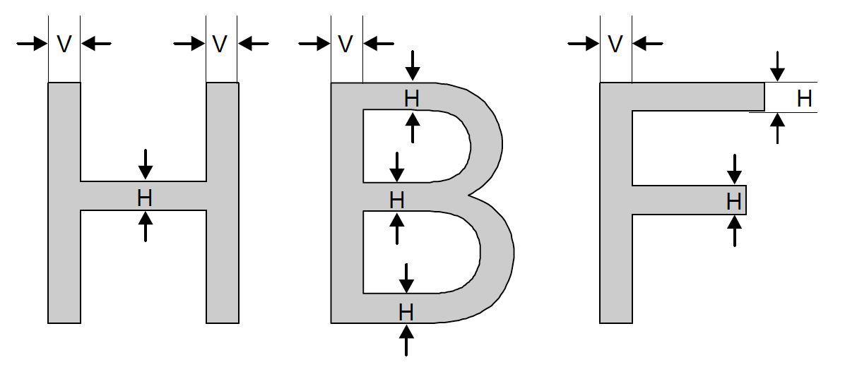
The most widely used stem widths are stored in the font header in order to force the rasterizer to render these stems at the same width.
This information is used to control at what glyph size the rounded stem width goes from one to two pixels and from two to three pixels. A step from one to two pixels means a 100% width increase and a step from 2 to 3 pixels a 50% increase. This means that near this value rounding errors will be maximal and control over stem widths will be necessary.
If one stem has a width of 74 units and another a stem width of 76 units and the UPM is 1000 units, then at a PPM of 20 pixels the first stem will be rounded to 1 pixel and the second stem to 2 pixels. Scaled back to the original coordinates, this difference will be 50 units! That is clearly too much for an original difference of only 2 units.
Standard widths work with stem hints. When the width of a hint is close to one of the standard widths, the rounded width of the hint (and the real stem outline) will be forced equal to the width of the rounded standard stem.
PostScript and TrueType Standard Stems»
In FontLab every font may have two sets of stems: PostScript stems and TrueType stems. They are applied in different hinting modes and have some differences:
- Number of PostScript stems is limited by 10 in each direction (vertical and horizontal).
- TrueType stems may have names. The number of TrueType stems is not limited.
- It is possible to define “stem hinting” for TrueType stems, which will control their scaling. Please see the TrueType Hinting section.
If some font has PostScript standard stems and no TrueType stems, they will be automatically converted when such a font is opened.