Briem’s notes on type design: Autotrace
Don’t do it. Just say no
Charles Lehman wrote out a model alphabet for his book, Italic Handwriting & Calligraphy for the Beginner. A few years ago, I scanned and autotraced it, made it into a font, and sent it to him as a present. Here’s a sample of the result.
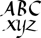
This, of course, is not type design. It is digitized handwriting. The characters don’t quite fit together. More work is needed. But our concern here isn’t the shape of the letters but the way they got into the machine.
The computer can create Bézier outlines for you by autotracing. It’s fast, but distorts all but the most casual designs. It used to be even worse, and too much is still left to chance. You should define your shapes yourself.

Automatic or hand-made
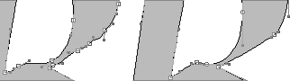
On the left is an example of bad autotracing. It has 52 Bézier endpoints, twice as many as necessary. On the right, the same letter is defined with 26 points, and better.
A closer look
The left example has points that only add random bumps. If you want an uneven outline, you should make it that way yourself. For comparison, the shape on the right has points where they are needed.
If you decide to autotrace anyway, the four tips on the next page may help you.
Notes on type design. Copyright © 1998, 2001, 2022 Gunnlaugur SE Briem. All rights reserved. Republished with permission in 2022 by Fontlab Ltd.