Briem’s notes on type design: Limit your choices
The hard way
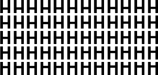
Here are sixty possibilities. Let’s select the height of the bar in the letter H.

Fifty-eight steps from a low bar to high are more trouble than they’re worth. Fortunately, there’s an easier way.
Half a dozen choices are usually better than five dozen. They’ll have the same range, but you only allow yourself six possibilities. We’re looking for a bar that is a touch lower than usual.

The third letter from the left is almost right, but not quite low enough. We’ll add another six possibilities.

Our previous selection is in the middle, with three variants on each side. When we settle for the second from the right, we can truthfully say we have seen enough alternatives. (In the larger range of sixty possibilities above, it’s the eighteenth: sixth from the left in the second row.)
Know the rules, but trust your eyes
A large part of design is a succession of unconscious choices. We like to think of them as sensible, logical decisions. Not all of them are. We talk of the demands of balance and tension, of tradition and innovation. Strip away the fancy words, and what is left? Somebody’s saying “this I like.”
Notes on type design. Copyright © 1998, 2001, 2022 Gunnlaugur SE Briem. All rights reserved. Republished with permission in 2022 by Fontlab Ltd.