Briem’s notes on type design: o-group two
New expectations
Arrighi based his letter c on the letter a. That won’t do for us. We are used to a different shape for letter c.

Here’s how Arrighi said the letters a and c should be written. He used the same method for both of them and the same grid as well. To me, the letter c looks lopsided.
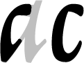
On the left stands the letter c based on the letter a, just about to fall over. On the right is a letter c based on the letter o. It is properly balanced. Here is one way of making it.
-
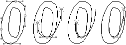
Start the letter c with the outer path of the letter o. Make the outher path about one-eight narrower. The left side should be the same width as it was before.
-
Make a copy if the lower half of the outer path. Align the lowest point to the bottom of the counter.
-
Reduce the left side of the path horizontally by half.
-
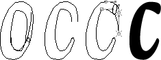
Align the left side of the path to the left side of the counter. Reduce the right side horizontally by a third. This takes you more than halfway to an exit stroke. You can end strokes in several ways. One is to cut them off with a straight line. That will work. If you use a curve, you have to decide what it should look like. For our letter c, I’d like curves.
-
Make a copy of the outer path. Flip it horizontally and reduce it by nine-tenths, maybe more. Put it next to the outer path, about one-third of the height of the letter.
-
Lift the counter by an eight of the width of the top curve. Then remove overlaps and path segments you don’t need. Join the loose ends.
-
Make another copy of the outer path. Reduce the size to about one-sixth. Then reduce it horizontally by a third. Put it close to the top and a little to the right of the exit stroke below it. Shift the path ends until they make good curves to the small path at the end.
-
Remove the path segments you don’t need. Join the loose ends, and you have a passable letter.
I didn’t use a formula to design the letter c. I worked first and measured afterwards. But at the time I wasn’t trying to explain anything. I was just having fun.


You can make the letter e from the letter c by turning the top into a bowl. Understanding how a broad-edge pen makes a shape like that is REALLY useful.

Arrighi says the letter t should have a short ascender, just high enough to distinguish it from the letter c. That’s a start. Use the crossbar from the letter f. You may have to shorten it. The letter t should be straighter than the letter c, and the bottom hook shorter.
Notes on type design. Copyright © 1998, 2001, 2022 Gunnlaugur SE Briem. All rights reserved. Republished with permission in 2022 by Fontlab Ltd.