Briem’s notes on type design: The curve
One fits all
In this exercise, we’ll use the same curve everywhere (well, almost everywhere). Our curve is shaped in part by limited space. The bowl of the letter a demands a tight fit.
An adjustment wil be necessary when two curves come together, as in the letter B. We’ll come to that later, when we assemble the capitals.

The top left-hand curve of the letter o is defined with a Bézier curve. It spans three rectangles of the grid: the top left corner, the next to the right, and the next below it.
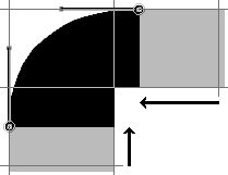
A closer look at the top left-hand curve shows greater detail. Here’s what you do. Put the bottom end of the Bézier curve in the middle of the rectangle below the corner rectangle. Then put the upper end one-fourth into the next rectangle to the right of the corner rectangle. Pull the handles of the curve into the middle of the corner rectangle, and you’re almost done.
Now move the bottom endpoint up one point, and the top endpoint one to the left. This will make a condensed version much easier.

After the first curve is out of the way, the rest of the letter o is easy. The top curve on the right is the same, flipped horizontally. You copy and paste the left, flip it, and drag it in place. The bottom is the same as the top, flipped vertically.
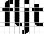
The only decisions you have to make are about the letters f l j t is the length of the horizontals. Try a few variations if you like.
The space between the letters will need adjustment. We’ll come to that later.

In the letters c e s, you need to make a choice about the length of the verticals. I suggest we use the same for all three, even if it makes the letter c look wide open. It will help when we get to the condensed version. Trying a few variations may be useful.
The letter s will not look right unless the middle horizontal is thickened slightly. That means shifting both the curve and the horizontal outline. Try a few thicknesses. They will show how much compensation you should add.
Notes on type design. Copyright © 1998, 2001, 2022 Gunnlaugur SE Briem. All rights reserved. Republished with permission in 2022 by Fontlab Ltd.