Briem’s notes on type design: Spacing capitals
Your first step in spacing capitals is to decide the width of the letters H and O. I suggest you print out a test in several widths.
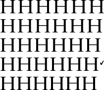
Here are five choices of the letter H. I selected the fourth line.

Here are five choices of the letter O. I selected the third line. With these as fixed points, we can space the other capitals.

This line shows how the two letters fit together in a line. It looks all right.
In his book Letters of Credit Walter Tracy describes how hot metal characters were spaced at Linotype. Anthony Froschaug also wrote about it in The Field of the Majuscule. Here’s a different presentation of much the same approach.


Once you have the left sidebearing of the letter H, you’ve got the left sidebearings of the letters B D E F I K L P R U as well.

The right sidebearing of the letter H can also be used for the letters I J M.

Walter Tracy says both sidebearings of the letter N should be slightly narrower than of the letter H. So should the left sidebearing of the letter M and the right sidebearings of the letters G and U.
Adverbs are slippery: I don’t know how much “slightly” means. If you measure some respectable type designs, you’ll see that they don’t all follow the formula. Let’s assume that “slightly” is five or ten per cent.
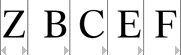
Both the sidebearings of the letter Z should be about half of the sidebearings of the letter H. So should the right sidebearings of the letters B C E F.


If you have the left sidebearing of the letter O, you’ve got both sidebearings for the letter Q. You have also got the left sidebarings for the letters C and G and the right for the letters D and P.

The letters A T V W X Y should have as small sidebearings as possible. The left sidebearing of the letter J should be as small as possible. That also goes for the right sidebearing of the letters K L R.

The letter S you have to space by eye. Put it between the letters H and O and play with the sidebearings.

Here’s the end result. Compare the gap between the letters G and H to the gap between the letters H and I. Look at the spaces on either side of the letter Q. Perfect they aren’t, but they will do for now.
Notes on type design. Copyright © 1998, 2001, 2022 Gunnlaugur SE Briem. All rights reserved. Republished with permission in 2022 by Fontlab Ltd.