The New Stroke and Thickness Tool
Speed Up and Perfect Your Drawing
Benefits Draw difficult letters and shapes faster and more accurately.
This is a tool that I’m excited to show you!
Some things that used to take minutes, like drawing hairline letters or adjusting terminals, can now be done in seconds—almost the blink of an eye.
In fact, I plan on using stroke+new thickness tool to create entire font families.
And what’s great about it: it only requires a couple tools and a couple panels. Eezy peezy.
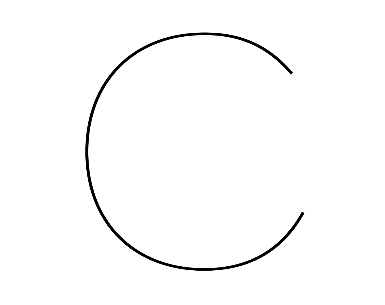
First, let’s see how it can help you tackle—for example—the deceptively tricky letter C.
How to Draw Letters Using Stroke and Thickness Tools
The C looks innocent enough.
The sans C is just an “O” with a chunk cut out of it, right?
Well if you have ever drawn a C, you know parts get bulgy, it’s difficult to get the curves right, and how do you get the terminals not too chunky or not too brittle?
But now—using these tools—the “C” can be made by just taking a chunk out of an “O”!
In this first part, you’ll “see” how to make a “C” like this in under a minute ▼
Let’s Get Started
Fire up FontLab. Start a new font, or open up an existing one and follow these steps:
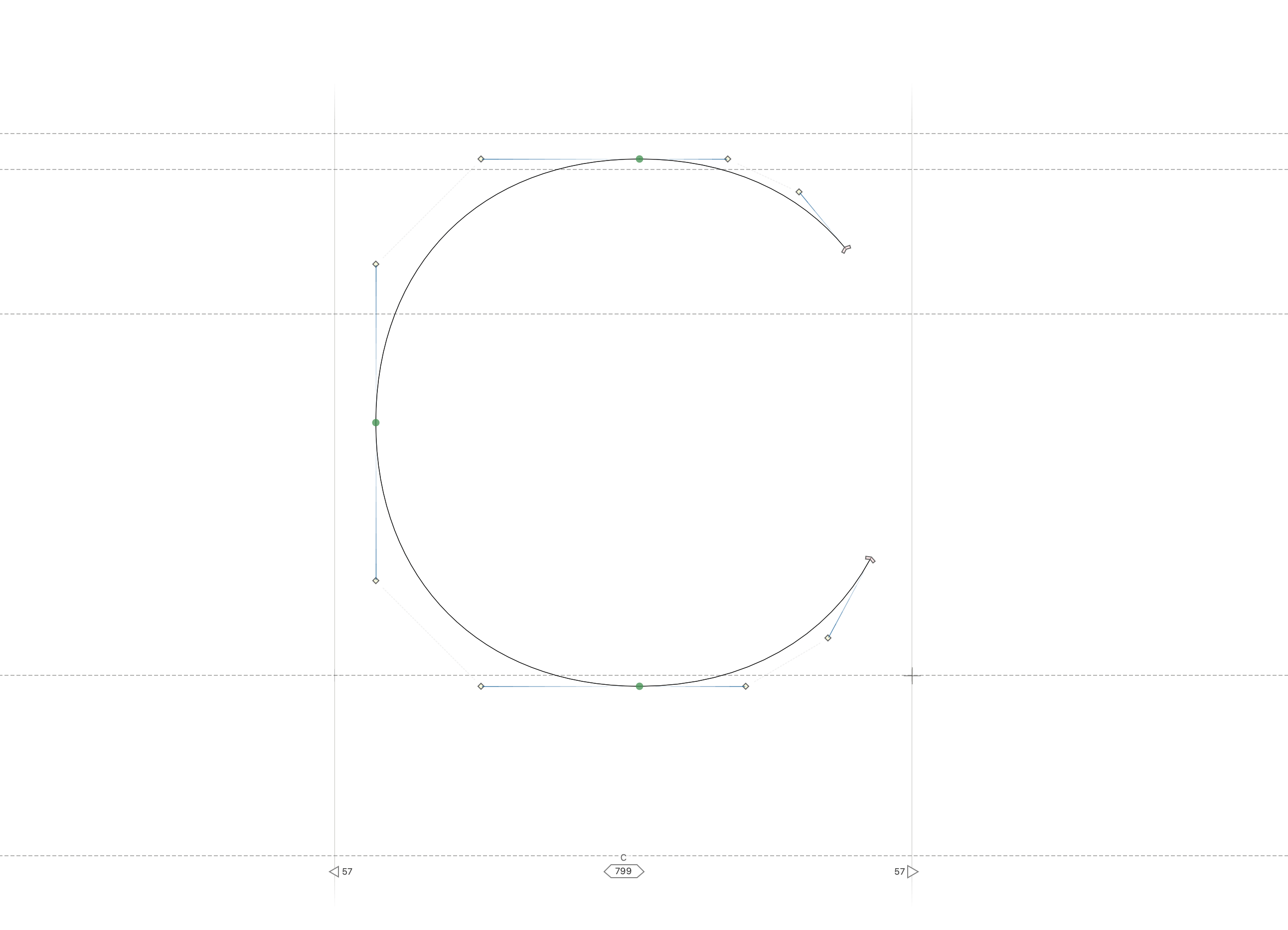
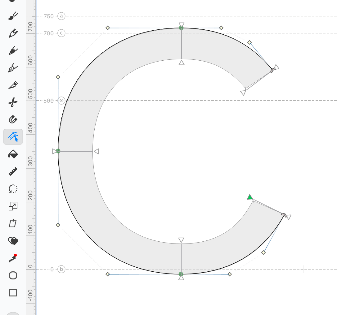
❶ Using the Ellipse tool, draw an “oval with curve tension”.
❷ Now use the Knife tool to slice out a chunk.
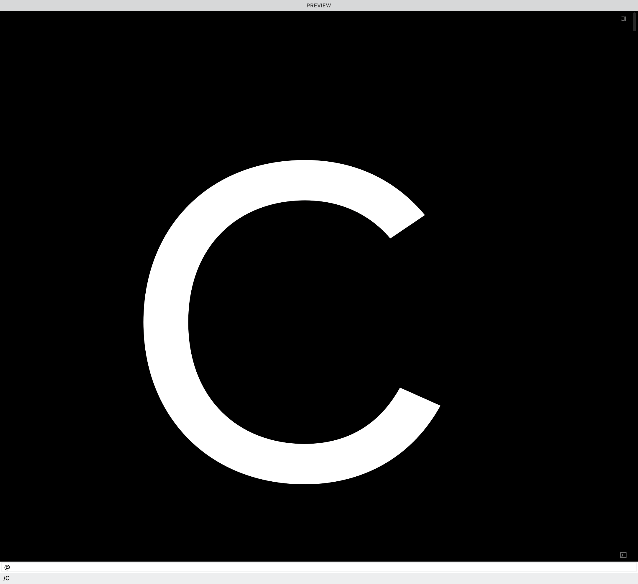
❸ Your letter should now look like a C, a single path, no stroke—essentially an invisible line. ▼
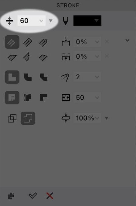
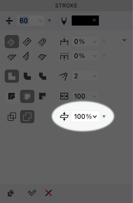
❹ Open up the stroke panel (Window > Panels > Stroke).
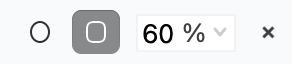
❺ Increase the stroke for the C—I used 60 stroke (≈ a light or extra-light font).
At this point, if you push space bar to preview, it’s not going to be the best. You need to make optical corrections. But first let’s adjust the positioning of the letter.
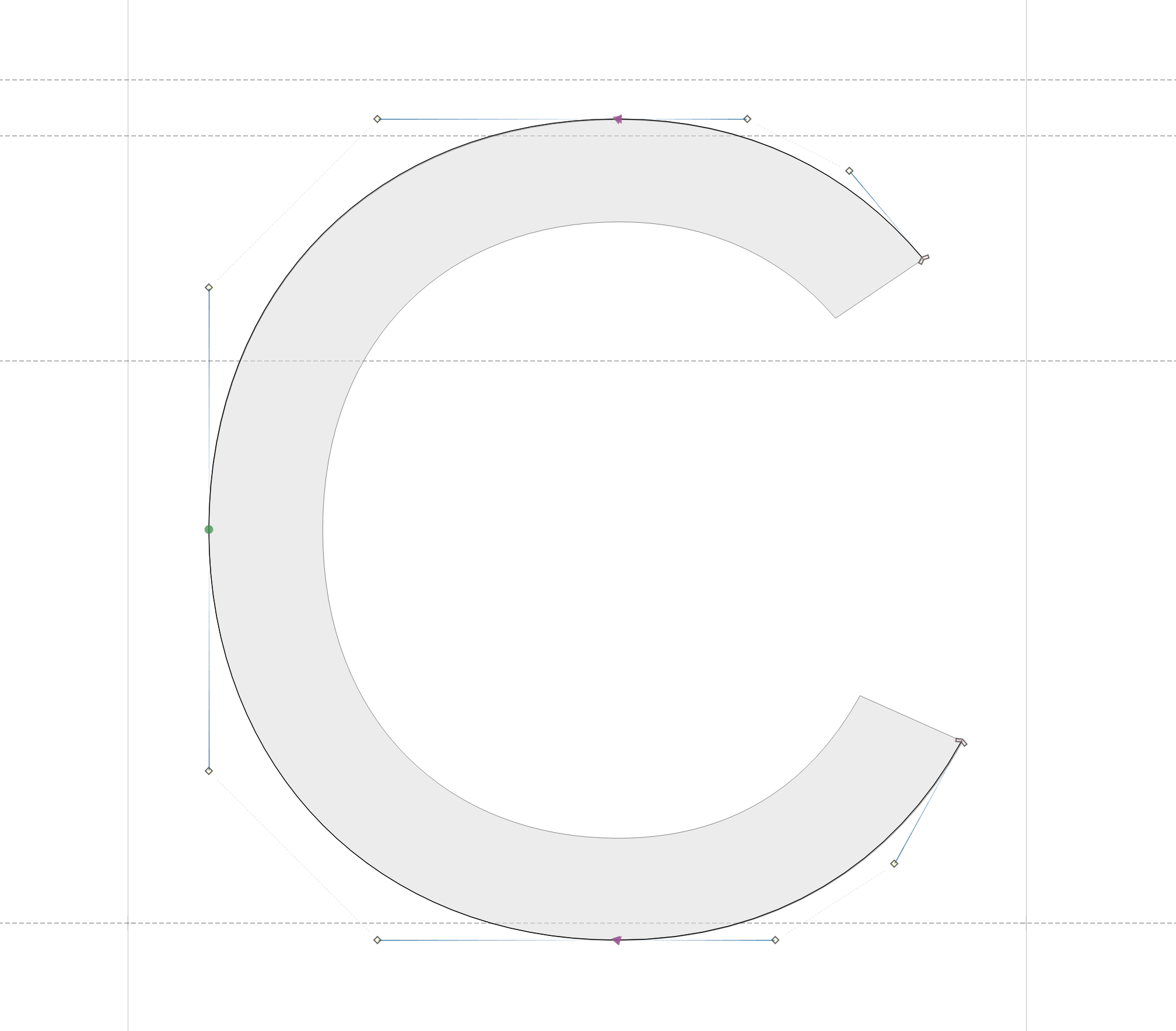
❻ The letter is poking up and down too high! So change the fill to inside. Like this:
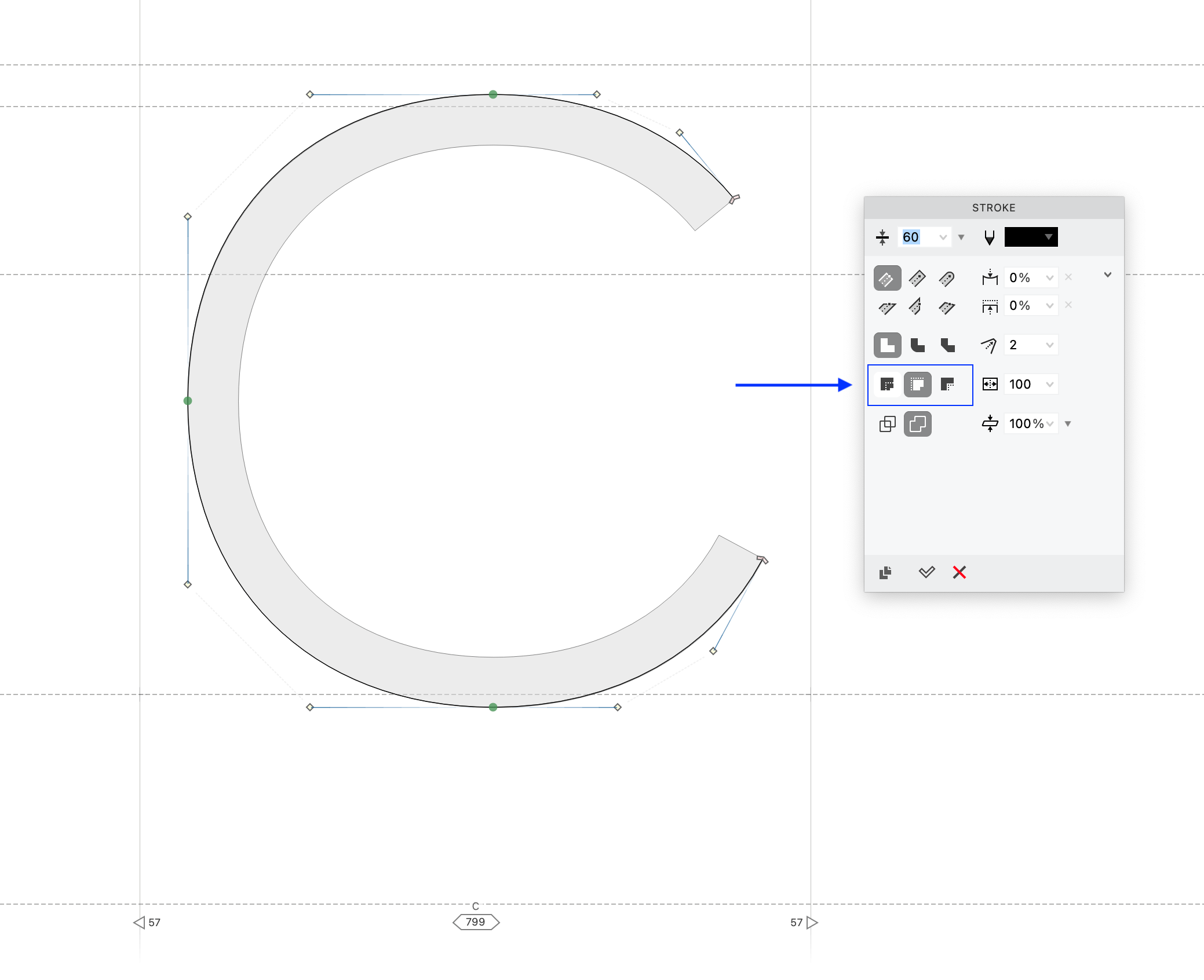
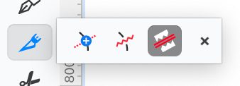
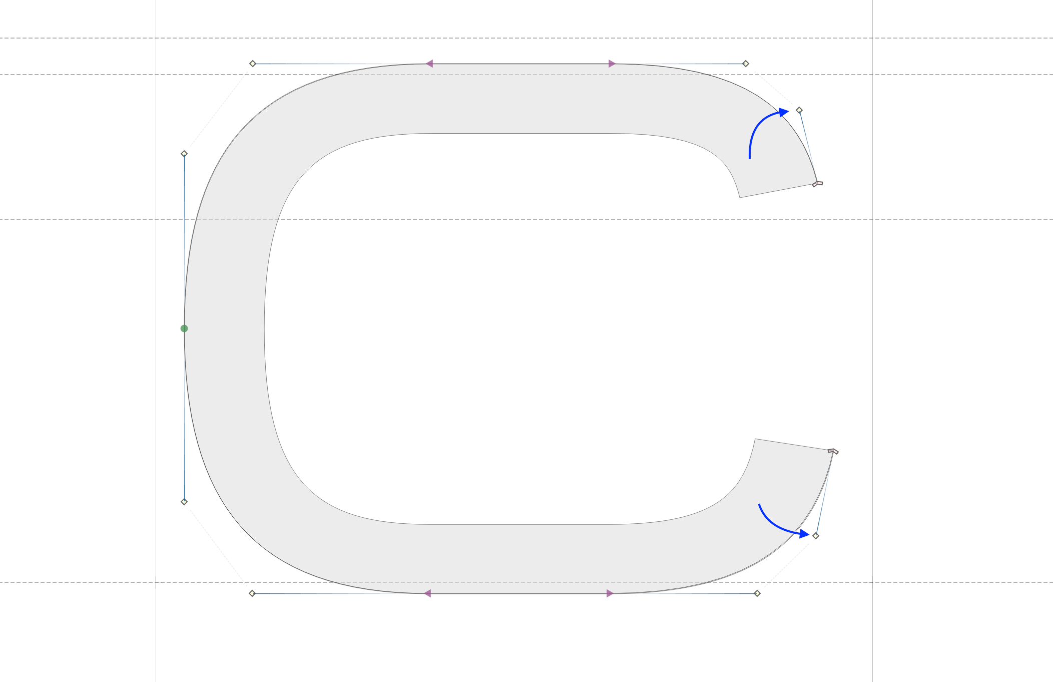
❼ Now that we have the correct overshoots, it’s time to adjust your terminals using this area of the stroke panel ▼
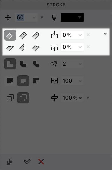
If you want to adjust your terminals independently, push the ⋁ in the upper right.
❽ Optical Corrections: Once you have the terminals that you like, you can adjust the contrast to optically correct the letter. 80 – 95% is about normal optical correction. (≈15% or less for high contrast letters, or ≈120% for reverse contrast letters!)
Now, you can also adjust the handles at the end of the C, to get the terminals looking how you want. All the usual commands like balance, harmonize, nudge and power nudge work on a single path.
Phew….OK!
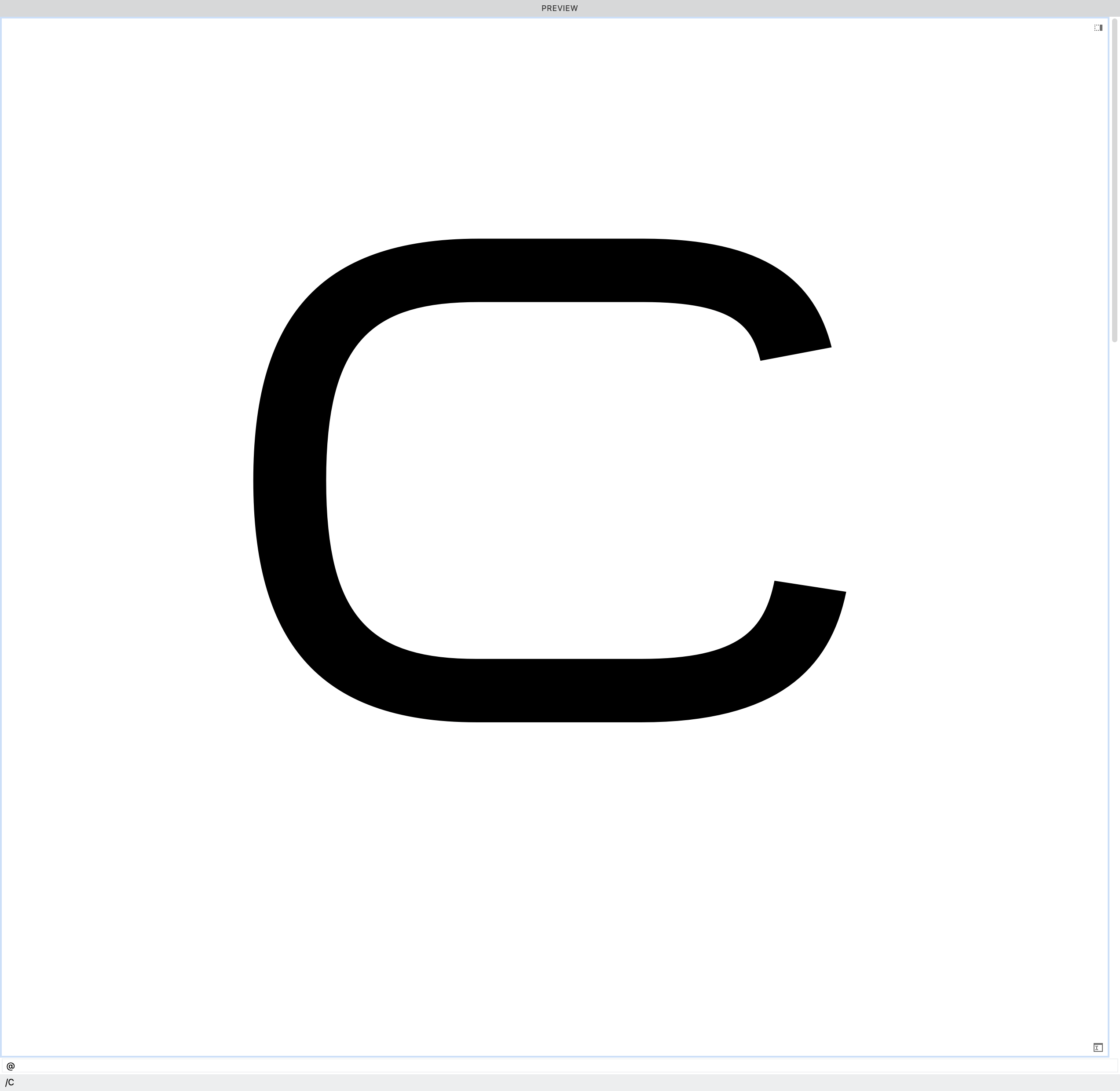
So, now you already have a pretty good looking C.
But the new thickness tool, allows you to adjust the stroke even more!
Adjust Strokes with the New Thickness Tool
Step by step
❶ click your shape using either the black or white cursor tools.
❷ Next click the Thickness tool (8).
❸ At each node you should now see a thickness adjustment.
You can adjust both triangles, but if you use an inner stroke, it’s recommended that you adjust the inner triangle only
For this letter, I adjusted the ends, the top, and bottom of the stroke. You can do all this, independently.
❹ At this point, that’s really all you need to do. If you want to change this into a “normal” contour instead of a stroke, go to the menu: Element > Expand Stroke.
Other Uses for the Stroke + Thickness Tool
Sometimes it can be hard to draw a perfect triangle, especially if it is at a strange angle.
Let me show you how to make a perfect triangle in any direction and from any start point—isosceles, obtuse, whatever!
First make a straight line using the rapid tool or Bezier pen.
From there you can go to the stroke panel as we did above and add a stroke. It doesn’t matter what number you choose. You will be doing most of the work in the thickness tool anyways.
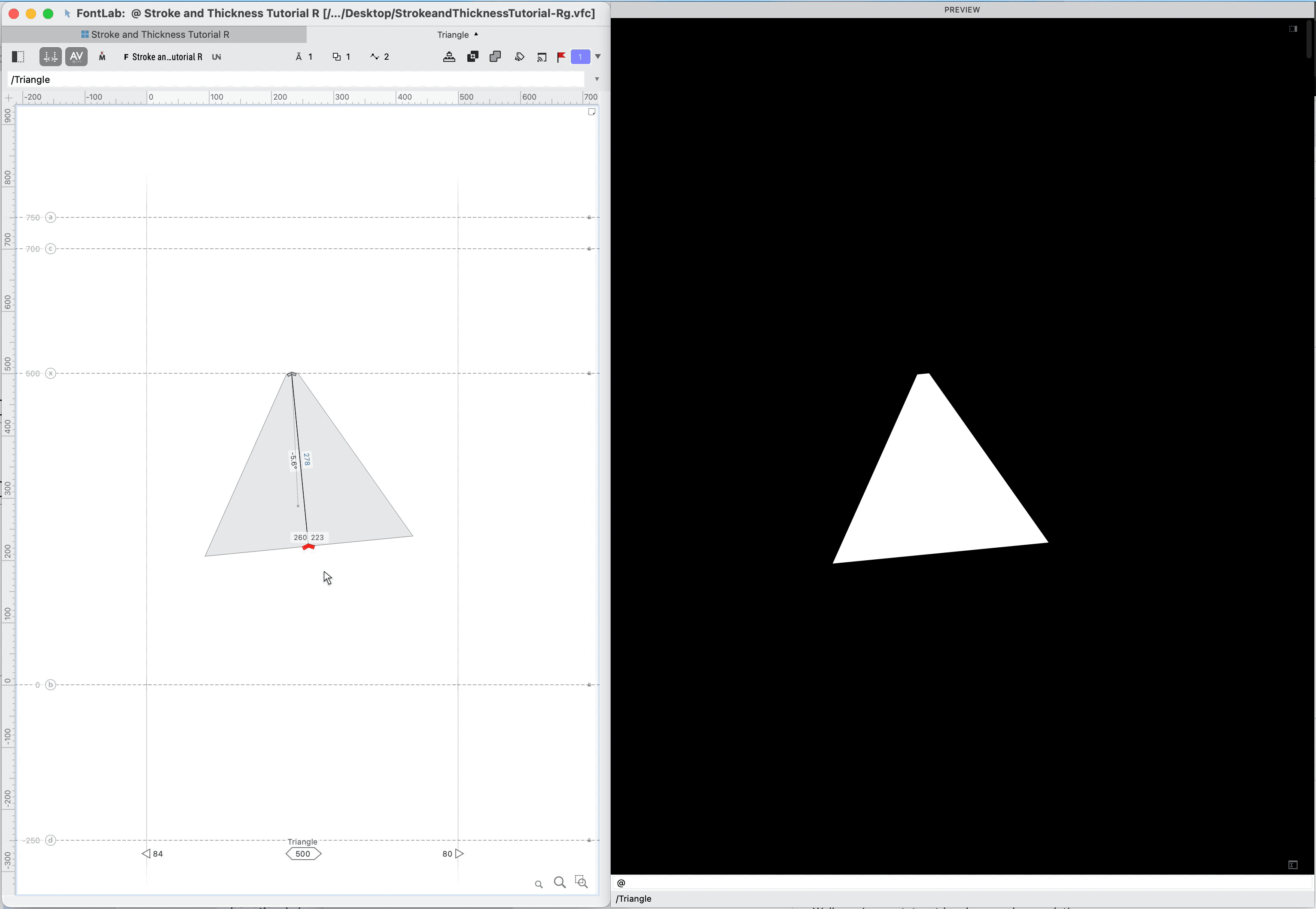
❶ Click into the Thickness tool.
❷ Now the important part: hold down Alt and drag the thicknesses to create a symmetric triangle.
Once you have that modified, you might end up with something like this ▼
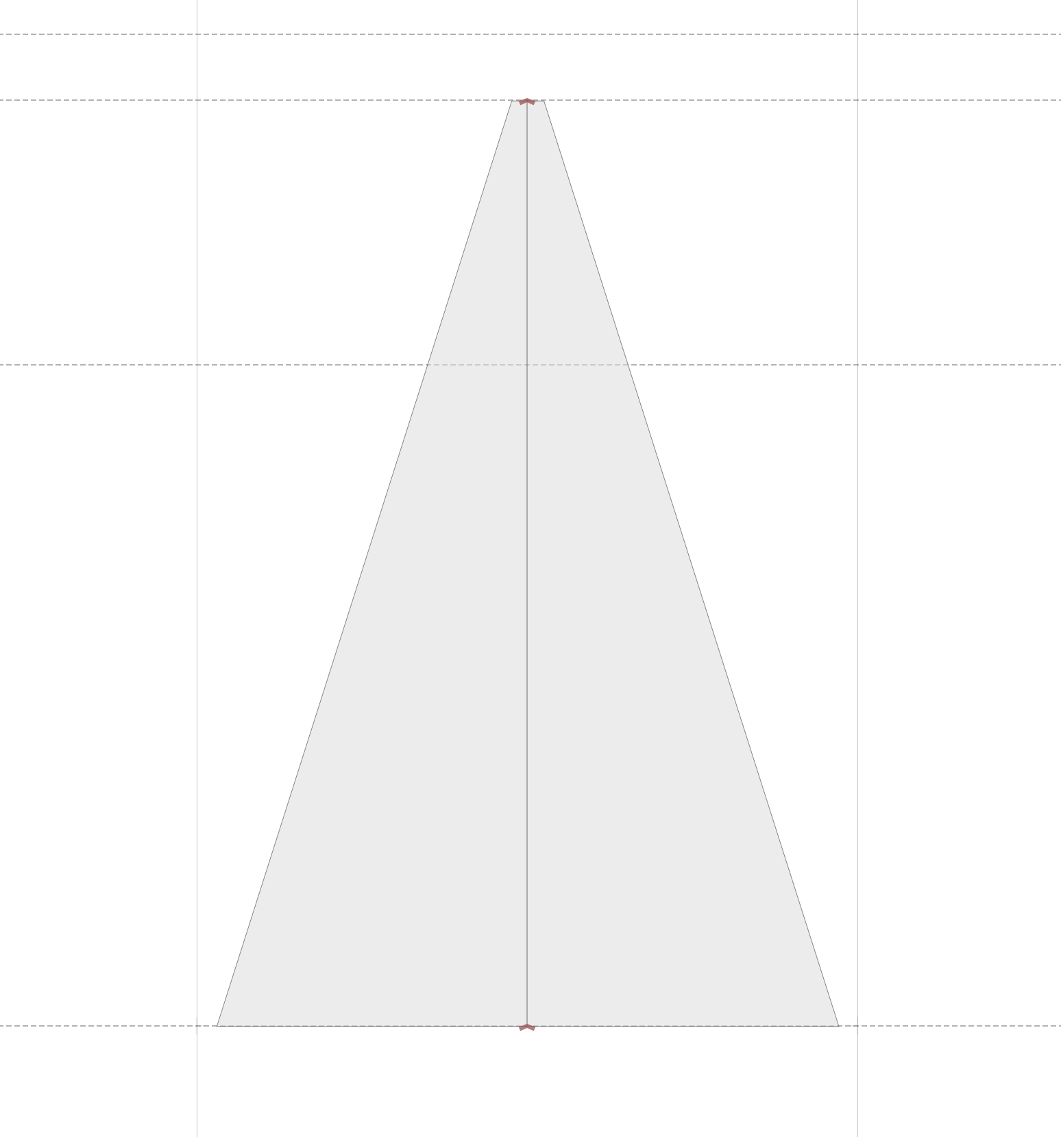
Ok, this is not an exact triangle, but a triangular trapezoid. If you want an actual triangle, all you have to do is narrow the top to zero.
Remember in the old days…when to modify a triangle you had to move all three or four points at different times?
Since this triangle is actually a stroke, it’s so much easier to manipulate than a shape!
Now you can rotate a triangle around one point!
Check this out ↓↓
Once you get the orientation you want, all you have to do is let go and readjust the thickness as needed.
Even More Shapes with Stroke + Thickness Tool
Guillement, periods, bars, brackets, braces, parentheses, in sans, script, and even serif fonts!
Here, I’m going to show you how to make a guillemet, step by step.
❶ First we’ll create the symbol. Go to menu: Font > New Glyph. Type “guilsinglleft”. Click create, and you now should be inside the left guillemet.
❷ With either the Bezier pen or Rapid pen tool, draw a straight line in the shape of a guillement (the chevron looking shape.)
❸ Now we’ll adjust the stroke. Bring up the stroke panel. Adjust the stroke width. I’m using 52 because that would somewhat match my C.
❹ Leave the stroke on both sides. Adjust your terminals. At this point, you might have something similar to this:
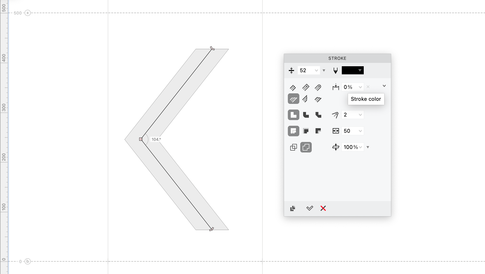
❺ Here’s where the fun begins! This time we’re going to look at another option, the join, or the elbows where strokes connect. In the stroke panel, change this to the type that you want.
Power Tip
Diagonal strokes can be optically adjusted as well.
Warning
Note: Join types are not available for inner strokes.
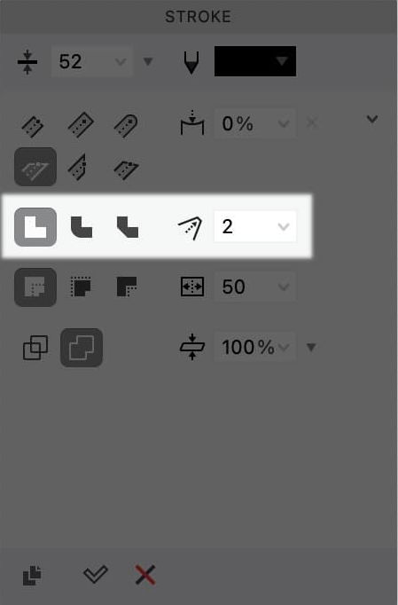
❻ To adjust the size of the flat or round join, use the stroke offset, like this:
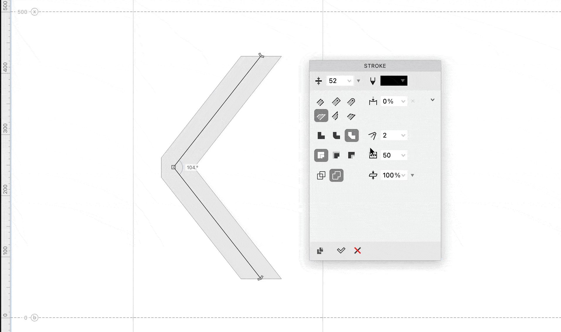
❼ Finally, make any adjustments using the thickness tool.
Families and Variations with the Stroke+Thickness Tool
Stroke makes it easy to modify a letter by nudging slider.
Because of this, stroke helps you quickly make variations of your original design.
And in just seconds!
Here’s how to make weight, width, and other variations.
Weight Variations
You can make a weight variation in a couple steps, including the difficult to make thins and hairlines.
Check it out.→
Making a Hairline
Starting from you previous C, change our stroke to 6 – 16ish.
I chose 10 for my hairline.
Now you need to clear out any adjustments that might be messing up the look of your letter.
In order to clear these out, click the white or black arrow, click the letter, and click thickness tool. Wherever the thickness triangles are green, this means you’ve made an adjustment.
Some adjustment is needed for correct interpolation. So, don’t delete the adjustments entirely!
But drag the thickness triangles until you are happy. :)
Adjust your stroke contrast if you want. Adjust your overshoots and width using power nudge.
In all of 20 seconds, you have a hairline letter!
Then just follow similar steps for Bold and other weights.
Pro Tip
In the case of my bold C, the curve tension was too high. Sometimes when you change the weight of a letter, you also need to adjust curve tension.
Adjust curve tension by menu: View > Tunni Lines (L). Then menu: Contour > Edit Tunni Lines (AltCmdL). Pull the dotted lines.
Tunni lines are a quick way to adjust the curves on your letters.
Width Variations
Condensed Letter Step-by-Step
Ok, let’s copy one of the C paths from above.
Using the power nudge tool,

move the left node holding Shift, like this. ▼
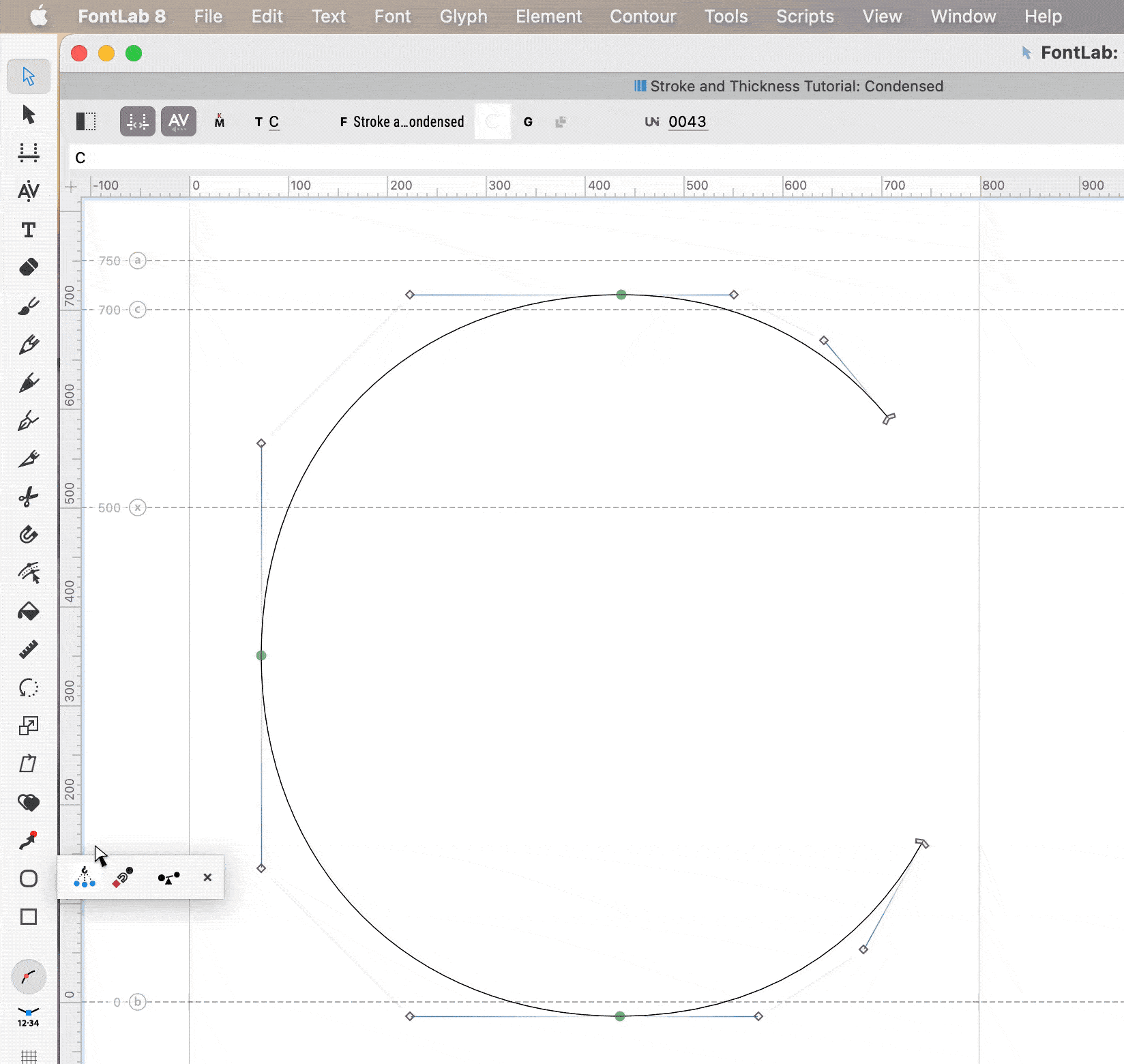
If you need to, line up the path ends.
After I add the stroke, I have something like this:
If you want to go to extra condensed where the sides are straight, that is more work, but is also possible.
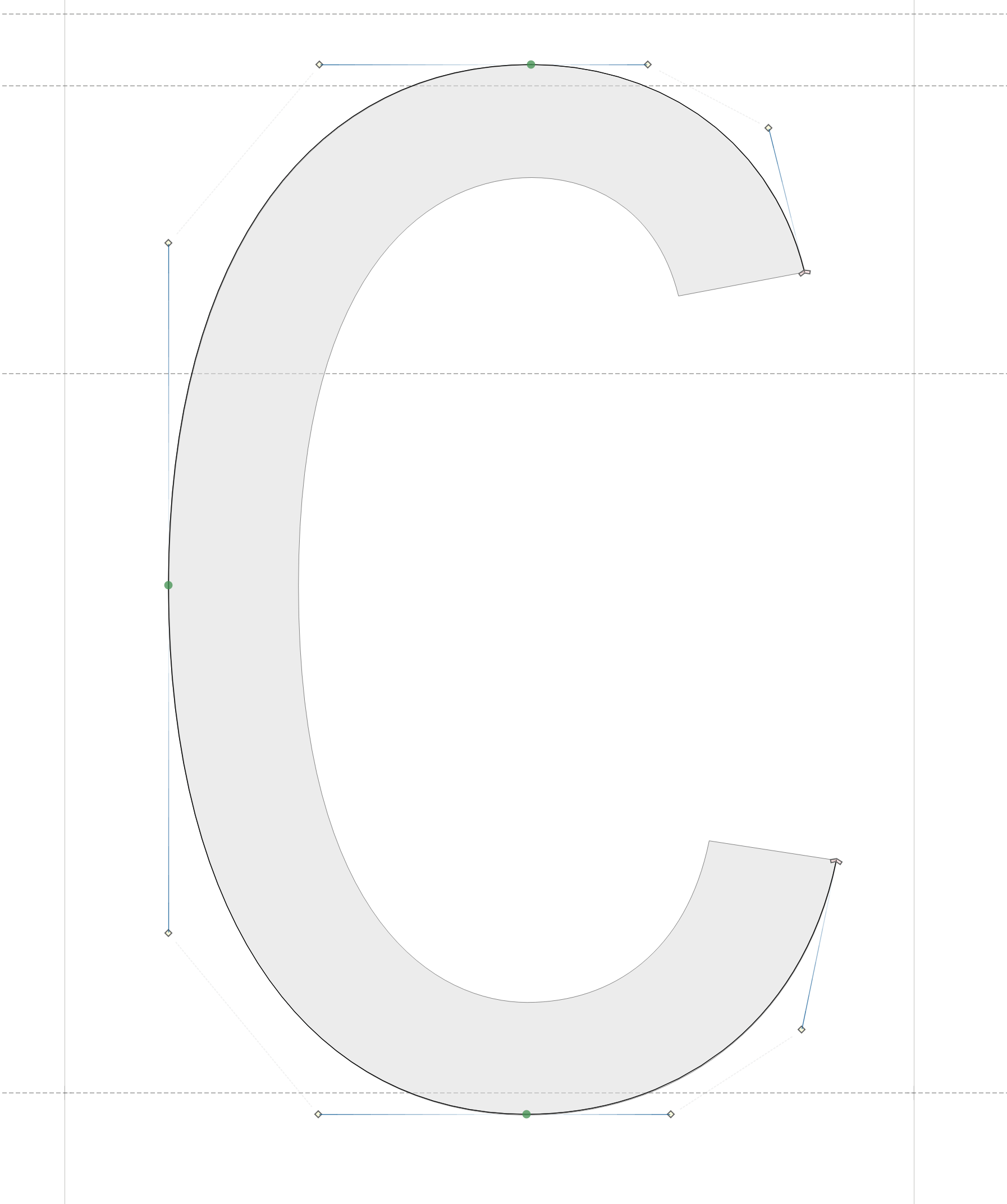
Expanded Letter Step-by-Step
Here’s how you can make an expanded letter using stroke + thickness tools.
First, you want to duplicate the nodes at the top and bottom of your “C”, so that you can spread the letter apart.
While selecting the top node, push CmdD to duplicate. Do the same with the bottom-most node.
Your C should look like this:
Now…holding Shift, select the left side and drag. (Continue holding Shift so that the C remains level.)
After that adjust the curves and the whiskers of the C until the shape is to your liking.
I know it sounds cliché, but the only limit of this stroke + thickness tool is your imagination!
You will find even more uses for this tool when you start your own FontLab experiments!