Briem’s notes on type design: Squeeze and stretch
Here’s how to make a condensed version.
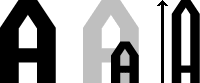
First we reduce the character set in size by 50%, sidebearings and all. Next we pull the top of the capitals to the height they were before. And then we pull up the lower case letters to match the caps, without lengthening the ascenders.
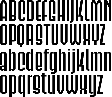
This may look like an interesting starting point for a different design. But that can wait. Twenty-one of these letters have to be pulled into shape. The rest (such as the letter D) is already finished, and needs no more work.

The center of the letter s should go to the middle. Measure the full-width original. That’s how you decide the length of the end stems.

The slanted parts can get distorted. This letter k must be put right. The letter z, both the cap and the lower case, probably need attention as well.
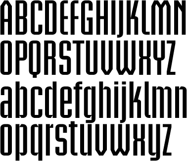
The condensed version should look something like this. We have reached the end of the first exercise.
Notes on type design. Copyright © 1998, 2001, 2022 Gunnlaugur SE Briem. All rights reserved. Republished with permission in 2022 by Fontlab Ltd.