Briem’s notes on type design: Spacing the lower case
You space the lower case as you do the capitals. Your first step is to decide the width of the letters n and o. Print out a test in several widths.

Here are five choices of the letter n in different widths. I selected the third line.

Here are five choices of the letter o. I selected the fourth line. We can base the spacing of the other lower-case letters on these two.

A line of the letters n and o looks like this. This letter n is not symmetrical, so the left sidebearing is wider than the right. Here it’s 14% wider.
This page describes the spacing of hot metal characters at Linotype. It draws on Walter Tracy’s book Letters of Credit , just like the page about capitals . Several texts deal with the subject from other angles. His is accessible. You should read the book.

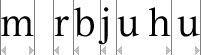
The letter m should have the same sidebearings as the letter n. The left sidebearing of the letters r b j u should be the same as the left sidebearing of the letter n. And the right sidebearing of the letters h and u should be the same as the the right sidebearing of the letter n.

The left sidebearing of the letters h i k l p should be slightly wider than the left sidebearing of the letter n. Let’s assume that “slightly” means five or ten per cent.
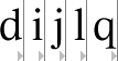
The right sidebearing of the letters d i j l q should be the same as the the left sidebearing of the letter n.
Remember that the letter j seldom has a serif on the right. When you set the sidebearing, measure from the stem of the letter n, not the serif.
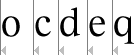
If you have the left sidebearing of the letter o, you have also got the left sidebearings of the letters c d e q.
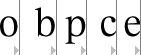
The right sidebearing of the letters b and p should be the right sidebearing of the letter o, and the right sidebearing of the letters c and e should be slightly wider. Again, we’ll assume that “slightly” means five or ten per cent.

Both sidebearings of the letters v w x y should be a small as possible. So should the right sidebearing of the letters k and r.
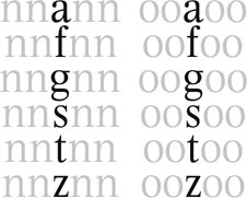
You have to space the letters a f g s t z by eye. Put them between the letters n and o and adjust the sidebearings until you’ve got the space around them that you want.

This method is a good start. Tightening the letters v w x y wouldn’t hurt. A formula for spacing is only a first step. Using your eyes comes next.
Notes on type design. Copyright © 1998, 2001, 2022 Gunnlaugur SE Briem. All rights reserved. Republished with permission in 2022 by Fontlab Ltd.