Avoid Mistakes By Following the Basic Vector Rules
Benefit: Manage vectors more easily when you follow these rules.
These rules come from, among others, Adobe Type 1 Font Format.
1. Points at Extremes
Place nodes at extreme horizontal or vertical positions.
This means straight nodes at the top, bottom, right and left.
Correct▼

Very Incorrect▼

A Bit Incorrect▼
So you can find them, FontLab makes the nearly horizontal node a brighter shade of green. ▼

In dark mode, the color difference between horizontal and almost-horizontal is very slight.▼

To check extremes, use light mode instead.
Info
FontLab puts nodes at extremes on export.
However, you can also get nodes at extremes in these ways:
- Drag handles, then hold Shift.
- Shift-Double Click handle.
- Alt-Double Click handle. (Slides node to extreme)
- Go to menu: Contour > Nodes at Extremes (AltCmdJ).
- If a node is really off: get Knife tool. Hold Shift and click the contour.
Info
FontLab puts nodes at extremes on export. However, FontLab has a 1° tolerance. If the handles are less than 1° from vertical or horizontal, FontLab will not add nodes at extremes. So you must make sure no nodes are “almost at extremes”.
EXCEPTIONS: Not necessary to place nodes at extremes of shallow curves.
Small curves:
- Rounded serif tips don’t need extrema (extreme nodes).

- Shallow tails don’t need extrema.

- Large, shallow curves don’t need extrema.

Info
Why? If you add extrema to shallow curves, that can mess up a couple things. It can mess up PS to TT curve conversion. It can cause interpolation issues. It can cause rounding errors.
2. No Kinks
Kinks happen when corner nodes (square) incorrectly replace smooth nodes (round).
Un-smooth ▼

The only time you might want to allow kinks, is when you have small details like this that won’t round correctly. (Notice that you also can’t have nodes at extremes.)

Info
If you draw with fractional nodes, shallow curves won’t look this bad. However, you will still have this problem with TT exports, since TTFs don’t support fractional coordinates.
3. Pithy Paths
Don’t use more points than necessary.

4. “Magic Triangle”
Handles should fall inside an imaginary triangle.
Good ▼

Bad. ▼ Follows the triangle rule, but goes against extremes rule.

Bad ▼ Handles outside of the imaginary triangle.

The one that is spread out has extrema problems AND the triangle is going the wrong way!
5. Path Direction
Black goes counterclockwise. White goes clockwise.
Two ways that can help you remember:
- Correct curves are like American, Continental European roads. You drive on the right. (TTF curves drive like Japanese and British roads, on the left.)
- FontLab’s little gray arrows should be on white. If they are over a gray part, contour direction is wrong.
Correct, arrows on white. ▼

Incorrect, arrows on gray. ▼

#6. Avoid Overlaps
Exports should not have overlaps. ▼

Exception to the Rule
Variable font exports are allowed overlaps.
7. Nodes at Inflection Points
This is not in the Adobe Type 1 Spec. But it has been common practice.
First, what is an inflection?
In the next picture, see how the s is going from counterclockwise at the top. Then, somewhere in the middle, it changes to the clockwise direction.
The point where it changes is an inflection.

Pro Tip
To see exactly where the inflection point is, turn on the curvature comb.
The point of inflection will be where the orange switches sides.

Inflection Rule
A node at the inflection point is not needed, unless you need to control your curve better. (You’ll see in the tutorial on curves, that this is very difficult.)
Info
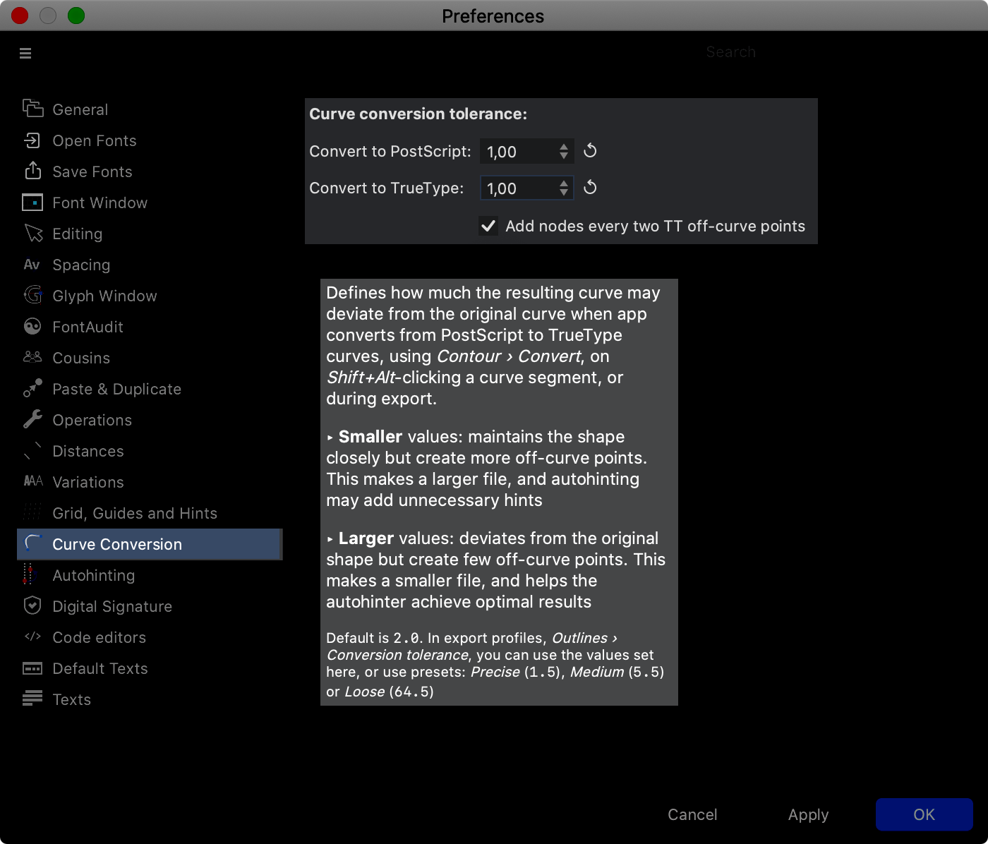
What’s the reason for no node at inflection? Some say having nodes on inflections help curve conversion. (From PS to TTF). This is not always the case. Instead, you can do this for better TTF curves:
- Leave the inflection nodes out.
- Then go to Preferences > Curve Conversion > ☑Add nodes every two TT off-curve points. You can turn the values downward which is more precise. FontLab uses 1.5 for precise.
Here’s an in depth discussion about inflections.
Please Note: These are for static TT (TrueType) fonts. If you are making a Variable TrueType font, you don’t want to add extra points to the curve.
Happy vectoring!
PS This PS is for you, if you already know these rules and how to use them.
In my vector drawing masterclass, you will discover that these rules are OLD!
You will learn that there are—not one, but—THREE! types of drawing rules.
These rules should not be confused with each other!