Briem’s notes on type design: Bowls, stems and curves


You don’t need to add a lot to the thinnest lines. Look at the bold letter on the left. It has a thin hairline, just as thin as the hairline in the regular weight. It will suit our purposes.
The bold letter in the middle has a robust hairline. If the design were intended for use in small size, say eight points or less, a hairline like that would be useful. The letter on the right has not only gained a swollen hairline but lost the crispness of the regular weight.
More of the same
If you’ve got the letter u, you’ve got the letter n as well. Turn the letter u upside-down and give it baseline serifs.

You can make the letter h from the letters n and l. And from the letter n, usually with narrower counters, you can make the letter m.

You can fatten the letters b d p q the same the way as you did the letter o. The join of the curve and the stem needs adjustment. Here’s how you make a bold letter b.
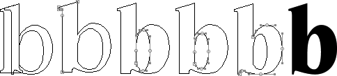
- Start with the letter b in a regular weight, and the bold letter l.
- Make a bold stem.
- Reduce the countershape horizontally to about the same size as the counter in the letter o.
- Reduce the counter vertically until the hairlines are about the same as in the letter u.
- Reduce the outer path of the bowl until the curve is the same thickness as in the letter o.
Notes on type design. Copyright © 1998, 2001, 2022 Gunnlaugur SE Briem. All rights reserved. Republished with permission in 2022 by Fontlab Ltd.