Briem’s notes on type design: The l-group
The letters i j l f make the l-group. We only have three: Arrighi didn’t include the letter j in his character set.

The lower case has shapes of its own, different from the shapes of the capitals. We need to define a few. Stem width is one. An exit stroke (a serif, if you prefer) is another.

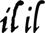
Arrighi’s letter i on the left has a dot that is easily mistaken for an acute accent. I think we should use an oval dot instead, as it is on the right.

His letter l is rough. Still, it gives us an idea of proportions and shape. We can use it. The lump at the top is a decorative element, written from left to right and then turned back on itself.
Arrighi’s letter i has an entry stroke that I’d like to leave off. It would look awkward when it followed the letters f and t. And we can’t really expect our users to stick in a proper ligature every time they come to the letters f and i.

Here’s how NOT to make a letter f.
- Assemble a letter l, an upside-down letter l, and a crossbar.
- Remove the overlaps. Join loose ends.
- Fill. The result looks awful.
For a start, the letter f should slant less than the other letters, as I mentioned on the page about optical illusions.
And here’s how I’d improve the mess I made of the letter f.
- Slant the letter to the left, two or three degrees.
- Make the descender narrower at the bottom curve. Deepen the curve on the left side and move it to the right.
- Straighten the stem
- Fill. This looks better.
Apart from the slant, I relied more on my own taste than Arrighi’s original work. You may well find a better way. Please feel free to do what you like.

We should add four items to our grid. The first is a template for a lower-case stem, slanting about 6 degrees. It won’t work every time, but it’s better than nothing. We don’t want the letters perfectly uniform, not even the slant.
The second, third and the fourth items to add are an ascender line, a midline, and a descender line.

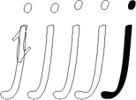
This letter j is not a simple assembly job. We start with the letter i and the letter l, upside-down. Next we remove overlaps and connect loose ends. Then we move the dot up and to the left. Finally we narrow the descender at the bottom curve. Remember to work from the left side. Deepen the curve and move it to the right. The thinnest part, the hairline, should be the same width as in the letter f.

The stems of the letters i and j bend in opposite directions. I wanted them to look right together. But uniformity was the least of my concerns.
Notes on type design. Copyright © 1998, 2001, 2022 Gunnlaugur SE Briem. All rights reserved. Republished with permission in 2022 by Fontlab Ltd.