Setting Up Italics
Benefit: Avoid the big headaches that come when you set up the italic wrong!
In this tutorial, you’ll see how to correctly create an italic from an upright. You will avoid problems.
File Setup
A lot of times it’s good to just duplicate your upright file.
Download VFJ
Here’s a file you can use.
This only contains the uppercase and lowercase. Both upright.
Warning
In no way am I suggesting your slant right after making the uppercase and lowercase. Although you could, if that worked best for you. See this article on workflow.
Here’s how you would set up an Italic file, step by step.
Follow along in FontLab!
Setting Up File from Regular Design
❶ First thing we need to do is open the file and save a new copy (CmdShiftS). You can call it CAL Tutorial Oblique. Or whatever else fancies your suit. ❷ Now open up the Fonts panel. Go to menu: Window > Panels > Fonts. Then open up your other file.
In the Fonts panel, you might see something like this:
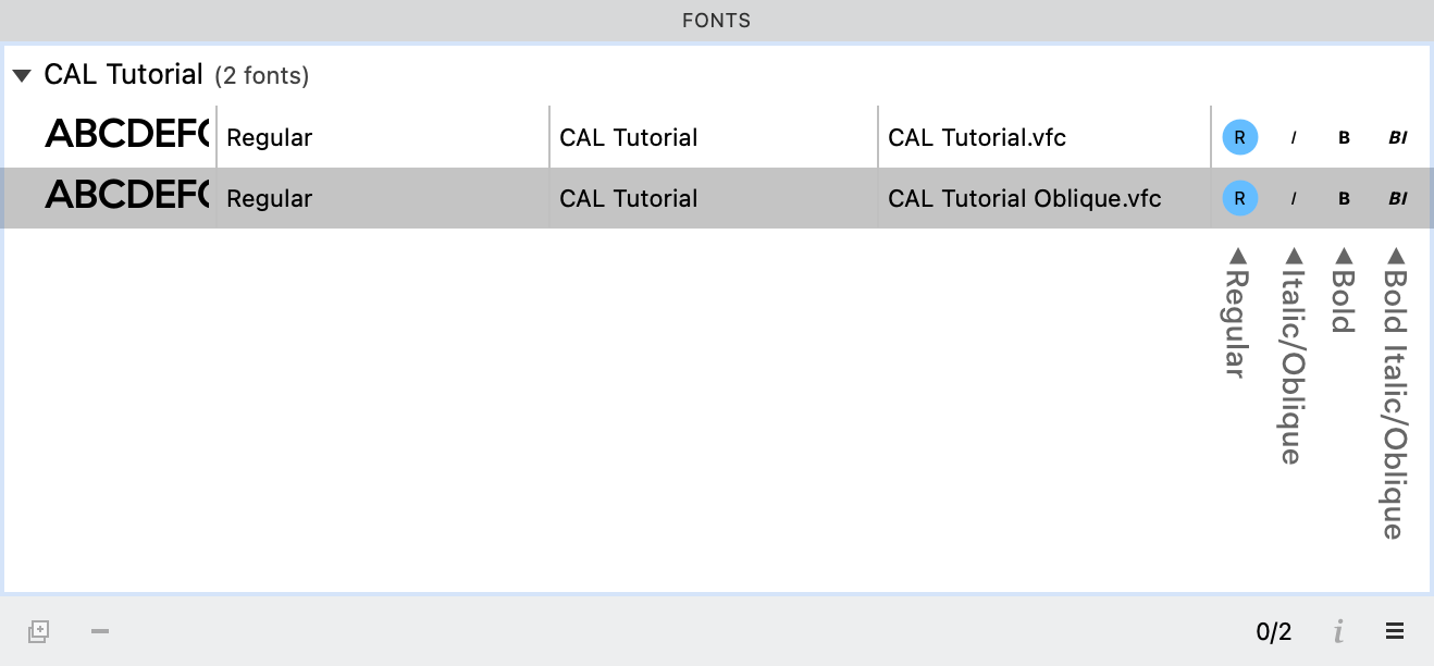
Those buttons on the right tell you where he is in the style family. Right now our two files are both regular! Click the I circle to make our “CAL Tutorial Oblique” the italic member of the family.
Now just for a little brush up, since some of you might not have made a family before.
Those buttons on the right represent Regular, Italic, Bold and Bold Italic.
If you have only one font, no matter if he is bold or slanted or backwards or upside down…whatever…he needs to be called regular.
If you have two fonts, that’s where you can start naming the fonts as a normal, quiet, two member family of Regular and Italic. Aww…isn’t that sweet?
Info
When I work on a family in two separate files, I like to keep both of them open. If I find a sidebearing is messed up or something else, I can just jump back into the Regular file. That way I can fix it up ASAP.
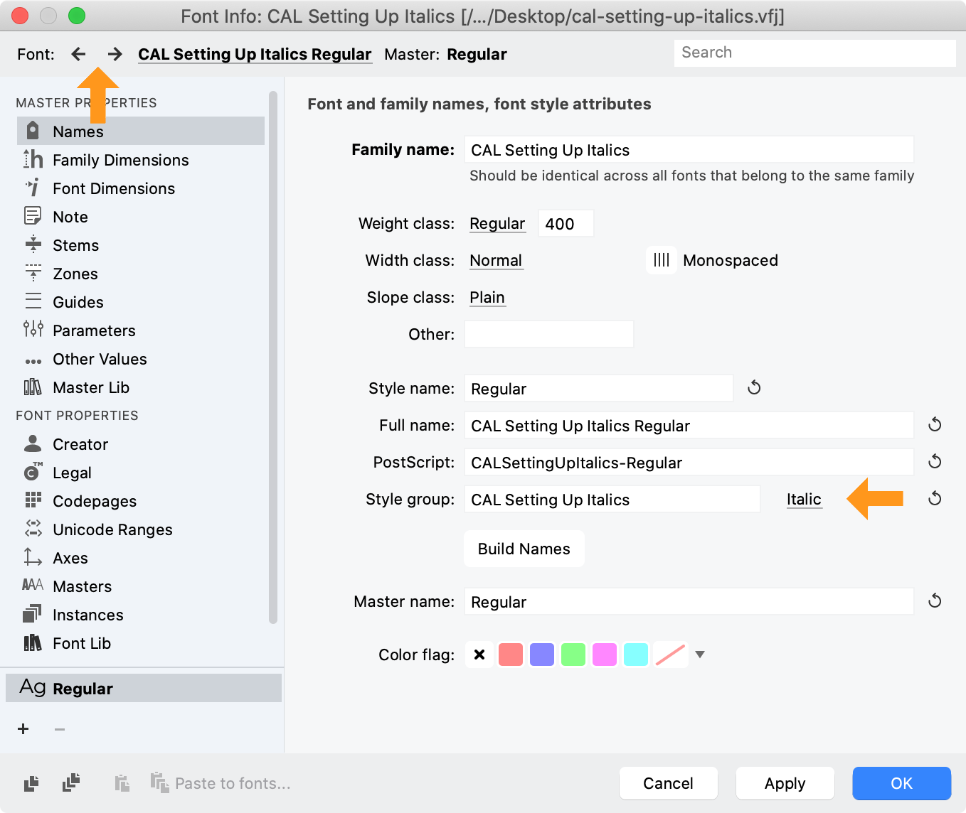
❸ Let’s hop over to Font Info to set up some things there. You can get to font info by hitting the ‘i’ in the lower right corner of the Fonts panel.
You know you are in the right file, if you see that it says italic here in the Style Group area. If not, you can switch to the correct file by clicking up here.
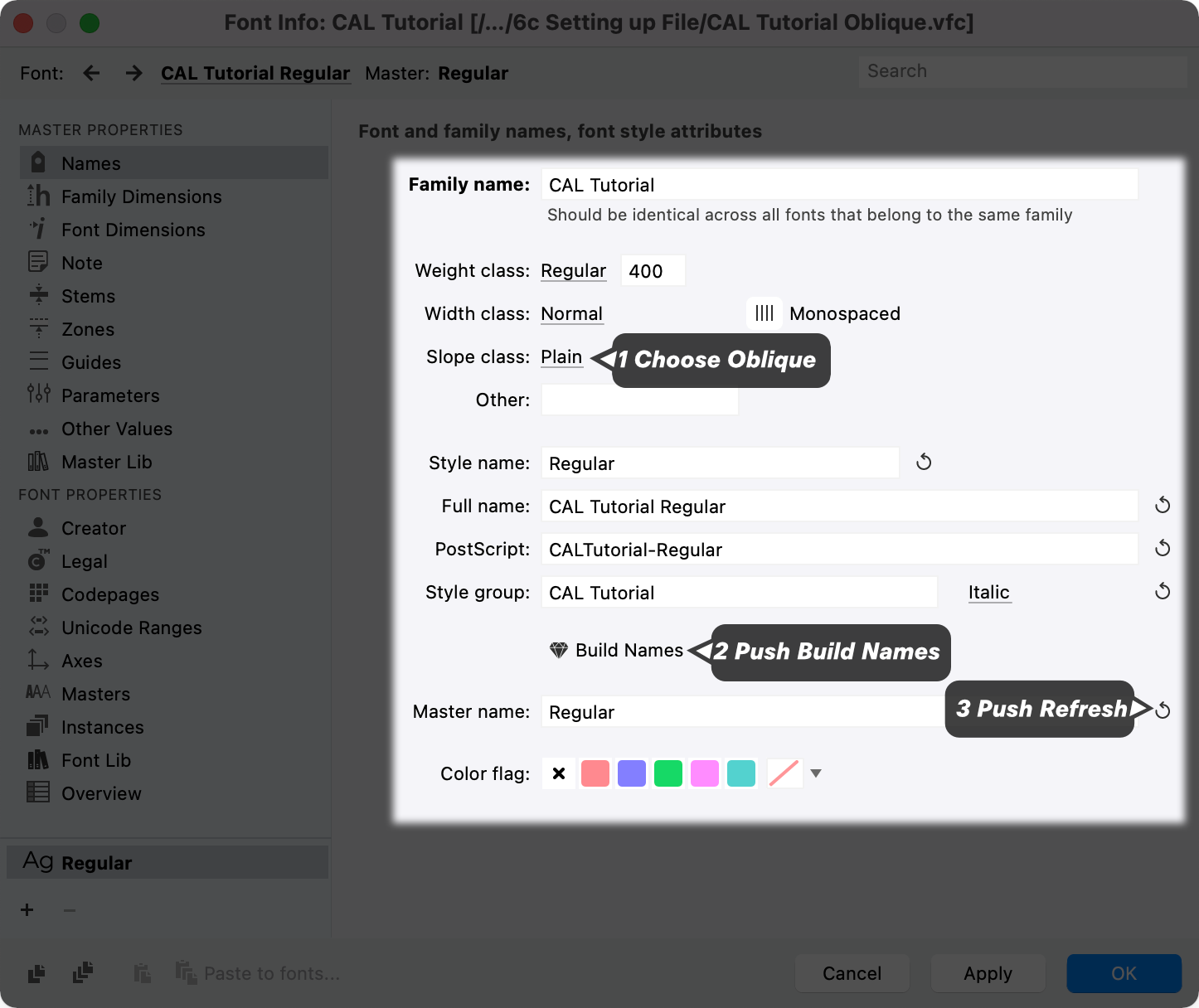
Here’s the things you need to change. You should leave the others the same.
Go in order from top to bottom. You set the top value, then can autogenerate the rest.
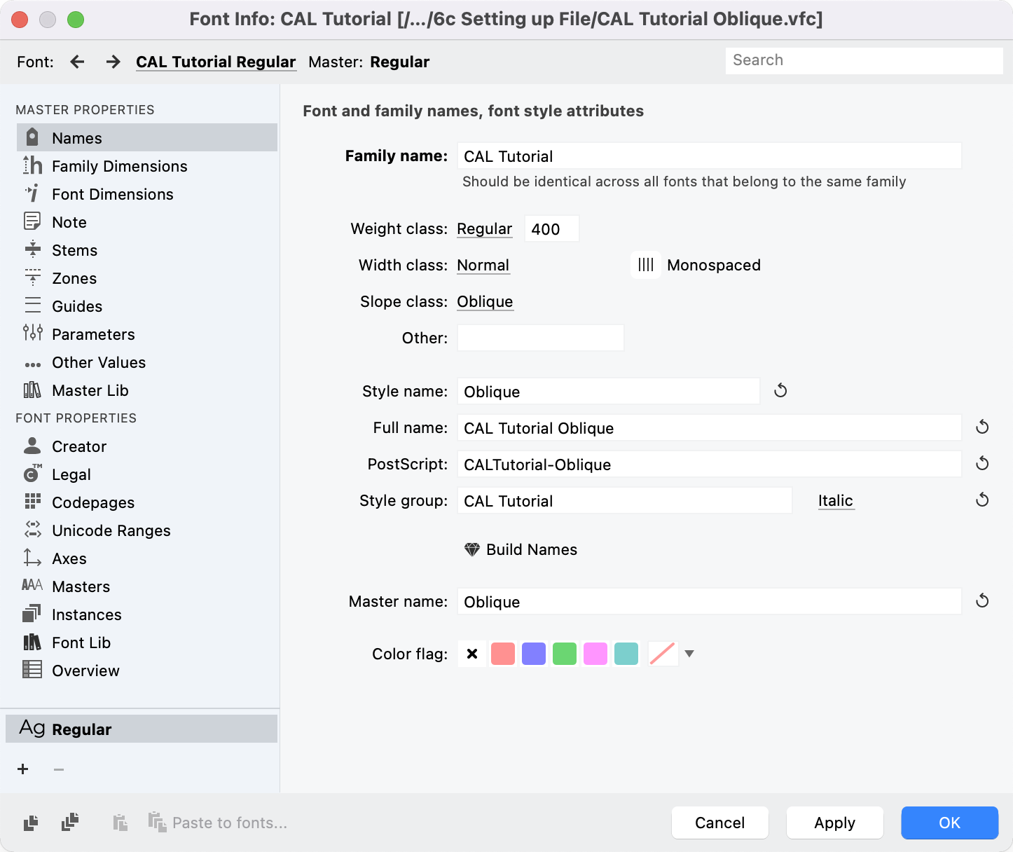
Now you should have Obliques all over the place like this:
Hit OK and save the file. Now let’s jump back into Font Info.
❹ Italic Angle This time, go to the “Font Dimensions” sidebar. Now let’s choose the italic angle for the font. It’s a best practice to choose one of the “beauty angles”. These help reduce rounding errors: 5.19° = 1 / 11 5.71° = 1 / 10 ♥︎
6.34° = 1 / 9 ♥︎
7.13° = 1 / 8 ♥︎
7.59° = 2 / 15 8.13° = 1 / 7 ♥︎
8.75° = 2 / 13 9.46° = 1 / 6 ♥︎
10.30° = 2 / 11 11.31° = 1 / 5 ♥︎
12.09° = 3 / 14 12.53° = 2 / 9 ♥︎
12.99° = 3 / 13 14.04° = 1 / 4 ♥︎
15.25° = 3 / 11 15.94° = 2 / 7 16.70° = 3 / 10 ♥︎
18.43° = 1 / 3 ♥︎
20.56° = 3 / 8 21.80° = 2 / 5 ♥︎
23.20° = 3 / 7 26.57° = 1 / 2 ♥︎
30.96° = 3 / 5 ♥︎
The ones with the heart are easier to work with. Personally, I like 11.31° (which was used for FF Din) and 16.70°. These are good because you can put your coordinates at increments of 10. Slant them, and there will be no rounding errors.
Enough of the details, go ahead and choose some number for this exercise. 11 – 15° is the “normal” slope. (Check the next tutorial and you’ll see how some of these slopes look.)
Setting Your Caret Offset

What’s a Caret
A caret is one of those blinking things that I’m looking at as I type this out!
Caret Offset
Your italic needs a caret offset.
Here’s why: if you just slant an italic forward and then mix that with regular, he will start trying to crash into the regulars in front of him.
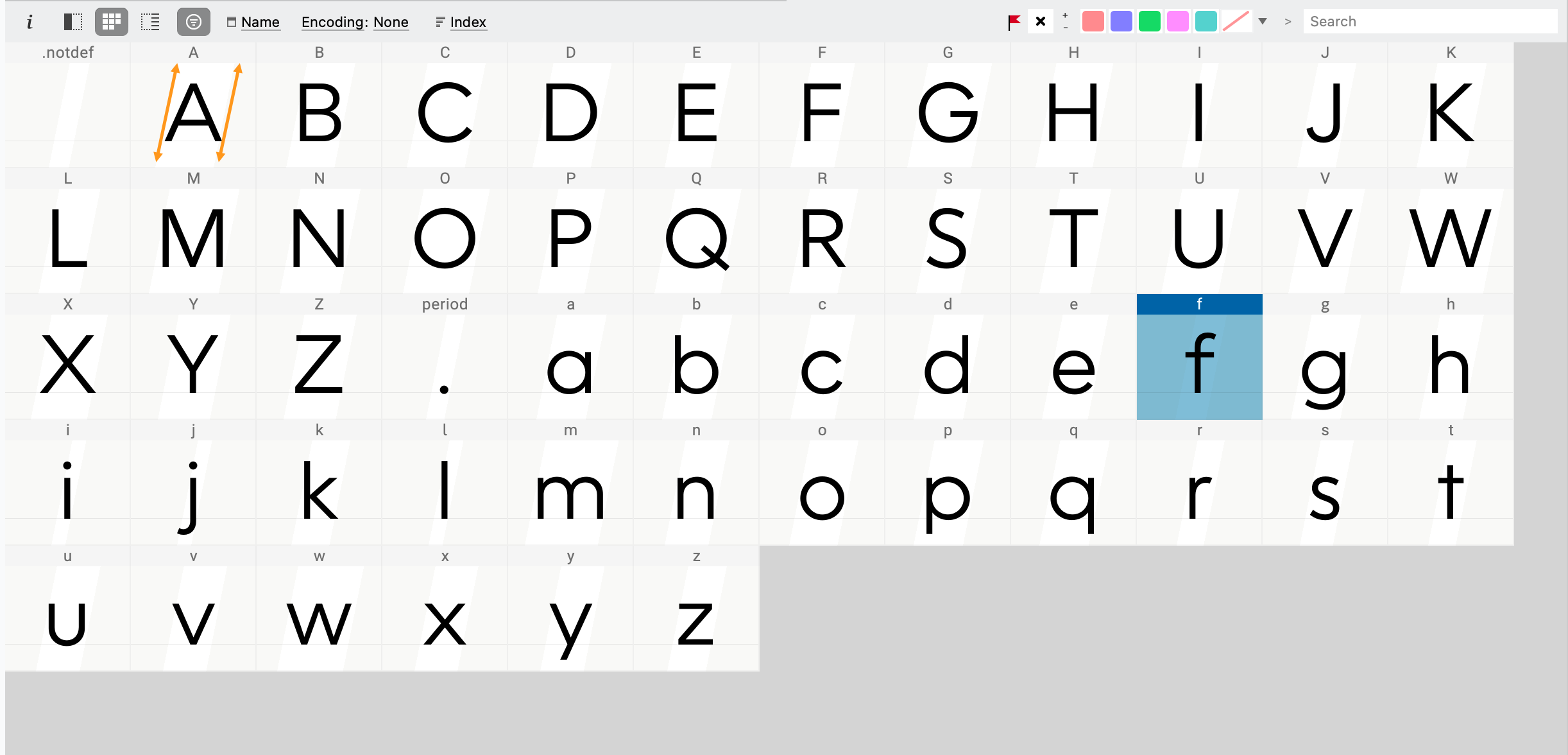
Here’s an example. I have put an italic n between two bars from the regular in the family.▼
I use this trick with the bars to check it, but you can’t just use the n! You have to do your CAPs, ascenders, descenders, all that stuff.
Offset Too Low Tall letters like your caps and forward moving ascenders like d, f, etc will crash into stuff in front of them. Sometimes even when there’s a space!
Offset Too Much If your offset is too much, you will see the descenders of your p, j, g, etc. start to crash into the things behind them!
So you have to try it out and get the right amount. For a normal slant (11 – 15°), a value of negative 40 – 60 is pretty good.
Since you don’t have any letters, right now you have to guess!
We are going to choose a value of −45 and hit apply.
Adjusting the Position of Your Letters
What Metrics Group Are You in?
Before we go any further, I need to divide you into two groups, since we’ll have to do different things depending upon how you do your metrics.
Group A: No Metrics Links
If you are using the file I provided you are in group A.
If you’re using your own file, let’s see if you’re in Group A or B.
Group A: Your sidebearings and advance width for you letters are only basic numbers.
No equal signs. No letters. No other symbols. Like this.▼
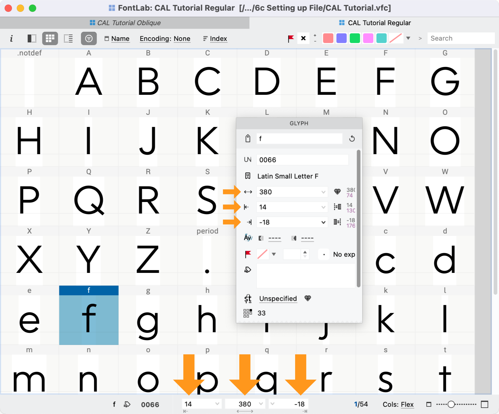
It must look like this for all your letters. Then you are in group A. If not skip down to the next section for Group B.
If you are in group B, catcha later!
Group A: Letter Adjustment
Welcome Group A!
You are my favorite group!!
Checking Sidebearings
First of all we are going to make sure that all your sidebearings are unbound.
It’s not that I don’t trust you…ahem…but…
Ok, so in the font window, select all your glyphs with CmdA. Then go to menu: Font > Metrics > Remove Metrics Links.
This will make sure that all the links and bindings are removed.
Otherwise we get problems where some sidebearings change, some stay the same. Basically one of those deals that makes you have to load back.
Great!
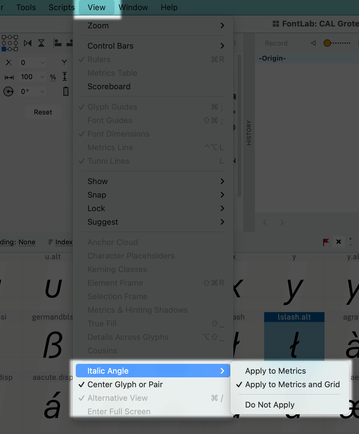
Let’s go to menu: View > Italic Angle > Apply to Metrics and Grid

Info
Don’t worry if you forget where this is. Book mark this other tutorial which will show you where all the italic settings are.
Check ✓Apply to Metrics and Grid.
In the font window, your sidebearings will be slanted. I have marked it in orange.
Ok, so here’s the thing…
When we changed our caret offset, that ONLY changed the caret placement.
It didn’t actually move our letters back to where they are supposed to be!
We have to do that ourselves.
Instead of going into the drawing window and just moving every letter back by 45 units, you can use actions.
Shifting Letter Backwards
First select everything.
Go to menu: Tools > Actions.
Now go to the sidebar. Select, Basic and then Shift.
Here’s a good set of options to use.
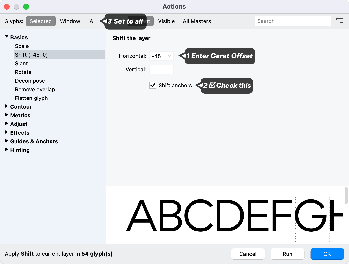
Usually, I don’t set actions to “all”. That’s disaster.
But in this case, we only have a few glyphs in our file.
Smash OK.
Your file is ready for slanting!
Warning
If you ever change the caret position, you will need to move all glyphs over. So I’d recommend doing some tests after you’ve slanted a couple things.
This tutorial is done for you, Group A! You can see the next section on making obliques!
Give yourself a pat on the back!
Group B: Letter Adjustment
Welcome Group B!
You are my favorite group!!
Actually, I’m usually in group B. I always have my sidebearings bound or linked. (But don’t tell the people in Group A.)
Ok, so first thing we need to do is make sure that this setting is off. Go to View > Italic Angle…
It’s very important that we do this first.

Now check View > Italic Angle > ✓Do Not Apply.
Next, go to menu: Font > Update Glyphs. This makes sure that everything gets back to their correct position.
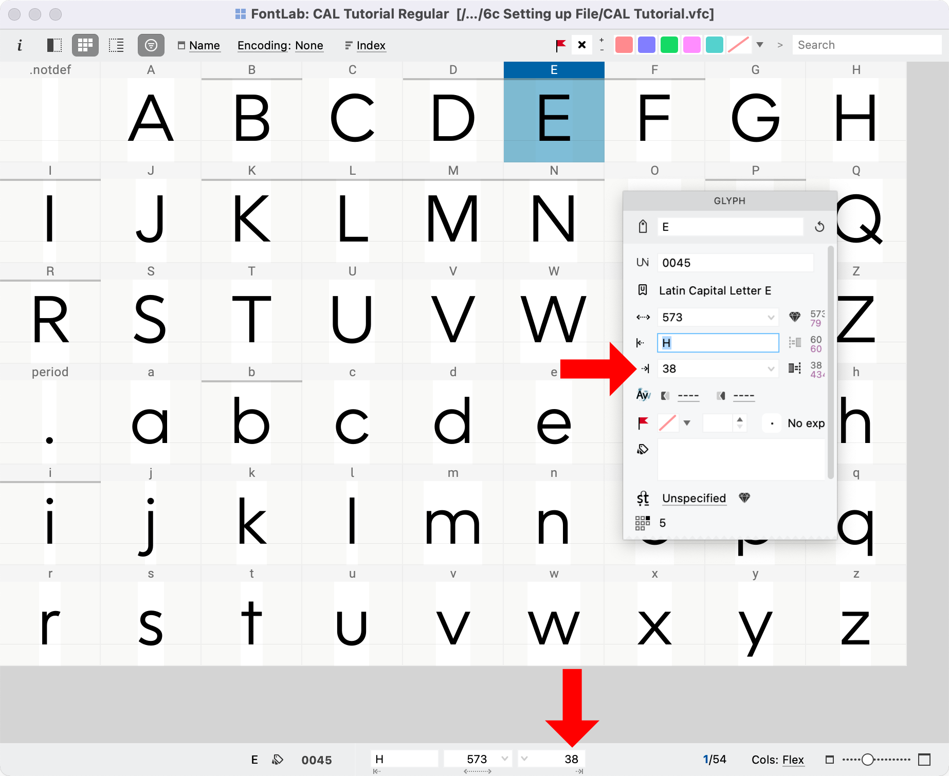
Ok, if you see sidebearings like this, where there is no equal sign or letter—this is bad.▼
First of all we are going to make sure that all your sidebearings are bound.
It’s not that I don’t trust you…ahem…but…
Ok, so go to menu: Tools > Actions. In the sidebar, go into Metrics then Bind sidebearings.▼
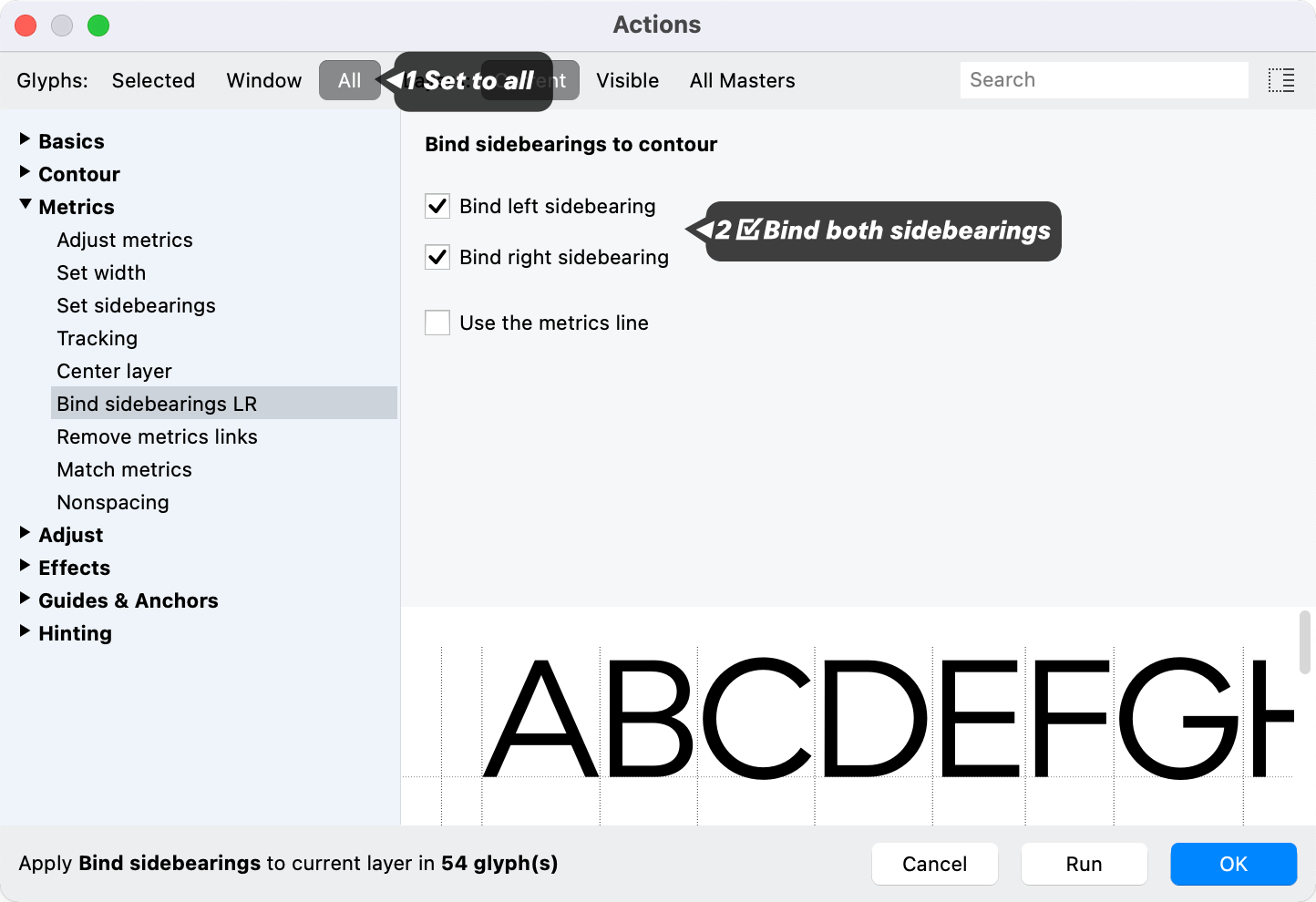
Smash OK.
This will bind the sides, but won’t mess up your metrics links.
OK, now this is going to be scary. Go back to View > Italic Angle. This time Apply to Metrics and Grid.
Now, if your metrics updated, you might see something like this in the Preview window.▼
The metrics are messed up.
But don’t worry!
Right now, the worst thing you can do is start changing your metrics links and sidebearings.
Don’t change anything!
Once we slant these in the next section, the sides will fix themselves.
Another Warning
With metrics links and a slant, it is impossible to work in “Do Not Apply” mode.
Conclusion
Ok, in the next tutorial I will show you how to make obliques!
Important things to notice
You can see that for Roman you could use a mixed sidebearing strategy.
In Italic, it’s not as easy. If you want to use links, it’s easiest if you keep Italic Angle > Apply to Metrics or Italic Angle > Apply to Metrics and Grid checked.
If you keep it in one of those modes, you can mix links with normal sides.
Any case…
In the rest of these tutorials I will be leaving it on “✓Apply to Metrics and Grid”.
Great!
Next we’re going to take a look at how slanting can mess up your letters. Then we’ll look at what you can do to fix it!