Briem’s notes on type design: Method
The “glass of water” principle
In hot-metal typesetting, letters were easily spaced apart. You added bits of lead for big spaces and brass strips for small gaps. Moving letters closer together was difficult. You had to file down the sides. For centuries, nearly every spacing problem was solved by adding space.
As a rule, the white space between letters and the white space inside them was meant to be the same.
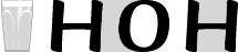
Imagine that you could pour a glass of water between letters and into the counters inside them. The distance between letters would have to be carefully worked out: the same volume of water that filled the counters should also fill the gaps between the letters.

Each letter sits on an invisible rectangle. This approach hasn’t changed since the invention of printing with movable type. Spacing is decided by the width of the sidebearings, the distance from the character shape to each side of the rectangle.
Fewer limitations
New technology has changed the rules. Phototypesetting can reduce sidebearings, the space on each side of a letter, as easily as add to them. Computers can take even beastlier liberties, and in greater variety.
Things have changed, and not all for the better. Tight spacing is here to stay. The best we can hope for is a decent proportion between counters and sidebearings. The good part is that we can kern with abandon. Where two letters are too far apart, we can move them closer and instruct the computer to remember. It will then tighten the gap whenever the letter combination appears. .
Notes on type design. Copyright © 1998, 2001, 2022 Gunnlaugur SE Briem. All rights reserved. Republished with permission in 2022 by Fontlab Ltd.