Making Instances
Benefits Save time by quickly setting up instances. Control exactly how you want your instances to look.
Making Family Members
So we have two family members already, the parents, ie the masters, then they mix to form the children.
In fonts, these children are called instances.
What Are Instances Good for?
Variable Fonts
When a font user installs a variable font, this will be a list of the styles they can choose from.
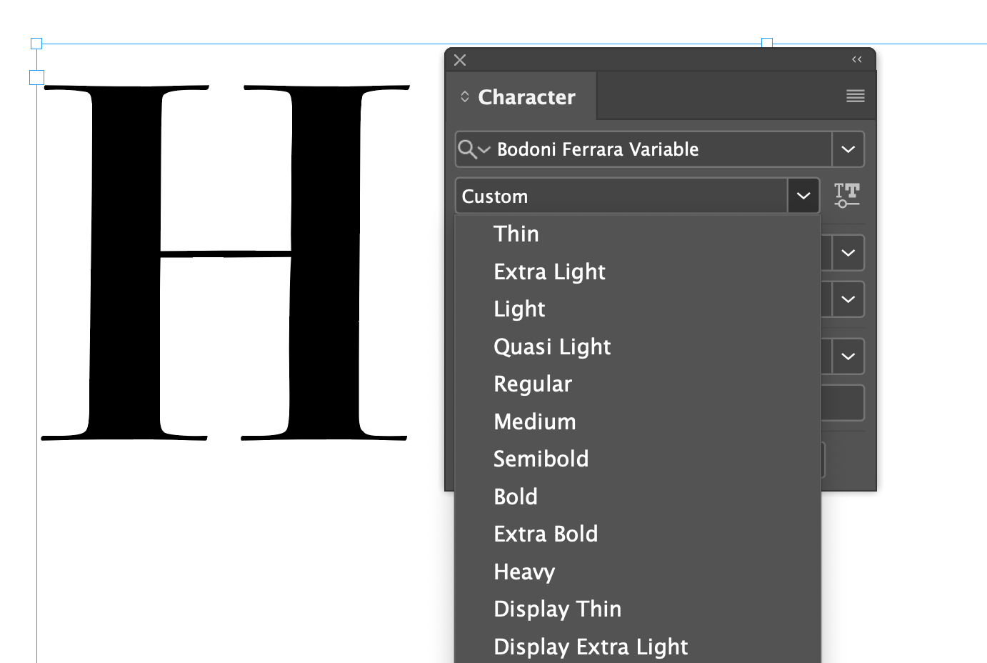
Besides this, the user can choose any custom axis point. But this gives him a good starting list.
Static Fonts
Also if you are making static font families, such as OTF, TTF, WOFF, WOFF2, the instance list is used to export various styles.
Automatic Instances
Download VFJ
❶ You can use your file from the last tutorial. Or you can download this file.
Load it up into FontLab.
Use the Variations Workspace. Go to menu: Windows > Workspaces > Variations.
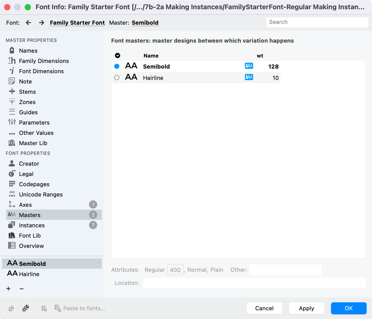
❷ Go into Font Info > Instances.
❸ Now in the middle of that page, it says “From Axes”, “From Masters”, “From Graph”. Since our Axes instance list is wrong, for now, push From Masters. The instance list should be populated with your Semibold and Hairline.
❹ Push OK, to go out of Font Info.
Before we get to making manual instances, a word about…
Interpolation vs. Extrapolation
Open the Variations Workspace and go to the Variations panel.
Try dragging the blue dot right and left.
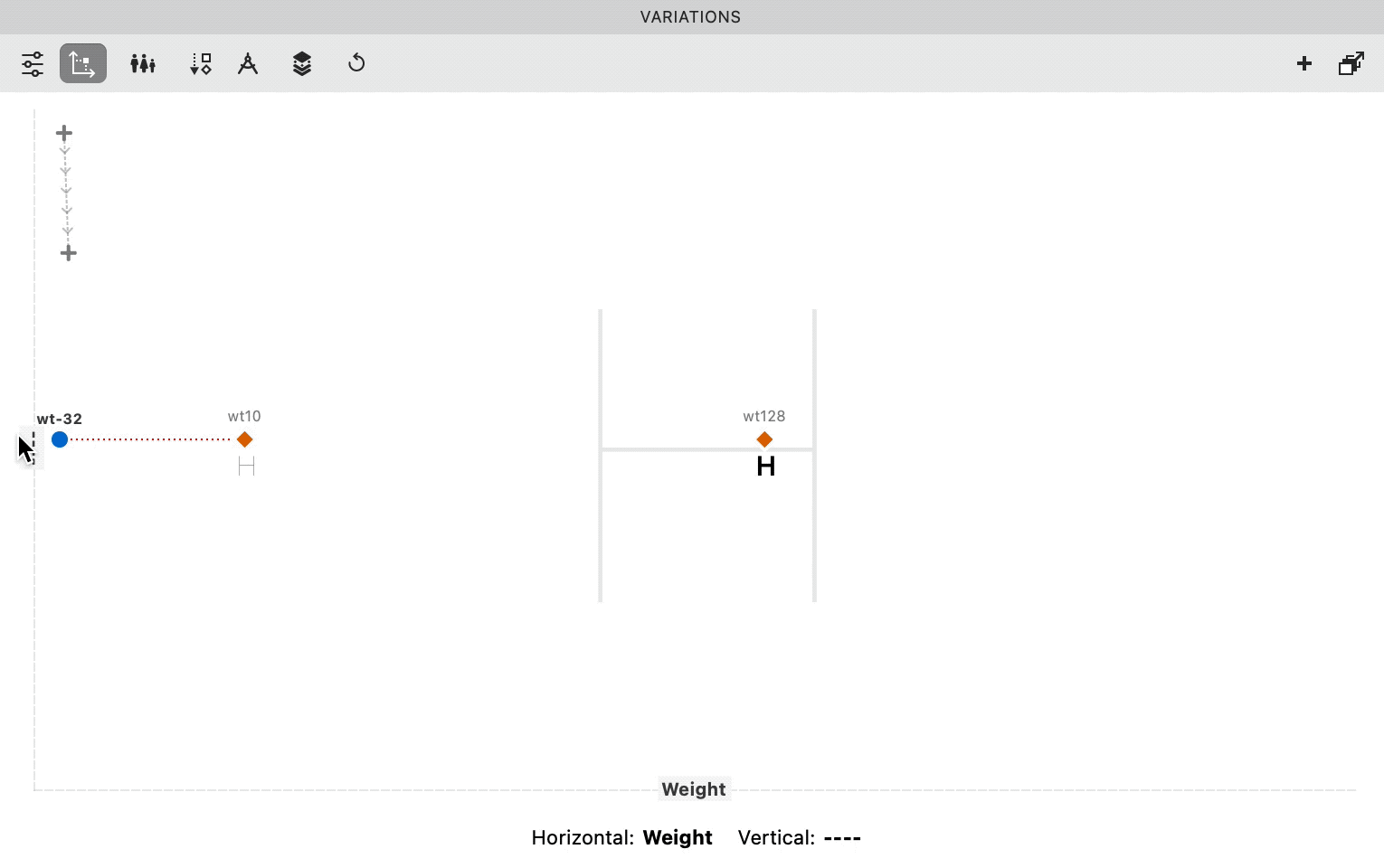
You might notice that the H in the background doesn’t change when you move past the 10. However it does change when you move past the 128! To the right.
It becomes an H that is darker!
In between the masters, the mix is called an interpolation.
Outside of the masters, it’s extrapolation.
Extrapolation
Extrapolation is the dotted lines on those charts telling you to buy a certain stock or financial product:

An homage to Dwiggins.
The stuff on the dotted line hasn’t happened yet!
How are you to know what will actually happen?
Here’s a way you can think about the extrapolation in FontLab.

The 220 master isn’t there! However, you can continue the trajectory of the nodes. You can see what 220 might look like.
It’s just like the stocks. Sometimes the trajectories happen. Other times predictions are wrong. You lose all your money in a stock market crash.
Sometimes extrapolation makes good letters. Sometimes it makes bad letters.
For now, we’ll avoid instances along the dotted area.
Info
If you don’t want to see extrapolations in the Variations panel, go to Font Info > Axes. Set your weight axis max to 128.
Warning
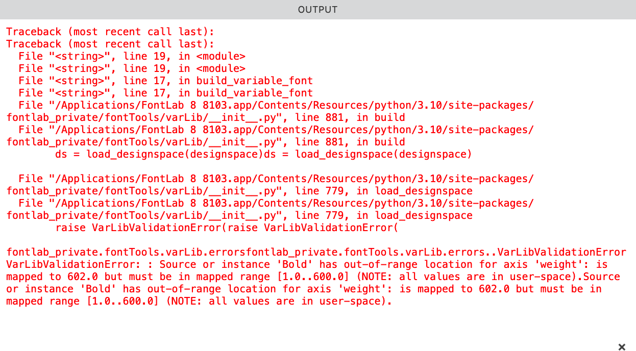
Suppose you make a variable font using the above numbers. You make an instance at wt140, outside of interpolation, into dangerous dotted territory!
You will be out of range, and when you export, you will get a message like this:
So keep instances between actual masters.
Manual Instances
OK, let’s set it up.
⓿ Make sure you have the Variations Workspace open.
❶ Variations panel, top left, there’s a button with sliders on it. click that. Now click the bottom button for instances.
Here and here.▼

❷ Use the slider and add instances.
Here’s how you do it.
First open up your Preview panel, so you can see what is happening.
Move the slider, and then click the lower + button.
Here’s the weights you might want to think about when making this.
Hairline Thin Extra Light Light Regular Medium Semibold
You don’t need all of these. Here’s an example of how you might do it. Remember to choose even numbers.
You’ll notice that all these are getting named as Thin!
Don’t worry, we’re going to change that next.
Fixing Instance Names
❸ Go to Font Info > Axes. Let’s import the instances from the once we just made!
Click the hamburger and import from instance.
❹ Go to the instances panel and now import from the fresh axes names.
Like so.▼
Your variable fonts will have these predefined instances.
Blue Dots
Let’s talk blue dots!!
Master Blue Dot
That little blue dot in the master’s panel assigns which master is primary.
Choose carefully!
The blue dot master does all these things:
- FontLab will match kerning classes to the blue dot master, if the classes are different.
- FontLab uses the hints in the blue dot master to make hints in other masters.
- If there’s no instance in the same place as that blue dot master, an instance will be added.
- Heaven forbid a glyph doesn’t interpolate, it will export a glyph from this master.
- The blue dot master will hover at the top of variable font drop down menus in some programs.
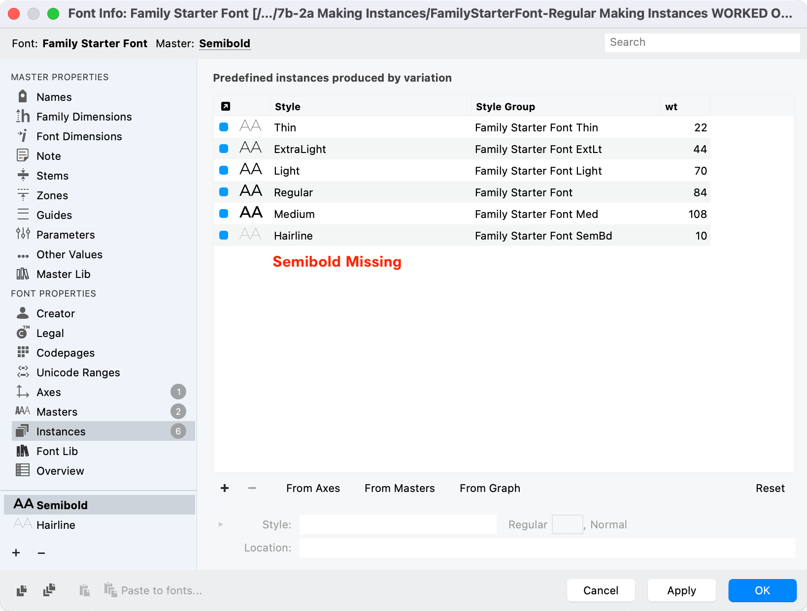
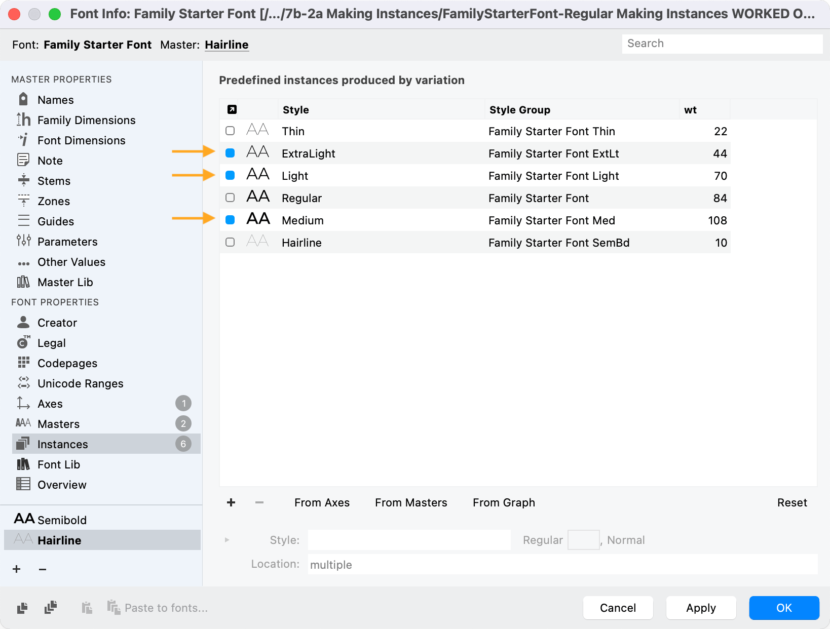
If Semibold is the primary master, but you don’t have it on the instances list.▼
In programs, the blue dot master will be at the top.
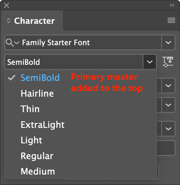
The blue dot master will be shown as default in some programs, such as the Praxis Axis test.
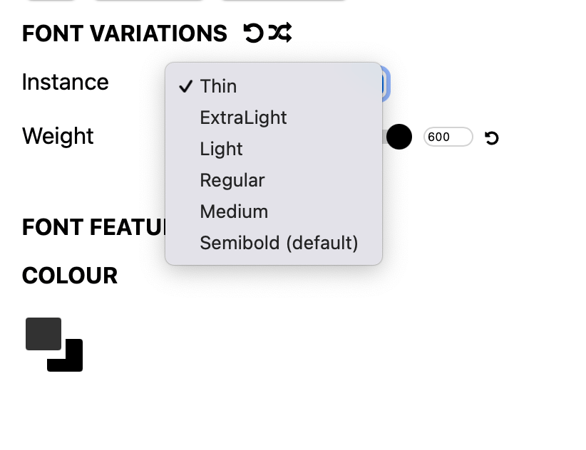
When a person installs the font on the computer, the blue dot master will be the one that is shown.
For example, if I changed the hairline to be the blue-dotted master, it would show.▼
Instance Blue Dot
The blue dots in instances are entirely different!!
These assign what will show up in export.
Now when you go to File > Export Font As…
And then click a static font like OpenType PS (OTF), the Instances will be automatically populated!
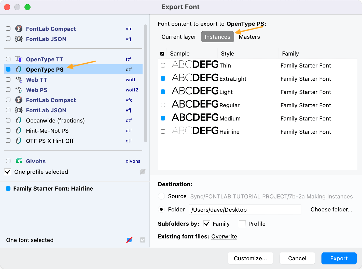
Very happy when I discovered this one.
BONUS Tip
Hold down option Alt while clicking to select or unselect everything!
Naming Instances
Many times the instances can use the full name.
However, in the future, what if you create this font style.▼
Ultra Contrast Extra Bold Semi Expanded Serif Small Caps Rounded Oblique
You need some abbreviations!
Here’s abbreviations from Adobe’s Font Naming Issues, Appendix A: Font Name Style Abbreviations.
Style names
Some operating systems and apps impose a length limit on the style name. Fonts with style names that are too long will not show up in the font menus at all, or their style names will be truncated. The limit is typically 63 characters. However, the style name portion is also used in the Full name, and in the PostScript font name, which have a shorter limit.
If the family varies in weight and/or width and you choose the appropriate Weight or Width Class from the dropdown in Font Info, FontLab can automatically build a style particle name for weight and for width, and then combines these particle names to form the style name.
The tables below show style particle names for weight and width. When FontLab builds a style name automatically, it tries the Full particle name, but if the style name becomes too long, it tries abbreviated particle names: first the Mid-length particle name, and if this is still too long, the Short particle name.
You may yourself choose to use the Mid-length or Short particle names consistently across the entire family — in style names, in axis instances, and in style groups (see next tutorial).
Weight particle names
For each weight class, the Weight column shows the standardized numeric weight class value, specified by the OpenType spec for static and variable fonts.
The numeric weight class value is often used by various systems and apps to select the weight. For example, it’s used in CSS (font-weight: 300;). The values can go from 1 to 1000, but if your font has no more than 9 predefined weights, use the full-hundred values (100 – 900). It’s highly recommended that your Regular weight uses the value 400. You may use additional in-between values if your family needs to have more than 9 predefined weights.
To set a weight class for a single-master font:
- use the Weight class dropdown in the Names page for a common weight class
- use the numeric field for an uncommon weight class (for example 440)
To set a weight class for a variable font:
- Use the Weight class dropdown or the numeric field in the Names page for the main master.
- For the Weight (
wght) variation axis, define the particle names and their corresponding design axis coordinates in the Axis instances field on the Axes page. If a particle name should be elided, wrap it in parentheses (typically:(Regular)). - In the Axis graph of the Weight axis, make sure that the design axis coordinates for the particle names correspond to the standardized numeric weight class values. For example, your axis instances field may define the particle
Bold=240if your Bold weight has the stem weight of 240 units, and then the axis graph should have the design coordinate240correspond to the user coordinate700, since 700 is the standardized weight class value for Bold. - Make sure the Weight class value of the main master matches the user coordinate of the default particle name in the Axis instances field. Remember: if you use a non-linear Axis graph, it is the user coordinate needs to match the main master’s Weight class, but the Axis instances field uses design coordinates.
- If you define instances in the Instances page, use the Weight axis dropdown at the bottom to specify their design coordinates, and use the weight dropdown and numeric field in the Style line to specify their Weight class, which needs to use the standardized values. Remember that the numeric Weight class value specified in the Instances page will be used only for static instances. For predefined instances in a variable font, the values obtained via the Axis graph will be used.
- For static instances, and for predefined instances in variable fonts, use the style name field in the Instances page to define the style name. We recommend that your style name uses the particle names from the tables below.
The weight class numbers don’t need to correspond to the actual weight progression (thickness of the stems). In fact, they almost never do. But for computers, it’s important that the Regular weight has the weight class 400, and Bold has 700.
Font vendors have used various common particle names for a given weight class. In the following table, the WeightC column shows the numerical weight class values, with the best-supported values in bold. The Best column has a checkmark (☑︎) if a particle name is most common, and recommended. The Long column also shows the best-supported (recommended) name in bold. The Mid-length and Short provide abbreviated particle names, useful in multi-axis style names and in style group names.
In instances with the default weight (with the weight class value 400), use (Regular) as the elided particle name in the Weight (wght) variation axis, and omit the particle name in multi-axis style names. Use Regular as the style name in the default instance of the family.
| WeightC | Best | Long | Mid-length | Short |
|---|---|---|---|---|
| 1-50 | ☑︎ | Hairline | Hair | Hr |
| 1-50 | ☐ | Extra Thin | ExtTh | XTh |
| 1-50 | ☐ | ExtraThin | ExtTh | XTh |
| 100 | ☑︎ | Thin | Thin | Th |
| 100 | ☐ | Ultra Thin | UltTh | UTh |
| 100 | ☐ | UltraThin | UltTh | UTh |
| 200 | ☑︎ | ExtraLight | ExtLt | XLt |
| 200 | ☐ | Extra Light | ExtLt | XLt |
| 200 | ☐ | ExtraLight | ExtLt | XLt |
| 200 | ☐ | Ultra Light | UltLt | ULt |
| 200 | ☐ | UltraLight | UltLt | ULt |
| 300 | ☑︎ | Light | Light | Lt |
| 350 | ☑︎ | SemiLight | SemLt | SmLt |
| 350 | ☐ | Demi Light | DemLt | DmLt |
| 350 | ☐ | DemiLight | DemLt | DmLt |
| 350 | ☐ | Demilight | DemLt | DmLt |
| 350 | ☐ | Semi Light | SemLt | SmLt |
| 350 | ☐ | Semilight | SemLt | SmLt |
| 400 | ☑︎ | (Regular) | (Reg) | (Rg) |
| 400 | ☐ | Book | Book | Bk |
| 400 | ☐ | Normal | Norm | Nm |
| 400 | ☐ | Plain | Plain | Pl |
| 400 | ☐ | Roman | Rmn | Rm |
| 450 | ☑︎ | News | News | Nw |
| 450 | ☐ | Text¹ | Text | Tx |
| 500 | ☑︎ | Medium | Med | Md |
| 600 | ☑︎ | SemiBold | SemBd | SmBd |
| 600 | ☐ | Demi Bold | DemBd | DmBd |
| 600 | ☐ | DemiBold | DemBd | DmBd |
| 600 | ☐ | Demibold | DemBd | DmBd |
| 600 | ☐ | Demi² | Dem | Dm |
| 600 | ☐ | Semi Bold | SemBd | SmBd |
| 600 | ☐ | Semibold | SemBd | SmBd |
| 700 | ☑︎ | Bold | Bold | Bd |
| 800 | ☑︎ | ExtraBold | ExtBd | XBd |
| 800 | ☐ | Extra Bold | ExtBd | XBd |
| 800 | ☐ | Extrabold | ExtBd | XBd |
| 800 | ☐ | Ultra | Ultra | Ult |
| 800 | ☐ | Ultra Bold | UltBd | UBd |
| 800 | ☐ | UltraBold | UltBd | UBd |
| 800 | ☐ | Ultrabold | UltBd | UBd |
| 850 | ☑︎ | Heavy | Heavy | Hv |
| 900 | ☑︎ | Black | Black | Blk |
| 900 | ☐ | Fat | Fat | Fat |
| 950/1000 | ☑︎ | ExtraBlack | ExtBlk | XBlk |
| 950/1000 | ☐ | Extra Black | ExtBlk | XBlk |
| 950/1000 | ☐ | Ultra Black | UltBlk | UBlk |
| 950/1000 | ☐ | UltraBlack | UltBlk | UBlk |
¹“Text” is sometimes a weight and sometimes an optical size. ²“Demi” is sometimes a weight and sometimes a modifier. The preferred weight particle name is “SemiBold”.
Width particle names
For each width class, the Width column shows the approximate average width as a percentage of the normal width of the family. The percentages are from the OpenType spec, but you don’t need to follow them blindly. It’s up to you how much condensed you really make your Condensed style.
Font vendors have used various common particle names for a given width class. In the following table, the Best column has a checkmark (☑︎) if a particle name is most common, and recommended. The Long column also shows the “best” nae in bold. The Mid-length and Short provide abbreviated particle names, useful in multi-axis style names and in style group names.
In instances with the default width (so-called “100%”), use (Normal) as the elided particle name in the Width (wdth) variation axis, and omit the particle name in multi-axis style names. Use Regular as the style name in the default instance of the family.
| Width | Best | Long | Mid-length | Short |
|---|---|---|---|---|
| 50% | ☑︎ | UltraCondensed | UltCond | UCn |
| 50% | ☐ | Ultra Compressed | UltComp | UCm |
| 50% | ☐ | Ultra Condensed | UltCond | UCn |
| 50% | ☐ | Ultra Condensed | UltraCond | UCn |
| 50% | ☐ | Ultra-condensed | UltCond | UCn |
| 62.5% | ☑︎ | ExtraCondensed | ExtCond | XCn |
| 62.5% | ☐ | Compressed | Comp | Cm |
| 62.5% | ☐ | Extra Condensed | ExtCond | XCn |
| 62.5% | ☐ | Extra Condensed | ExtraCond | XCn |
| 62.5% | ☐ | Extra-condensed | ExtCond | XCn |
| 75% | ☑︎ | Condensed | Cond | Cn |
| 75% | ☐ | Extra Narrow | ExtNar | XNr |
| 75% | ☐ | Extra-narrow | ExtNar | XNr |
| 87.5% | ☑︎ | SemiCondensed | SemCond | SmCn |
| 87.5% | ☐ | Compact | Comp | Cm |
| 87.5% | ☐ | Narrow | Narrow | Nr |
| 87.5% | ☐ | Semi Condensed | SemCond | SmCn |
| 87.5% | ☐ | Semi Condensed | SemCond | SmCn |
| 87.5% | ☐ | Semi Condensed | SemiCond | SmCn |
| 87.5% | ☐ | Semi-condensed | SemCond | SmCn |
| 100% | ☑︎ | (Normal) | (Normal) | |
| 112.5% | ☑︎ | SemiExpanded | SemExp | SmEx |
| 112.5% | ☐ | Semi Expanded | SemExp | SmEx |
| 112.5% | ☐ | Semi Extended | SemExp | SmEx |
| 112.5% | ☐ | Semi Extended | SemiExp | SmEx |
| 112.5% | ☐ | Semi-expanded | SemExp | SmEx |
| 112.5% | ☐ | Semi-extended | SemExp | SmEx |
| 112.5% | ☐ | Wide | Wide | Wd |
| 125% | ☐ | Extended | Ext | Ex |
| 125% | ☐ | Extended | Extd | Ex |
| 125% | ☑︎ | Expanded | Exp | Ex |
| 150% | ☑︎ | ExtraExpanded | ExtExp | XEx |
| 150% | ☐ | Extra Expanded | ExtExp | XEx |
| 150% | ☐ | Extra Extended | ExtExt | XEx |
| 150% | ☐ | Extra Extended | ExtraExt | XEx |
| 150% | ☐ | Extra-expanded | ExtExp | XEx |
| 150% | ☐ | Extra-extended | ExtExt | XEx |
| 150% | ☐ | Ultra Wide | UltWd | UWd |
| 150% | ☐ | UltraWide | UltWd | UWd |
| 200% | ☑︎ | UltraExpanded | UltExp | UEx |
| 200% | ☐ | Ultra Expanded | UltExp | UEx |
| 200% | ☐ | Ultra Extended | UltExt | UEx |
| 200% | ☐ | Ultra Extended | UltraExt | UEx |
| 200% | ☐ | Ultra-expanded | UltExp | UEx |
| 200% | ☐ | Ultra-extended | UltExt | UEx |
FontLab also includes built-in width particle names for monospace fonts.
| Width | Best | Long | Mid-length | Short | Mono |
|---|---|---|---|---|---|
| 50% | ☑︎ | Mono UltCond | MonoUCn | UCn | ☑︎ |
| 62.5% | ☑︎ | Mono ExtCond | MonoXCn | XCn | ☑︎ |
| 75% | ☑︎ | Mono Cond | MonoCn | Cn | ☑︎ |
| 87.5% | ☑︎ | Mono SemCond | MonoSmCn | SmCn | ☑︎ |
| 100% | ☑︎ | Monospaced | Mono | ☑︎ | |
| 112.5% | ☑︎ | Mono SemExp | MonoSmEx | SmEx | ☑︎ |
| 125% | ☑︎ | Mono Exp | MonoEx | Ex | ☑︎ |
| 150% | ☑︎ | Mono ExtExp | MonoXEx | XEx | ☑︎ |
| 200% | ☑︎ | Mono UltExp | MonoUEx | UEx | ☑︎ |
Slope particle names
Font vendors have used various particle names for the slope. In the following table, the Angle column shows the common italic angle for left-to-right scripts. The Best column has a checkmark (☑︎) if a particle name is most common, and recommended. The Long column also shows the best-supported name in bold. The Mid-length and Short provide abbreviated particle names, useful in multi-axis style names and in style group names.
The best practice is to avoid the non-standard slope names. If the instance is upright, use (Plain) as the elided particle name in the Italic (ital) variation axis, and omit the particle name in multi-axis style names. If the instance is sloped, use Italic as the particle name and in style names, no which direction the italic angle is sloped, and even if the font is not a “true italic” but an oblique or slanted design. Use Regular as the style name in the default instance of the family.
| Angle | Best | Long | Mid-length | Short |
|---|---|---|---|---|
| 0 | ☑︎ | (Plain) | (Plain) | (Pl) |
| 0 | ☐ | Upright | Upri | Upr |
| >0 | ☑︎ | Italic | Ita | It |
| >0 | ☐ | Oblique | Obliq | Obl |
| >0 | ☐ | Cursive | Curs | Cur |
| >0 | ☐ | Kursiv | Kurs | Kur |
| >0 | ☐ | Inclined³ | Incli | Inc |
| >0 | ☐ | Sloped | Slop | Slo |
| >0 | ☐ | Slanted | Slant | Sla |
| <0 | ☐ | Backslanted | Bkslant | Bsla |
³Not commonly used.
Modifier Abbreviations
(Alphabetic order)
| Modifier | Abbrv |
|---|---|
| Demi | Dm |
| Semi | Sm |
| Ultra | U |
| Extra | X |
Other axes and style attributes
If your instances differ in aspects other than weight, width and slope, you can specify name particles in additional variation axes, or you can specify an extra particle name in Font Info > Names > Other for a master. FontLab will use these particle names when it builds the style names.
In the following table, the Attribute column lists the variation axis or design attribute which your design may differ. The Long column shows full-length particle names, in parentheses if they’re commonly elided (omitted from multi-axis style names). The Short column provides abbreviated particle names.
| Attribute | Long | Short |
|---|---|---|
| Optical size | ExtraSmall | XS |
| Optical size | Small | S |
| Optical size | Caption | Capt |
| Optical size | (Text) | (T) |
| Optical size | Subhead | Subh |
| Optical size | Head | Head |
| Optical size | Large | L |
| Optical size | Titling | Ti |
| Optical size | Display | D |
| Optical size | ExtraLarge | XL |
| Optical size | Poster | P |
| Character set | Alternate | Alt |
| Character set | Expert | Exp |
| Character set | Ornaments | Or |
| Character set | Oldstyle | OS |
| Character set | Old Style | OS |
| Character set | Oldstyle | OsF |
| Character set | SmallCaps | SC |
| Character set | Small Caps | SC |
| Character set | Swash | Sw |
| Character set | Standard | Std |
| Character set | Professional | Pro |
| Character set | Pan-European | EU |
| Character set | World | W |
| Character set | WGL4 | WGL |
| Character set | Central European | CE |
| Character set | Cyrillic | Cyr |
| Character set | Greek | Grk |
| Design | Deutsche Fraktur | Dfr |
| Design | Inline | In |
| Design | Outline | Ou |
| Design | Rounded | Rd |
| Design | Script | Scr |
| Design | Shaded | Sh |
| Design | Typewriter | Typ |
| Contrast | (Low) | |
| Contrast | High |
Those are the basics. (Although there’s more you can do with instances.)
In the next tutorial, you’ll learn some special groupings that are required by retailers like MyFonts. You’ll set up Style Groups. See you then!
Great job!