Briem’s notes on type design: Assembly work
Here’s how to make a bold letter r.

- Align the letter r in regular weight to the stem of a bold letter i.
- Throw away all of the letter r except the ear. Stretch the right serif about 20%. You’ll find more about that on the optical illusion page.
- Select the right side of the ear. Stretch it downwards.
- Select the underside and stretch it to the left.
- Select the lowest segment and squeeze it to the right until it meets the stem.
You use the same approach to the letter f.
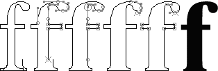
- Align the bottom of the bold letter r, with stretched serif, to the stem of the letter f in regular weight.
- Delete the bottom of the letter f. Connect it to the bold bottom. Select the top, the right bar and the right side of the stem. Stretch them about 40%.
- Select the underside of the dot, the right bar and the right side of the stem. Squeeze them to the right until they join the bottom. (Some people call both the dot and the ear “ball terminals.”)
- Select the right side of the dot and stretch it down.
- Select the left side of the dot and stretch it down. If you want it bolder, this is the time to adjust the handles atr either end sideways. Shorten and thicken the crossbar.
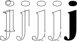
Begin a bold letter j with bold letter i and the regular weight of the letter j. (Turning the letter f upside-down doesn’t work. Try it: you’ll see what I mean.)
Next delete the top of letter j and the bottom of the letter i. Then select the bottom curve. Stretch it until it meets the right side. Finally shave the right side of the descender. You shift the Bézier point higher up the right side. Keep the handle where it was.
You shape the hook of the letter t the way you shaped the serif of the letter a.
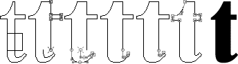
- Put a bold stem template on the regular weight of the letter t.
- Cut the stem and drag it to the full width of the template.
- Stretch the bottom curve 15-20% to the right.
- Squeeze the inside to the right until it joins the stem.
- Adjust the hook by squeezing inside upwards.
- Give the top a shallower curve. Make the crossbar shorter and thicker.
Middle weight
I said at the outset that we should double the regular weight. We could then blend whatever bold we wanted from the regular and the bold. Here is a 50% blend.

Here are two weights. We can call one of them semibold and the other bold. We can also call one bold and the other black. No matter which labels we stick on them, the shapes are the same.
You may well discover that the weight you had in mind wasn’t quite right. You can then make a few weight in minutes and decide which you like best.
Making a bold lower case is enough. Once you have done that, the capitals need hold no terrors for you.
Notes on type design. Copyright © 1998, 2001, 2022 Gunnlaugur SE Briem. All rights reserved. Republished with permission in 2022 by Fontlab Ltd.