Curve Tension
Benefits Avoid Mismatching Curves by Correctly Setting Your Curve Tension
When I think of tension, I think of: Tension in the shoulders. Post tension slabs of concrete. Tension cables holding up the Golden Gate Bridge.
Tension is associated with stress and pull.
In this section we look at closed curves, and their DNA—curve tension.
In some fonts the tension is too low. Getting the right curve tension is tricky.
In this tutorial you will:
- Understand what styles of letters have what curve tension.
- See the fastest ways for changing curve tension in FontLab 8.
- Change curves ultra fast using Tunni Lines.(The Tunni lines were invented by Eduardo Tunni and the FontLab team.)
- Know exactly what the Tunni Numbers mean.
- Understand all the tensions from rhombus to squircle to circle.
- Save time, when you set the global curve tension.
Along the way, you’ll also learn about common ways of rounding corners—say for app icons. Which has…corner tension! Now in FontLab 8, corner tensions are independent of font-wide settings!!
Let’s get started.
What’s Important about Curve Tension?
There are three main shapes in font design.
- Square, represented by the n.
- Triangular, represented by the v.
- Circular, represented by the o.
The “o” contains the DNA of many other letters. b, c, d, e, g, p, q, s, B, C, D, G, J, O, P, Q, R, S, U all inherit the o’s DNA. a, h, j, m, n, r, u inherit a portion of that DNA.
These letters inherit the o’s shape and curve tension.
Curve Tension in Letters
Here are various historical o’s. Let’s look at sans first.
Notice all these tension numbers! In a bit, you will learn how to change the global and individual tension for your letters.
These numbers will give you a baseline.
Info
I’m just looking at historical fonts because they are more familiar. There are great contemporary fonts that show similar characteristics.
Download VFJ
These o’s are approximations, drawn by me, and a bit simplified. You can look at the shapes I made in this file: cal-curve-tension.vfj
Ok, so you know some common curve tensions.
You might be wondering what those percentages mean.
What are the curve tension percentages?
When you saw the percentages on the above o’s, that might not have made too much sense.
You’ll better understand it when you know what shape has 0% tension, and what shape is 100%.
What is Zero and 100% curve tension?
Zero curve tension means that the handles are zero.
There’s no outward push. So there’s no curve.
Even thought the outward points show up as round, green nodes, they are really sharp.▼
100% curve tensions means that you have the handles extended all the way out, so that they touch each other.
This is the farthest that you can have your handles. (Otherwise you will break the magic triangle rule.)
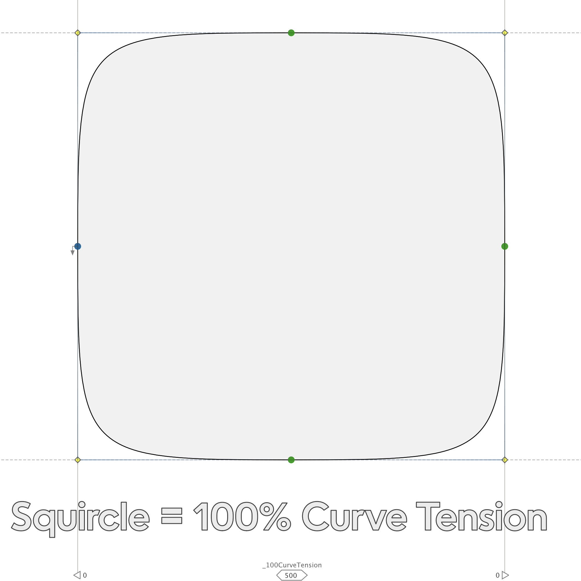
What is a circle? Well it’s ≈ 55.192%. In FontLab this is labeled as 55%.
But…
If you want to know more exactly what the percentage number means, here it is:
What exactly do these percentage numbers mean?
In the file, look at this segment from the Futura o.
See how the handle is 146? And the vertical distance from the middle node to the top node is 260?
OK.
The curve tension is 56%, because when you divide 146 by 260 that approx. equals 56%.
Or in other words, the handle is 56% of the total distance.
OCD ALERT
Beziers cannot represent the circle exactly. At the worst point (the center of each quadrant), cubic splines have an error of about 5e−5. Do you want crazy accuracy?? If so, do this:
If you are using fractional coordinates, you can zoom in and nudge the tunni lines just a smidge. Then save that to some glyph and use that as your perfect circle. Of course, this is actually “less perfect” because it goes “out of bounds” more. However, the greatest deviation from a circle is not as bad. BEEP BEEP. This has been an OCD alert.
Super Ellipses
Here’s a series of super ellipses, all with different curve tension. You can see how the shapes are similar to the sans o’s.
Here’s the name of each shape:
❶ Rhombus. ❷ Rhombus with convex sides. ❸ Ellipse (in this case a circle). ❹ High tension super ellipse. ❺ Squircle.
See how the outer shapes feel pulled very tight? These have high curve tension.
See how the middle shapes look normal? This is normal curve tension.
See how the inner shapes look pushed together? This is low curve tension.
Info
The technical name for the rhomboid shapes is hypoellipse. The shapes with greater curve tension are the hyperellipse.
Serif O Curve Tension
Now we have the tools to look at serif o’s.
Remember, these are simplified shapes.

Info
These o’s have been adjusted to the same height. Also, this Bodoni style is a bit of a caricature, and mixes in a bit of Rosart.
In the file, you can take a look at the curvature combs. (The orange labels. You will more easily see what is going on.)
How You Can Measure Your Curve Tension
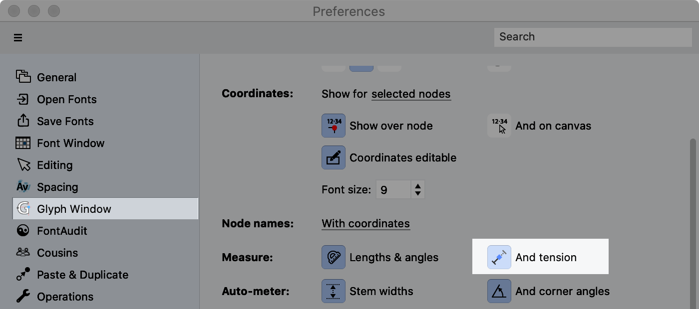
Select a handle. The curve tension will be display along the handle line.
If not, go to Preferences > Glyph Window and turn on Measure tension.▼
Changing Curve Tension in FontLab
FontLab uses “Tunni Lines”, lines named after Eduardo Tunni, the Brazilian font designer.
These lines connect handles and makes it so much faster to change curve tension. Instead of moving each handle individually!!
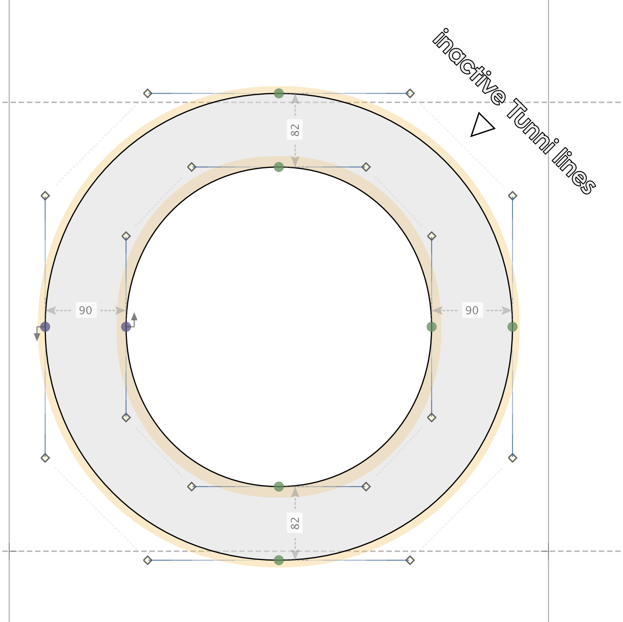
Usually Tunni lines are turned off. So we’ll turn them on, then change curve tension for the letter.
❶ Make a letter o. ❷ Push L on your keyboard to turn on the Tunni Lines. They will still be inactive.
 .
.
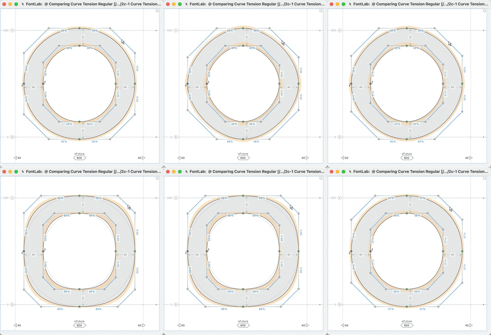
❸ Go to menu: Contour > Edit Tunni Lines, and all the lines will become active. Just drag the lines to change.
Info
I’m showing large movements in this GIF. Usually, I will only do small tweaks, of 1% or less.
❹ What if you only want to change a couple lines? Highlight the handles. Then like before, go to menu: Contour > Edit Tunni Lines. ❺ When you change one Tunni line only, you will see an additional line and two blue dots.
You might be wondering…
What are all those blue dots and lines for??
Here’s what it is:
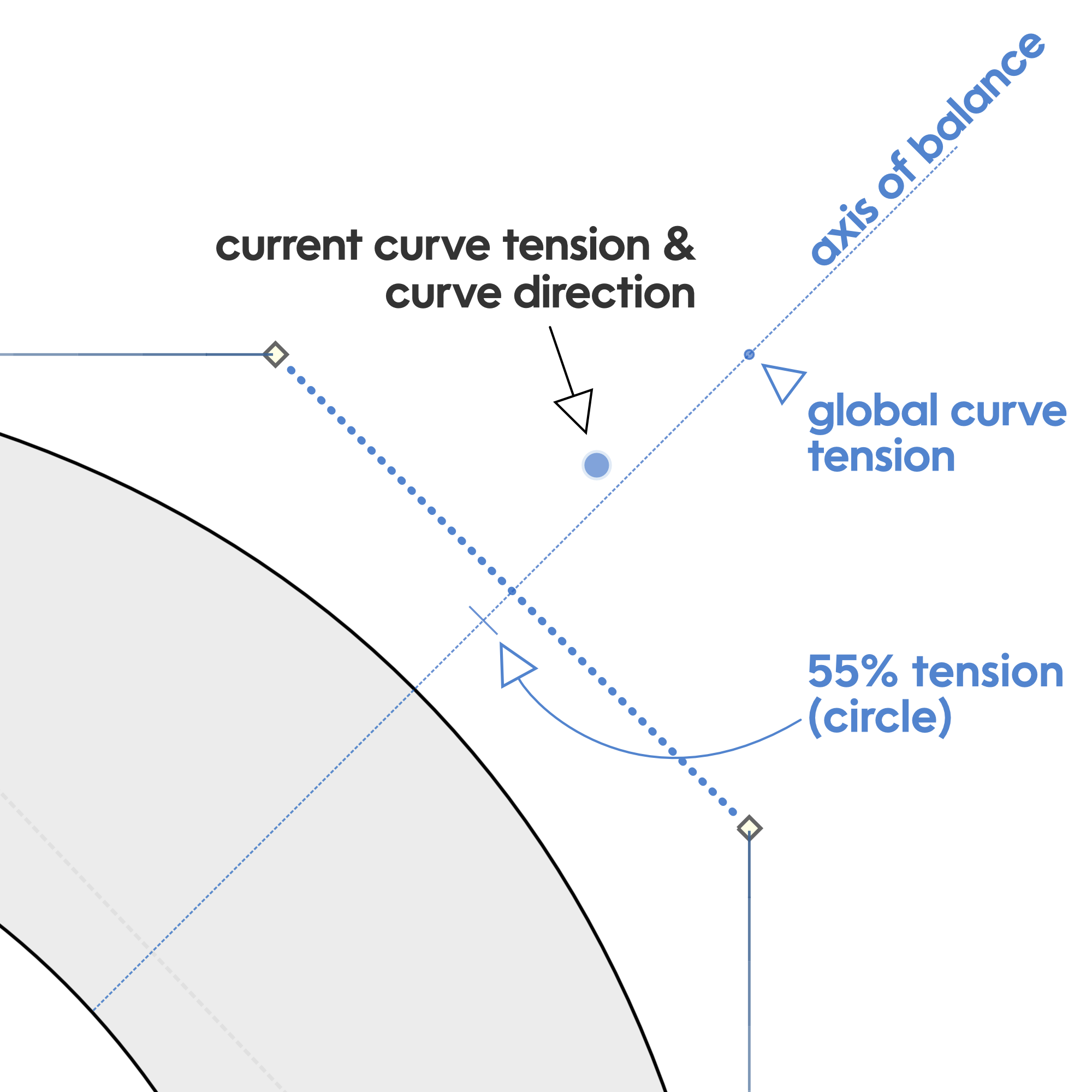
Now this drawing brings up more questions than it answers!
Warning
It’s a good idea to hide Tunni lines when you are not using them. That way your drawing window is cleaner, and you don’t accidentally change curve tension. Turn off the Tunni lines by pushing L.
More Questions about Curves
You might have more questions, like:
How do you change the global tension?
What is balance?
You might have also wondered before, why do the inner circles of the O usually have more curve tension? Especially as the ‘o’ becomes more square??
What is going on???
How to Set Your Global Curve Tension
We’ll start with the easy one first.
Global tension helps your curves match right out of the gate—when you first make them.
When you draw with the Rapid pen tool, it uses global curve tension. When you make an ellipse using this subtool, it defaults to global curve tension.

Step-by-Step
❶ Determine the curve tension for your font. At first, you can just take a guess using the examples of sans and serif tensions. ❷ Go to menu: File > Font Info…> Font Dimensions
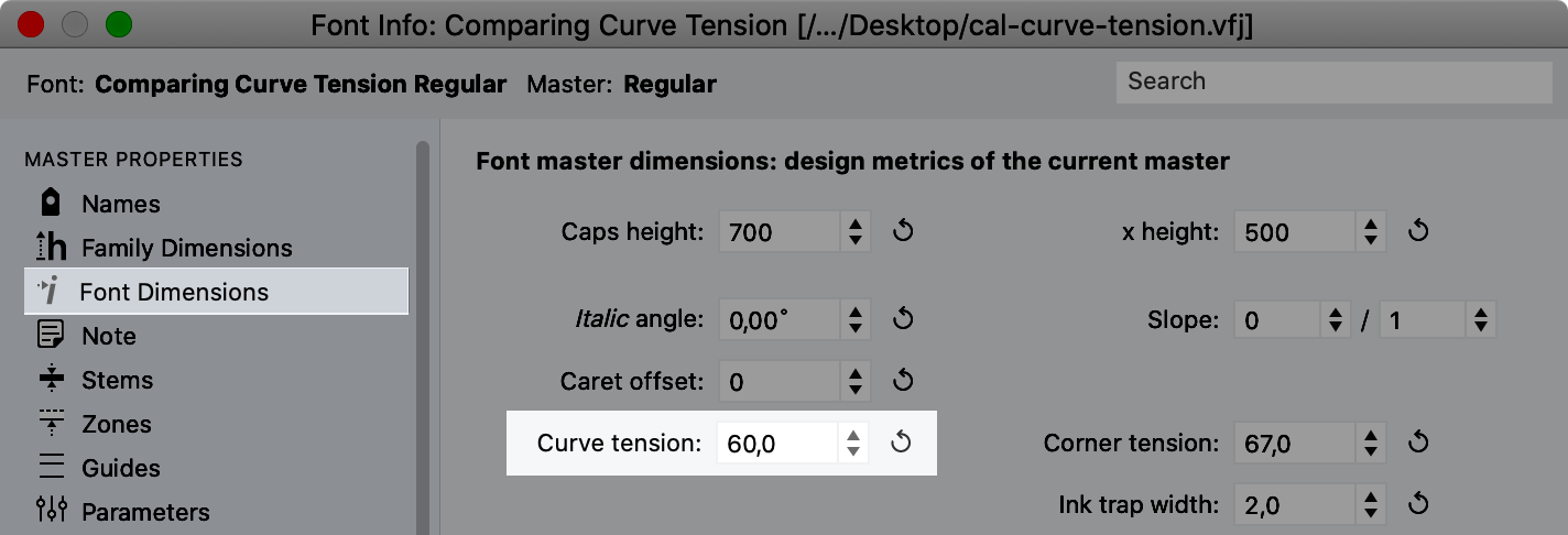
Info
If you have other masters, you can set curve tension individually. :)
Balancing Your Curves
In the above Tunni diagram, you noticed that there was an “axis of balance”.
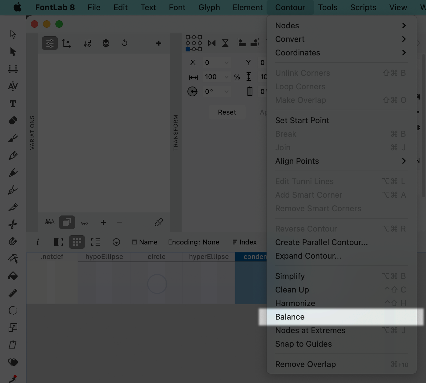
Also, you might have noticed a command called “Balance” in the Contour Menu.
Here’s the difference between balanced and unbalanced.
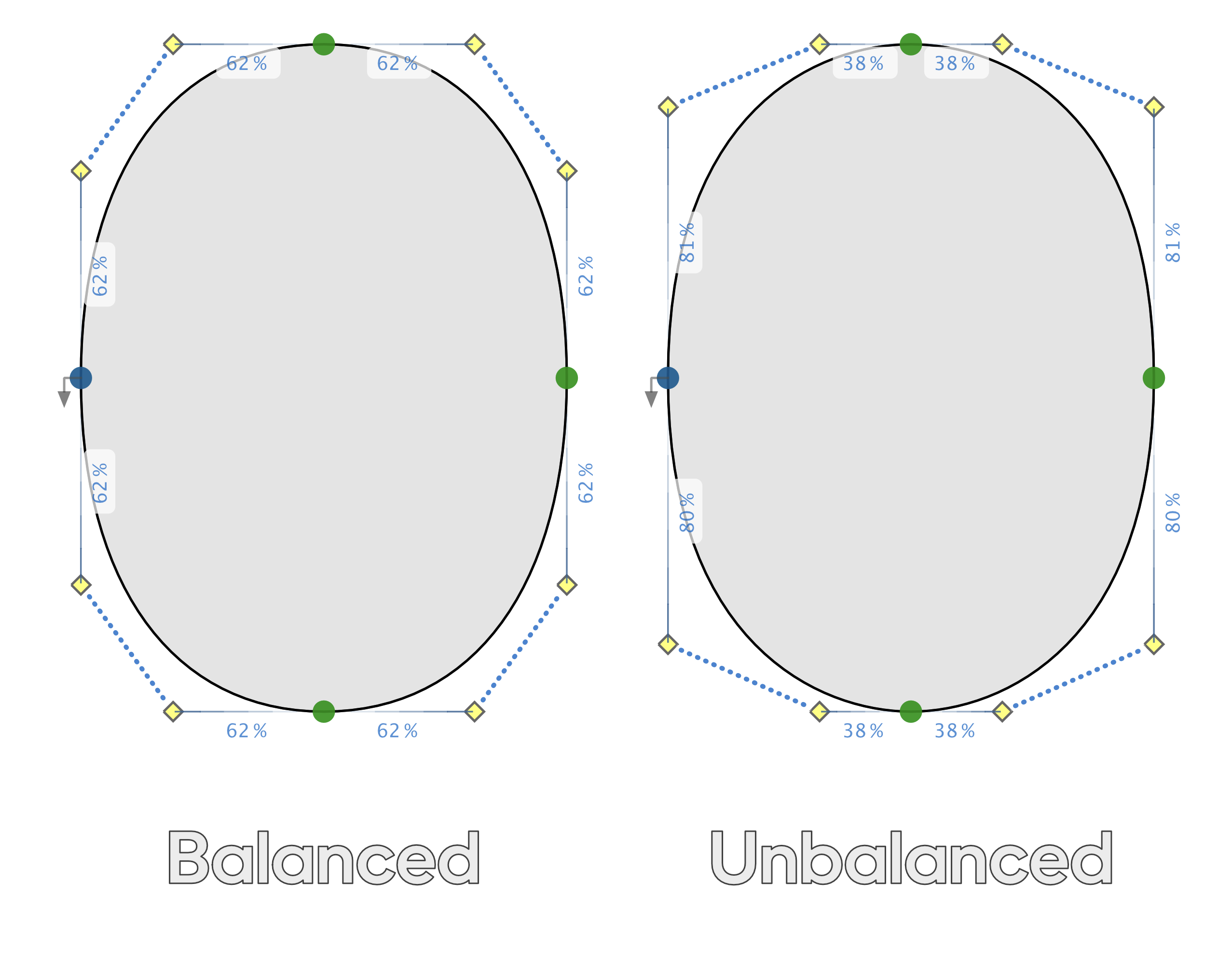
So if you want to call it a day, just go to menu: Contour > Balance.
However, if you are interested in knowing when to use balanced and unbalanced curves go to this tutorial on expanded and condensed.
Why does the inside shape usually have more tension than the outside?
You might have noticed from those examples that the inner curve tension of the o is usually higher than the outer curve tension.
Why is this?
Funny you should ask…I have the answer right here!
It’s actually easier if we look at rounded squares.
Rounded Squares
First let’s check out a rounded square with the exact same outer and inner shapes.▼
Yikes!
That doesn’t look great.
Here’s why.▼
When the exact same shape is in itself, you will get thickness bulges.*
*Speaking here of curves with varying curvature. Curves other than the circle.
What if you want the same thickness in the corners?
On the other extreme, you need to do this.
You can see why. The radius of a circle keeps the corner uniform.
In black, the shape looks like this.▼
Do you want the inner square rounded?
Then, you will have bulging.
There’s no way around it.
Here’s one possible compromise.▼
This one only bulges to 114. (Remember the first one bulged to 125.)
Here’s how I made it in FontLab.▼
This uses smart corners, check out this tutorial.
In font design, we counteract thickness bulging by:
❶ Varying the curve thickness to hide such imperfections. ❷ Raising the inner curve tension.
Go back up to the sans curve tensions. Notice how Futura has hardly any difference between outer and inner curve tension. Eurostile has a huge difference.
So let’s summarize this into a basic rule:
To avoid bulges, the circle needs no modification. The closer the curve gets to a square, the greater the difference in curve tension, between the inside and outside shape.
Further Curve Tension Resources
This is not even all there is to say about curve tension!
When you are making expanded or condensed fonts, curve tension does some pretty weird stuff. See How to Make Condensed and Expanded Curves. In that tutorial, you will also get some tools for testing out curve shapes, quickly before drawing!
To see how to make better icons faster, check out this tutorial.
That’s about it.
That was a lot of stuff!
Great work!