Fonts Look Bad at Size, Pt. 2
More Problems and Solutions
In the past I’ve designed a font that was not for any particular size.
Well…
It only looked good at the size which I drew it! Not much else.
The considerations in the last part bring us to the major problem:
The Type Size Problem
Type has to be legible, but also be interesting to look at—whether that be beautiful, ugly, spiritual, or base.
Form and function.
Like the Mona Lisa, type has to work on different levels!
We’ll first look at common solutions, then we’ll see the tools in FontLab that allow you to implement these solutions.
Solutions for the Type Size Problem
Font designers have found these ways to fix the problem.
Ordered from more common to less common.
- One Size System. One font for all sizes.
- Two Size System. Usually text and display.
- Size Specific System. Various fonts for different sizes.
Let’s start with #3 because it is the foundation of the others.
Size Specific System
In the past, you had to recut for every size!
And there were a lot of sizes.
Here’s the sizes of fonts in times of yore.▼
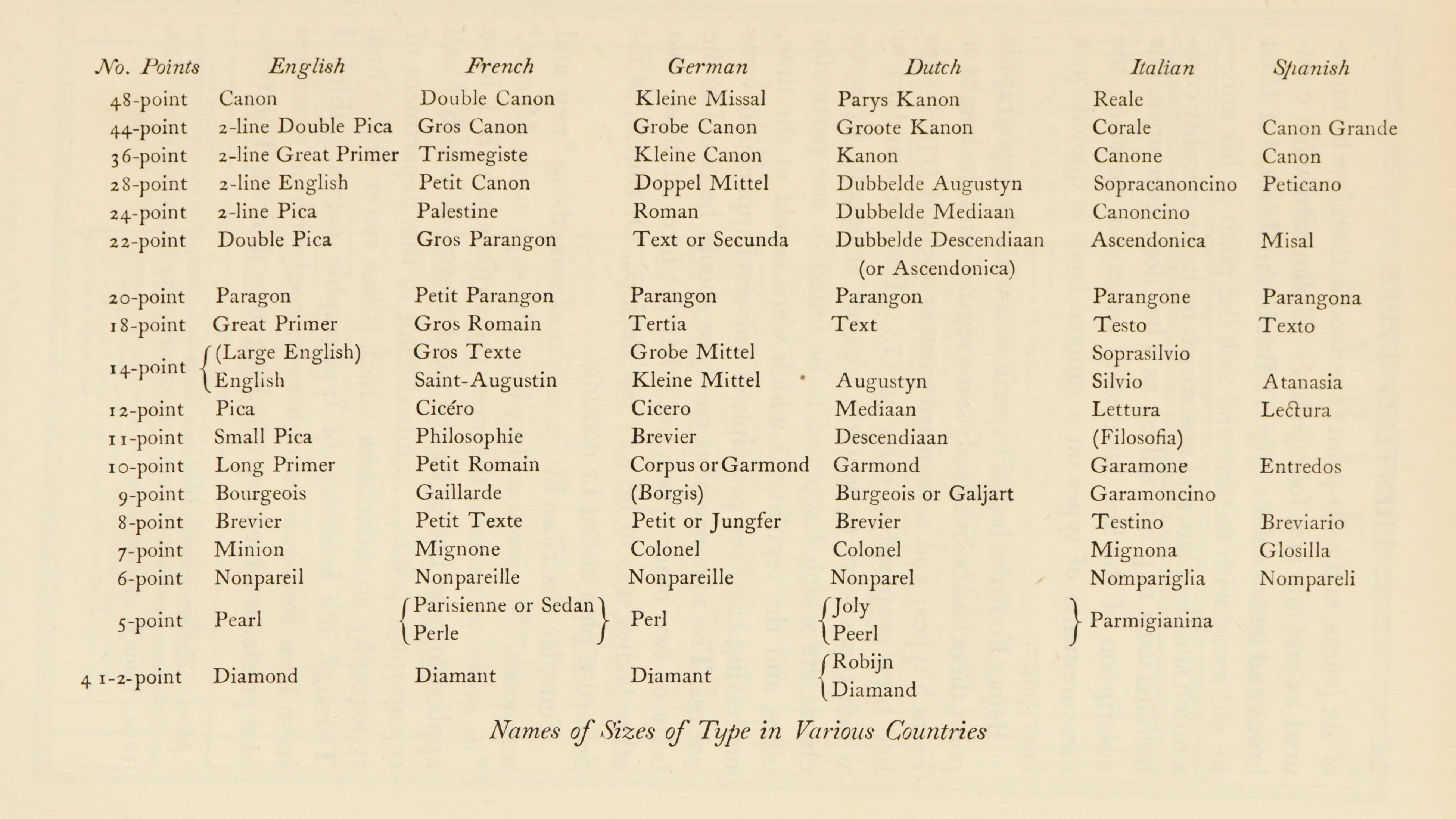
(Updike, Printing Types p. 27)
This is not even all of them, because this list is missing the big sizes!
Info
Metal type has a size ceiling. Once a letter gets too large, it’s punch is too large. Then it just can’t punch through the metal matrix! That’s why wood type is used for the very large sizes.
Let’s compare different sizes.
Here’s an example of a “modern” style serif. Bodoni’s Casale font.
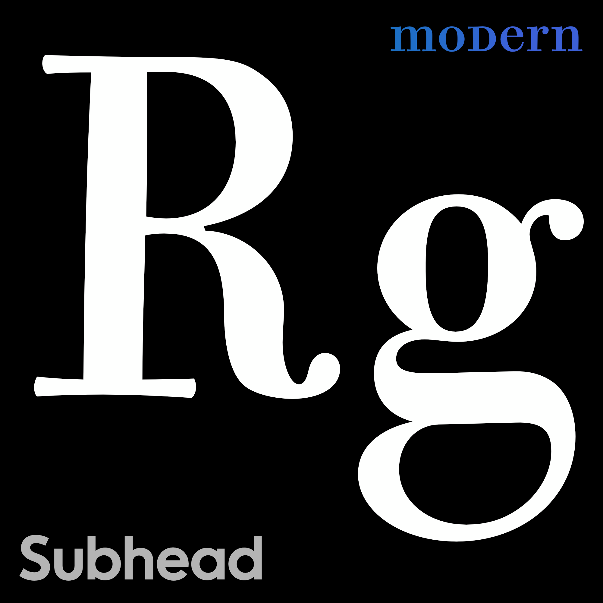
Subheaders when blown up, have slabby serifs.
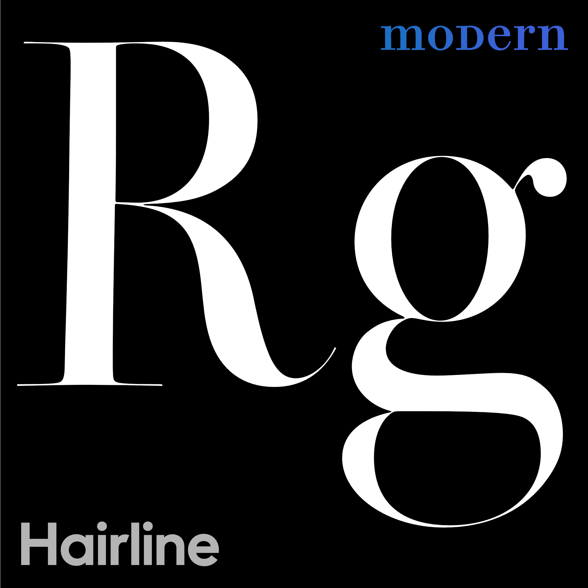
Here is a hairline version of Bodoni’s Ferrara font. A font of this size was impossible in Bodoni’s day, but I’m pretty sure he would have done if this way if he had had a PC or Mac.
Serifs and some of the main strokes are hairline width.
Now…
Is it really fair to compare these fonts like this???
At a similar computer size?
If you look at them at the same size like this, they look similar.
The main difference is the round terminal on the tail of the R. Also the thicknesses are different.
However…
If you put them at the correct actual size, they would look more like this.▼

Hairs (thin strokes) have to match!
Remember high spatial frequencies? Like the curls in Mona Lisa’s hair?
Imagine if da Vinci had made a Monazilla next to Mona Lisa. Then she’d have these huge curls, like this.▼
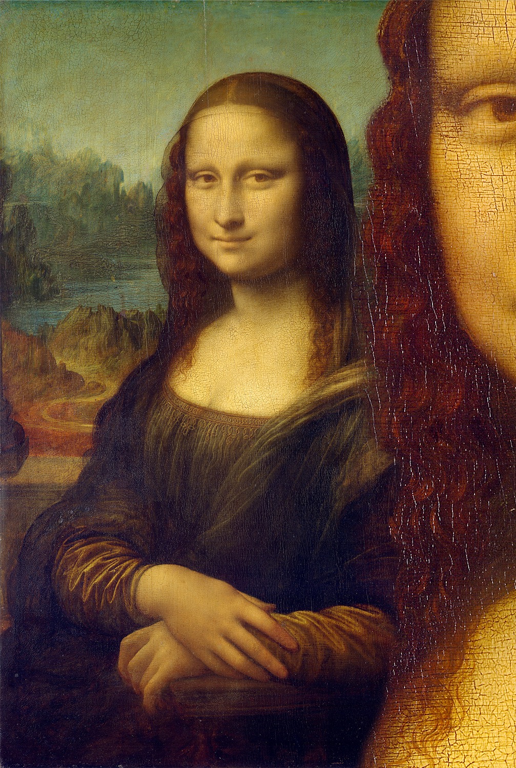
You get the idea.
Also the size of the paint cracks doesn’t match.
In fonts, that might be doing something like this.▼

Info
It’s a bit more complex than this. Depending upon what you are looking at, your eyes automatically calibrate to different frequency channels. Part of the reason these look wrong is that the R calibrates you to a higher frequency. Then, in the g, these frequencies are mostly absent. But before, when you saw the hairline R and subhead g in different pictures, this difference probably didn’t bother you. Your eyes had time to re-calibrate.
Hairlines Cannot be Shrunk
Remember in Alice and Wonderland where Alice gets huge then small, then huge then small??
Well…Thin things have trouble changing at scale.
For example, take a fire ant.
With that laser beam from Honey I Shrunk the kids, blow him up to the size of an elephant.
That fire ant’s spindly little legs would just collapse.
Now what if we shot that laser at an elephant and shrunk him down to the size of an ant…
….Well with his stubby little legs, how could he climb over gravel twice his height?
Same things with size specific fonts.
Have you ever seen someone print Bodoni 72 at 12 points?
It doesn’t work!
Here’s why.
You have strokes that are necessary for recognition.

When the primary strokes are stronger, the letter is resizable.▼

FontLab’s waterfall shows that it is resizable until the small sizes.

When a primary stroke is too thin, the letter is not as easily resizable.


Isn’t that amazing?
The H’s can look about the same at a large size, but totally different at smaller sizes!
Using the Waterfall
In the next project, you will see how to use FontLab’s waterfall.
Chart of Sizes
If you are making size specific designs, here are the main ones. I have starred the most common. I have put a heart next to the ones that have the most potential to be beautiful. They can sometimes wow people, but are least practical.
| Size Name | Points |
|---|---|
| Agate/Micro/Caption | <8.5 |
| Small text (rare) | 8.6 – 10.9 |
| Text ★ | 8 – 14 (sometimes to 18) |
| Subhead | 14.1 – 24 |
| Deck | 18 – 40ish |
| Display ★ | 25 – 72 |
| Headline | 30 – 90 |
| Poster ♥ | 90+ |
| Hairline ♥ | 100+ |
Or you can just label each font with the best point size. Such as Didot 12, Bodoni 72, etc.
Info
You might notice that towards the small end of the spectrum, each size is only good for a few points. That’s because sizing text follows a non-linear curve. More on that in the section for setting up multiple masters.
Rating the Size-Specific Solution
The Good When printed at the right size, this gives beautiful results—results not possible with other methods. Also, this method is necessary for high contrast styles. (Which cannot print well at text sizes, unless adjusted.)
The Bad The problem with this system is that it can confuse users. Also, there is a good chance that the fonts will be used at the wrong sizes.
Note
You can make just one size-specific design. You don’t need to cover the whole spectrum of sizes. For example you could make one, standalone font for display. One standalone for only hairline. (Well…text size, not so much. People expect italic and bold at the very least. But the normal sized 4 person family doesn’t really cut it that much anymore either.)
How to Make Size Specific Designs in FontLab
If you decide you want to make a font family for different sizes, you need to choose an axis first.
Here are your options.
Go into File > Font Info > Axes.
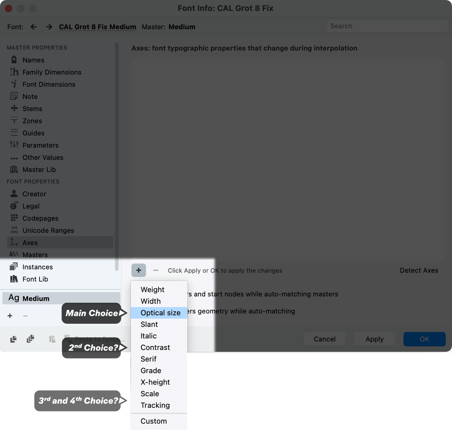
The main choice is the Optical Size Axis. Contrast is also a good option, because added contrast usually brings down the spatial frequency. As we’ve seen tracking changes the optical frequency of the letterspacing. I don’t exactly know what scale is, or how it differs from optical size.
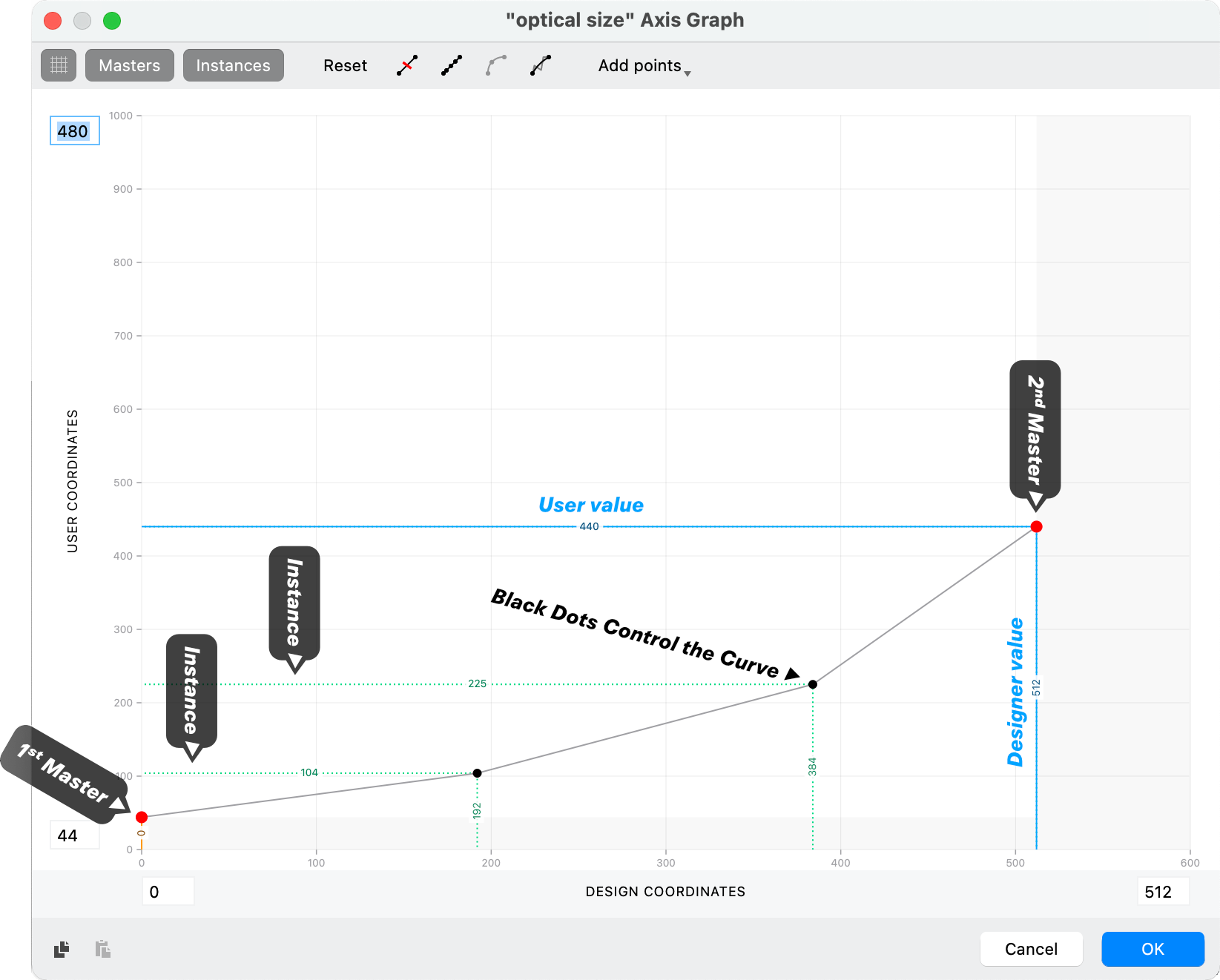
Here’s an example axis, used for the Bodoni Ferrara font.
Here’s how I set up the optical axis.▼
Info
I used 512 because that is 2⁹. The design coordinates use a base 2 system. Optimally your instance would be base 2 as well, but this is usually not possible.
The optical axis is non-linear. Usually the curve is going to look something like this in FontLab. You can use the black dots to make a piecewise function. (In this case, a semi-curve made of different linear equations.)
For more information on how to set up masters, see this section.
Two Size System
The two size system is similar to above, but there’s one font for display and one for text.
So you’re using the text font to cover 6 pt. to 23. Then display for 24 and up.
If the Display and Text Are Similar
If the display and text are similar, why not make their paths compatible, so that you can blend them and make subheaders?
If the designs are similar, it doesn’t make sense to make them independent, unless you are in a rush.
Display and Text Are Different
Usually however, you will make one set for display another for text. It would be best if they were different enough to really warrant different designs.
Certain font designers specialize in display, and others in text.
Some do both.
For ideas on making a display font see this tutorial project.
It’s especially difficult to make a good text face, as you have to balance many concerns.
See this project for Text Faces.
One-Size-Fits-All System
Personally, I don’t believe that there’s a font that can cover all sizes.
To use a baseball analogy—
Suppose you only had one guy to cover the entire outfield.
The other team would score a lot of home runs. You’d probably give that solofielder a heart attack.
Even if not, he’d look pretty silly running around all over the green.
The Best Designs for the One Size System
Remember we had these sets of letters in the last tutorial?
High, Mixed, Low, Very Low frequency letters.
Just sort of reasoning it out, the High Frequencies probably won’t work well for small sizes. The Very Low Frequencies probably wouldn’t look good at big sizes.
That leaves us with the middle two.
Low Frequency Designs
Low frequency designs—like monoline fonts—are primarily for small sizes.
However, because a graphic designer can push the tracking button and bring them together…
…Wala! They have tight spaces at high frequencies! This calibrates the eye differently.
Mixed Frequency Designs
But mixed frequencies seem to hit the mark for the one size system.
You can mix in small details for large sizes, with sturdy skeletons for large sizes.
To me, the main risk is making a font that doesn’t quite excel at anything.
Some Other Solutions
Mode Through Feature Sets OK, this one is sort of a secret.
In Cal Grot (still unreleased) I made main masters, then Fontless Masters (Glyph Masters), which I then turned on in some letters and off in others. That way I had a two font system within one font, and accessible through style sets.
Tracking Another thing you can do is to build into your font tracking using the position command in a style set feature. We know that in program tracking is relatively dumb.
Suppose you do negative tracking in a program. OO is going to crash while HH still looks too far apart.
If you made a tracking using classes, this would allow a display style tracking.
Basically, personally I feel that the one-size-fits-all system, while maybe saving the user money, puts the burden on the user. He/she has to track the font, then kern to correct the tracking in order to make it look good.
Check out the next tutorial.
It’s a project where we take these ideas about frequency and I show you how to put it together into a font.