Briem’s notes on type design: Capitals three: obliques
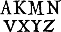
In addition to he letter R, Arrighi made eight capitals with slanting stems. Here they are. The letter Z is easiest. We’ll assemble it first.
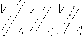
We start with parts of the letter E, and flip the top horizontally. For the middle, we’ll use the template for straight stems and tilt it.
Next we remove the overlaps and join loose ends. But that’s not quite enough.
Then we’ll enlarge the bottom serif. And, for a livelier stem, we’ll put a couple of breaks in the slant. This makes a respectable letter Z.

Arrighi’s letter slants, just like his letter S. So we’ll slant ours a bit as well. It won’t be as nicely balanced, but it will be closer to the original.
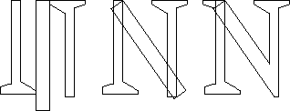
Begin the letter N by fetching a stem template. Pull it well below the baseline. We also need a couple of narrow ones (the same we used in the letter U.) Stick serifs on them. The right one should go as far below the baseline as the curves of the rounded letters.
Next rotate the stem template. The top right-hand corner should overlap the top right corner of the narrow template. Keep turning until the underside is in the middle of the thin template on the right.
Then remove the overlaps and join loose ends. Fetch a serif. Put it at the top, on the left. Remove the overlaps again. Join loose ends, and you’re done.
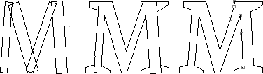
Start with two upright templates and two narrow ones. Rotate them until you’re got the shape you like for the letter M. This may take a bit of work. I like the two lower countershapes to be almost mirror images of one another. And that includes making the two triangles the same height. Not everybody bothers with this. I also like the bottom point to be nearly the same shape as in the letter N, and rest on the baseline. But what you do depends on what you want.
Next you add whatever serifs you fancy. You remove the overlaps and join loose ends.
And then I suggest we’ll give the letter a few odd points and shake it up a bit. This will add family resemblance.

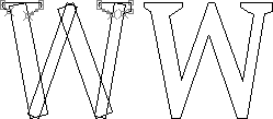
The letter W is a latecomer in the Latin alphabet, and only shown as a variant in Arrighi’s book. I suggest we use a simpler structure, almost the letter M flipped on its back. The proportions are different, of course, but the assembly is the same.
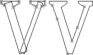
The letter V is put together much the same way as the letter W. The bottoms of them both should go as far below the baseline as the curves of the rounded letters.
As a final touch, we can add couple of points that break the straight lines.

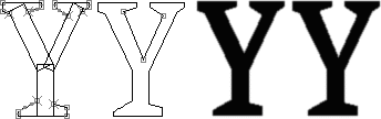
The waist of Arrighi’s letter Y is too high. We can safely lower it. Fully assembled and filled in, the letter has a lot of back where the three stems meet. The counter has been deepened in the letter on the right, which I think is an improvement.
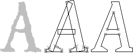
The letter A is put together from standard parts. They are two stems and a bar the same thickness as in the letter E. I widened the counters at the bar and raised the top of the upper counter. I improves the letter in the same way as it does the letter Y.
The scanned image of the letter A has an interesting shape. The top is flat, slightly at an angle, rather than pointed. This gives me an excuse to add another suggestion of handwriting with a broad-edge pen. I also tilted the letter to the right, without any justification whatever. That was the way I wanted it.

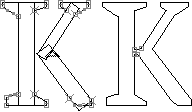
The waist of the letter K should be much the same height as the middle bar of the letters E and H. The white space around the diagonals should be in balance. And the lower diagonal shouldn’t reach far to the right. That would create spacing problems we can well do without.
The upper of the slanted stems is often joined to the vertical stem, and the lower slanted stem to the upper. Arrighi seems to have joined the lower to the vertical stem first. I liked very much making this a part of the design.
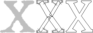
The stems of the letter X are made of two pieces each. This helps capture the look of a slightly disjointed original. And two crossed stems can usually do with a little help, as I mentioned on the page about optical illusions. And Keeping the serifs short will make spacing easier.
Notes on type design. Copyright © 1998, 2001, 2022 Gunnlaugur SE Briem. All rights reserved. Republished with permission in 2022 by Fontlab Ltd.