Briem’s notes on type design: The x-group
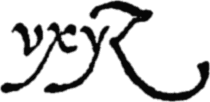
The letter w is missing from Arrighi’s character set. Here are the other four letters of the x-group.
The lower-case letters in our design slant about six degrees. The letters of the x-group should fit among them. You may have to test a few slants to find what the right one.
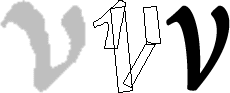
Assembling the letter v is easy. Getting it right may take extra effort.
Start with the template for a lower-case stem. Backslant it five or six degrees. That takes care of the left oblique. Add a copy of it on the right. It only has to be about half as high. Stick a serif from the letter n on the left diagonal. And put a thin diagonal between the two templates.
Next you take away the path segments you don’t need and join loose ends. Then you smooth the curves. That’s the tricky part. If you know how to make thicks and thins with a broad-edge pen, you should write the letter v with it a few times. It will show you where to put the swells. If you don’t, use your eyes and do the best you can.

The letter w is even easier to assemble than the letter v. And very little adjustment is necessary.
You start with two letters v. Next you rotate the second letter four to five degrees anticlockwise. Then you remove overlaps and join loose ends. And make the thin diagonal of the first letter a little thinner than when it stood on its own.


Arrighi’s descenders look great, but they weren’t meant for typesetting. They can get tangled up in each other. Instead of a lovely curve, I used a safer shape for the descender of the letter y.
Start with the letter v and the descender of the letter q. Join them, and continue the curve from the oblique of the letter v all the way down to the serif. This descender usually stays out of trouble.
If you really want to digitize the original descender, you can put it into an alternative character set. That’s what I did.
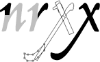
You make the letter x from bits of the letters n and r. First rotate the template for lower-case stems anticlockwise by five or six degrees. Next add a thin, straight oblique down to the descender line. And add a final flourish to that. Then remove the overlaps and join loose ends.
You may want to move the slanted lines in opposite directions at the point where they cross each other. I mentioned this on the page about optical illusions.
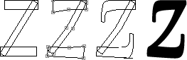
Arrighi’s extravagant letter z won’t take us far. Here’s a safe alternative. Start by arranging three rectangles in roughly the proportions and stem thicknesses you want.
Next sketch out the swellings and curves you have in mind.
Then add serifs, and pull them to the length you want. Remove overlaps, join loose ends, and smooth the curves.

I made a second letter z and put it in the alternative character set. The top doesn’t overreach to the left, and won’t get snarled up with letters on the left. I also changed the descender curve. Otherwise my letter seemed about to fall apart.
We can probably agree that my scanned original didn’t give us a full picture of Arrighi’s intentions. Any revival is like that. You choose the shapes you like best and work from them.
Few originals are perfect. What will you do about the flaws? Some you can include or leave out. Others you can play down or exaggerate. In the end, it comes to this. What do YOU want?
Notes on type design. Copyright © 1998, 2001, 2022 Gunnlaugur SE Briem. All rights reserved. Republished with permission in 2022 by Fontlab Ltd.