Briem’s notes on type design: Limits
How short?
Some bold designs have shortened serifs. Others have not: it’s a matter of taste and often a matter of convenience.
Bold stems alone are not enough to make dark, dense text. You need to stick the letters close together. That’s when short serifs are better than long.
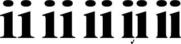
The pair of the letters on the left has serifs of the same length as in the regular weight. The next two have shorter serifs and can stand closer together. The pair at the end of the line has the shortest serifs and the narrowest gap. We’ll use the second example from the right.

Once you have made the letter i, the letter l is easy. Just pull.
There are limits
A type family that includes a really fat version will bump into various restraints. Planning the bold and the regular weight together from the outset can save you work later.
An ultrabold letter k, for example, can be overwhelmed by the lower diagonal. Work out what you can do in the bold and what your can’t. Make the necessary compromises. Build them into the regular weight. Here’s an example.


The ultrabold letter k on the left has gone about as far as it can go. The lower diagonal can’t match the width of the stem. It is only saved by tapering.
The letter k on the right also has a slightly tapering diagonal. In the light version it isn’t needed to save a difficult shape. But it does support a family likeness.
Notes on type design. Copyright © 1998, 2001, 2022 Gunnlaugur SE Briem. All rights reserved. Republished with permission in 2022 by Fontlab Ltd.