Setting Up Variations
Set up your font family and export a variable font!
Benefits Save time and energy when you set up your masters and axes correctly the first time.
Before we look at more axes, let’s take a break.
Here’s how you get started with setting up the main 4 axes.
Setting Up the Master
Download VFJ
Here’s a file to use.
In File Explorer or Finder, double click it. You might see a warning like this.▼
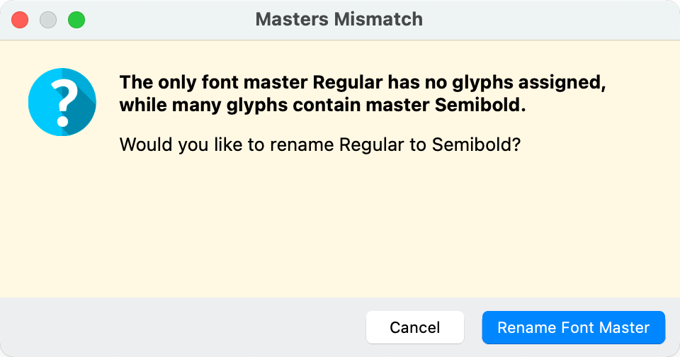
Info
This doesn’t happen often. I made the font like this on purpose to show you renaming masters.
You get this warning if your master has no glyphs in it. (Sometimes happens when you copy from a font with different master names.)
You can push Rename Font Master.
If you pushed Cancel, here’s how you’d rename the font master manually.
Manually Assigning a Master
This problem often happens when you copy a layer or glyph from another VFC file.
To show you the correct panel, go to the Variations Workspace. Click Window > Workspaces > Variations.
Info
If you like to work in one window, click Window > Workspaces > Manage Workspaces. And load this bad boy up.▼ one-window-variations.fl_workspace
In the new workspace, look at the Layers & Masters panel.
The first, you know something is wrong because the layer name is not bold.
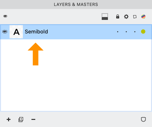
Unbolded names mean this is a layer, not a master.
You need to assign it as a master.
There are two basic ways to assign a master name:
Change Layer Name→Master Name
Go to the Layers & Masters Panel. Change this like so.▼
Double click the name. Change it.
Here’s your final result:
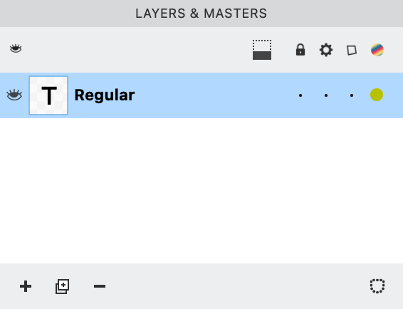
The name is now bold, because the layer names = the masters names.
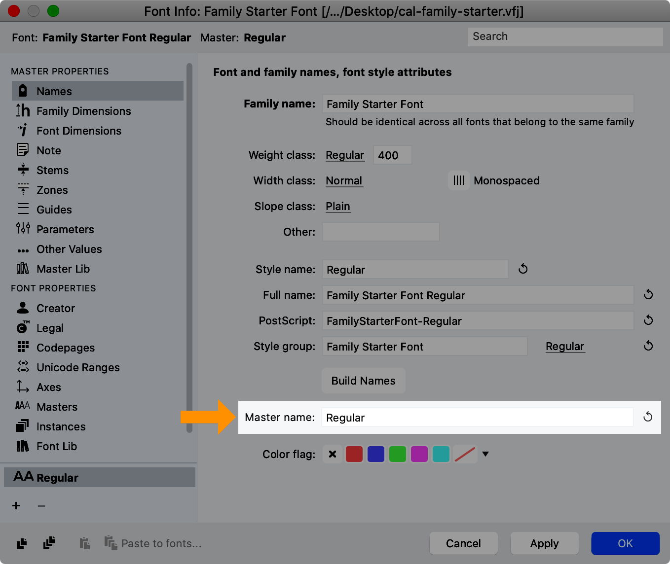
Not sure what your master is named?
Go to menu: File > Font Info > Names.
Change Master Name→Layer Name
This is the opposite of what you just did.
You choose this when you think—
“I like this layer name. It makes more sense. Actually, this should be the new name for the master.”
Here’s how you do that.
Go into menu: File > Font Info > Names.
Now enter Semibold into the Master name.
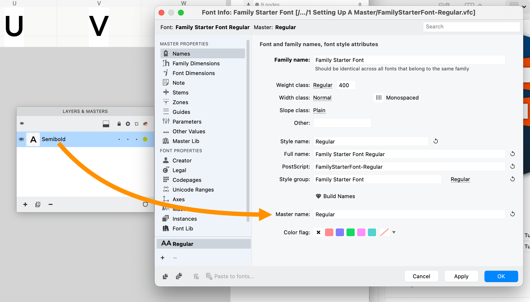
While you are there, you also need to change the weight class.
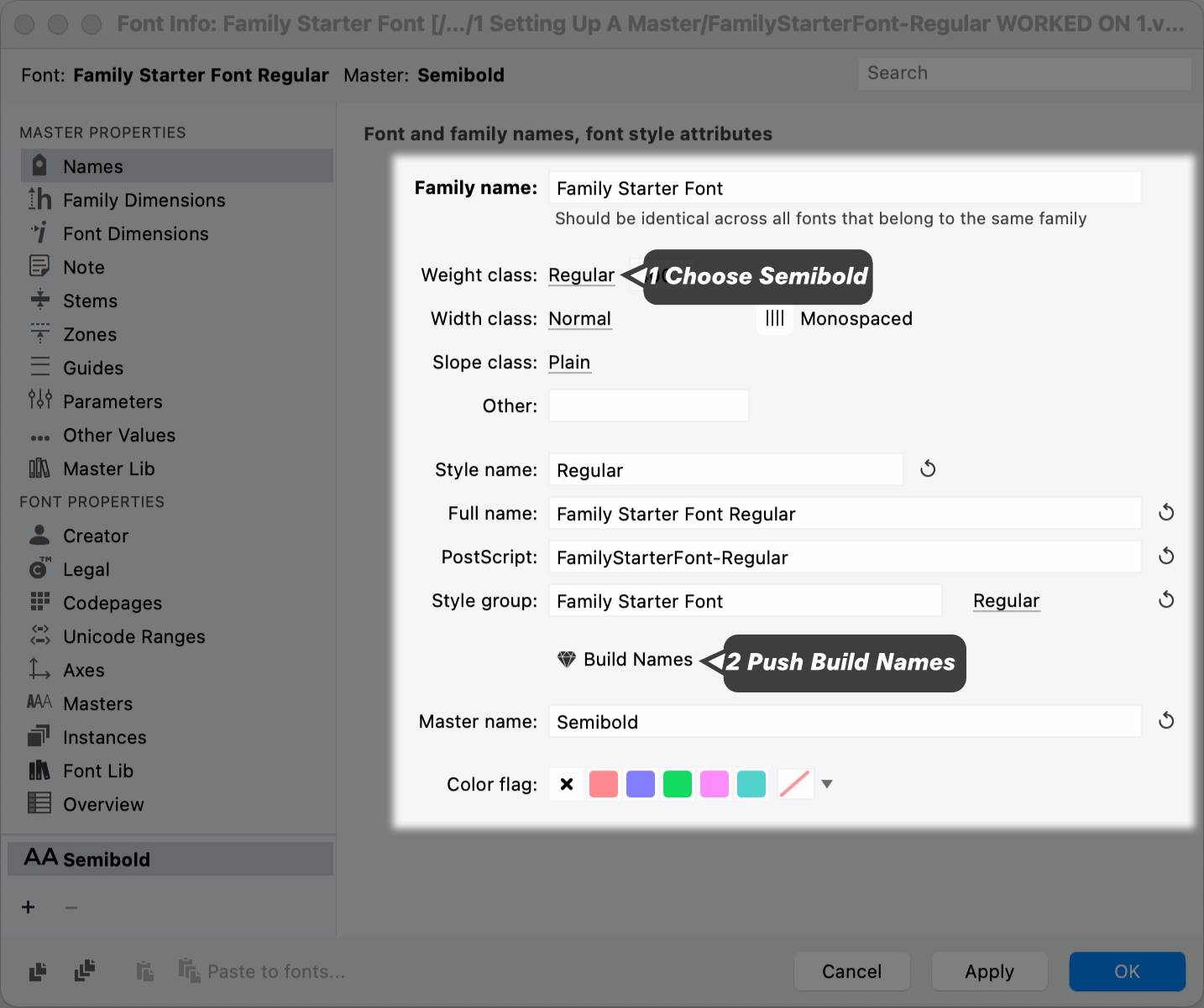
Hit OK.
In the Layers & Masters panel, your final result should be this.▼
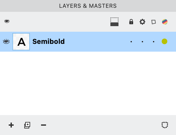
✓Good!
Because the name is in bold.
After you get the correct master name, you add your axis!
Let’s start with the weight axis, because this is the most common.
Adding Weight Axis
Go back into Font Info > Axes (pronounced AX-ees). On the Axes page, push the plus sign (add exis) and select Weight.
You now have a weight axis!!
Here’s a basic rundown of this important Axis page.

For now, hit Apply.
Customizing Axis Graph
Here’s why you might want to change the graph.
For the person using the font, 400 = regular. However, 400 is not helpful to you, the designer!
What’s more helpful?
Well it would make the most sense to use the lowercase ’n’ stem as the weight number. However, in the file there are only caps, so maybe the H stem?
Measure that now. (You can also use the diamond on the Measurements Panel.)
Great!
Now let’s take that number and customize your graph.
If you are not in the Font Info > Axes window, go there now. click the graph symbol in the upper right.
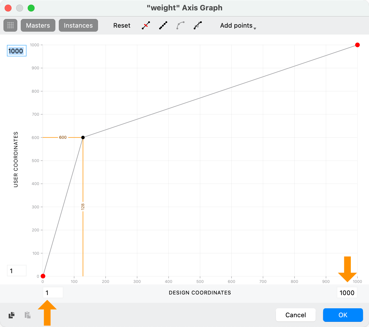
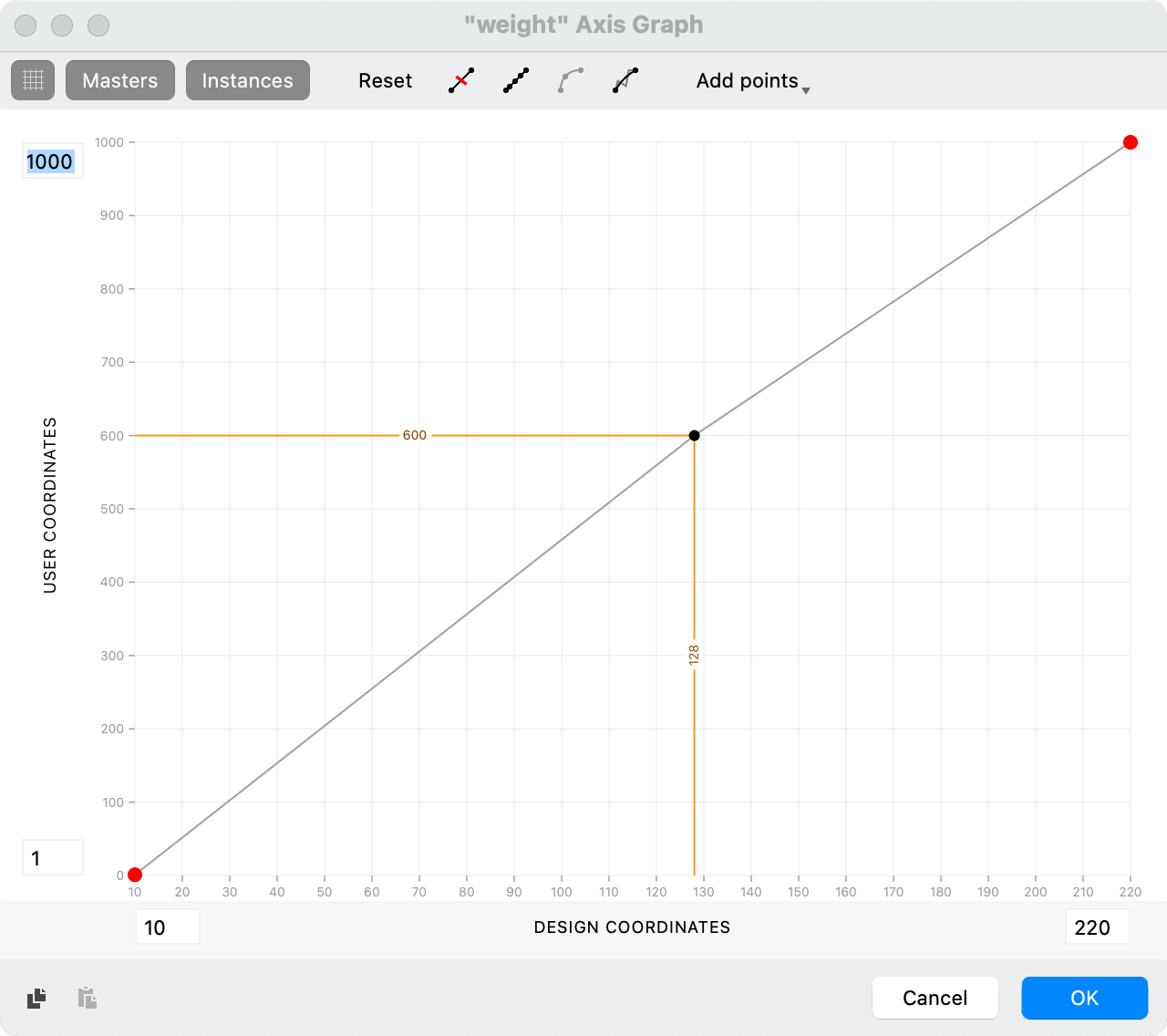
You should see the “weight” Axis Graph. Like this:
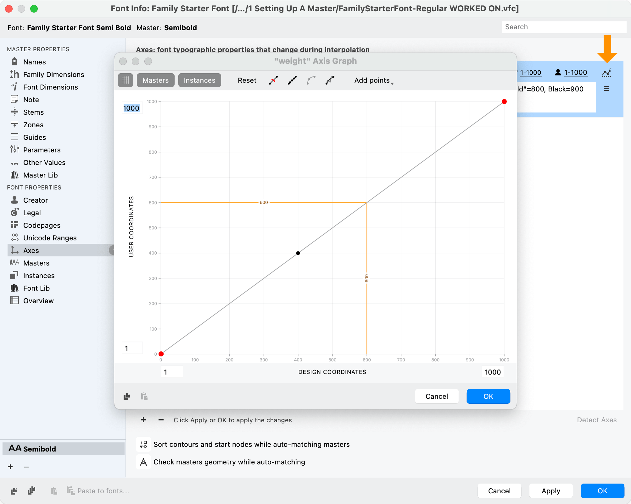
If you don’t see the orange line, go back out of the graph and hit Apply.
Intro to the Axis Graph
First of all, the Axis Graph and the Variation Panel’s map, are two entirely different things.
The Axis graph looks as above.
The Variations Panel map looks like this:
What does the Variation Panel’s map do?
That’s a map of your “design space”. It shows you where your masters are. You have the blue dot to get an idea of how they mix.
What’s the Axis graph then?
Well, that shows the relationship between your design (input) and user (output) numbers on one axis.
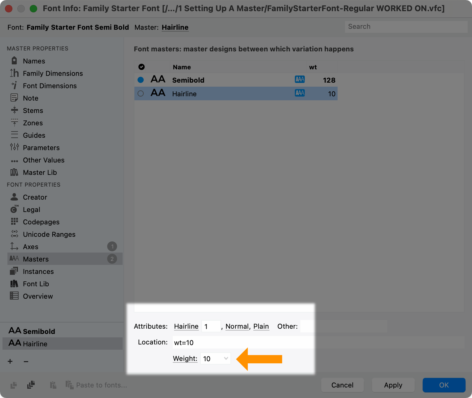
Setting Your Master Value
So what was your measurement for the H?
128. That means you want input = 128.
For the user of your font, Semibold = 600. So, you want the _output = 600. _
So, from math, we know that (x,y) is an ordered pair. Or (horizontal input, vertical output). So what order do you put those value?
Your x input is 128. Your y output is 600. You need (128, 600).
So click the black dot in the middle and change the value to (128, 600). Or you can drag the dot.
Info
If there’s no black dot, click “Add points▼”.
Video:
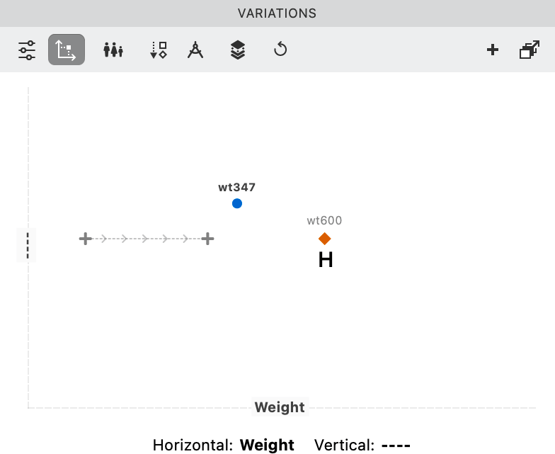
Notice that our orange line is all messed up!!
That orange line represents our Semibold master. We need it to match the values of the black dot.
Drag the orange line to the dot.
Your master is now set up!
Now, you could push OK. And you’d be in OK shape.
But your Variation panel would look a bit messed up with the semibold too far left:
To fix the Variations panel, you need to adjust your graph range.
Adjusting Graph Range
These are the two numbers that represent your design range.
In order to set those, you need to ask yourself the question:
“What’s the highest and lowest range that I will design in?”
It’s OK if this is just a guess at first. You can always change later.
A large range would be 10 to 220. (See the tutorial on weight examples for common minimums and maximums.)
For this example, we’ll use that.
Here’s what you do:
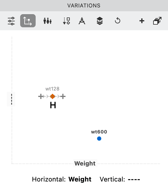
❶ Change the design coordinates to 10 and 220. Push OK. ❷ Push Keep. (Since you already set your master!) ❸ Push OK to Font Info. Save changes.
Your Variations panel should now look like this.▼
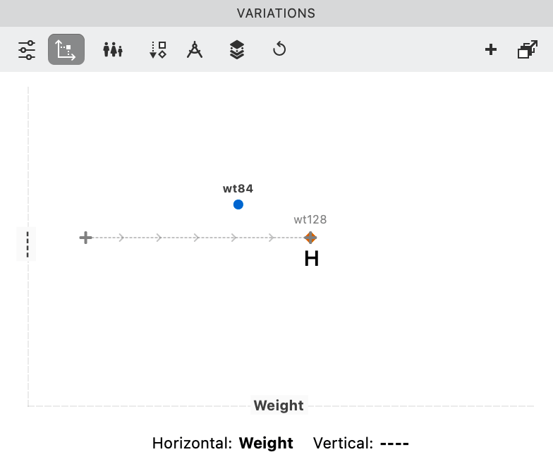
If you go back to Font Info > Axes and to the graph, it will now look like so.
Perfecto!
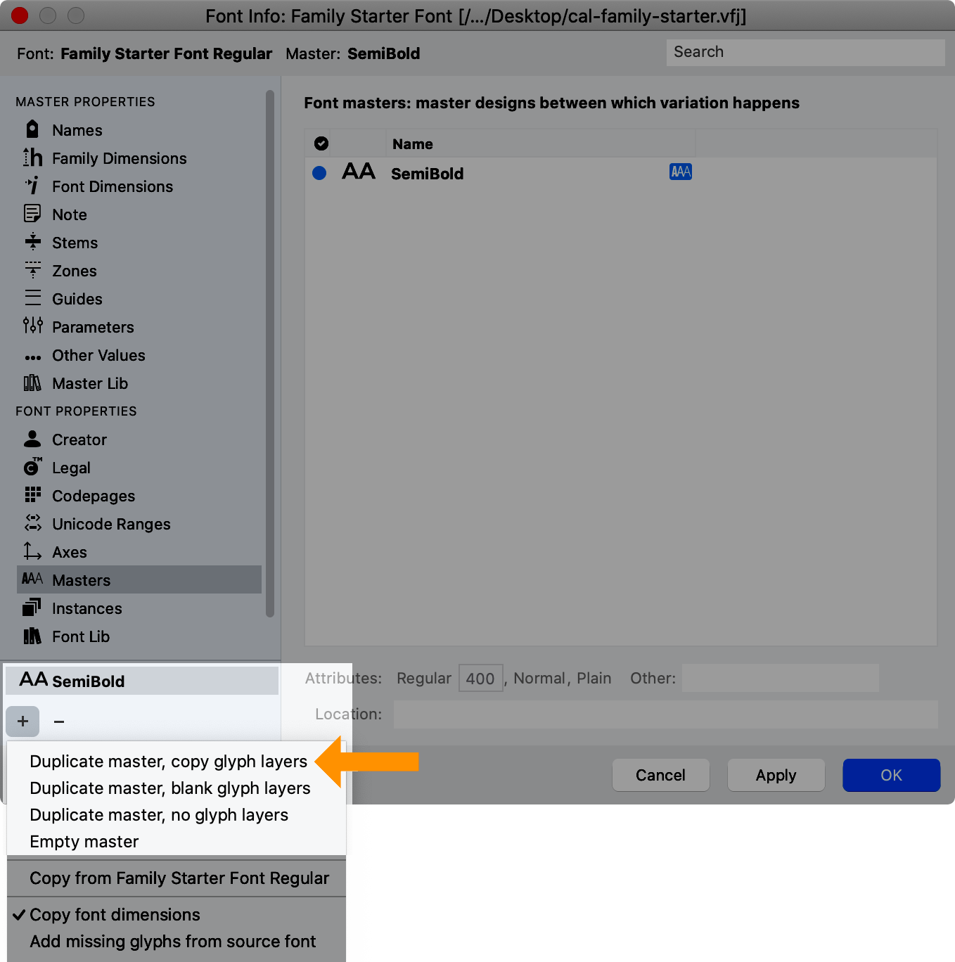
Adding Next Master
Now you are ready to add the next master.
Let’s try adding it at 10. It will be a hairline.
Go to Font Info.
In the lower left, click the plus sign (Add master), then Duplicate Masters, Copy Glyph Layers.
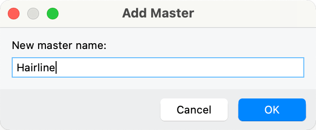
Assign it a name of hairline.▼
Many times FontLab will assign the correct name when you choose the master.
In this case, we’ll tweak it manually.
First, change the names:
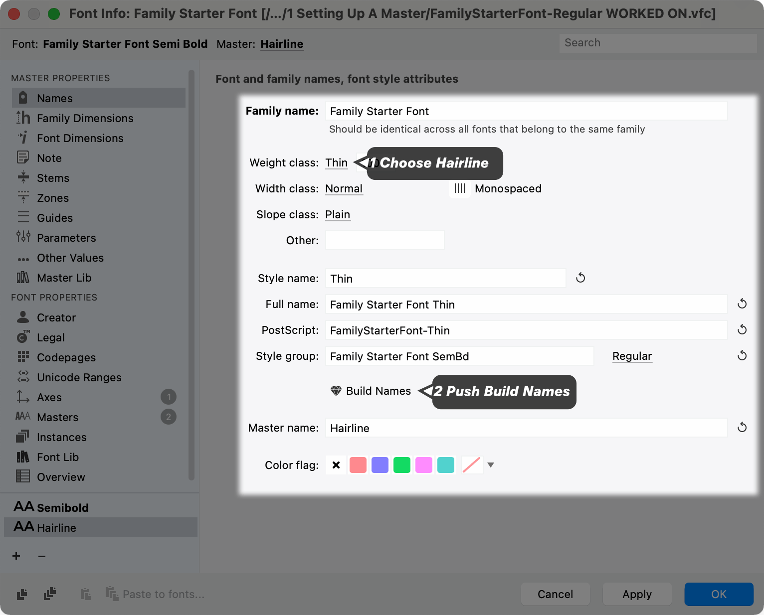
Now in the sidebar, click “Masters”.
Since 10 was our minimum, change the weight to 10. There are three places you can do it on this page. I usually just change the bottom number.
Push OK!
First Hairline Letter
We copied the glyphs from the other layer to make drawing the hairline easier.
Warning
Check your Layers & Masters panel to make sure you have the correct master selected. You don’t want to change the letter in the wrong layer!!
So in the Layers & Masters panel, make sure that the “Hairline” master is highlighted blue.
Double click the H and make all his thicknesses equal to 10. For accurate and precise design, keyboard arrow keys work best.
Also adjust the H sidebearing larger. Lower weights usually have greater sidebearings. (Check you sidebearings using HHH in the preview panel.)
Here’s what I came up with:

Exporting Variable Font
That’s actually all you need to test out a variable font.
Let’s export it by pushing CmdE.
Select “Variable TT”.
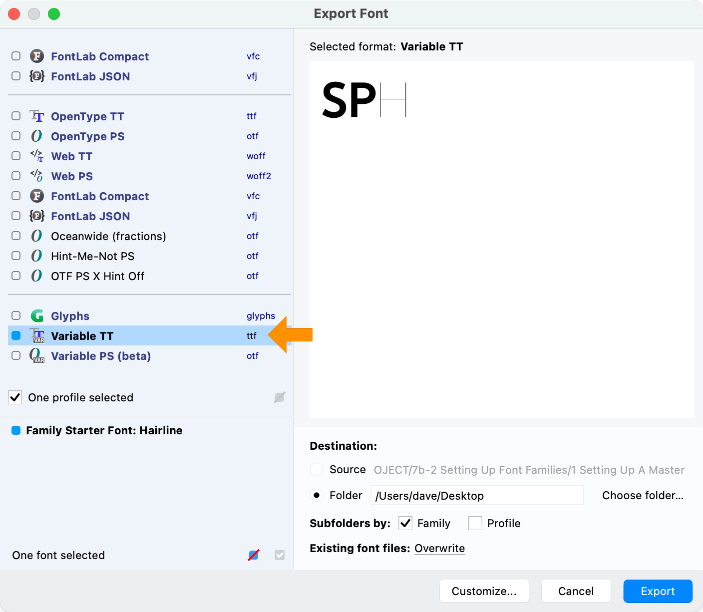
Yes!
Now you install it on your system.
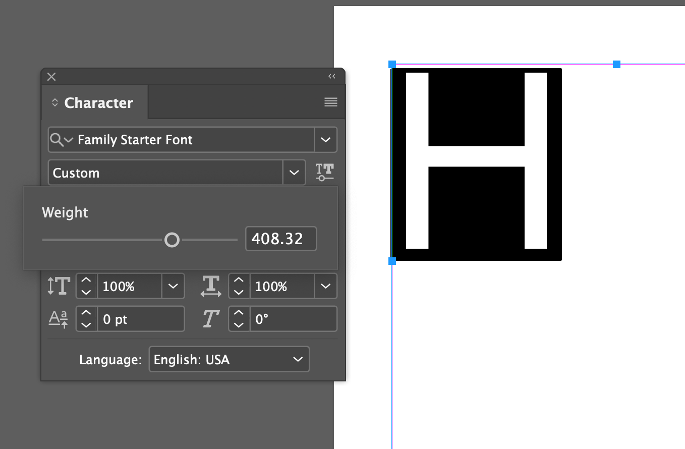
If you have a program that uses variable fonts, such as Sketch or Adobe Illustrator, Photoshop, or InDesign, you can try the H and see that it in fact does work!
Example of a custom location in InDesign.▼
Don’t have those apps? Don’t worry!
You can use this website, Axis Praxis to test out your variable fonts.*
Good Idea
Check your variable font exports as you go! Variable fonts are a relatively new technology. It’s a good to export frequently especially after adding a master or axis. 👍
Good work!
That was a lot of things.
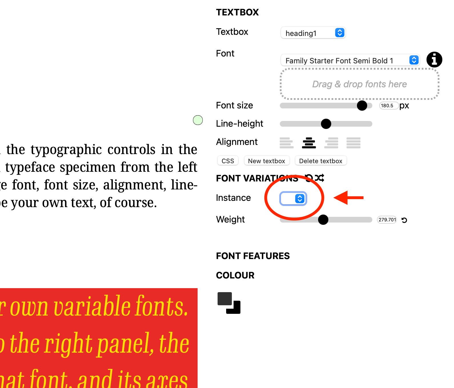
Now you may have noticed, in Axis Praxis or your program, the Instances or Styles field was empty!
In the next tutorial, you’ll learn how to make different styles in between your masters.
Great work!
- Axis Praxis is run by Laurence Penny, an all round great guy and a founder member of the team that created Myfonts.com as a startup within Bitstream. However, here is a disclaimer. California Type Foundry and/or FontLab accepts no responsibility for damages that arise from the use of third party websites. California Type Foundry and/or FontLab are not liable to any person using the third party websites in any action or claim for Economic Harm, irrespective of any foreseeability of that harm. California Type Foundry and/or FontLab makes no representation, guarantee or warranty, express or implied, verbally or in writing regarding performance of third party websites or programs. Use at your own risk.