Making a Text Sized Letter
How to Make a Text Font
Before we start editing our text, let’s change our waterfall settings. Go to the gear icon in the Preview panel. Delete the larger waterfalls. You might go with settings such as this.
This is what you might see.

I hate, hate, hate these cupping serifs! They look like gross little finger poking up out of the swamp from Lord of the Rings.
So let’s straighten the cups out. Open the Transform panel. If you want less handle distortions in this case, push align vertical middle.
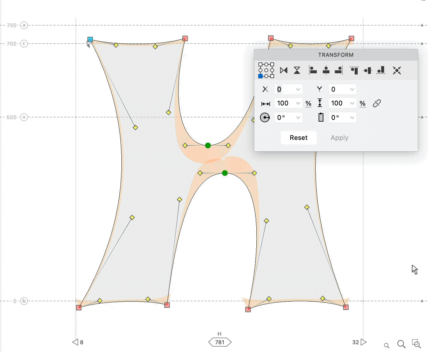
If it doesn’t align all the way, push the button again.
Do this also for the top.
Next, use the keyboard cursors. Nudge the bottom of the stems to the baseline. Pull the top of the stems down to the cap height.

Notice that when you took away, the difference between the top half and bottom half became greater!
As you make bolds and condensed and change the heights of things, you will need to know this next rule:
PRO Rule
Subtracting makes two things more unlike. Adding makes two things more equal.

Example: When you have the two rectangles on the left, they are proportionally very equal. When you subtract the dotted line, the new highlighted shapes are very unequal. Now the larger is many times greater than the smaller.
That’s why our H-bar looks too high.
We subtracted equal amounts from the top counter and the bottom counter.
Ok, so now adjust the H middle.
From the rulers, drag out a guide to 350. The middle should be a bit above that.
Ok, you’ve fixed the biggest problem first.
Now let’s see what you’re dealing with.

The main problem is that these H’s look like X’s or K’s. The shape is ambiguous.
Also the stems feel wobbly.
Based on that, straighten out the middle counters. Adjust the outside to be more straight if needed.
PRO Tip
Squares are bigger than circles. So adding curve tension can give your letter more space at small sizes.
Here’s where you might end up.▼

The waterfall looks like this. But before you move on…ask yourself, “What looks wrong?”

You might have seen that:
- The vertical strokes are too thick.
- The horizontal stroke is too thin.
- The spacing between letters is too tight.
Here’s one way to fix this.
❶ Increase the thickness of the middle stroke. Do that now. Look at your Preview panel as you do this. At this point I also increased my curve tension more.
❷ Since we subtracted some space in the middle, open it up. Highlight nodes like this then move 10 – 20. The white space in the middle should have gotten larger. Be strategic with your selections.

❸ Add spacing to the side.
❹ Further adjust your stems. If your letter is too wide, adjust the stems by subtracting from the outside. If your letter is too narrow, adjust the stems by subtracting from the inside.
My H now looks like this.▼

This is the waterfall.

This H is a lot more legible. But he lost some of his character.
So let’s bring that back by first duplicating his outer nodes. He should now match the structure of the Hairline. Go to the Layers and Masters Panel. You might see this.▼
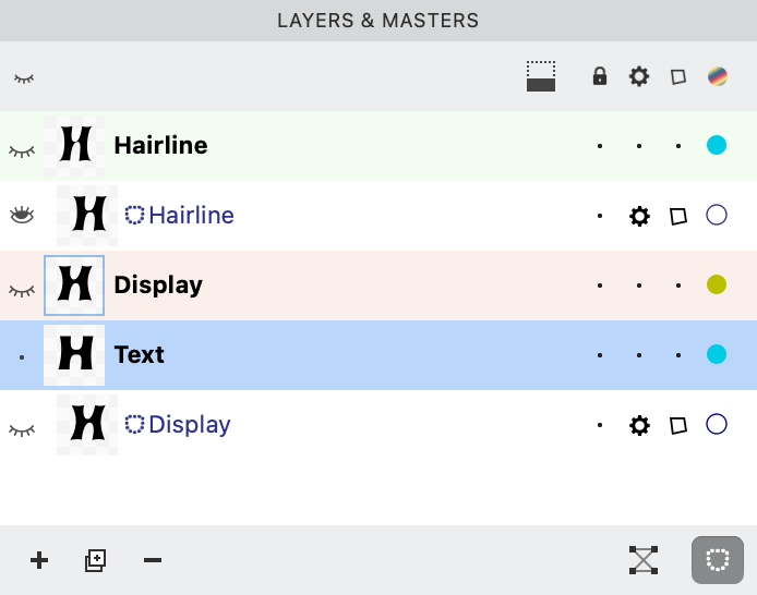
Let’s turn off that “Display Master”. Push the middle dot. That will put the gear on him. He will be turned off.
Here we go!!
You are on the final parts of this design.
Do these things:
❶ To make the outside tips show, pull it about 10 down. Now adjust the nodes so that it points more.
PRO Tip
At low sizes, dull tips are pointier than pointy tips!
❷ Slant the handles of the middle nodes, to bring back the slanted motion. ❸ Adjust the stems. The top of the right seems to get thin again.
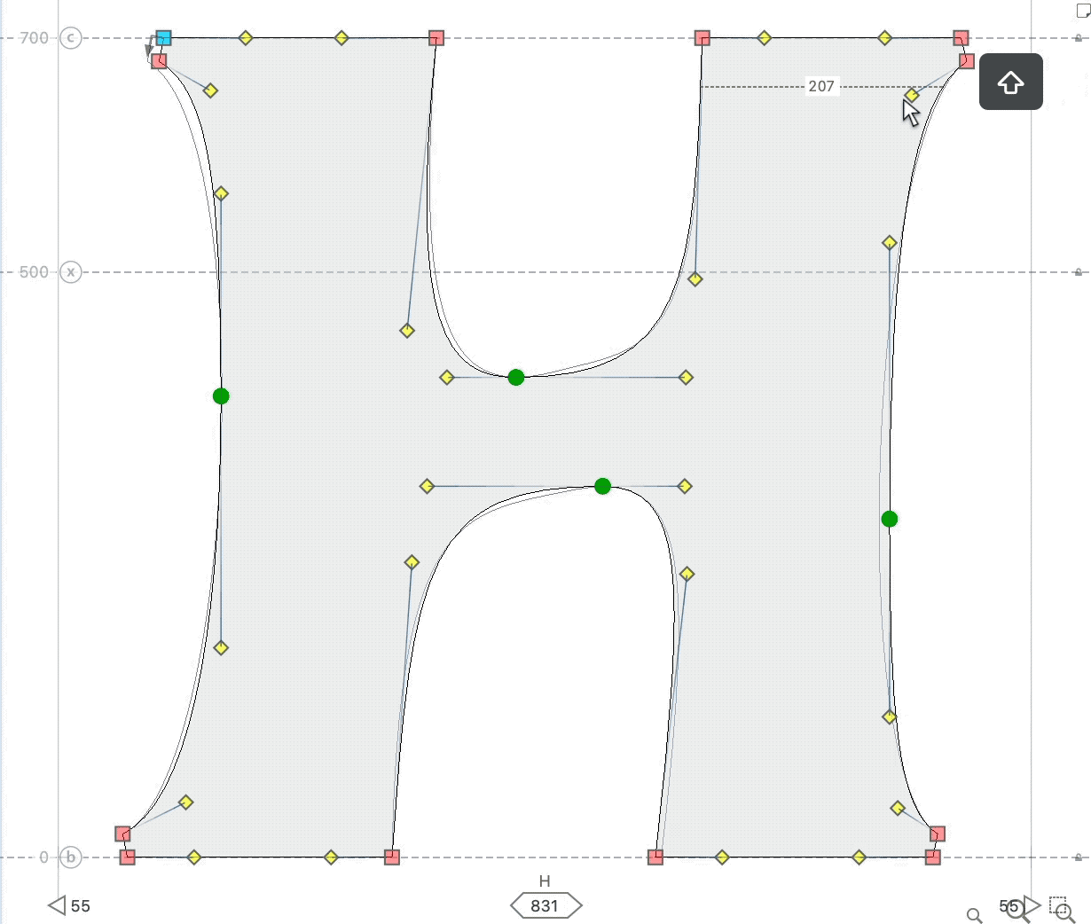
You might be somewhere like here.▼
The node structure is not good. When a node structure is no good, put the image in a mask, then get a similar shape using good node structure.
This is a lot to do, so I’m showing it here. The mask is already placed.
Final Touches
Let’s check stem thickness.
Since this is a weird shape, you need to use a mixture of your eye and measurement tools.
To use the measurement tool, go to menu: View > Show > Quick Measurement
This next part is necessary for this shape. Hold down Shift. That will keep the measurement straight.▼
You’re done!!
Now is the fun part of admiring your work. :)