Understanding the Different Curve Types
Benefit Confidence in Understanding the Curve Types and Their Problems
By this point in the refining process your letters should have:
- Nodes at extremes.
- No extra paths.
- Simpler node structure. (Not too many nodes, not too little.)
- Have a good height.
Before we get too deep into automatically and hand tweaking your curves, let’s get an idea of the most important concepts.
At the end, we’ll get some pointers from Benjamin Franklin himself.
Curve Shapes
There’s actually a couple classes of curve shapes.
There are some good things about each curve type. There are some bad things you need to be aware about.
Once you understand these, you will be more ready to hone them.
Curves In One Direction
Arc
A segment of a curve or a complete curve, like an ellipse or circle.
We’ll represent this as a circle for now.

Normally, shapes don’t have direction.
However, this is writing. And writing has direction.
In right-handed, western writing, it’s most natural to write in a counterclockwise↺ direction. (Coincidentally, this also happens to be the direction of black paths!!)
So we’ll label it with this direction, ↺.
Spiral
Another curve in one direction. Spirals are found a lot in the natural world, though in many different forms.
It is found less in fonts, but is still noticeable in some situations, such as the @ symbol or ornamental strokes.

Arch
The arch is not technically a curve. It is a composite of curve and straight lines.
This shape is frequently found in letters, so we include it here. It also flows in one direction.
This one is made from a semicircle and straight lines.▼

Notice: It’s going clockwise ↻ instead of counterclockwise ↺! It’s going the wrong direction!
Let’s flip it to become a U. Now it’s flowing in the natural direction of writing. ↺

Loop
The loop is considered a non-simple curve because it intersects itself.
However, like the previous curves, it goes in only one direction.
This is a loop formed from a symmetrical shape.
If you trace the path, it’s still going counterclockwise ↺.

Bouncing
(Ok, this is really an upside down bounce.)
It’s upside down because this is how they are drawn in fonts/handwriting.
Here’s the upside down bounce with one arrow.

Doesn’t that look very similar to a loop?
Here’s it with two arrows.

You can see that it is in fact, going counterclockwise ↺ both times!
Ok…
Those are the curves that go in ONE direction.
Let’s now look at…
Curves in Two Directions
These curves travel in two directions.
They both have a point where they change directions.
If it is a gradual change, that point is called an inflection.
S-Curve
The most import of these is the S-curve—the curve with inflection.
This is an S-curve made from two semicircles.

See how the middle looks a bit weird?
We’ll talk about why that is later.
Here’s the curve with two arrows. You can more easily see that the direction changes in the middle.

The S-curve is one of the most difficult shapes to master.
Later you’ll discover tips and tricks for this curve.
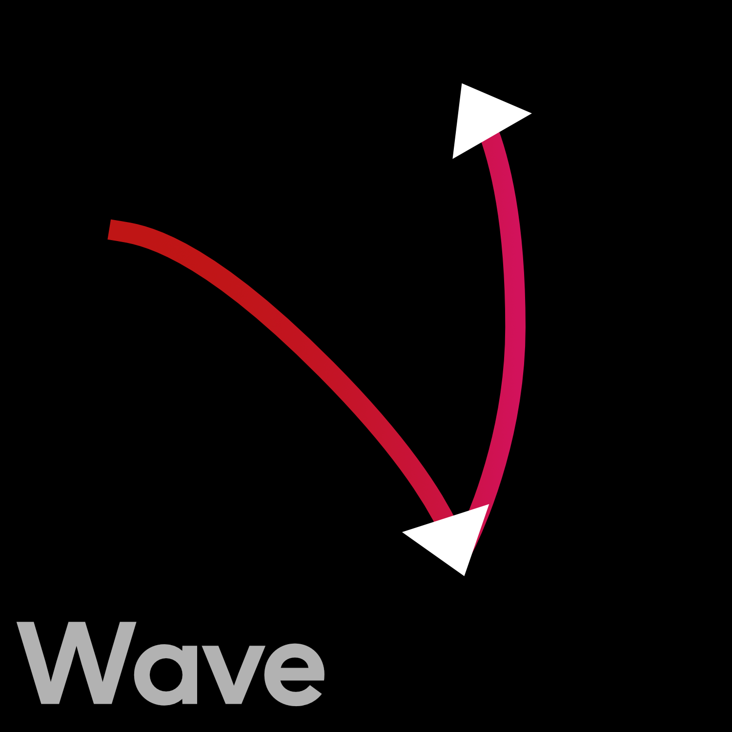
Wave
This is the upside down wave.
It doesn’t occur too often. Sometimes in shapes like the italic v, w, and y.
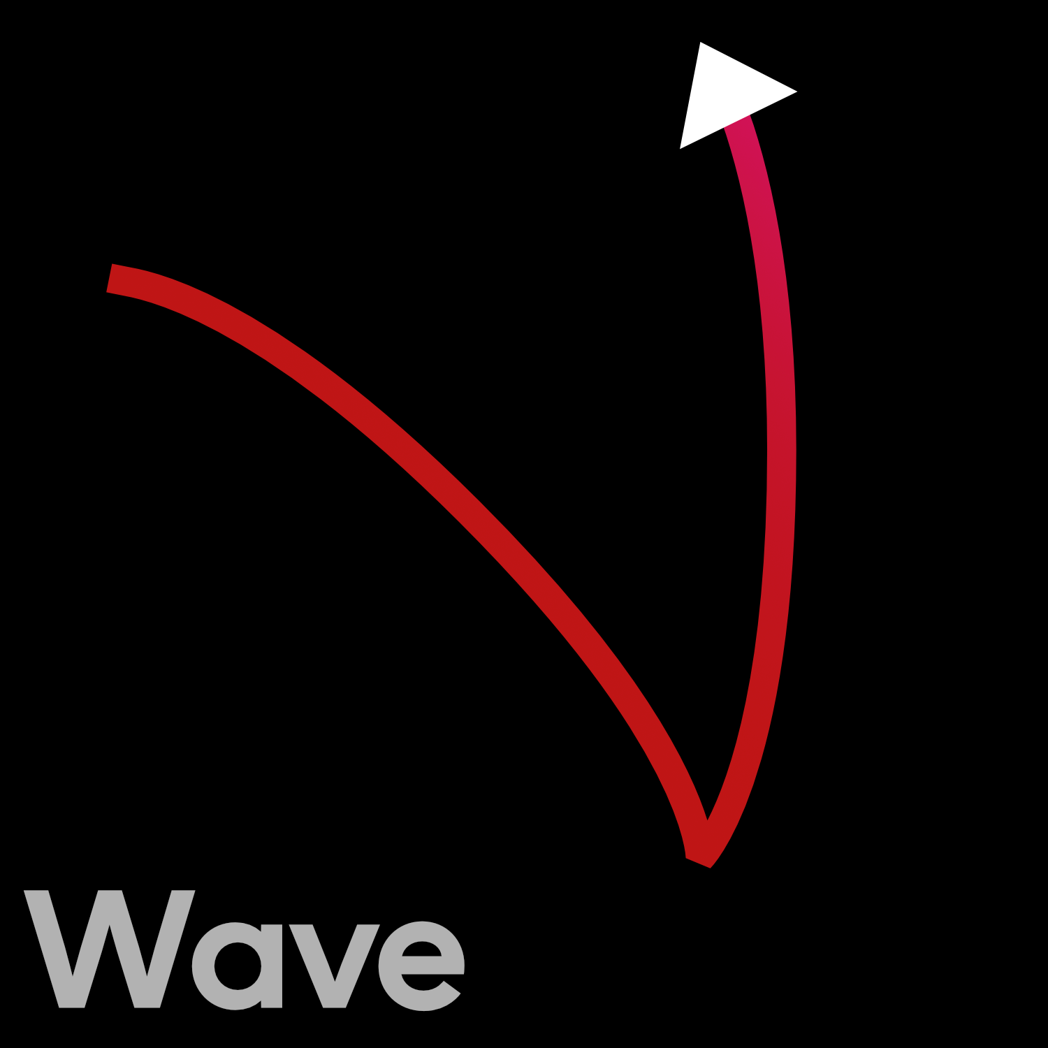
Like the S-curve, this shape changes directions.
See how it starts out clockwise ↻, then moves to counterclockwise ↺?
Understanding the Curvature of These Shapes
Download VFJ
These are the basic shapes that make up just about every curve in fonts.
Open this file which has geometric examples of all the curves types.
Warning
The shapes in this file are for illustration purposes. You’d never make an actual ’S’ 1,000 units tall!
We’re going to take a look at the curvature.
Understanding Curvature
People have always been trying to make letters out of geometric shapes.
Like Beauty and the Beast, it’s a tale as old as time.
Here’s an S from Geoffroy Tory’s Champ fleury, 1529.
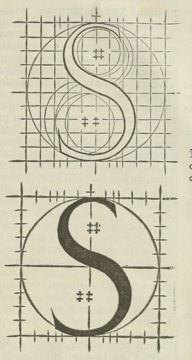
They inscribed circles first, then make the shape.
We’re going to work backwards.
We start with our shape, then make the circles.
Suppose we have this curve.▼

We have our shape. Now, we’ll make the circles.
Let’s just take the top of the loop.

See how the red part curves a lot more than the rest of the shape?
Now let’s see what type of circle can fit in there.

Something like that. We are being very approximate here.
Now let’s look at the part with the least curvature.▼

Now, let’s put a circle on that.▼

Haha. It’s huuuuuuuge.
Now let’s compare the low and high curvature.

We can see that the greater the curvature, the smaller the circle.
Now you have the background to understand your best friend.
Well… your best friend for fixing curves.
Using the Curvature Comb
Go to the loop in the file. It’s the “nine”.
Now, let’s turn on curvature.
At the bottom of your toolbar click this button.
If you don’t see that button, go to menu: View > Show > Curvature.
You should see something like this:
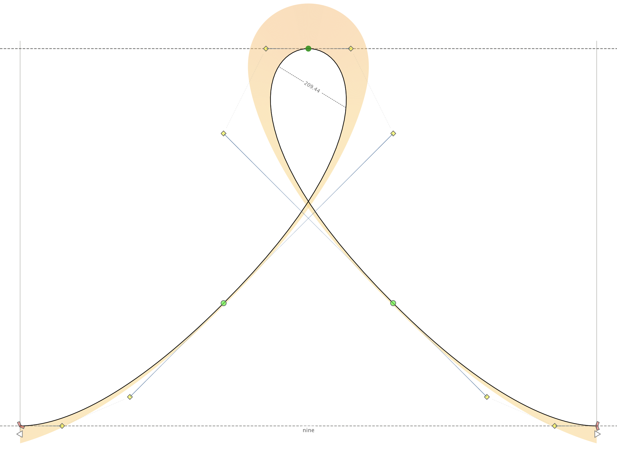
See how the top has high curvature, represented by orange?
See how the middle of the sides has very low curvature?
To summarize:
big circle=big radius=low curvature=small curvature comb
small circle=small radius=high curvature=large curvature comb
Math Matters
The formula to find the radius of a circle tangent to a curve is beyond me. However, curvature in relation to that circle’s radius is simple. Curvature is the inverse of the radius. Or curvature=1/r.
Info
To customize curvature comb’s size and brightness, go to Preferences > Glyph Window then the section about “Curvature”. There’s a bright orange bar. You can’t miss it!
The Boring One! Constant Curvature
The circle is the most elemental shape. He’s everywhere. Like air.
But also like air, he’s boring. You don’t think about him much.
And that shows in his curvature comb.

The elemental nature of the circle is why geometric sans will be around forever. Circular logos and symbols will be around forever.
The Second Most Boring Curvature
You will be surprised at what else has a boring curvature.
In the file, take a look at the Euler (Oy-lr) spiral. (The Q in the file.)
The shape is interesting, but the curvature is boring. It’s curvature is changing linearly (steadily).▼

Linear is a bit boring.
The Euler spiral is used by engineers to subtly curve train tracks.
With trains, boring is good.
You don’t want anything exciting when you’re rounding the ridge at 93 miles per hour, with 17,000 tons at your back!
The Curvature of the Universe
Imagine you are traveling on the vast, infinite, cosmic circle.
You are traveling on this, until everything stops, and the circle shrinks to the size of a dime and you are pulled along that.
Sounds crazy?
That’s exactly what happens on every hnmu.
Go to the n shape in the file. Look at this. (Example.)

The straight line is the circumference of an infinite circle. Or so some say.
Then it changes into a tiny circle.
Do you see that bad transition?
The curvature comb goes to zero to mohawk instantly.
One huge problem in font design… How do you make the straight to curve transitions not suck so bad?
The S Problem
Another related problem.
If you thought straight to curved was bad, try curved in one direction to curved in the other direction!
It’s why S’s have been plaguing beginner font designers since Pannartz and Sweynheim..
Look at this S made geometrically from two semicircles!▼

Check out that curvature comb!▼

Yikes, this transition is even worse than the n!
The transition looks crumplier than cornbread.
(We’ll actually fix this in the next project.)
Handwritten forms of the basic curves

Let’s look at someone who was able to string all these shapes together.
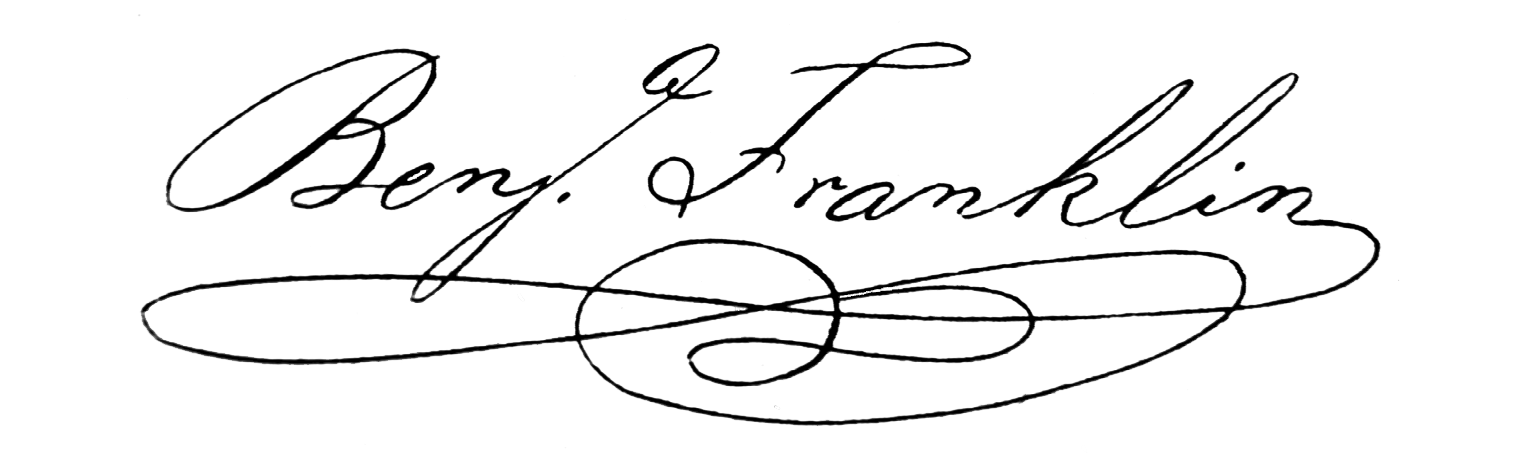
Benjamin Franklin’s Signature
Factoid
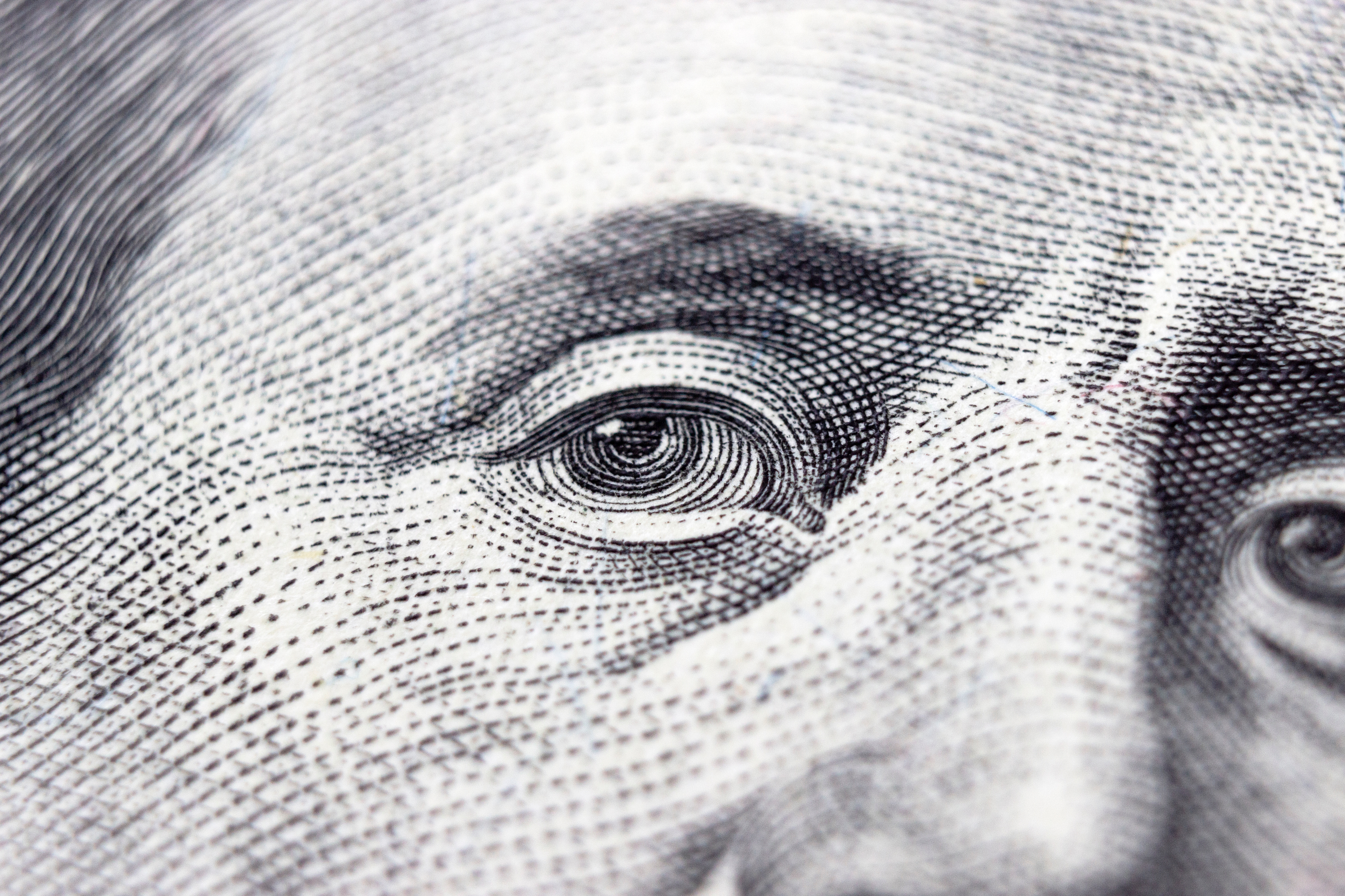
A signature flourish is called a “paraph”—originally a security feature against forgery. Sort of funny, considering all the security features covering up Benjamin’s face on the 100 dollar bill today! (Which cannot be shown here for legal reasons.:-)
Benjamin Franklin was outspoken about letters.
He even once wrote a letter to Bodoni criticizing Bodoni’s scripts! (That criticism was incorrect, as Bodoni was following certain drawing idioms of continental Europe.)
In any case…
Here’s how Franklin put together different curves into his signature flourish.
Here’s the inflection points of the flourish:
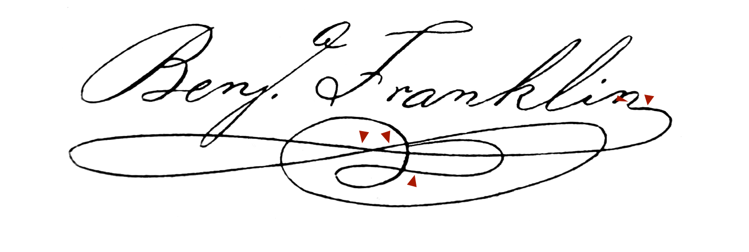
See also that he includes loops. Part of a spiral. And the other parts of the signature show many of the other curve shapes.
Source: https://commons.wikimedia.org/wiki/File:Benjamin_Franklin_signature.png
PS
When to Ignore Curvature Combs
Suppose you do a serif font. You add brackets (curves between the stem and serifs). You add maybe some slight rounding to the serif tips.
But then you turn on your curvature comb. Your “I” looks like a lighthouse off the coast of Maine.

But then you push Space, and your “I” looks like this.▼

That isn’t so crazy right?
Why did the curvature comb make such a fuss?
That’s because these small curves are just made to soften the straight lines.
These are FAKES! PHONIES! Phony curves!
They don’t count…at least when you are reading the curvature comb.