Briem’s notes on type design: Bumpy curves

This letter has a bump in the underside of the counter. At this size it doesn’t stand out, so I stuck in a triangle that points at it. Let’s take a closer look.

Reversed, the countershape shows the flaw more clearly. The triangle still points at the bump.

The curve suffers from an unfortunate arrangement of Bézier points. Here’s one way of putting it right.
- Stick in an additional point midway up the slant. Then eliminate the bottom point.
- Adjust the curve to the same depth as it was before. Stick in another point at the bottom.
- Eliminate the point that you added midway up the slant.

That’s it: the lump is gone. This method is useful in smoothing curves. Here’s another example.

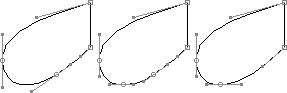
The letter on the left has a bad case of lumpy curves.
- Take out the top point of the outer curve. Move the right point until you get a smooth arch from the stem on the right. Adjust the height.
- Add a point at the top of the curve.
- Now do the inner curve. Remove the top point. Shift the right point to fit the stem on the right. Making something that goes with the outer shape would be nice.
- Add a point at the top of the curve.
Notes on type design. Copyright © 1998, 2001, 2022 Gunnlaugur SE Briem. All rights reserved. Republished with permission in 2022 by Fontlab Ltd.