Briem’s notes on type design: The letter g
Once you have made a bold letter s, the letter g need not worry you.
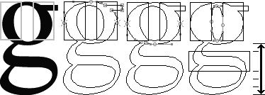
Start with the regular weight of the letter g and some templates. Stretch the upper half of the top bowl to its full width. Next widen the lower half of the top until it meets the top half. Then reduce the countershape.
For the lower part, turn a stem template 90 degrees. How high should it go? Put one-fourth of the space you’ve got left above the template, and three-fourths of the space below it.
- Align the outline of the counter to the bottom of the template and reduce it vertically by 55%. Move it slightly to the left as well. That will give us a stronger hairline on the right.
- Cut the path. Squeeze the bottom left segment to the right about 20%.
- Adjust the top-left segment to meet the bottom-left segment.
- The left side of the lower part is made of two curves. Squeeze the right side path down until the cleft between them is aligned to the bottom of the template.
- Stretch the upper curve until it touches the bottom of the upper part of the letter.
- The right side is easy. Stretch the path segments until the flat top of the curve overlaps the top of the template.
- Squeeze the top of the curve until the end joins the bottom of upper part. Join loose ends.
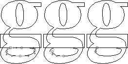
This is a safe approach. There are not doubt other ways of making a bold letter g, and just as good.
Weight loss?
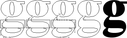
A bold letter g sometimes looks darker than the other lower case letters. The measurements may match, but a lot of black shapes go into that letter. Trust your eyes. And take a look at the page about family likeness.

The letter on the left is the full weight of the bold. The other letters g are a blend of bold and the regular weight, each 5% lighter than the next.
I don’t think the full weight of the letter g in this design would overwhelm the others. But until I ran the test I wasn’t sure.
Notes on type design. Copyright © 1998, 2001, 2022 Gunnlaugur SE Briem. All rights reserved. Republished with permission in 2022 by Fontlab Ltd.