PS Autohint, Part 2
Stems and Special Settings
Results of Zones
Last part we put in zones. What did adding zones do?
Did it make it look better at small sizes??
Drum roll, please.

At 8 points there was an improvement, both in color and alignment.
Here’s a comparison of the before zones H and the after zones H.

Info
I’m not sure what made the right stem get better. All the widths are the exact same as well as page placement.
You can see that since we haven’t set stems, those are still uneven.
Stem Problems
Besides the stems not matching for the H, check out this lowercase!▼
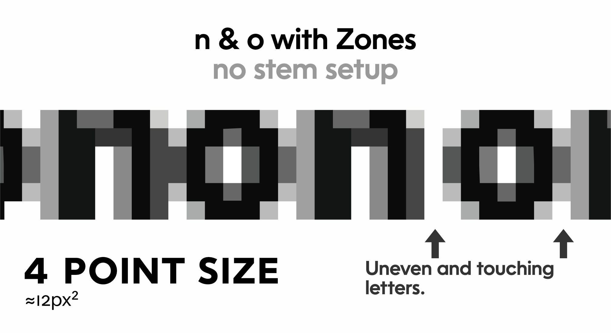
Uneven and touching letters.
Let’s set up stems to fix the sides and see what happens.
Setting Stems
Step 1: Prepping Your Stems for Hinting (Screen fonts)
Just like fixing overshoots, your vertical stems need to be exact. That goes for both straight and round stems.
Of course uppercase and lowercase stems can be different.
Info
For displays it is OK to vary your stems. Such as in black sans, the E’s have narrower stems than the H’s. Actually, in black sans uppercase hardly any stems are equal.
Let’s use the measurement panel to measure our stems. Go to menu: Window > Panels > Measurements. Push CmdA to select all.
Smash the diamond.
You should get something like this.▼
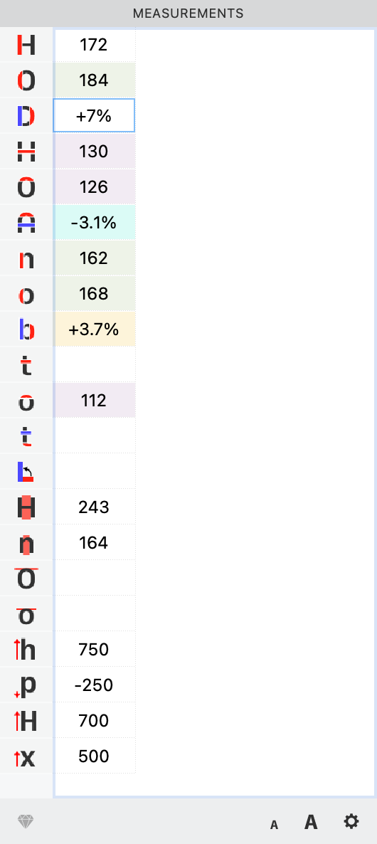
If a cell doesn’t fill, select it. Hit the diamond again.
If it still doesn’t show up, you can record the value manually. (Just make sure not to hit the diamond again! Otherwise your info will get overwritten!)
Step 2 Entering Stem Widths
Verify the accuracy of your measurements panel. Then, go to Font Info > Stems.
The stem values help the rasterizer to know how much to fit into a pixel.
Hit the diamond. If these values do not match your chart, let’s enter them in manually.
Info
The general recommendation is to stick with at most 2 stems in each direction, although up to 10 in each direction are allowed. In the end, testing and seeing what works is important. For example, in my Rosart font, the vertical stems ranged from 13 to 126, with 3 major areas in between. This required more stems.
Warning
For multiple master fonts, similar stems must have the same names! Otherwise interpolation will not happen.
In this specific instance, going with four stems instead of two stems gives no real difference, so I’m doing it like this:
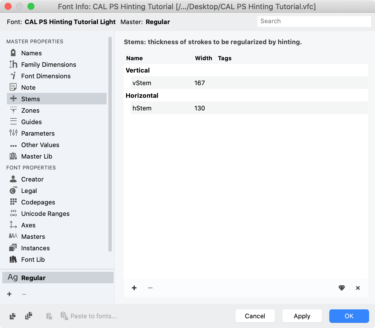
For the vertical, I took the average of the lowercase and uppercase straight stems. For the horizontal, I took the H crossbar.
Setting AutoHint Ranges
You’re getting close, but not quite done!
If you don’t help the autohinter, you can get weird hints in our final fonts.
So, you have to set the minimum and maximum autohint values.
These are use by FontLab to set the glyph level hints. (What we did before was set the font level hints.)
Go to Font Info > Other Values > Postscript Hinting.
Here’s some plausible values, for this particular font.
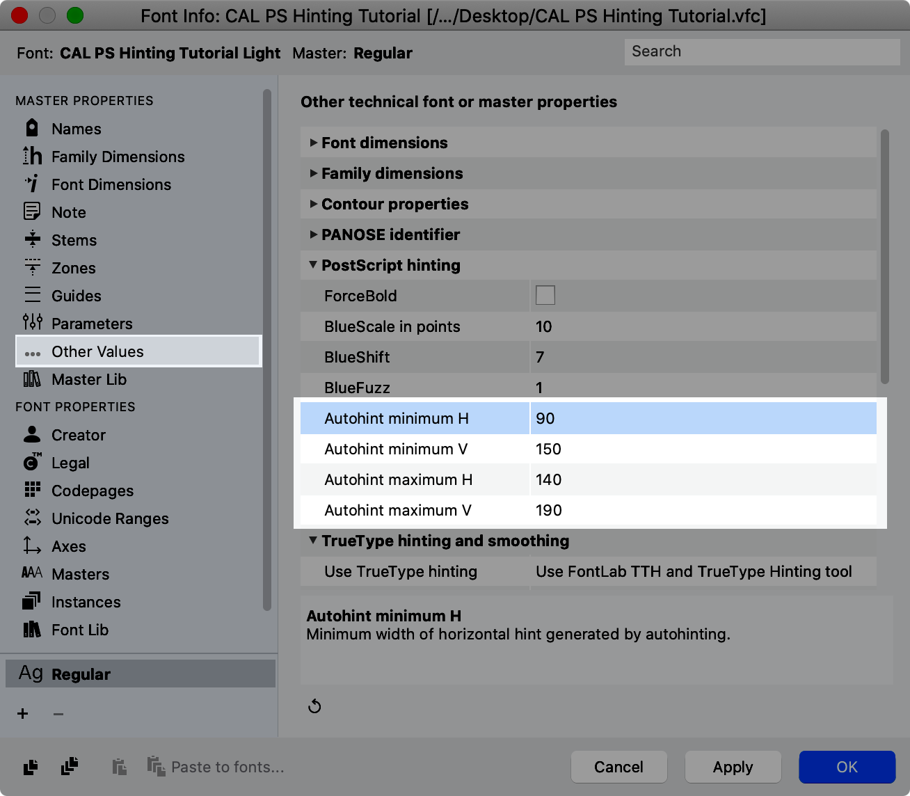
In a real font, you’d need to find your minimum values and upper values, then give the autohinter a bit of wiggle room.
Err on the side of a large range for that one.
OK, let’s finally export the file and see how it looks with stems and zones!
How Our Fonts Look
If you can, make a waterfall in whatever program you have available. If you have a PC, a Microsoft Office apps will work. If you have a Mac, you’ll need an app like InDesign that uses hinting information.
Let’s see what zone + stem hinting did for the font!
Here’s the before and after O’s.

Here’s the before and after H’s:

So that’s the good news! Also the letters are overall more legible.
Here’s how the 4 point lowercase improved.

It is a bit hard to tell it improved. Stand back from the screen, and you’ll see that the crisper o’s improve the legibility.
Problems Hinting Creates
It’s problem time again!
You should be aware of some of the problems PS hinting can make.
Problem 1: Letters Have Different Widths
If we look at the lowercase of the 6pt size, stems made it more legible. However, the letters are of different sizes.

Solution Unfortunately, there is no way to correct these inconsistencies. The rasterizer has to fit a certain amount of characters on a line, and this is one way it does this.
Problem 2: Round letters look very wide
Notice also how some of the lowercase o’s look very wide.
Solution To prevent very squat o’s, don’t make your o’s circular!
Narrower letters counteract the squatness.
As the o becomes closer to a squircle, it more easily fits onto the square pixel grid.
To summarize, narrower bowls and higher curve tension fit the pixel grid better.
Problem 3 Middle Bars droop
These are the worst!!
It’s common for middle bars to droop. For example, the BEFGH8. But the problem is most noticeable in the B, E, H, and 8.
Check out this font at a weird zoom.

This problem seems more common in digital publishing software like InDesign or Microsoft Word or Publisher, where the point size might not line up exactly with the pixel grid.
Also, zooms in these programs make it worse.
Solution PS (OTF) hinting has no native way to fix this. (TT (TTF) hinting does.) Some workarounds will be talked about in the tutorial on manual hinting.
OK…
So here’s where we’ve been.
You’ve seen how many people use hinted fonts.
So you’ve seen which types of fonts need hinting, and which ones don’t.
You’ve fixed up your letters for hinting.
You’ve set your zones. You’ve set your stems.
You’ve seen what hinting does to your lettershapes.
In the next one, we’re going to talk about more blues.
You might even call them the Blues brothers!
There’s a whole rat pack of them, and they further change how your font is displayed on screen.
See you then!