Briem’s notes on type design: Density
Sometimes the stems need to be of different weights to look the same. Here’s an example.
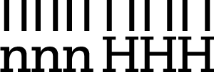
The stems of the lower case are closer together than the stems of the capitals. This makes the lower case denser on the page. If all the stems are the same weight, the capitals look too light. I mentioned this already on the page about verticals.
Here’s a rough test to select stem width of capital letters that fits the lower case.

The letter H on the left has same stem width as the letter n. The second letter H is 13% bolder. The third is 26% bolder and the fourth letter H 39% bolder.
In this design, making the capitals 13% bolder may well work. More tests would probably help. Please don’t assume that all capitals will have the right weight if the stems are 13% bolder than the lower case stems. It doesn’t work like that. Size matters as well. Here are two examples.

Different size calls for different stem width, which is the same in these four letters. The small letter on the left looks bolder than the large letter on the right.
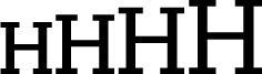
The stem width is different in each of these four letters. It has been adjusted for density. The stems of the small letter on the left are 16% lighter than the stems of the large letter on the right.
Capitals aren’t the only exceptions to stem width, although I used them here to make my point. Superscripts usually need compensation for size. So do several characters, the percertage sign and the copyright symbol for example. And don’t add too much weight to bold apostrophes.
There are no right answers. Run some tests. Use what looks right.
Notes on type design. Copyright © 1998, 2001, 2022 Gunnlaugur SE Briem. All rights reserved. Republished with permission in 2022 by Fontlab Ltd.