Briem’s notes on type design: The letter O
Let’s make the letter O from scratch.
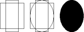
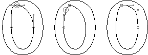
Our starting point is the width and height of the letter. On the left is abox of four templates, two vertical and two horizontal. The curve template is 15% wider than the upright stem, about the same as in Bodoni. The horizontal is whatever we want. Testing a few thicknesses may be worth the trouble.
Next we fit an ellipse to the height and the width. The result is on the right, the ellipse in black. It doesn’t make an interesting shape for the letter O.
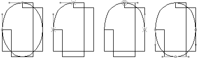
Here I have pulled the left and top templates out of the way so we can see what we’re doing.
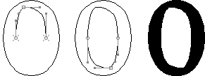
First, we pull out the curve to give it a bit of shoulder. (Deciding how much can take a while.) Next we get rid of the rest of the ellipse, leaving only the new shape behind. Then we copy, paste and flip it horizontally to make a symmetrical top half. Finally we copy, paste and flip the top half vertically to make a complete outline.
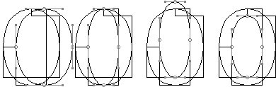
Now for the white counter. Begin by making a copy of the outline. Keep it at the same height as the original, but shift it sideways to the right. The left side should overlap the right side of the upright template on the left.
Next reduce the width of the countershape. The right side should overlap the left side of the upright template on the right. Then move the shape up. The bottom should overlap the top of the lower horizontal template. Finally reduce the height of the shape. The top should overlap the bottom of the upper horzontal template.
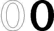
That’s it. You’ve got a letter O, respectable and dull. I’d like it to have a touch of handwriting with a broad-edge pen.
First I shift the top point sideways. Then I move the handle down. This gives me a nice corner, but the top right curve is too shallow. I pull it sideways and up. (Working out the curves you like can take time.)
All that remains is to make a copy of the upper counter and turn it 180 degrees. We’ve got a letter O. And with slight changes, we can use it in most of the other curved letters.
Notes on type design. Copyright © 1998, 2001, 2022 Gunnlaugur SE Briem. All rights reserved. Republished with permission in 2022 by Fontlab Ltd.