Briem’s notes on type design: Diagonals
Here’s one way of making a bold letter z.

Start with a stem template and a letter z in the regular weight. The bold mustn’t get too wide. We can take care of that that by rotating the template anticlockwise a few degrees. Next we fit the lettershape to the stem width. Then lengthen the serifs a little and increse the bracketing. That will do it.
You also rotate a template when you make a bold letter x.
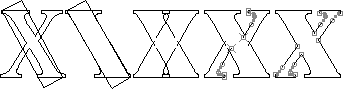
- When you put the template in place, remember that our bold serifs are shorter than in the regular weight.
- Widen the thicker of the two diagonals to match the template. Discard the thinner one.
- Make a copy of the remaining stem and flip it horizontally. This is a simple way of getting matching serifs on both sides.
- Drag the inner paths of the copy outwards until the diagonal is as thick as you want it.
- Slant the stem halves of the thin diagonal until they are close to forming a straight line. The kink in the thinner diagonal is usually bigger in a bold letter x than in the regular weight.
A thin diagonal that crosses a thicker diagonal sometimes looks wrong. The page about optical illusions shows how you can compensate. You don’t have to; many popular designs don’t. But you should know how to.
Remove the overlaps and close the path. As usual, there’s more to do.

The thick diagonal in the letter on the left is straight, but is seems broken where the thin diagonal passes through it. This can be mended. You move the corner point on the left side down a little, and the corner point on the right side up a little.
In addition, you can also move the corner point of the upper countershape a little to the left, and the corner point of the lower countershape a littel to the right.
Making a bold letter v is much the same.

- Align a stem template to the letter v in a regular weight.
- Widen the left stem and shorten the outer serif.
- Discard the right stem.
- Make a copy of the left stem and flip it horizontally. Shift it a little to the right, if you like. This will make the bottom slightly wider than it is in the regular weight.
- Shift the left side of the right stem to the right until it is as thick as you want it. Remove the overlaps and close the path.
- There’s more. You may want to pull down the bottom corner of the counter. It often makes the letter look better. For more on that subject, take a look at the page about optical illusions.
Here’s one way of making a bold letter w.
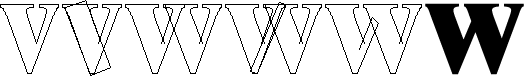
- Make a narrow letter v. This one has been squeezed 10%.
- Align the letter to a stem template.
- Make a copy, and overlap the two. Make sure that the counter of the left letter is not much smaller than the counter of the right. You may like to tilt the two letters a little towards each other, a couple of degrees perhaps.
- You can make the left counter bigger by tilting the right side. I suggest you use a template rather than doing it by eye.
- All that remains is to remove the overlaps and join loose ends.
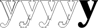
A bold letter y is not difficult. Start with a bold letter v. Add the letter y in a regular weight and discard all of it except the descender. Next enlarge the descender to make the weight of the bulb match the weight of the stem. Then fit the right half of the descender to the right side of the letter. Finally adjust the dot and the left side of the descender, remove overlaps and join loose ends.

You need to be careful about details when you make a bold letter k.
- Align a bold letter l and a letter k in the regular weight.
- Rotate a stem template until you have reduced the countershape as much as you dare.
- Adjust the left side of the lower diagonal and the left side of the upper diagonal. The top counter can be bigger than the bottom counter, but not much.
- Fit the right side of the lower diagonal to the template. You can get away with making it sligtly thinner.
- Adjust the top diagonal.
Notes on type design. Copyright © 1998, 2001, 2022 Gunnlaugur SE Briem. All rights reserved. Republished with permission in 2022 by Fontlab Ltd.